Q • What characters were the easiest for you to design? How did the use of Key Characters help?
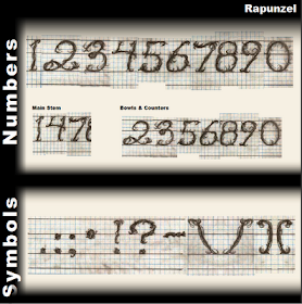
The characters that were the easiest to design are in the upper case category were the two subcategories I created. One is called “Strong Corner Top Left” They all used the same stem and have the same type of top arm. The Diagonals were also not too difficult since once again I am using repeating strokes to create consistency. The lowercase letters in the subcategory called “bowls and Counters” was also not too difficult as they all use the same shape of strokes. Using Key Characters was very helpful.
Q • What characters were the most difficult to design? Are there any that you were unable to complete to your satisfaction, and if so, what do you think is causing the difficulty?
The more difficult capitol letters for me are in a category called “Strong Stem”. They were hard as they had different attributes that were difficult to incorporate into my style of design. I think I am heading in the right direction with this font. It defiantly has not arrived, but it is getting there.
Q • Do all of the characters that you designed appear as a set, or do some look out of place? Tell us of any that don't fit and what you think may be wrong with them.
For the most part I think they appear to be part of a collection. The “R” character could be in question as it is the only one that has a descended. I may adjust that in my next version. I also may also reconsider the “M” character,
Q • Tell us if the set looks just as you expected or if you are surprised by how it is turning out.
For the most part the font is coming along how I expected. The look will change a bit I believe when I go to design on the computer.
Q • Let us know if there is anything you don't like about your rough typeface and any changes that you think might improve it.
Other improvements I would like to consider is the width of some of the characters. I think the width needs to be more consist ant and in these roughs it varies quite a bit.
See Rough Sketch below.


