Pages

12/3/10

Neville Brody - star typographyer

How do the contribution of Neville Brody affect the study of typography?
 
Known for his anti-traditional views, Neville Brody was an English designer that encouraged the evolution of conventional typefaces to abandon the ridged structure of legibility. Brody quickly fell into the public eye in the 1980’s with his record cover designs. In the beginning he was his unique innovative use of architectural and visual elements set him apart from other designers.  His work for The Face magazine revealed his creative innovations in graphic design and “established his reputation as one of the worlds leading graphic designers” (FontShop, 2010).

It was his creative vision used in, The Face magazine, that shifted the way typography was viewed by society. Neville Brody paved the way and changed the look of traditional design with his radical concepts of how typography was incorporated into the design. Many magazines and advertisements quickly adopted and applied this innovative design concept. He continued search for new innovation in type, which led him to begin designing and developing his own typefaces.

Today Neville Brody has focused his attention on “electronic communication design” (FontShop, 2010). With his many advances and contributions to design and typography, Brody has earned that title, “star typographer”. He designed many well-known fonts like: “Arcadia, Industria, Insignia, FF Blur, FF Pop, FF Gothic, and FF Harlem” (Identifont, 2010).
Sample of Influence.
 
Work Cited:
Design Team Production | G321 XA.  Week Four Online Lecture: Typography A Quick History, 12 2010.

"Identifont." Identifont - Identify Fonts by Appearance, Find Fonts by Name. Web. 03 Dec. 2010.
"FontShop." FontShop. The World's Best Fonts. Web. 03 Dec. 2010.
"MyFonts." MyFonts. Web. 03 Dec. 2010.

11/29/10

Virtual Team Apps - Skype


In my virtual design team experience, one essential tool that makes communication so much easier is to use Skype to host a group conference call. Not only does this application allow you to talk directly to the group, but you can also have a group chat that enables the team to share documents and even share your desktop. It is free and works on both mac and PC. www.skype.com

Dropbox - Great Doc Share App.

A great app for document sharing. This application has been a life saver in my virtual team experiences. It updates the file for everyone in real time. It is just another folder on your and their computer.


See the video and check out the website to get this great app. http://www.dropbox.com/

11/13/10

Team Conflict

QUESTION? Why do conflicts arise in a virtual team?

Conflict occurs in teams for many different reasons. Whether the team struggles with who’s in charge, a lazy teammate, individuals trying to get off task, a change in direction, or even not meeting deadlines, conflict occurs. In the end most conflicts that arise can be boiled down to due to two types of conflict.

Cognitive conflict involves problems with ideas, principles, issues, or even processes. A cognitive conflict is more targeted at the task and how it is accomplished. The other type of conflict is affective, which focuses on people, values and emotions. This type of conflict is directly linked to personal and the different personalities and background.

Most of the time poor communication is a cognitive conflict. When things are unclear as far as, goals, delegation, expectation, deadlines, quality, and even concept, a team will fall into conflict because of the lack of communication. To avoid this it is important for everyone to ask questions, and take time to make sure everyone is on the same page. It may also be wise to over communicate and have critical items in writing more than once. In the virtual environment it is even more difficult as there is not the visual cues to reinforce what is being said. Also technology does sometimes fail, and critical messages may never actually make it to their recipients.

Having unrealistic expectations is of an affective type of conflict. This is especially true when members of the team may not have as much experience or talent as they claim. Emotions run wild when teammates cannot meet expectations. Individuals in the team may become disappointed in coordinator, and try to take control of the team themselves. In contrast a coordinator my not be satisfied with the work of the finisher and create conflict with trying to improve the quality. Another issue almost every team experiences in this area, is when some members may not commit the same amount of time and effort other team members feel should be given. The conflict arises as the over achiever is irritated at the slacker and the slacker is annoyed at the push of the over achiever.

What ever the conflict is it is important to try to repair the breakdown, to make the unit function more effectively and not a repeating incident. Conflicts can either be resolved constructively or destructively. A constructive resolution would show growth and change from the conflict. It actually fixes a problem and the team is stronger because of the conflict. A deconstructive resolution is the worst way to resolve a conflict as no resolution is reached. It then divides and team and breaks down team moral. It drains the team of energy and vision.


Resources:
AIO Lecture Week1
http://www.ohrd.wisc.edu/onlinetraining/resolution/aboutwhatisit.htm
http://www.chumans.com/human-systems-resources/managing-team-conflict.html

Team Mission Statement

QUESTION? What is the importance of a mission statement for a team?

A mission statement helps a team keep on track with the objective and direction of the task. One of the many functions of a mission statement is to identify a direction and goal for the team to work towards. It will help define and prioritize how and what the team does, as well as, how resources are used. It reveals the identity, standards and core function of the team’s aspirations. In the most simple of terms, it organizes the group to be more productive by getting everyone one the same page.

Without a mission statement a team could easily get off task and waste time floundering instead of making steps to accomplish and expedite the goal. A team lacking a mission statement might trying to accomplish the same goal, as a team with a mission statement, but will waste time, energy and resources. Without a sound direction the team also may be come frustrated, conflicted and even hostile toward each other. The end result the team produces will also probably not be as clear and effective as a group with a mission statement.

A mission statement helps turn a team into a well-oiled machine, as it spells out the values and objectives. With the values and goals defined direction is quite clear, therefore, eliminating some opportunities for conflict.

Resources:
AIO Lecture Week 1
http://www.samples-help.org.uk/mission-statements/team-mission-statements.htm
http://www.health.state.mn.us/divs/hpcd/chp/hpkit/text/team_mission.htm
http://www.businessplans.org/mission.html

11/9/10

Extreme Realism

Extreme Realism

Image Source: https://blogger.googleusercontent.com/img/b/R29vZ2xl/AVvXsEhjR50VrB_882jT6V9F5_K5NVsaKdqo8pUY0m4FUchr5H3JkEVwBsV6x-xIajOMKobyHzdktqd8nTsVcqk4LiXqGpuhHYVGlw-2OffTimMs3B4hS79ujDEq8M6HbucVPqfGKQQmfOo8MkcI/s400/Picture+3.png

Isn’t that a photograph? It is hard to believe Don Eddy was able to capture such detail in his paintings of cars. He is obviously an artist that was strongly influenced by the Extreme Realism Movement and actually considered himself to be a photorealist. In this piece Don Eddy is able to give the viewer a very accurate account of a common everyday setting. His work is so detailed with realistic reflections, light, color and value that at first glance the viewer might think they are actually looking at a photograph opposed to a painting. The artist has revealed the setting without distorting it.

Cubism


Cubism

Image Source: http://1.bp.blogspot.com/_H__ZfihjeDc/S7UVYnXvKdI/AAAAAAAAAd4/QdckPLurCNw/s1600/zhatter.png

This illustration of The Mad Hatter, titled "Time for Tea" by Alex Pribnow, reveals a solid influence of the cubism movement. The viewer can see the different parts of the figure have been broken down into simple geometric shapes used in this movement. The viewer can see the cone, cylinder and sphere forms used to create the figure. It is also apparent the artist does not use a traditional perspective with the figures face, but shows multiple viewpoints. The main view of the figure is a profile view, but we are still able to see both eyes and eyebrows on the face.

Surrealism

Surrealism

Image Source: http://behance.vo.llnwd.net/profiles/57681/projects/488962/576811271844962.jpg


This self-portrait, by Francesco Sambo, shows great influence of Surrealism. The artist has placed brought the viewer into an unresolved conflict. He has placed a figure that is morphing into or out of the wall. The figure has a large hole in his chest. Seeing the texture and slight color at the top left is symbolic of the blood splatter that would have happened when the hole was created. I notice that there is not a rich use of color, but more muted. The blood has turned browner in color, which tells the viewer this incident happened a while ago. Finally the gesture and expression of the figure lets the viewer know that the experience is still fresh and unresolved by the figure. Further more the surreal influence is very present in this piece as we are looking into the subconscious of the artist.

11/8/10

Pop Art - Andy Warhol - Soup Label

QUESTION: Is the label on a can of soup, art? What is your opinion of the work of Andy Warhol? In what ways has it affected your own style - or has it not?


In my opinion the label on soup is not art, but has been graphically arranged for effective communication. There is an artistic touch to the organization and use of space, color, fonts that establishes visual hierarchy, but in my opinion it is not art on the typical Campbell’s soup label. I would consider this more design or layout or design.  In examining other labels for example Hobo Soup, I find this example to be a form of art. The designer has incorporated and illustration in a clever combination with the necessary text and color. The movement of the cooking soup smell works great to create visual hierarchy and lead the viewer to the product name, which is also identified by the imagery. The imagery is interacting with the text and works together as a whole.  I would consider this label art.
 http://t3.gstatic.com/images?q=tbn:ANd9GcTL3LdlaOFwHutr09paUUi1f2-GLAJypSvTf1HEvy6NGrIjSIU&t=1&usg=__NaftuGva7-k3nZbzHTit-snMo8k=
The practice of taking common everyday objects, images and even icons that are easily identified in their culture and incorporating them and redefining them in artwork is known as the “Pop Art” style. Andy Warhol is one of the many artists known for working in this style and being part of this movement. While he has been able to create many pieces and be quite successful in this style, I personally am not a big fan of the style alone. It seems strange that an artist can repeat an image, object or photograph, change the colors and claim it as their art. I know as a designer, I can’t even really use photography that has been produced by another individual without purchasing it or asking permission.
 http://t3.gstatic.com/images?q=tbn:ANd9GcSmtaQTaoeHDkQW4BWdL-Lk2gi6Rvbu4pTSfIRu8IqSi9_ql6E&t=1&usg=__c3U05SWOUekS2o9ii0r0BQSY0jc=
Even though I am not a huge fan of this movement in art history, I personally think it is one of the best and more inspiring movements. The main elements I pull from this style are rebellion, mockery, and free political expression. I see how it mocks mass production and materialism with the boom of consumerism in that time of society. I see had it points its finger at society and laughs. It shattered the division of fine artists and commercial design and has bridged the gap between these two art forms. Without the Pop Art movement graphic design would be completely different today.

Resources:
AIO Lecture
http://wwar.com/masters/movements/pop_art.html

11/7/10

Preflight, FlightCheck - Printing problems


Preflight is very important. I really never knew much about it before I started working my first job as an Art Director. In this position I had to flightcheck all projects before we would send them to the printer. Basically, if there were any issues it would come back to me as I was the one that did the final checks.

In the beginning I was very confused by the process as I found so many issues alerted I, that I was told just to ignore. With more experience I learned what issues would cause problems and which ones would not.

One key thing to keep in mind of why flightcheck is important is it will make you aware of issues that you may not have even considered. One time I was running fight check on a project to send out to a specific printer. This printer had sent me their personal settings for the flight check software, and would make sure everything was setup to their specs.

When running this project through I found that many of the gradients in the design did not meet the standards for the printer. In this case the printer wanted no color less than 10% or it would not show up. The gradients were created with 10% color, and would not show up at all.

While I was not the one that created the gradients, I would have been the one that got nailed with missing this detail when the project didn’t print correctly. I was able to flag this issue and got the company that created the gradients in some hot water.

Fight check is a great last step to ensure you will have the print you are looking for. If you don’t flight check you will probably end up making multiple trips to the printer as little details easily slip by, and affect the print. I have found something as silly as not having embedded images and not including them with my print package has wasted my time as well as the printers.

As far as checking it yourself, without software assistance, I don’t suggest it. The software is there, USE IT! There may be a small issue that you are not even aware of.

11/6/10

Photoshop Adjusting Levels.

When adjusting levels in Photoshop use Adjustment Layers so you are doing “No Destructive Editing”

Go to your adjustment layers pallet.
Choose levels.
Hold down the “OPTION” key while sliding the sliders and adjusting your histogram.
Notice when the color starts being revealed. That is a good stopping point.


Start Image:


Notice adjustment Holding Option Down

 See Corrected Image:

Fashion Illustration VS. Technical Illustration

Fashion Illustration VS. Technical Illustration

While fundamental drawing and rendering skills are required in the professional illustration industry, the various fields require greater discipline of certain techniques than others. In taking a closer look at fashion illustration and technical illustration one will quickly realize these two areas of illustration require a drastically different approach to accomplish their objectives.

Fashion illustration has greatly evolved over the years. With the advances in photography, fashion illustrators are no longer burdened with the responsibility of rendering out fashion advertisements, catalogues and displays. Today these items are mostly done with photography. Photographers, however have not replaced the job of fashion illustrators, but rather opened the opportunity to work specifically in the initial creation and design of clothing, accessories and garments. Fashion illustrators work out the design of the items, before they are created with fabric or materials. Their designs do not have strict standards as far as needing to be realistic or proportionally atomically. Rather, they can be loose, expressive and stylized, which may help display and even sell the overall look of the proposed style. The drawings rely on the use of line and the simplified human form to express the concept, look and style the designer has in mind.

The fashion illustration below, for example, uses the same girl over and over in different clothing and accessories combinations. It is not at all realistic as the drawing of the figure is quite distorted and the model is identical in each rendering. At the same time, it gives the viewer a strong sense of the look the designer is going for with their clothing.

Image Source:http://www.lushlee.com/images/art/09/9/fashion-illustration-by-bu.jpg

Technical illustration is known for its detail, accuracy, dimension and proportions, which is quite a different direction from fashion illustration. A technical illustrator needs to have a great understanding of perspective, drafting, mechanical drawing, and even knowledge of software like CAD, CorelDraw and in some instances 3D software. While some technical drawings maybe simplified line drawings, others may be a detailed perspective rendering. The overall effect should show the viewer what something does, or give a greater understanding in a technical nature or direction. Regardless of how detailed the technical illustration maybe, it will reveal the important details needed to communicate a sometimes very complex idea. A major advantage of a technical illustration over a photograph would be the ability to simplify the drawing for an easier understanding of a complex idea. A great example of this would be a technical illustration showing how a four cylinder engine functions. The illustrator, James Provost, has actually cut away a section of the engine case to reveal what is going on inside. The drawing below is detailed; proportionate and accurate to show give the viewer an understanding of the complex process happing inside the engine.

Image Source: http://jamesprovost.com/files/2009/11/power-split-device-cutaway.jpg

Technical illustrations many times use colors and added symbols for clarity and even sometimes my show a extra enlarged view to accommodate certain details and complexities.

Fashion and technical illustration are quite different when considering how detailed and precise technical is compared to the free stylistic renderings done for fashion. These two drastically different approaches do have a few things in common. Both fashion illustration and technical illustration are sometimes used in initial studies before fabrication. A technical illustration of a new product would be proposed to a board, like a fashion illustrator may have created a rendering of a collection in proposal for a designer looking for a contract. Fashion obviously deals with fabricating garments, and technical drawing may show a design for a new product, part, or piece of machinery. While these two divisions of illustration have a demand for different disciplines of illustration, both require a fundamental understanding of illustration, form and rendering techniques.

Works Cited:


"How to Become a Fashion Illustrator, Fashion Sketcher." StyleCareer.com, How to Work in Fashion, How to Break Into Fashion and Image Careers. Web. 05 Nov. 2010. .

Intermediate Illustration | G320 UA. Week Five Online Lecture: Specialized Fields in Illustration, 11 2010.

Lushlee, Angie. "Bu Lago Millan." Lushlee.com. 09 Sept. 2009. Web. 06 Nov. 2010.
.

Provost, James. "Power Split Device • James Provost • Technical Illustration, Editorial Illustration, Motion Illustration & Infographics." James Provost • Technical Illustration, Editorial Illustration, Motion Illustration & Infographics. Web. 06 Nov. 2010.
.


11/5/10

Contrast - Identify, Correct,

A great technique to identify contrast issue as mentioned in this weeks lecture is switching the image to gray-scale and checking the overall range of gray-scale value. Then after identifying areas that need adjustment using the history pallet or undo command, or if the image did not have previous edits before the color change using a “Revert” command would also restore the file to its original state.

I then suggest using the adjustment layers. When I first started using Photoshop we never had these. I would always keep a copy of the original image in a separate layer in case I needed to go back. With adjustment layers this step is not needed. The first tool I always use to adjust contrast is “Levels”. In my experience taking a quick look at the curve will explain most contrast issues. I then simply correct it by adjusting the arrows on the curve.

Another tool I use quite often in adjusting contrast is the curves tool. I also use this tool with an adjustment layer as well. The curves tool has quite a bit more control than the levels adjustment and allows for a more involved correction. One of the main times I go to the curves tool is when I am adjusting an image and removing a colorcast. I great starting point for this adjustment is to click on the mid-tone eyedropper and find a middle gray tone in your image and select it. This may correct the cast, or at least give a great starting point to make further adjustments too.

Resources:
AIO Lecture

Norman Rockwell - Essay ad campaigns


Norman Rockwell is well known for his illustrations on covers of numerous magazines and especially The Saturday Evening Post. He had the ability to look at the culture around him and create visual stories that expressed the wants and needs the people. His illustrations had ordinary people doing everyday activities with exceptional details creating a utopian scene. In the words of Norman Rockwell, “I paint life as I would like it to be” (American Masters, 2006). More plainly stated by Steven Spielberg, “ Rockwell painted the American dream – better than anyone” (American Masters, 2006).

Rockwell’s career as an illustrator spanned many years in which he created many wonderful pieces, and icons that are still recognized today. One thing many people do not remember about this talented artist is his great talent in advertising. It estimated that Rockwell actually did twice as many ads than covers. His incredible talent gave him the opportunity to promote and sell a wide variety of products.

In the 1920’s illustrators had more of a celebrity status and were revered for their familiarity of culture and especially public preference. On many occasions Rockwell’s clients would give him complete control of ad campaigns and strategies of how to promote and sell their products or service. Rockwell knew how to make his pieces interact emotionally with the viewer, which made his advertisements extremely successful. The techniques used in his advertisements are similar to how the photography is set up today to tell the story of the product.

Rockwell began doing advertisements in 1914 and continued illustrating commercial campaigns for 60 years. By 1920 he had already done advertisements for a diverse amount of products. Heinz, oil heaters, tires textiles, Post cereals, US Marines and even motors were the products he began promoting.

He shows that he has great understanding of visual communication in the Norman Rockwell’s advertisement for Parker 61 pen’s in 1959. The viewer sees this master put so many little bits and pieces into this ad. He uses great balance of color in his blocking of the product to bring the viewer back and forth from the color combination. The viewer’s attention is brought to the center of the illustration with the brilliant yellow and he places the product clearly on this background, which really showcases the product. Next consider the all American look he has given this girl and her friends. They are all pretty, conservative, and happy for each other. This wholesome group is every father’s dream of a successful, happy daughter ready to go off to college and be even more successful with this great gift from her father. He then reassures these assumptions when he places the text, “Daddy is trying to spoil me!” This makes the suggestions placed in the illustration more concrete and reassures the viewer that a Parker 61 is a real treat. His eye for detail makes his message incredibly successful. In today’s advertisements many times stock photography is uses. The stock photographs do not contain the elements that tell the story like Rockwell did.


Norman Rockwell’s creativity and understanding of the human figure, as well as, the American culture has made his work very successful for over sixty years. As an accomplished Illustrator he has collections of techniques to establish visual hierarchy and strike an emotional card with the viewer. Not only is his work an inspiration for today’s designers, but also it is a wealth of techniques that need to be observed, understood and used to create incredible pieces with solid design techniques. Today as designers we can appreciate his attention to detail and telling the visual story with his elements first. The initial glance can tell the story, but the more you look there is much more to the story than meets the eye.

Works Cited


"1959 Rockwell Illustration for Parker 61 | Monochromatic Outlook." Monochromatic Outlook | There She Goes, My Beautiful World. 27 Mar. 2008. Web. 02 Nov. 2010. .

American Masters. "Norman Rockwell - About Norman Rockwell | American Masters." PBS: Public Broadcasting Service. 07 Feb. 2006. Web. 02 Nov. 2010.
.

"Norman Rockwell Advertising Art 1914 to 1976." Where Norman Rockwell Art Collectors Begin. Web. 02 Nov. 2010.
.

"Norman Rockwell." American Art Archives, Illustration, Illustrator, Art. Web. 02 Nov. 2010.
.

"Norman Rockwell Art." Norman Rockwell Prints. Web. 02 Nov. 2010.
.


10/26/10

DesignFirms - Free Profile


Get a free professional designer listing on Design Firms!

About DesignFirms!

DesignFirms, period. Stats will show that over time, our site has consistently grown compared to other competiting sites. Our paying advertisers - they are real - not displayed to make us seem bigger than we really are. They are quality companies spending money to make money. Don't take our word for it, Google "designfirms" and see for yourself. Try searching for keywords like "design company", "need a website", "design directory" and even try your own searches. You will see that we are the best hands down. Add in other cool features such as the marketplace, reviews, jobs, portfolios, awards, articles and our link exchange network, you have the web's most prestigious design marketplace.

If you have doubts about finding the right company with DesignFirms, know that our directory is automated but also human edited. We make every effort to provide quality firms for you to choose from. Need more proof? View some company reviews.

What is DesignFirms?

As one of the world's leading directories of web designers, developers, graphic designers, etc., your business can reach thousands upon thousands of visitors each month. Unlike most directories in similar nature, DesignFirms is easy to use and even easier for visitors to find a provider for the services they need (your company). Read below for more information on why DesignFirms is the best vehicle in building your design business.

If you are a business looking to advertise on the DesignFirms directory, this page will help you understand what DesignFirms has to offer and how it will help your business succeed.


Unsharp Mask

Although it sounds backwards, “Unsharp Mask” in most cases will enhance clarity and make images sharper and clearer. While this filter may appear to have an affect the entire image, Unsharp Mask is only applied to the edges of an image. It accomplishes the “sharpening effect” by adjusting the acutance, which refers to the clarity or transition at the edge of an image. Unsharp Mask is a great way to increase clarity of detail in photographs.

This filter should not be applied to every image, but only on images that need a crisp sharp look. If enhanced detail is not needed in an image, using this filter could result in unwanted noise or added graininess to the look to the image.

Images that are great candidates for this filter would be images that contain a large amount of detail. While there is a large range available in the setting, small amounts of these settings accomplish the sharpening need. Applying this filter too much can over emphasize certain textures and unwanted detail, as well as, in some instances create a halo around images. All of which would be unwanted results.

One thing to always remember about this filter is it is not a solution for a photo that is not in focus. While it may look better with the application of the filter, it won’t make a out of focus photo sharp. Another thing to keep in mind is that it should be applied to images last, after all other editing has been done. This will ensure maximum clarity.

Some suggested setting for unsharpen mask.

Subject              Amount         Radius          Threshold
Soft subjects       150                 1                     10
Portraits             75                   2                        3
Moderate sharpening 225       0.5                      0
Maximum sharpening 65         4                       3
All-purpose sharpening 85      1                        4


Source:
For starting values of the USM filter for different uses, try the ones suggested by PhotographyJam:
http://photocritic.org/unsharp-mask-sharpening-photos-photoshop/


Resources:
http://www.earthboundlight.com/phototips/unsharp-mask.html
http://www.cambridgeincolour.com/tutorials/sharpness.htm
http://www.cambridgeincolour.com/tutorials/unsharp-mask.htm
http://dictionary.reference.com/browse/acutance
http://www.naturescapes.net/122004/tg1204.htm

10/23/10

Figure Drawing - Gouache Paint, Color Pencil

Objective: Figure drawing of Olympic Event & render appropriate color in two different traditional mediums.

This illustration was rendered in gouache paint.


This illustration was rendered in Prisma color pencils. 

Color Choices - Complementary - Warm & Cool Colors.

OBJECTIVE: Give your impressions of how the artist might have approached the choice of colors.

I chose an illustration from Mark Bender. He is was one of my instructors at the Art Institute of Pittsburgh when I attended back in 2002. I always enjoyed his style and great use of color. In this piece you see that he has a warm and cool color contrast. His rich blue and green works very nicely with the vibrant orange and yellow. The color pallet choice is actually complementary which gives greatest contrast and great harmony. I also find it interesting how he chose to place the man working in realistic colored clothes. The man is dressed in blue coveralls and a white shirt. His arms are rich golden collection of orange and yellow. In addition to creating a great contrast and harmony, the colors selected are quite realistic and what you would expect to see.

By Mark Bender

Source:http://www.pittsburghillustrators.org/portfolios/bender/bender2.jpg

10/20/10

Product Mockup - Prospective & Color Rendering

OBJECTIVE: Create a line drawing of a product that would be good in an Olympic ad. Then do a color rendering of that drawing.

I first chose the product of "painreliever" This specific product is a actually produced by the Publix brand.
After I had the drawing completed I used Prisma Color Pencils to render the drawing in a monochromatic blue color. 

Great Color Design Application!

Here is a great site with a free color application that could be a great color tool.
Check it out the Color Scheme Designer

http://colorschemedesigner.com/

Effective Use Of Color - Triadic Color - Illustration


kitchen
Image Source: http://www.unstage.com/2009/10/great-use-of-color-in-digital-art/
 
In this illustration titled “kitchen” by Zain you see an example of an artist using a triadic color scheme. This means that the color pallet consists of three main colors that are equally spaced around the color wheel. It is a solid scheme to use as it provides strong contrast but maintains balance or harmony of color.
The artist establishes a cool feel with the use of blues in the top of the illustration. This was a great technique as the cool tones allow the viewer to be drawn in to the illustration, which creates a greater illusion of depth. In addition to the perspective and shading the use of blue makes this kitchen space appear very deep especially with the contrast of the pink warm tone, which is the one of the other colors used in the triad.

The pink tone adds a splash of warmth, but is secondary to the coolness of the more dominant blue. While the piece is quite sad and mellow looking do to the dominate cool color, the use of the warm pink tones on the bottom, are a great way to lead the front of the piece toward the viewer. This contrast of warm and cool is a great technique for this piece as it creates an illusion of an extended visual field a great use of color in this exaggerated perspective drawing.

Finally the artist uses a touch of yellow, which completes this triadic pallet. This aids in the established light source and gives the viewer a feeling of sunlight. This also pushes the blue primary color to appear darker and possibly sadder and helps the viewer realize the intended tone of the piece where the girl is stuck inside working, on a beautiful sunny day.

Resources:
AIO Lecture
http://www.color-wheel-pro.com/color-schemes.html
http://colorschemedesigner.com/

10/18/10

Emotional Impact of Color

QUESTION:  "The impact of color on the emotional feel of a piece can add significantly to the message of the illustration." Explain by giving examples.

Color is a key component in an illustration in aiding the viewer in establishing the correct emotion. A very simple example is the use of complementary colors like red and green. This combination in most situations in the American culture makes people think of Christmas. While looking at the color green alone the viewer may assume growth, fresh, go or safe, it does also have some negative associations like greed and jealousy. It is amazing how adding the complementary color of green to red has created this holiday brand color. 

By itself color red has other emotional effects on people like the association of heat, fire, power, it has also been associated with a signal to stop. The color red is even used to represent love and passion. 

 
Pink is another color that has been a way to establish femininity. Most children wearing pink clothing are assumed to be female. Also consider how the popular retailer Victoria Secret has taken the color pink and branded their store with this color. Even the Breast Cancer Awareness has adopted this color for their movement.
           
Some color combinations even can effect how the piece is visually viewed. For example Warm color combinations have a tendency to appear to move in the direction of the observers and seem to be in a closer proximity. To push away from the viewer one could chose to use a cool color combination, which would will aid in the scene pulling back from the viewer. In other words, warm colors will appear to be larger than cool colors.


One key thing to keep in mind about color is a viewer may respond differently to color depending on their culture and background. While it may seem that response to color could be a natural response, it is really based on conditioned influence or association of a specific culture. An example of this is how in the Chinese culture the color red may be associated with luck,  or celebration, but in South Africa it is the color of death or mourning.


Resources:
AIO Lecture
http://www.color-wheel-pro.com/color-meaning.html
http://www.writedesignonline.com/resources/design/rules/color.html

http://webdesign.about.com/od/color/a/bl_colorculture.htm


OUTPUT Resolutions LPI

Printer
LPI
Newspaper ads
85
Magazines and brochures
133
High-end magazines
150
Annual reports
175
High-end brochures
175
300 dpi laser printers
53
600 dpi laser printers
106
1200 dpi laser printers
212

Production/Output Consideration

QUESTION: When you start a new project, should you be concerned about what method of printing will be used for the final product?


Resolution:
When starting a new project if is very important to know the final output. First of all, the output will determine what resolution you will need for your images and graphics. A designer would choose a different resolution based on the final output of the project. The resolution used in a newspaper is different than a magazine and the resolution of a magazine is different from a high-end brochure.

Color:
The final output will also determine color abilities or limitations. Is the project using a CMYK or a specific pantone color? If it is a screen print the color pallet could be limited. Knowing the color limitations may also reduce your options available with specific filters and effects.

Format:
The format the file is saved in could also become an issue as well. Many printers have reported issues with trying to print TIFF files that complex colored designs. Some printers may require a specific format for production and have specific guidelines how the file needs to be set up. One printer may want .125” bleeds set, while another prefers .25”. Many printers offer a profile that will set up the file to their spec’s, or instructions of how they want the file setup. Another thing to consider is has the file been setup with the appropriate trapping, chokes and spreads.

Fonts:
Fonts are often an issue when it comes to printing and production especially if a design uses TrueType fonts. While TrueType fonts offer some benefits to designers, they are known for their history of causing printing problems. Many times to avoid printing, and clarity issues a designer should choose Type 1 or post script fonts for their high resolution output and reliability.

Drawing Line & Shade Concepts

Line and Shade Drawing Concepts from Instructor:
by: Victoria Vebell - AIO Intermediate Illustration.

1. Drawing is creating the illusion of 3D space on a 2d surface.

2. There are no lines in the 3D world only edges seen by the contrast by what's behind it.

3. A line is an abstraction of an edge.

4. Lines create shape, shading creates form.

5. Light creates unity of form by all the objects having the same direction of the light source.

6. Shading is made up of different tones of value. All value is judge how light or dark it is by comparison to another tone.

7. The human eye can see about 40 different values.

8. A trompe l'oeile (fool the eye) artist can render maybe 15 -20 different values in a drawing.

9. A very good artist can render 10 different values.

10. Every good drawing must have a pure white and a pure black.

11. The more different values you can render the more realistic your drawing will be.

12. This is the basis for eye movement, the more contrast you create in an area the more your eye notices it and appears to come forward. The converse is true, the less contrast you have (the closer your values are together) the more that area recedes and your eye slides over it.

Think of it this way, on a sunny day everything looks clear and sharp.... more contrast of values. On a foggy day, the values are all muted and close together and everything seems soft and fuzzy.

13. Realistic rendering takes time and patience. Building up the tones to black will make your drawings more realistic and stronger.

14. Using vine charcoal is a bad choice for small work. Pencil or charcoal pencils both with a paper stump is the best choice.


Tip: to keep your shading from smearing, put a clean white piece of paper under your hand:)! Also if an area gets too dark, use a kneader eraser and dab it slightly. You also can re-establish your white areas by making a point with your eraser and draw the lights back in.

SOURCE:
Instructor: Victoria Vebell - Intermediate Illustration - AIO

10/12/10

Mac User Repair Disk Permissions

A basic rule of thumb for all you mac users out there. After any software or updates are installed you really should repair your disk permissions.

So many users have no idea what that even means. It is a very simple process.

1. Before Repairing Disk Permissions, Shut Down All Programs.
2. Go to Applications>Utilities>Disk Utility


3. Select the Drive to repair. (Note if you have more than one drive select your main or home drive.)

4. Then choose Repair Disk Permissions.


5. The process may take a few minutes. NOTE DO LET THE APP RUN ALONE. Most users are tempted to go out and do other things while this runs, Please refrain from the temptation.

Typography - Mixing typefaces

Designers should feel free to mix typefaces in design. In some situations using contrasting fonts will result in emphasis on certain words. Using complementary typefaces may help establish a clean visual hierarchy to organize the text and quickly lead the viewer through the layout. However, it is cautioned that using fonts that are too similar can cause a clash and be confusing to the viewer. An example of this would be using more than one script typefaces in a layout. At the same time there are a few things a designer may want to be mindful of when choosing typefaces to use in the same piece.

The first thing to consider in font selection for any piece is considering the intended audience. A brochure for in a pediatrician’s office could take on the look of a child like handwriting for the typeface, while it would be completely inappropriate in a cosmetic surgeons office. Keeping the intended audience in mind when choosing and mixing fonts is key to selecting a font that will enhance the design and communicate efficiently.

Another thing to keep in mind is the typography in most cases I the voice in the design. The look and feel of the typeface then becomes the tone or personality. In our culture today most people know that if you are using all caps in a text message or email, that the sender is shouting, yelling or angry. With this in mind it is important that the personality reflects the piece and enhances the communication.

In the lecture it mentioned how mixing typefaces would be a great way to show emphasis. Consider trying to whisper and shout in the same line. Using a thin font may whisper while a contrasting thick font may shout. One thing to keep in mind though when mixing fonts is leaving a dominant font to reduce confusion in the design.

Resources:
AIO Lecture Week 2

10/11/10

Anti Theft For Laptop and Phones!

Prey lets you keep track of your phone or laptop at all times, and will help you find it if it ever gets lost or stolen. It's lightweight, open source software, and free for anyone to use. And it just works

How it works!
Basically you install a tiny agent in your PC, Mac or phone, which silently waits for a remote signal to wake up and work its magic.
 

This signal is sent either from the Internet or through an SMS message, and allows you to gather information regarding the device's location, hardware and network status, and optionally trigger specific actions on it.

Get it now: http://preyproject.com/


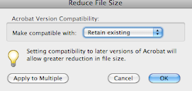
Reduce PDF file size in Adobe Acrobat

Many times you create a pdf and the file is just too big. Maybe you art trying to email the file to a client, or upload the file to an online server. In these instances reducing the size of your pdf file is ideal.

This process is actually quite simple in Adobe Acrobat.

1. Simply have your file open in Adobe Acrobat.
2. Go to Documents> Reduce File Size
3. Select your compatibility- ( I always suggest -Retain Existing)

Your file is now smaller!

Typography Leading.

Leading:
What is leading? In typography it is best defined as the amount of added vertical spacing between lines of text.

A rule of thumb often used by designers who manually adjust leading is to set leading 1½ -to-2 points larger than the point size of the type.


http://www.planetoftunes.com/dtp/dtp_media/fonts_typography/leading.gif

TrueType Font Issues

TrueType Font Issues:


In spite of these impressive benefits, many designers may not use TrueType fonts. TrueType fonts have been known to have reputation of causing printing problems when TrueType fonts are interpreted through PostScript output devices. Another reason why TrueType is not the best choice is that experienced designers notice small quality issues in the structure of the TrueType characters. In addition the file size tends to “inflate” when TrueType fonts are included in a page layout file.

Type Classifications

For a large list of type classifications, go to the Adobe link on this page:
http://www.adobe.com/type/browser/classifications.html

Printing Issues With TIFF

Tagged Image File Format (abbreviated TIFF). Designers may not want to use .TIFF files as there has been know issues when it comes to printing.

Printers often find TIFF files difficult to work with. Avoid using TIFF files in complex multicolor designs.

Perspective line drawing

Objective: Complete a perspective line drawing will be man-made objects of your choice (buildings, machinery, furniture, etc.)

Generating Good Ideas!

Question: There is no formula or procedure for coming up with great ideas. Discuss some methods that will help in generating good ideas for illustration.

When working on any project I normally have a few ideas that come to mind right away. However I have a 4 main avenues I tend to work through in coming up with good ideas.

Conceptual Notes:
Most would call them some type of thumbnail but I prefer to call them “conceptual notes”. They really won’t mean much to anyone but me. These notes will consist of symbols, graphs, text and even a rough sketch, very rough sketches. I use anything to get the idea out and move on. This is a process I use if I am just slammed with ideas. After I get the ideas out, I may try to brainstorm and workout a few concepts so that I don’t black ball myself into a corner.

Research:
Sometimes I have no idea where to start. I am working on a project where I have no experience with the topic. In this case I will start with some research. I will surf the web, for information, images, logos, websites, and maybe contact someone with more knowledge to gain a better idea of where I should even start.

Think Tank:
My all time favorite way to come up with great ideas is working in a “creative think tank”. Surrounding myself with other creative, or people that maybe quite concrete with an objective to keep me on track, or even people that don’t have a clue of what to do and are afraid of the challenge; I enjoy the group interaction. I find that sometimes the best idea comes from the worst suggestion.

Consult My Muse:
If all else fails and I cannot get a jump on a concept I talk to my wife. I tell here what I am trying to accomplish and maybe some rough thoughts I have, and she can normally help me clarify the direction I should head. My wife is not an artist, but she is very creative. Consulting another person and bouncing ideas of them can really help one figure out what will work and what won't, which helps eliminate many bad ideas.

Illustration Shading

Question: Although lines are extremely useful, line-only drawings are not as effective as drawing can be. To really bring drawings to life, shading needs to be used." Discuss the importance of shading in illustration.

Shading gives dimension to an illustration. It allows the viewer to observe a sense of volume and allows the artist to take the viewer more realistic understanding with object appearing three-dimensional. It also allows the artist to reveal the light source and can even give the viewer an idea of the setting of the piece. Many different techniques can be used to accomplish shading such as hatching, crosshatching, pointillism, blending, veiling, stumping, circular technique, and even scribble technique. In some cases an artist may even choose to work backwards by choosing a dark stock to represent the darkest point, and add a light colored medium to build to the highlight.


Samples:
Hatching

http://www.roymech.co.uk/images/hatch_ex.gif
Crosshatching:

http://th06.deviantart.net/fs36/300W/i/2008/243/e/b/Cross_Hatching_Sketch__Fist_by_esninism.jpg

Pointillism
 http://www.robert-redmond.com/photos/NudeStudies/Pointillism.jpg

 Blending
 http://www.lifelikedrawing.com/5valuegrid.jpg
Veiling
 http://www.explore-drawing-and-painting.com/images/shading-techniques-veiling.jpg
Stumping

http://www.explore-drawing-and-painting.com/images/shading-techniques-stumping.jpg

Circular

 http://library.thinkquest.org/C005470F/images/fundamentals/shading1.jpg
Scribble 

http://library.thinkquest.org/C005470F/images/fundamentals/shading2.jpg

Resources:
http://library.thinkquest.org/C005470F/technique/shading.html
http://www.explore-drawing-and-painting.com/shading-techniques.html