 (NYPL Digital Gallery, 2011) Title: Rivetting on the dome, a quarter mile up Artist: Lewis W. Hine Date: 1931 Location: Rochester, NY Medium: Photography “Lewis W. Hine. Rivetting on the dome, a quarter mile up during construction on the Empire state Building in New York City 1931 Photograph George Eastman House, Rochester; New York” (Pohl, 2002).    (Working on Skyscrapers | Aashish Puniany, 2011) Title: Working on Skyscrapers Artist: Unknown/Aashish Puniany Date: Unknown Location: Indonesia Medium: Photography In studying the images in the book I was very drawn to the work of Lewis W. Hine. In his “Hine. Rivetting on the dome, a quarter mile up” I was quite amazed at the angle of the shot. The photographer is actually higher than the workers. The viewer normally would see the large towering buildings above them, not as small distant shapes below. The dark images of the men and structure contrasting the lighter city really show the viewer how far below the city is. This concept is very impressive totally captures how dangerous the condition is for the men working. His title fills in some questions a view might have. First of what is, how high are these men, and the second is what are they doing. It was difficult to find a modern version of this today with so much “red tape” and liability issues. Most photographs I found were stock images that were save and shot from the bottom of the structure with a large lens. In my mind that is a completely different photo. I finally found some photos that are quite similar to what Hine is doing in his. On Aashish Puniany’s blog, he features a small series of photos very similar to Lewis W. Hine of men working very high up on a building over looking the city below. Aashish Puniany also uses black and white photos like Hine, which creates a dynamic contrast, as he too shows his foreground darker and distant city below lighter. His angle of his subject is not quite as drastic as Hine, but the photographs are still taken slightly above the subject to reveal they breath-taking height. A few of his photos defiantly highlight the lack of safety and danger of what these workers are doing. Works Cited: "NYPL Digital Gallery | Detail." NYPL Digital Gallery | Home. Web. 05 May 2011. Pohl, Frances K. Framing America: a Social History of American Art. New York, NY: Thames & Hudson, 2002. Print. " Working on Skyscrapers | Aashish Puniany." Images, Videos, Websites and Many More. Web. 05 May 2011. | |||
Showing posts with label Art History. Show all posts
Showing posts with label Art History. Show all posts
5/6/11
Lewis W. Hine - Men Working on Skyscrapers
Objective: Select an image that you consider to be representative of today's documentary photography and that resonates with the documentary examples:

5/3/11
Allie Mae Burroughs, Wife of a Cotton Sharecropper- Cirtique
QUESTION: Although documentary photography attempts to be impartial about the situation it records, there are aesthetic approaches taken by photographers that elicit a strong reaction from the viewer. Allie Mae Burroughs, Wife of a Cotton Sharecropper, Hale County Alabama, taken by Walker Evans that was made as part of a project that addressed the plight of migrant workers during the Great Depression. Consider his choice of setting, lighting, compositional arrangement, and title, among other strategies, to describe aspects of the Evans photograph that you think have been manipulated by the artist to produce an empathetic response from the viewer.

(Uppsala Universitet, 2011)
Walker Evans has set up his photograph “Allie Mae Burroughs, Wife of a Cotton Sharecropper, Hale County Alabama,” beautifully. I would speculate that every technique used in this photo was used with the intention to reveal a simplistic way of life that has been very wearing.
In first looking at the 3 main textures captured in the photo the viewer sees the rough wood grain of the backdrop, the detailed pattern material on Allie Mae’s blouse and the smooth texture of her skin. These three main textures create a great contrast. This contrast reveals a rough abrasive environment that this soft individual is surrounded by. The building is her environment, and it is rough and surrounds her every moment. Her blouse is her labor and tasks. She is very busy not having even a moment for herself. She has so much too do and barely enough time to do it. Her environment requires her labor. The third main texture is her skin. It is soft and smooth and is the only constant in the piece. We see how the skin is revealing wrinkles showing time and abuse from the environment and labor, but the skin is resilient against its opposition.
The flat lighting creating little dimension, may lead the viewer to further speculate that the life of this migrant worker is very simple and monotonous. She works hard long hours day after day sticking to her routine. Her stark expression cues the viewer to know she is turning into a machine. She has been hardened, by life, extreme conditions and hard work. The wrinkles on her forehead help the viewer know she is less than happy about her current situation, but the gaze in her eyes show that she knows this is all she has.
Work Cited:
"Uppsala Universitet - PM_fotografi2 - Mynewsdesk." News Releases Mynewsdesk - Search, Monitor, Publish and Share Press Releases. Web. 03 May 2011.
Jackson Pollock Early VS Later Work - Is there a connection?
QUESTION: Jackson Pollock is known for his abstract work. Much of his career focused on the production of work that was meant to avoid illusionism. His early training, however, was based on a realistic approach to the representation of the artwork. Naked Man with Knife is an early piece by Pollock. Compare it to his Autumn Rhythm No. 30. Discuss similarities between the two works. In your opinion, has his early training influenced his later work? Justify your response.


At first glance Jackson Pollock’s Naked Man with Knife and Autumn Rhythm No. 30 do not appear to have many similarities at all. Overall the pieces are very different. In Naked Man with a Knife, His earlier work, he reveals the figure in more of a cubistic style, but non-the-less a figure is discernable as well as the knife. In Pollock’s later work, in this case Autumn Rhythm No. 30, there are no discernable figures in this piece.
Looking deeper into each of Pollock’s paintings the viewer begins to uncover subtle similarities. Each piece reveals great a sense of chaos, yet shows great balance and unity. Each piece also reveals an enormous feeling of energy and creates a unique affect to almost release internal aggression. One of the most obvious similarities between Pollock’s pieces is the circular swirling motion continually leading and guiding the viewer around each piece. Both pieces also appear to use a more limited color pallet. While Nakade Man with Knife introduces reds, blues and yellows, the overall tone is more muted creating a more monochromatic effect. Autumn Rhythm No. 30 uses black, white and a tan color which also creates a very muted earth tone.
Both pieces have a very full visual plane, but Naked Man with Knife, does lead the viewer to focus on the knife. I believe among the chaos created in the piece the knife is revealed to be the focal point. The many faces and exaggerated figure leads me to believe Pollock is shows a battle within in this piece. In Autumn Rhythm No. 30 Pollock may also reveal a battle within, but does not have the piece establish any form of visual hierarchy. “There's no central point of focus, no hierarchy of elements in this allover composition in which every bit of the surface is equally significant” (Jackson Pollock, 2011).
In my opinion his early work did defiantly influence his later style. The swirling and circular motion is very apparent in both. I think in the beginning Pollock revealed more of what was behind his paintings. As time progressed Pollock was able to use a more expressive abstract style, but hold his core meaning on a more private personal level. I think he also grew to move away from a focal point, wanting his work to be viewed as an entire expression instead of focusing on just one area of the piece. His early work was needed, and necessary for him to be able to evolved to his later works.
Works Cited:
Pollock, Jackson (1912-1956) - 1938-40 Naked Man with Knife (Tate Gallery, London) | Flickr - Photo Sharing!" Welcome to Flickr - Photo Sharing. Web. 03 May 2011..
"Jackson Pollock: Autumn Rhythm (Number 30) (57.92) | Heilbrunn Timeline of Art History | The Metropolitan Museum of Art." The Metropolitan Museum of Art, New York: Metmuseum.org. Web. 03 May 2011..
(Pollock, 2011)
(Jackson Pollock, 2011)
At first glance Jackson Pollock’s Naked Man with Knife and Autumn Rhythm No. 30 do not appear to have many similarities at all. Overall the pieces are very different. In Naked Man with a Knife, His earlier work, he reveals the figure in more of a cubistic style, but non-the-less a figure is discernable as well as the knife. In Pollock’s later work, in this case Autumn Rhythm No. 30, there are no discernable figures in this piece.
Looking deeper into each of Pollock’s paintings the viewer begins to uncover subtle similarities. Each piece reveals great a sense of chaos, yet shows great balance and unity. Each piece also reveals an enormous feeling of energy and creates a unique affect to almost release internal aggression. One of the most obvious similarities between Pollock’s pieces is the circular swirling motion continually leading and guiding the viewer around each piece. Both pieces also appear to use a more limited color pallet. While Nakade Man with Knife introduces reds, blues and yellows, the overall tone is more muted creating a more monochromatic effect. Autumn Rhythm No. 30 uses black, white and a tan color which also creates a very muted earth tone.
Both pieces have a very full visual plane, but Naked Man with Knife, does lead the viewer to focus on the knife. I believe among the chaos created in the piece the knife is revealed to be the focal point. The many faces and exaggerated figure leads me to believe Pollock is shows a battle within in this piece. In Autumn Rhythm No. 30 Pollock may also reveal a battle within, but does not have the piece establish any form of visual hierarchy. “There's no central point of focus, no hierarchy of elements in this allover composition in which every bit of the surface is equally significant” (Jackson Pollock, 2011).
In my opinion his early work did defiantly influence his later style. The swirling and circular motion is very apparent in both. I think in the beginning Pollock revealed more of what was behind his paintings. As time progressed Pollock was able to use a more expressive abstract style, but hold his core meaning on a more private personal level. I think he also grew to move away from a focal point, wanting his work to be viewed as an entire expression instead of focusing on just one area of the piece. His early work was needed, and necessary for him to be able to evolved to his later works.
Works Cited:
Pollock, Jackson (1912-1956) - 1938-40 Naked Man with Knife (Tate Gallery, London) | Flickr - Photo Sharing!" Welcome to Flickr - Photo Sharing. Web. 03 May 2011.
"Jackson Pollock: Autumn Rhythm (Number 30) (57.92) | Heilbrunn Timeline of Art History | The Metropolitan Museum of Art." The Metropolitan Museum of Art, New York: Metmuseum.org. Web. 03 May 2011.
4/27/11
Rufino Tamayo - America Mural (influenced by) Picasso - Guernia
OBJECTIVE: Select from the Internet an image of an American wall mural that you consider to be significant. Write an analysis contextualizing the content and style of the mural. Discuss how the site contributes to the meaning of the mural.
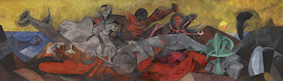 Title: America
Artist: Rufino Tamayo
Date: 1955
Intended Location: The Bank of the Southwest – Houston, TX 1955-1990
Current Location: Dallas Museum of Art – 1993 - current
Size: 13’2” x 45’10 3/8”
Medium: Vinylite
(Rufino Tamayo America Mural, 2011)
The very large “America” mural, painted by Rufino Tamayo in 1955, is known for being one of his most magnificent and impressive murals. Working alone in Mexico City for 5 months 7 days a week Tamayo was able to truly focus his efforts into his 13 by 45 foot colorful creation. When he had completed it he rolled it up and sent it to Houston, Texas to be displayed at the Bank of the Southwest.
What initially drew me to this mural was the use of the cubism style. According to my research, Tamayo has established a reputation in working in combination of cubism and futuristic styles, which are both apparent in this piece. This allegorical piece reveals the history and richness of America.
The main white figure in the center of the piece resembles a nude female in a reclining position. Surrounding the figure Tamayo has placed iconic natural resources to signal the abundance of the land. The viewer is reminded by “the fish, symbol of wealth of the sea; by a plant, symbol of the richness of the land; by an oil geyser and spring of water, symbols of our underground resources” (Rufino Tamayo America Mural, 2011). Tamayo also shows the unity and cultural influences in the different races with the white and red figures embracing in the top of the painting.
He chooses a vibrant pallet of reds, blues, yellows and greens, as well as, shades of gray. It is these decisions and understanding of color that have given Rufino Tamayo a reputation for color. “Today Tamayo is indeed regarded as one of the great colorists of the twentieth century” (Sotheby’s, 2011).
Tamayo reveals his discipline in study and understanding of his trade as he reveals the influences from Picasso’s Guernica, as well as, the emotion of the Mexican School. The piece “successfully asserts the timeless values of civilization” with his “Abstract Expressionist’s embrace of the primitive and the mythic” (Sotheby’s, 2011).

Title: Guernia
Artist: Pablo Picasso
Date: 1937
Size: 11’ x 25.6’
Medium: Oil Paint
(Guernica, 2011).
Works Cited:
"Guernica (painting): Facts, Discussion Forum, and Encyclopedia Article." AbsoluteAstronomy.com. Web. 27 Apr. 2011.
"Rufino Tamayo America Mural." MID-CENTURIA : Art, Design and Decor from the Mid-Century and beyond. Web. 27 Apr. 2011.
"Sotheby’s New York to Offer Important Mural by Rufino Tamayo, Entitled America." TheArtWolf.com - Art and the Art World. Web. 27 Apr. 2011.
4/25/11
Architecture - Arts and Crafts
The Arts and Crafts movement evolved in opposition to the industrial revolution and specifically against the Victorian period. The Arts and Crafts style “ refers to the early 19th –century British and American movement to revive handicrafts” (Gray, 2011). Those dedicated to the style wanted to see society move back to being more of a handmade society once again. The desire for a worker to have pride in his skill and craftsmanship fuelled the movement, as well as, the brutal “working conditions found in the factories” The industrial revolution opened the gates of mass production, but had not established a high level of quality control. “Manufactured goods were often poor in design and quality” (The Arts and Crafts Movement, 2011).
The Arts and Crafts style of architecture include both bungalow and craftsman homes. They were known for being easy to build and maintain, as well as, being affordable. They were typically built with natural materials like wood, stone and brick. The furniture and light fixtures were custom and built in, which created great unity with the interior elements and structure. It also provides efficient uses of space. Arts and crafts used an open floor plan and typically featured a dominant fireplace in the main living space. The “fireplace was the symbol of family in the Arts and Crafts movement” and open floor plan revealed a rejection of the many small rooms commonly used in Victorian architecture (Gray, 2011). The interior also many times had exposed beams.
The exterior of a typical arts and crafts style home would be identified with a porch with either square or round columns or a low-pitched roof. In most cases they also featured wide eaves. The underlying goal was to attempt to make the “structures become part of their settings by seamlessly integrating them with nature” (AIO, 2011).
See example below.

(D. L. James House, 2011)
Architect: Greene and Greene
Location: Carmel Highlands, California
Date: 1918
Building Type: house
Materials: native stone
Style: Arts and Crafts
Works Cited:
AIO .American Art History | ART3010 UA. Week 4 Arts and Crafts Movement, Web.
25 April 2011.
"D. L. James House - Greene and Greene - Great Buildings Online." Architecture Design Architectural Images History Models and More - ArchitectureWeek Great Buildings. Web. 25 Apr. 2011..
Gray, Liz. "Arts and Crafts Architecture : HGTV FrontDoor Real Estate." HGTV FrontDoor Real Estate - Homes For Sale, Real Estate Listings Search. Web. 25 Apr. 2011..
"The Arts and Crafts Movement." Art, Design, and Visual Thinking. Web. 25 Apr. 2011..
The Arts and Crafts style of architecture include both bungalow and craftsman homes. They were known for being easy to build and maintain, as well as, being affordable. They were typically built with natural materials like wood, stone and brick. The furniture and light fixtures were custom and built in, which created great unity with the interior elements and structure. It also provides efficient uses of space. Arts and crafts used an open floor plan and typically featured a dominant fireplace in the main living space. The “fireplace was the symbol of family in the Arts and Crafts movement” and open floor plan revealed a rejection of the many small rooms commonly used in Victorian architecture (Gray, 2011). The interior also many times had exposed beams.
The exterior of a typical arts and crafts style home would be identified with a porch with either square or round columns or a low-pitched roof. In most cases they also featured wide eaves. The underlying goal was to attempt to make the “structures become part of their settings by seamlessly integrating them with nature” (AIO, 2011).
See example below.
(D. L. James House, 2011)
Architect: Greene and Greene
Location: Carmel Highlands, California
Date: 1918
Building Type: house
Materials: native stone
Style: Arts and Crafts
Works Cited:
AIO .American Art History | ART3010 UA. Week 4 Arts and Crafts Movement, Web.
25 April 2011.
"D. L. James House - Greene and Greene - Great Buildings Online." Architecture Design Architectural Images History Models and More - ArchitectureWeek Great Buildings. Web. 25 Apr. 2011.
Gray, Liz. "Arts and Crafts Architecture : HGTV FrontDoor Real Estate." HGTV FrontDoor Real Estate - Homes For Sale, Real Estate Listings Search. Web. 25 Apr. 2011.
"The Arts and Crafts Movement." Art, Design, and Visual Thinking. Web. 25 Apr. 2011.
Photography VS Painting - Edward Steichen, Grant Wood
  (Masters of Photography, 2011) (Grant Wood, 2011) Today at first glance, we might question the efforts of Edward Steichen in his piece, The Flatiron, 1905. With the advances of Photography in the 21st century it is hard for us to imagine how difficult the equipment was to work with in this medium. Steichen shows his viewers that he not only knew how to use the equipment, but manipulate it and creates a powerful effect as he studied architecture and nature at twilight. Seeing the reflection of the landscape on the ground and the dreary sky leads me to think Steichen was attempting to create a great effect of a mist in is image. Using contrasting tones he creates dark silhouettes of branches, but then is able to create distance with a lighter shade on the architecture. His foreground is not exactly very visible as we are just able to see basic shape. His middle ground and background might bring about some controversy, as those like my self would call the background the brightest sections where nothing is visible and the middle ground is slightly out of focus, revealing the large structures. When contrasting piece Steichen’s photograph to is the Grant Wood painting, Fall Harvest great contrasts are revealed. In the painting the setting is completely different. Wood chooses to work on the rural landscape of a farm. In his piece the viewer gets a slight sense of depth as he has used perspective and created rolling hills that overlap the visual plane. The most interesting difference is that the painting has much more clarity and information for the viewer in the represented distant areas than the photograph. The painting gives the viewer an illusion that they can actually see for miles. The photograph is completely different, as in the darker setting it would be impossible to see such a distance. Steichen does give the viewer a short sense of distance, but it appears to be very short. The color pallet Wood selected is also slightly different. While, both pieces have a warm tonal feel, Wood has added green hues giving his piece greater vibrancy. In my opinion Wood had done brought his viewers attention to the middle ground as Steichen has. The background is less in focus and lighter and does not have the contrasting value creating greater detail. The foreground is in focus, but is darker almost creating a base or foundation for the viewer to start with and be lead into the middle ground with the dark angled lines. There are also similarities in these pieces. We see how both artists chose to work with a darker foreground and lighter background, which helps draw the viewer into the piece, in this case creates a sense of depth. Both also contrast nature with man-made structures. Both artists used nature to separate the viewer from the architecture as they have both placed the viewer in nature looking to structures. Knowing that both pieces are establishing the viewer in nature looking toward the architecture, I believe both paintings are for those not living in the cities. In both cases elements of nature have created a barrier and separated the viewer from the established structures. I find that as a way that each artist has addressed those that are not city dwellers as outsiders. Or beasts that lurk in the shadows. Works Cited: "Grant Wood. Authentication, Certificates of Authenticity and Expert Appraisals." Art Experts, Inc.: Authentication, Certificates of Authenticity and Expert Appraisals. Web. 25 Apr. 2011. Masters of Photography. Web. 25 Apr. 2011. Resources: "Edward Steichen: The Flatiron (33.43.39) | Heilbrunn Timeline of Art History | The Metropolitan Museum of Art." The Metropolitan Museum of Art, New York: Metmuseum.org. Web. 25 Apr. 2011. | |||
4/21/11
Chuck Close VS Gusstavus Hesslius
Chuck Close is known for painting in a photorealism style. This style pushes detail to the extreme, as it closely resembles a photograph. The artist is able to capture and recreate an image by paying close attention to intricate detail and produce a piece in realistic quality. He created his “Big Self Portrait” with acrylic paint and airbrush on canvas using a grid technique with enlarged photographs to dissect the image and recreate in a larger scale with incredible accuracy and attention to
detail.
detail.
Many differences are very apparent between the self-portrait of Chuck Close and works of Gusstavus Hesselius. Maybe the most obvious of differences is the “Big Self Portrait” of Close is painted in black and white while Hesselius’s pieces are both in color. Also the other major difference is the style of Chuck Close’s photorealism shows greater detail of the figure and gives the viewer much more information. Closes understanding of the human figure is spot on and attention to shadows and light move is image to greater realism.
Hesselius seems to want to show is portraits in their glory. The chief with his blue garment and accessories hanging from his neck bordered by an oval show casing the image and the self portrait showing himself in an honored position of authority give both of these characters more of a feeling of awe and power. Chuck Close uses more of a raw gritty approach and does not glorify his portrait but rather appears to degrade it. We see that he even has a smoldering cigarette in his mouth. His hair is everywhere and we are not even sure he is clothed. Unshaven and unkempt it almost appears that Close wants his viewers to think he had just rolled out of bed. His haphazard appearance in the photo adds to the photorealistic quality created in his technique.
In trying to find similarities between the pieces a viewer can identify that all the figures are male, none of the figures are smiling, and the chief and Close’s self portrait are both created with the same view of the face. These two images are also more closely related as they do not have the figure with any furniture around them.
Looking at similarities and differences it can quickly be realized that Hesselius’s paintings really do not have much connection to the Chuck Close “Big Self Portrait”. While they are all paintings, Close’s photorealistic style really takes his piece in a different direction when comparing it to the works of Hesselius. From the perspective, realistic human form, color, and even over all appearance displayed in the portrait Chuck Close shows stark contrast to Hesselius in his self-portrait.

Chuck Close
Big Self Portrait
1967-1986
Acrylic on canvas.
107 1/2 x 83 1/2" (273 x 212 cm).
Walker Art Center, Minneapolis
(ArtsNet Minnesota, 2011)


(Common-place, 2011)
Works Cited:
"ArtsNet Minnesota: Identity: Chuck Close." ArtsConnectEd. Web. 06 Apr. 2011. .
Common-place. Web. 07 Apr. 2011. .
"MoMA.org | Interactives | Exhibitions | 1998 | Chuck Close." MoMA | The Museum of Modern Art. Web. 06 Apr. 2011..
Gustavus Hesselius
QUESTION: A portrait is an image of an identifiable individual and often attempts to convey as much of that individual’s identity as possible to the viewer. A portrait is an artist’s interpretation of what the artist feels are important traits to convey about the subject. In theory, self-portraits are a bit different in that they portray the artists’ own view of themselves.
Visit the following links to view portraits by the Swedish artist Gustavus Hesselius, who was active in New England during the first half of the eighteenth century:
* Gustavus Hesselius, Tishcohan, 1735
* Gustavus Hesselius, self-portrait, c. 1740
The first is an image of the Delaware Chief Tishcohan. The second is a self-portrait by Hesselius.
Because we don’t know much about either men, these images serve as important documentation of who they were. How would you describe these two men? How would you interpret the specific details, such as background, garments, lighting, and facial characteristics, found in each image? Are there substantial differences that distinguish the self-portrait from the portrait? Discuss the differences with reference to the two images. In your opinion, to what extent do cultural differences dictate the way in which artists represent themselves and other members of their community versus how they represent those who are considered outsiders?
Visit the following links to view portraits by the Swedish artist Gustavus Hesselius, who was active in New England during the first half of the eighteenth century:
* Gustavus Hesselius, Tishcohan, 1735
* Gustavus Hesselius, self-portrait, c. 1740
The first is an image of the Delaware Chief Tishcohan. The second is a self-portrait by Hesselius.
Because we don’t know much about either men, these images serve as important documentation of who they were. How would you describe these two men? How would you interpret the specific details, such as background, garments, lighting, and facial characteristics, found in each image? Are there substantial differences that distinguish the self-portrait from the portrait? Discuss the differences with reference to the two images. In your opinion, to what extent do cultural differences dictate the way in which artists represent themselves and other members of their community versus how they represent those who are considered outsiders?
| (Overcoming Nausea, 2011) With no background and research about these images one must go off of visual cues left by the creator. In this case the Swedish artist Gustavus Hesselius left a handful of visual marks to help the viewer draw conclusions about each image. These images show great contrast in the individuals. The first of Delaware Chief Tishcohan indicates he is an Indian by his skin tone, hair, clothing and accessories. The face also shows weathering and deep wrinkles’ indicating this individual spends a great amount of time outdoors in the sun. Also looking closer at the blue garment is not a typical stitched garment, but more of a wrap, which would be more common of that culture of people. This image also does not have anything in the background. It could be a visual cue to lead the viewer to connect the idea that this man does not have many possessions, and is more of a nomad. His social status is lower class and most defiantly poor. The shape of the body indicates that the figure is strong, but defiantly not wealthy as the figure is thin. The chief is also show to have a light source from straight on which makes him appear more flat, and simple, which is another great visual cue to indicate a commoner. The self-portrait of Gustavus Hesselius shows a great a contrast in social status, culture and class when compared to the image of the chief. His pale skin and a white wig were a traditional style of sophisticated gentlemen of this time period. His clothing, a white blouse with a dark over coat show that he has money and is at a higher status than a common laborer. He is also seated in a large chair at a desk, which could lead the viewer to believe he is educated and established in his career and not a common laborer. The lighting is displayed from the right. This gives more dimensions to the figure as the right side of the face is in highlight with the hand below and the left side is in shadow. With greater dimension a viewer may be lead to consider a more complex elite role this individual plays. The one common thread that both of these images has is that each one show a man that is not smiling. Both have a very serious facial expression, as the mouth in each piece is pulled tight across creating more of a frown. The chief, however, has a softer less arrogant look, as his eyebrows are both in a relaxed position. The self-portrait shows the right eyebrow raised. This could lead the viewer to assume the image portrays a sense of power, arrogance or superiority. With these many visual cues the viewer can quickly gather information and make assumptions about each image, their status, and culture. Works Cited: AIO .American Art History | ART3010 UA. Week One Assignment 2 – DQ2, Web. 05 April 2011. "Overcoming Nausea." Common-place. Web. 05 Apr. 2011. | |||
Maps VS Landscapes
Question:
Research two types of images that focus on the depiction of land:
* Landscape images that give you an idea of a particular place and its terrain
* Maps meant to help navigate through the land
Discuss what features, such as depictions of flora, fauna, geographic details, help to distinguish images depicting land as landscape or map. In other words, what makes a landscape different from a map? Provide examples from your research to support your answer. Are there images that do not easily fit into either of the categories described? Why? Cite at least one example of such an image.
Research two types of images that focus on the depiction of land:
* Landscape images that give you an idea of a particular place and its terrain
* Maps meant to help navigate through the land
Discuss what features, such as depictions of flora, fauna, geographic details, help to distinguish images depicting land as landscape or map. In other words, what makes a landscape different from a map? Provide examples from your research to support your answer. Are there images that do not easily fit into either of the categories described? Why? Cite at least one example of such an image.
 (A Little History on the Prairies, 2011) In researching images of maps and landscape I found that the landscape images give the viewer a greater sense of detail. They spark instant emotions as well. In the watercolor and ink piece by Ron Woodall the viewer quickly see a stark baron area. We notice the flat land and the color pallet that leads us to believe the areas is a very dry desolate place. We see no living thing in the image just dead grass and dark skies. The structure in the painting even gives us visual cues to believe it is abandon. The windows and doors are open and parts of the structure are falling down. There is no smoke in the chimney and the path to the structure looks abandon. The viewer feels the emotion of solitude, failure, death or abandonment.  (Waiting, 2011) The next landscape painting I studied was a more modern landscape. It is less detailed than the previous but still gives us many visual clues to what the artist is trying to communicate. In the painting “Waiting” by William Wray we see an urban setting. In our culture it is easy to identify the structure of the golden arches. We instantly know it is a McDonalds restaurant. We see figures waiting on the corner and images that resemble cars, billboards, streetlights and signs. We see the harsh contrast of green grass and vibrant landscaping against the gray of the concrete sidewalk and street. The other visual que I believe the artist is attempting to show us is that this landscape is in a morning or evening setting. The light source is coming from the right and showing the viewer either beginning or ending of the day. The viewer might have a emotional strike of hunger in seeing the arches, fatigue, accomplishment, or ambition with the positioning of the sun.  (Aviation Weather Services – Observed Text Products, 2011) The map diagram I found and studied of the Weather Depiction Chart Example is very different from the landscape images. The map is more analytical details and facts to the viewer. This map is not colored and is very information specific. To truly find this map useful one would need to have the understanding of interpreting the symbols and markings for effective communication.  (April 2009, 2011) In the study of Jasper Johns “The Map” we see a completely different type of map. The map is very abstract and does not give the viewer much information but may get more of an emotional reaction as it uses many vibrant colors and abstract shapes. The visual cues are very subtle and if the viewer were not familiar with United States this map would not be very helpful at all. While this map is more expressive and iconic, it may give general ideas about the shape and locations of some of the states, but would not help most looking for more detailed accounts. From my research I find the main difference between maps and landscapes are that maps are more analytical providing data. Even in the abstract map the facts are there as far as the shape and locations of states. In looking at the landscape image I find the viewer is more inclined to abandon fact and move to more emotional responses. The viewer could draw visual conclusions based on visual cues, which could be correct, but are more or less hypothesis.  (Autumn Falls Painting by Jaison Cianelli, 2011) Finally I also found a landscape that was totally uninformative. My first look at “Autumn Falls” by Jaison Cianelli left me with so many questions of what I was seeing. Is it an explosion? A bright light? It was not until I saw the title “Autumn Falls” That I was able to understand this landscape as a waterfall. Even with that name the viewer has great difficulty gathering information from the image. In conclusion, I find that the more information an image has the quicker the viewer is able to assimilate what the creator is communicating. Greater details also aid in communicating more information but more details do not mean the image is more interesting. I find the weather map very boring and uninteresting even though it has the most factual analytical data for the viewer. Taking this thought a step further I would venture to say that in creating visual cues and mystery without telling the whole story, the image keeps the viewer interested and looking for more to gain greater understanding. Works Cited: "Aviation Weather Services – Observed Text Products." Touring Machine Company. 22 June 2008. Web. 5 Apr. 2011. "April 2009." Music & More. Web. 05 Apr. 2011. "Autumn Falls Painting by Jaison Cianelli - Autumn Falls Fine Art Prints and Posters for Sale." Jaison Cianelli - Fine Art. Web. 05 Apr. 2011. "January 13 – March 4, 2011 - University of Lethbridge Art Gallery." University of Lethbridge. Web. 05 Apr. 2011. "A Little History on the Prairies." ALICE SALTIEL-MARSHALL. Web. 05 Apr. 2011. ""Waiting"" MoCo Loco - Modern Contemporary Design & Architecture. Web. 05 Apr. 2011. | |||
Neoclassical Architecture
| QUESTION: Architecture was one area where the European influences in America appeared during the Neocclassical era. These architectural examples remind us of an important period in our history as a country as well as document interesting developments in architectural style in both public and domestic buildings. Discuss European Neoclassical influences on public and domestic architecture from the Neoclassical era in America. Focus on how it was adapted and evolved in America as well as its importance in forming a nation identity. Neoclassical architecture is best described as structures that are designed based on the classic architecture of ancient Rome and Greece. Neoclassical architecture, also called new classical, can be identified by a handful of distinguishing features. It is best known for its symmetrical shape and tall columns that run from the bottom to the top of the structure. They also are known for having a “low-pitched triangular gable on the front of some buildings” (Craven, 2011). This was very popular “in the Grecian or Greek Revival style of architecture”, and is called a pediment (Craven, 2011). Another notable feature found in neoclassical architecture is a domed roof. It was the neoclassical influence that gave birth to the Greek Revival and Federalist style architecture, which were popular in the United States in the early 1800 and 1900’s. The home below, located in Saratoga, New York, is a great example of Greek Revival architecture. Its distinguishing features include a “pediment gable, symmetrical shape, heavy cornice, wide plain frieze, bold simple moldings, entry porch with columns, decorative pilasters” and “narrow windows around the front door” (Greek Revival House Style, 2011). While the Greek Revival style of architecture made its debut in the public building in Philadelphia, the influence and made its way south and many of the large plantation houses were designed with its distinguishing features. Even in the 20th century the style continued to show its influence in with many American homes that utilize the designed with the front-gable.  (Greek Revival House Style, 2011). The Federalist Style became popular “in the United States from about 1780 until the 1830s” (Federal and Adam House Styles, 2011). The many distinguishing features in this style became quite popular in the early American Colonies. Features like, “Low-pitched roof, or flat roof with a balustrade, windows arranged symmetrically around a center doorway, semicircular fanlight over the front door, narrow side windows flanking the front door, decorative crown or roof over front door, tooth-like dentil moldings in the cornice, palladian window, circular or elliptical windows, shutters, decorative swags and garlands” and “oval rooms and arches” are how many identify this style (Federal and Adam House Styles, 2011). Even with his great popularity with early American structures the influence can still be seen in many modern American buildings.  (Federal and Adam House Styles, 2011). Works Cited: Craven, Jackie. "Pediment - Definition of a Pediment - Architecture Glossary." Architecture and House Styles - Architecture and House Styles and Home Design. Web. 12 Apr. 2011. "Federal and Adam House Styles - House Style Pictures - Federal Houses and Adam Houses." Architecture and House Styles - Architecture and House Styles and Home Design. Web. 12 Apr. 2011. "Greek Revival House Style - House Style Pictures - Greek Revival Houses." Architecture and House Styles - Architecture and House Styles and Home Design. Web. 12 Apr. 2011. | |||
Twilight in Wilderness - Frederic Edwin Churches
QUESTION: Although at first sight landscapes often appear as innocent and neutral, close inspection provides clues to the ideological perspective espoused by the artist. Browse through your textbook and identify a landscape painting that you feel is explicit about its role in offering a nationalist vision. What would you say the message of the painting is? What does the artist want to convey about America? What role, if any, do people play within the landscape?
 In Frederic Edwin Churches, “Twilight in the Wilderness” an optimist may suggest that he is expresses a feeling of anticipating with his vast open space. The 40 by 64 inch oil painted canvas, displayed in “The Cleveland Museum of Art” located in Cleveland, Ohio, creates great dimension giving the viewer a sense that the painting never ends. This visual cue touches on the idea of open opportunity offered in the United States and the potential opportunities and limitless possibilities in the west. At the same time, others may argue that the contrasting dark surroundings the thin strip of the setting sun reveal a sense of great uncertainty, anxiety or even fear of difficulties ahead. With the knowledge of the context that the painting was done in 1860, most are confident that the painting was not an optimistic outlook. With the Civil War a year after the creation of the painting, most viewers of that time a less than optimistic response to Churches efforts. Beyond the initial reaction to the great space created with vibrant color and an advanced knowledge of field of depth; or the dark contrasts pushing toward oppression; another obvious observation in this vast landscape is the lack of people. “Church has banished all evidence of human habitation” (Pohl, 2002). The viewers are giving the scene of an undisturbed wilderness, leading to the idea of uncertainty. Additional the settlers on the east coast at this time were less concerned with the preservation of the west and more concerned with expansion and the issues of slavery. In Painting an undisturbed westward facing landscape, Church brings up a social issue that was in the forefront of the minds of most of the society of the time. Today most don’t see the painting today as the early Americans did. With the political issues left to the history books and the discussion produced by the piece today is the speculation that Church has included an eagle in on the left side as “a symbol of American power” (Church: Twilight in the Wilderness, 2011). Others claim the painting holds religious connections to Christianity. They look at the areas “where the branches cross,” and consider it a connection to a crucifix” (Church: Twilight in the Wilderness, 2011). Maybe these subtle details were indeed what Church was trying to focus on. It is possible that the painting was an attempt at optimism, pride and religious deliverance. Regardless of Churches intentions, the political issues were in the crosshairs of the public minds. Either the issues of that time gave the viewer’s distortion or clarity of Churches intentions. Works Cited: "Church: Twilight in the Wilderness." Mark Harden's Artchive. Web. 12 Apr. 2011. Pohl, Frances K. Framing America: a Social History of American Art. New York, NY: Thames & Hudson, 2002. 150-51. Print. | |||
Twin Towers By Christiaan Bekker

(TwinTowers Painting by Christiaan Bekker – TwinTowers, 2011)
In the painting title “Twin Towers by Christiaan Bekker” the artist fills the canvas with exquisite detail of the attack on the United States on September 11th 2001 (TwinTowers Painting by Christiaan Bekker – TwinTowers, 2011). This day marked the birth of America’s “War on Terror”. Bekker displays the horror of the tragedy, the pure evil of the enemy, the destruction and devastation left behind and the hope created by a free nation looking forward of.
In my initial look at Bekkers oil painting my eye was quickly drawn to the statue of liberty crying. Her mouth wide open, eyes clinched shut as she tears her garment and exposes her heart, which is a burning American flag. This imagery alone conveys the oppressing sadness of this event.
Above lady liberty we see the twin towers backed by darkness or in my opinion smoke, We see the artist has slipped in a few more details here as we see the clouds next to the top of the tower appear to have evil eyes looking at the towers and lower we see two giant hands with claws gripping the tower. The artist wants us to see the evil intent of those how took the lives of many innocent Americans that day.
In the lower right hand corner we see the devastation of the event. Tangled metal, smoke and rubble. The artist pays tribute to those who fought to save lives with is including of the somber looking firefighters. He also pays respects to those who lost their lives in the event as the firefighters are lowering the flag to half mass.
While 911 was a day of horrible destruction and sadness, many clung to hope. I believe this is displayed in the top right corner where we see the sun and the firefighter pointing on to the US flag, which appears to be held by many. I think this shows our hope in our country and its freedom.
Other more subtle items Bekker added to this piece are the tail of the American Airlines airplane. This reminds us of those hostages and the terror that was experienced before they collided with the towers. We also see a small section of the pentagon below the towers, to remind “At 9:43 a.m., a third passenger plane crashed into the Pentagon” ( September 11th, 2011). Finally, we see the bald eagle in the center. I believe this is symbolic to show that even when we are attacked we are a strong nation that comes together.
Works Cited:
"September 11th." Digital History. Web. 14 Apr. 2011.
"TwinTowers Painting by Christiaan Bekker - TwinTowers Fine Art Prints and Posters for Sale." Fine Art - Art Prints - Fine
Art Prints - Greeting Cards - Posters - Originals - Buy Art Online - Sell Art Online. Web. 14 Apr. 2011.
Mulberry Bend VS Monadock Building
QUESTION:
Photographing American Architecture
The rise of industrialism and the accumulation of wealth and labor in major U.S. cities may have led to the development of the skyscraper, a simple and functional type of architecture that was distinctively American. At the same time that the monumental buildings discussed in chapter five of your text , were being constructed to accommodate the commercial needs of large cities, there were also squalid tenement buildings that were the focus of the documentary photography of Jacob Riis. The image available at the following link depicts a neighborhood in the lower east side of New York that housed many of the European immigrants that flocked to the U.S. at the end of the nineteenth century:
Jacob Riis, Mulberry Bend, 1896
Compare the image of tenement buildings with those of the skyscrapers found in your book. What are the different messages being conveyed by these images? How do the photographers compose the images to address the different functions (public v. private) of these structures?
Photographing American Architecture
The rise of industrialism and the accumulation of wealth and labor in major U.S. cities may have led to the development of the skyscraper, a simple and functional type of architecture that was distinctively American. At the same time that the monumental buildings discussed in chapter five of your text , were being constructed to accommodate the commercial needs of large cities, there were also squalid tenement buildings that were the focus of the documentary photography of Jacob Riis. The image available at the following link depicts a neighborhood in the lower east side of New York that housed many of the European immigrants that flocked to the U.S. at the end of the nineteenth century:
Jacob Riis, Mulberry Bend, 1896
Compare the image of tenement buildings with those of the skyscrapers found in your book. What are the different messages being conveyed by these images? How do the photographers compose the images to address the different functions (public v. private) of these structures?
  (Candida Martinelli's Italophile Site, 2011) (Google Images, 2011) (Candida Martinelli's Italophile Site, 2011) (Google Images, 2011)An a initial response in viewing the photo of Mulberry bend and the photograph of the Monadnock Building located in Chicago, IL, could be misconstrued as a different time period. We see crowded streets full of people walking and horse drawn carriages and carts in Jacob Riis’s photo. The streetcars and automobiles in the photograph of the Chicago skyscraper designed by Burnham and Root could be misleading in the comparison of these two photographs. The major difference I see first hand is that in the Mulberry Bend photo the streets are very crowded and busy with excitement. In viewing the photo of Jacob Riis, we see the area is not glorified in anyway. Riis actually had an office located in Mulberry bend where he worked writing articles. He would daily journey through this cramped dirty area and see the quality of life for the inhabitance of this neighborhood were quite inadequate. In his writings, Jacob Riis was noted for how he “emphasized the humanity of the tenement population” (Documenting "The Other Half", 2011). We can see he also uses a similar technique in his photography. These structures located in the poorer areas on the lower East side of New York City are between three and five stories high and have rickety fire escapes and the littered street also is a visual indicator this area is not well taken care of. In the photo of the Monadnock Building we see a different story. There is hardly any activity in the street below. Given that this structure is a first class office complex, we could guess the photo is taken on a weekend when workers are not around. A streetcar and a few automobiles give us the idea that transportation is needed to bring individuals to this structure from the suburbs. The design is simple with it clean lines and sublet curve showing more modern or contemporary feel on the exterior. We don’t see shutters around the windows as we did in the Mulberry Bend neighborhood. The feel created by the intimidating structure is power. This structure gives a greater sense of security and success. The slightly flared base of the structure helps us verify the building materials. “The brick walls still serve as supportive elements for the sixteen stories and are 17 feet thick at the base” (Pohl , 2001). The size, clean lines, and height grant a confident appearance to the Monadnock Building Works Cited: "Candida Martinelli's Italophile Site(Immigrants NY 1890)." Candida Martinelli's Italophile Site (Italian Culture,links,free Ebooks). Web. 19 Apr. 2011. "Documenting "The Other Half": The Social Reform Photography of Jacob Riis and Lewis Hine." American Studies @ The University of Virginia. Web. 19 Apr. 2011. "Google Images." Google. Web. 19 Apr. 2011. Pohl, Frances K. Framing America: a Social History of American Art. New York, NY: Thames & Hudson, 2002. 290. Print. | |||
Mary Cassatt VS Kenyon Cox
QUESTION:
The painter Mary Cassatt is often discussed as an American artist who, at the end of the nineteenth century, became intimately involved with the European Impressionists and strongly recommended them to American collectors. Her work often focuses on the depiction of informal domestic life. Compare the domestic scene featured in her Mother and Child of 1905 with the idyllic scene depicted in Kenyon Cox’s Eclogue, from 1890. What are the differences in the themes of these paintings? How does the choice of styles — Impressionism by Cassatt and Realism by Cox — fit with the content of each painting? How do you think the gender of the painters informs their choice of themes and treatments?
Mary Cassatt chooses a more serious subject matter in her painting “Mother and Child”. Cassatt was known for showing this type of instructional task oriented nurturing of women as it was considered their role. This is also reinforced as both subjects in the portrait are not smiling, but rather have more of a somber gaze. She also is committed to displaying the social expectation of women in society, but painting scenes of standard female behavior. Her commitment to her impressionistic style creates an interesting contrast to her conservative social view. The color pallet creates a rather flat background and allows the artist to bring the subject forward with the lighter tones. The use of the mirrors and created reflections also aid in creating greater dimension in the piece. Kenyon Cox is a great contrast to Mary Cassatt. One of the biggest issues is subject matter. Cox and the exposure to “the Aesthetic Movement of the 1870’s and 1880’s in Europe” had drawn his attention to study and paint female nudes. Americans at this time did not paint nude subjects (Pohl, 2002). He also was encouraged not just to paint what he saw, but create am emotional reaction to his still life. It is interesting that Cox paints in a realistic style when he is working more toward an emotional response.
In Coxes, “Eclogue” a cluster of nude female figures has been gathered on the right portion of the canvas, which was considered an inappropriate sexual overtone at this time. Cox has attempted to create more youthful and innocent look to the figures to remove the erotic feel created by the revealed flesh of the figures. A male figure is seen entering the scene from the left walking toward the women “confirming the purpose of this display of female flesh” (Pohl, 2002).
Cassatt and Cox are similar in the fact that they both choose to paint women as their subject matter. However, Cassatt places “ her women are often engaged in a particular domestic activity, caring for children” while Cox paints a scene of erotic emotional responses. (Pohl, 2002). They both choose to paint in styles that in my opinion seen to contrast their intention of their piece. In this case both paintings do reveal nudity, but Cassatt defiantly has her subject in context of innocence.

(Art 6 Lecture 18, 2001)
Title: Mother and Child
Date: 1905
Artist:Mary Cassatt
Medium: oil on canvas
Size: 36 1/4 x 29 in.

(Kenyon Cox, 2011)
Title: An Eclogue
Date: 1890
Artist: Kenyon Cox
Medium: oil on canvas
Size: 48 1/4 x 60 1/2 in.
Work Cited
"Art 6 Lecture 18." Welcome to the Slide Projector an Instructional Website for Denise Johnson's Art History Students. Web. 19 Apr. 2011..
"Kenyon Cox, Eclogue, 1890." Beautiful Century. Web. 19 Apr. 2011..
Pohl, Frances K. Framing America: a Social History of American Art. New York, NY: Thames & Hudson, 2002. 270-271, 299. Print.
In Coxes, “Eclogue” a cluster of nude female figures has been gathered on the right portion of the canvas, which was considered an inappropriate sexual overtone at this time. Cox has attempted to create more youthful and innocent look to the figures to remove the erotic feel created by the revealed flesh of the figures. A male figure is seen entering the scene from the left walking toward the women “confirming the purpose of this display of female flesh” (Pohl, 2002).
Cassatt and Cox are similar in the fact that they both choose to paint women as their subject matter. However, Cassatt places “ her women are often engaged in a particular domestic activity, caring for children” while Cox paints a scene of erotic emotional responses. (Pohl, 2002). They both choose to paint in styles that in my opinion seen to contrast their intention of their piece. In this case both paintings do reveal nudity, but Cassatt defiantly has her subject in context of innocence.
(Art 6 Lecture 18, 2001)
Title: Mother and Child
Date: 1905
Artist:Mary Cassatt
Medium: oil on canvas
Size: 36 1/4 x 29 in.
(Kenyon Cox, 2011)
Title: An Eclogue
Date: 1890
Artist: Kenyon Cox
Medium: oil on canvas
Size: 48 1/4 x 60 1/2 in.
Work Cited
"Art 6 Lecture 18." Welcome to the Slide Projector an Instructional Website for Denise Johnson's Art History Students. Web. 19 Apr. 2011.
"Kenyon Cox, Eclogue, 1890." Beautiful Century. Web. 19 Apr. 2011.
Pohl, Frances K. Framing America: a Social History of American Art. New York, NY: Thames & Hudson, 2002. 270-271, 299. Print.
Subscribe to:
Posts (Atom)