 Image Source: http://www.unstage.com/2009/10/great-use-of-color-in-digital-art/ In this illustration titled “kitchen” by Zain you see an example of an artist using a triadic color scheme. This means that the color pallet consists of three main colors that are equally spaced around the color wheel. It is a solid scheme to use as it provides strong contrast but maintains balance or harmony of color. The artist establishes a cool feel with the use of blues in the top of the illustration. This was a great technique as the cool tones allow the viewer to be drawn in to the illustration, which creates a greater illusion of depth. In addition to the perspective and shading the use of blue makes this kitchen space appear very deep especially with the contrast of the pink warm tone, which is the one of the other colors used in the triad. The pink tone adds a splash of warmth, but is secondary to the coolness of the more dominant blue. While the piece is quite sad and mellow looking do to the dominate cool color, the use of the warm pink tones on the bottom, are a great way to lead the front of the piece toward the viewer. This contrast of warm and cool is a great technique for this piece as it creates an illusion of an extended visual field a great use of color in this exaggerated perspective drawing. Finally the artist uses a touch of yellow, which completes this triadic pallet. This aids in the established light source and gives the viewer a feeling of sunlight. This also pushes the blue primary color to appear darker and possibly sadder and helps the viewer realize the intended tone of the piece where the girl is stuck inside working, on a beautiful sunny day. Resources: AIO Lecture http://www.color-wheel-pro.com/color-schemes.html http://colorschemedesigner.com/ | |||
Showing posts with label Design Principles. Show all posts
Showing posts with label Design Principles. Show all posts
10/20/10
Effective Use Of Color - Triadic Color - Illustration
5/11/10
Graphic Design Websites
Web resources to stay on top of trends and continue learning:
http://www.gdusa.com
This is the home site of the monthly magazine “Graphic Design.” Published by Kaye Publishing for over forty years, this magazine and the corresponding Web site provide tons of information on the latest news, trends, and people in the design world.
http://www.commarts.com
Communication Arts Magazine has long been considered the premiere publication of the world of advertising and graphic design. Articles on the industry as well as several showcases of the best work from all over the world make this magazine a must on any designer’s shelf. The corresponding Web site has valuable online information and links to award-winning Web sites and interactive media sites.
http://www.pantone.com
Pantone is the leading manufacturer of color systems throughout the world. Their Web site provides valuable information on color and color trends as well as tips on designing with color. Use the “search” function to search for “trends” to find articles and links to information on color.
http://www.adobe.com
Adobe is the leading developer and distributor of software for the visual communication industry. Their Web site is a storehouse of valuable information on how to use their software as well as information on trends. Use the “search” function to search for trends. Most of the links will connect you to Adobe’s press room where you will find articles on fonts, color, graphics and much more. Adobe allows you to sign up for regular email updates on the latest news.
http://www.trendwatching.com
This site, mentioned earlier, provides the latest information on everything from new marketing techniques to consumer needs and desires. Search for documents within the site using the Google search engine.
http://www.creativepro.com
Creativepro.com has the latest news on trends, fonts, graphics, print, stock photos, systems and hardware. Web and business graphics are also included on this information rich site. Links to each are on the homepage making it easy to find the information you want quickly.
5/3/10
10 Rules for More Effective Advertising
10 Rules for More Effective Advertising:
1. Does the ad tell a simple story, not just convey information?
2. Does the ad make the desired call to action a part of the story?
3. Does the ad use basic emotional appeals?
4. Does the ad use easy arguments?
5. Does the ad show, and not tell?
6. Does the ad use symbolic language and images that relate to the senses?
7. Does the ad match what viewers see with what they hear?
8. Does the ad stay with a scene long enough for impact?
9. Does the ad let powerful video speak for itself?
10. Does the ad use identifiable music?
Source:
http://www.americanresearchgroup.com/adrules/
3/25/10
Concept, Form, Color - 3 Fundamental Elements
Any effective graphic illustration has the 3 fundamental parts; concepts, form and color. With these 3 elements working together in harmony, and each contributing its individual essence a graphic piece will be quite effective.

Resources:
AIO Lecture
Graphic Design School. David Dabner, 3rd edition
http://blogofbad.wordpress.com/2009/04/27/bad-concepts-%E2%80%93-harley-davidson-perfume/
http://www.rubinville.com/dailydave/uploaded_images/gatorade-755235.gif
The concept, or thought put into the layout is most often the most critical element. There are plenty of extraordinary ideas out there, but there is also a mess of horrible ones too. If color and form are applied to a poorly considered concept the design will not be effective. A great example of a bad concept is Harley Davidson Perfume. Quoting from Neil Zawacki’s bog discussing this poor concept he writes, “most people *didn’t* want to smell like a biker who’s been chased by the police for three days. Nor did the bikers have any strong urge to pretty themselves up for Rhonda the chain-smoking cocktail waitress.” (Zawacki, 2009)
Form or, the composition, is the foundation of the design. Being able to create harmony, balance or even tensions in a way that is visually appealing takes understanding of how the different elements relate to one another. Form is critical as it has the potential to communicate extremely well quite poorly.
Finally color is the key ingredient to add variety or change the mood of a piece. Color not only has a psychological and emotional suggestion to its viewer, but it also claims branding, and used correctly will support the entire graphic illustration. A perfect example that comes to mind is how Gatorade used a splash of color in this ad. The color contrast on the dark image identifying the orange Gatorade is very powerful. Not to mention a strong concept like “sweating Gatorade” as well as a strong form or composition that communicates, athletes are refreshed with the beverage. See Ad Here:

http://www.rubinville.com/dailydave/uploaded_images/gatorade-755235.gif
Cited:
Zawacki, Neil. “BAD CONCEPTS – Harley Davidson Perfume.”
The blog of the Bad. April 27, 2009
Resources:
AIO Lecture
3/8/10
2/20/10
Applying Styled Text
I found an image of Kat Von D. I thought I would add here name as a tattoo. I created a text layer with the font “Hurricane”. I rotated the font and got the sizing pretty close to run from her shoulder to her armpit. I then used the “DAMP” method to remove some hairs and clean up the skin. I then converted the text layer to shape and went to Edit>Transform>Warp and adjusted the shape of the text to fit the space. I then changed the layer style to overlay. I then adjusted the color by selecting the color from another tattoo and applied it to the text shape. Then I created a path with the pen tool around the figure and made a selection. Duplicated the main image and dropped saturation in the background and increased the brightness.
1. Found image of Kat Von D.
2. Chose Font Hurricane.
3. Located place for Text “tattoo”
4. Applied the DAMP Method to remove hair.
5. Rotated font
6. Converted layer to shape.
7. EDIT> TRANSFORM>WARP image to fit.
8. Apply layer style Overlay
9. Match color from other tattoos
10. Used the pen tool to create outline of figure and make selection
11. Duplicated main image.
12. Applied mask to background to adjust saturation and brightness.
13. Save
Image Source:
http://i.pinger.pl/pgr162/2ba221cb0004d4284abbb91d/8.jpg

Before
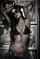
AFTER
Vector VS Rastor Graphics
Vector graphics are mathematically based shapes and lines, objects and fills. They are typically generated with illustration or drawing software like Adobe Illustrator or Freehand. One of the greatest advantages of using vector images is that they are very easy to scale and retain a sharp clear quality. For example if a small logo is created as a vector graphic, it can be resized to be used on a large billboard and retain the same great sharp quality as it the original. I would recommend creating vector graphics for logos, symbols, graphs and charts in books, promotional posters and illustrations. Any occasion where the end result needs to have clean and clear distinct shapes vector is the best choice. Vector graphics also tend to be much smaller than vector graphics since the images are based on mathematical descriptions instead of pixels.
Raster images are composed of pixels or squares of colors. They are created with scanners, digital cameras or raster based software like Adobe Photoshop or Fireworks. Since raster graphics are based on pixels, attempting to increase the size of a vector graphic can cause some issues where the image will loose detail and clarity. However, raster images can be reduced in size and maintain quality. Since raster graphics are pixel based they also have issues with resolution where vector images do not. Web graphics for example have a resolution of 72-96 dpi. Printed images need from 200-300dpi. Raster images are known for being very large if they have a great amount of detail and pixels. Many adjustments and effects can easily be added to raster graphics like drop shadows, blurs, bevels and more. While converting from vector to raster is quite easy, converting from raster to vector is not. Raster files are mostly photographs since it offers a wide range of effects, manipulations, and adjustments. to this type of file. When working on photographs, creating textures and subtle digital effects raster is the way to go.
Resources:
AIO Lecture: Week 4
http://www.logodesignworks.com/blog/vector-graphics-and-raster-graphics-difference
http://designwashere.com/design-battle-vector-vs-raster/
AIO Lecture: Week 4
http://www.logodesignworks.com/blog/vector-graphics-and-raster-graphics-difference
http://designwashere.com/design-battle-vector-vs-raster/
Some examples of vector art from my website see the links below
VECTOR ART:
1. This vector graphic works well as it is crisp and clean at any size. I also like how it is stylized and simplified, but still has a refreshing essence.
2. This is a vector layout for a magazine. The graphic of the motorcycle is a stylized illustration. This is great as the graphic can be reproduced for other media and keep consistency with branding. For example if this graphic was going to be used on a billboard it would retain the sharp crisp quality.
3. This is a page that contains all vector graphic logos. I try to create all logos as vector graphics so they can be easily resized for any application.
RASTER ART:
1. Here are some book covers I created for a client while I worked as an Art Director. These book covers were created in Photoshop software ad used in some cased up to 50 images to create the montage. The covers have many filters and effects and layer styles applied to the photos. To keep the quality of the cover for the final printing these graphics were created as raster art.
2. The same client I used to do book covers for now has a demand for cd covers. He wants a wild colorful design. I use Photoshop raster art to accomplish what he is looking for. See samples of his covers on this website.
2/18/10
Multipage Brochure Experiments
Given a chance to design a multiple page brochure, would you like to experiment with different styles and layouts or would you prefer to use the contemporary style? What, in your opinion, might interest general public?
Whenever I have designed a multiple page brochure, the first thing I always consider is the budget. How many pieces will the client want? How will I reproduce them? How much money is the client willing to spend? Most of the time when I design brochures for clients it always comes down to meeting the budget. First I typically look at what the client is trying to achieve in the brochure. Is it Information for training, awareness, promotion or something completely different?
Of course still need more information before I really start thinking about the design. How much and what information do I need to include? Are there any extra items that the brochure needs to accommodate like CD’s, DVD’s, Pens, etc? Does it need multiple folds, tear offs, die cutes, pockets?
Once I have answers to all these questions I begin to thumbnail and think of ways to make the form of the brochure function the best. I look at other layouts and creative brochures and consider those designs verses mine. Then I consider how will the brochure be produced.
So, to answer the question, I like to experiment with new styles. I think seeing something different with great production always attracts attention. Using dynamic typographic and exciting photography to generate interest on a unique looking brochure is more likely to draw attention and say “you got to see this!” compared to a standard design.
A great example of this is when I go to the Dr.’s office and look at all their brochures in the waiting room. Some of the big drug companies have great unique shape brochure about the latest anti-depressant, heart medication, diabetic supplies and so forth. They pop off the display and scream “LOOK AT ME, I AM NEW AND EXCITING!” Verse the simple packet of papers stapled in the top left corner printed on a copy machine that needs cleaned and is out of toner. Pushing brochures to the next level is just part of the graphic design game we designers call work.
Is Thumbnailing That helpful?
How does thumbnailing aid in your creation of a multiple page brochure? Does it actually make the process faster or does it slows down the process?
Thumbnailing is vital to the creative process when working on any project. While it does take time to think and develop multiple concepts for thumbnails, it is much better to sketch out some ideas and see how they will work, opposed to spending hours on a design and realizing it is not good and needs new direction. While having a concrete concept when starting a multi-page brochure does entice some to jump right in, exercising a thumbnail technique will expand the possibilities, and further develop the concept of the design. Creativity flourishes when working on quick, design sketches. Even if the thumbnailing exercise directs a designer toward their original concept, the process has not been in vain. The designer now has other creative elements floating in their head that will take this project to the next level.
Thumbnailing is vital to the creative process when working on any project. While it does take time to think and develop multiple concepts for thumbnails, it is much better to sketch out some ideas and see how they will work, opposed to spending hours on a design and realizing it is not good and needs new direction. While having a concrete concept when starting a multi-page brochure does entice some to jump right in, exercising a thumbnail technique will expand the possibilities, and further develop the concept of the design. Creativity flourishes when working on quick, design sketches. Even if the thumbnailing exercise directs a designer toward their original concept, the process has not been in vain. The designer now has other creative elements floating in their head that will take this project to the next level.
Got Legs?
What current marketing and advertising campaigns, other than ones presented in this lesson, have "legs"?
A great campaign that was used back in the 50’s that is still referenced today is for Marlboro cigarettes. The Marlboro Man, marketing campaign that was put together by Leo Burnett Co. created rough and rugged imagery of the cowboy surviving in the range with a cigarette. The campaign was used from 1954 all the way to 1999. Kathleen Schalch details how the target market related to the campaign in her report on National Public Radio. She explains, "In a world that was becoming increasingly complex and frustrating for the ordinary man, the cowboy represented an antithesis -- a man whose environment was simplistic and relatively pressure free. He was his own man in a world he owned" (Schalch, 2002). Although the campaign was very masculine, the strapping, rugged Marlboro Man is still a well-known icon for this product today.

Source:
Schalch, Kathleen, “The Marlboro Man”
October 21, 2002. Web November 3, 2009.
<>
Resouces:
AIO Lecture Week 5
http://en.wikipedia.org/wiki/Marlboro_Man
http://adage.com/century/icon01.html
Imagery Is Key In Design
The use of complementary images, typefaces, colors, and papers plays an important role in the success of an artwork. Do you agree with this statement? Give reasons to support your answer.
YES, YES, YES, I agree, how could anyone not agree? This week’s lecture reminded us of how important imagery is in our designs. And when talking about images it always said, “an image is worth a thousand words”.
The other details used in the design, typography, color, medium and paper work together to bring the creative idea alive. The elements give the piece personality, mood, tone and most important a message.
Letterform for example is extremely powerful in it’s ability to provide unconscious persuasion. From attracting attention, to setting the tone of a layout, the observer is emotionally and subconsciously impacted and gathers the feeling of the piece without even knowing it. Typography affects people and most of the time they don’t even consciously notice it. A script typeface can create the feel of a particular era or time period as well as, project a mood, elegance and sophistication.
Color is another element that can’t be overlooked. Color has so many conscious and subconscious effects on it’s observers. Color has so many different associations to different cultures due to its history and what the culture has used the it symbolically. Another great example of how powerful color was mentioned in the first week of reading with advancing verses receding color. Color also holds a critical role in visibility.
Finally medium and paper are equally important in a successful design. Does the final piece require the pressed polished look of a high gloss paper? Or is a rough 100 percent recycled cardstock more fitting? The paper and which medium the design is executed in is so critical. Can you imaging opening a brochure in a plastic surgeons office that was created on newsprint and crayon? Possibly in a pediatricians office… These elements to me also fall under another name I call craftsmanship.
Resources:
AIO Electronic Design Lecture Week 3
AIO Advanced Typography Week 4
http://www.sessions.edu/courses/Course-Advanced-Typography.asp
Graphic Design School 3rd Edition pg 26-39
Stock VS Origional Artwork?
Would you prefer to use stock photos/illustrations for your work or would like to create original ones? Why would you do so?
At this point, if the project has the budget for stock photography and I can find images that will work well in the design, I prefer to use that resource. While at the same time I always am concerned about the copyright rules that go along with stock photography. Making sure to read the fine print, or use the photo as an element and create a new piece from the resource seems to always be a haunting issue. I also agree that there are great advantages to staging my own photography or creating an exact piece to meet the needs of a project.
Currently the major factor in going to stock photography is I don’t have the equipment or experience to capture what a professional photographer can. Hopefully this will change over the next few years. At the same time there has been times when I need an exact image that and I would create it myself.
To conclude yes I would prefer to use stock photography for its professional look and convenience, but at the same time for certain projects I prefer to create my own imagery to get the exact image I need or to avoid the conditions of purchased art.
Resources:
AIO Lecture Week 3
www.Corbis.com
www.istockphoto.com
Steps In The Creative Process
How many steps are in the creative and conceptual process?
I always have a hard time agreeing with statements that say, “ this is how it’s done every time”. I do agree that, “sometimes” there are four steps in a creative and conceptual process, but sometimes there are also five or even nine. Sometimes the process is going back and repeating a few steps a few times. I think of how sometimes I think of a great concept right off the bat. Even after a little research and exploring other possibilities I come back to the initial idea, execute it and it is great. I think of other times, however, I really struggle with finding a creative idea. I prepare, I think about it, I may even have and “Aha!” moment, but I find myself going back to the beginning and doing more research. This is especially true when working on logos. A great article on thedesigncubicle.com, talks about the 11 steps taken in a successful logo design process. A few more steps than four…
So I conclude, sometimes there are four steps possibly;
Research, Incubation, Illumination and Implementation. But other times the best creative solution is not achieved so simply, and more steps are necessary to achieve an ideal solution.
Resources:
Graphic Design School 3rd edition pages148,149, Module 4
http://www.creativity-portal.com/bc/four.steps.of.creativity.html
http://www.maxvalue.com/tip027.htm
http://www.bnicolorado.com/cgi-bin/viewnlcontent.cgi?nlarticle_id=213
http://www.nwlink.com/~donclark/creativity/creativity.html
http://www.thedesigncubicle.com/2009/05/11-steps-of-a-successful-logo-design-process/
Thumbnails, Thumbnails, Thumbnails...
In your opinion, what are the reasons and the values behind the process of Thumbnailing ideas in large quantities?
The use of thumbnails is a great way to think through different concepts for an ideal solution to a design problem. Many times the “perfect concept” considered in the beginning can be taken further, trumped, or even redirected altogether by using thumbnails as a tool to evaluate the best direction. Thumbnails are also great time savers. Instead of pouring hours and hours into a design, seeing a few thumbnails may take the project in a different direction. Even showing a client a few thumbnail sketches can help the client see what your thinking and possibly redirect or add to the concept with out loosing large amounts of time invested to the project already.
My favorite way to utilize thumbnails is in a group/team brainstorm setting. It’s amazing what a group of creative people can come up with when they are all focusing and utilizing each other’s strengths and weaknesses.
As far as the quantity of thumbnails, I think it’s great. Most cases I have had seem to require a few more thumbnail sketches than I would personally choose to experiment with. I personally shoot for about 5-7 for personal clients. When doing larger quantity of thumbnails I tend to do more research, as I need more concepts and material. The only downside to being force into more creative concept development is, with more great ideas it is more difficult to decided on a direction.
Resources:
AIO week 2 Lecture
http://desktoppub.about.com/cs/basic/a/thumbnails.htm
http://desktoppub.about.com/b/2003/06/05/design-thumbnail-sketches.htm
http://drawsketch.about.com/library/bl-thumbnail-sketching.htm
PROs & CONs of a Grid
Discuss the advantages and disadvantages of using grids. Should they be used at all?
Of course grids should be used. They create structure and consistency in design. While they do create rules, rules can be broken. Who is the designer anyway? Subdividing or modifying the grid could also be a useful solution if the structure of a grid seems to interfere with the flow of the design. In the end a grid is not much more than are a guide, a direction, a way to establish consistency and in a timely manor. It is a perfect tool to help utilized the design space. They are a great way to create structure and harmony in a design.
In some situations if the grid is blocking a creative concept, of course, throw it out! There have been times that I have been so excited about a concept I dive right in and put the concept down. A great example of this is when I am working on logos and even websites. I know in the end in web development a grid is key, but when trying to design and break out of the uniform expected structure, working through concepts without a grid can be very beneficial.
Another personal example of how a grid can be a disadvantage is I currently work with one client who likes all his designs very loose and unstructured. In fact when I started working with him, I had to make lots of revisions to designs due to the fact that I had most of the layout in a solid grid. Even though the now the finished product is usually unbalanced, chaotic, and lacking structure he is delighted. Is the customer always right?
Resources:
AIO Lecture Week 1
Design School 3rd edition –pgs 17,18,19,140
http://webdesign.about.com/od/layout/qt/why_grids.htm
http://graphicdesign.about.com/od/layout/a/grid_system.htm
http://v3.markboulton.co.uk/articles/detail/why_use_a_grid/
GRID Webpage VS Newspaper
Are certain grid applications better for one type of product or service over another? In your opinion, why is this so?
Webpage VS Newspaper
A great example of one grid application that is ideal in one situation and completely inappropriate in another is a web page grid verses a newspaper grid. In a newspaper there is mostly heavy sections of copy that are displayed in multiple spaced columns. A webpage is completely different where a grid to divide up the page for navigation, content and in some cases advertising.
When I worked for an online adverting agency, at one time we were discussing the grid used in classified papers and applying that to our classified website design. While it sounded good in theory, having the same “look” as classifieds in the paper, applying that design to a website was very difficult. The main issue I remember is the user would be continually scrolling down the page reading the narrow column.
To answer the question "Are certain grid applications better for one type of product or service over another?" Defiantly!
Resources:
AIO Lecture Week 1
Design School 3rd edition –pgs 17,18,19,140
http://960.gs/
http://tutorialblog.org/grid-systems-in-web-design/
http://graphicdesign.spokanefalls.edu/tutorials/tech/column_inches/col_inches.htm
Grids?
What grids appear to work most flexibly, most creatively, most productively? In your opinion, why is this so?
The rule of balance and principal of thirds I think create the most flexible and creative grid for productivity. As the lecture pointed a grid will “narrow the "creative options"” By using one of these two principles for layouts creates many opportunities, as it is a limited amount of structure and control. The possibilities are endless. At the same time, while this limited structure will open creativity and flexibility, it is probably not the best choice for productivity. Using a grid with more structure and control will save time and as the lecture also stated, "things are falling together nicely." With a more structured grid, like a nine column grid, the decisions have been made which will ensure a more consistent design.
Resources:
AIO Lecture Week 1
Design School 3rd edition –pgs 17,18,19,140
http://desktoppub.about.com/od/designprinciples/l/aa_balance4.htm
2/17/10
Red Bull Logo Reliant on Color Recognition...
QUESTION?
Think of a brand, product or company whose logo or branded image is reliant on color recognition. Evaluate this use of color. What is the message this color conveys? Why does it convey this message? Give examples in your response.
The Red Bull energy drink uses “red” as is main color with a touch of “yellow”. The color, red, is an ideal choice for this brand, as it not only to reinforce the name “Red” Bull, but the color, red, also is known for raising blood pressure, or causing excitement. Red Bull has used phrases like “Red Bull vitalizes body and mind” and “Red Bull gives you wiiings!” (Peterson, 2009) in it’s marketing campaigns. With the color, red, being associated with drive, action, energy, and strength, it is an ideal match for the branding.
The splash of yellow also used in the logo is a nice touch as yellow is associated with, sunshine, warmth, and happiness. The relationship of the two colors is an Analogous Relationship, where colors are located close to each other on the color wheel. Both colors would be in the warm family.

Cited:
Peterson, Erik. “Logo Critiques.”
1 June 2009. Web. 11 Jan. 2009.
<http://www.logocritiques.com/resources/color_psychology_in_logo_design/>
Resources:
AIO Lecture Week 1 – Design Audience
http://www.logotree.com/html/color_psychology_logo_graphic_design.htm
http://www.logocritiques.com/resources/color_psychology_in_logo_design/
http://www.color-wheel-pro.com/color-meaning.html\
http://www.worqx.com/color/combinations.htm
Think of a brand, product or company whose logo or branded image is reliant on color recognition. Evaluate this use of color. What is the message this color conveys? Why does it convey this message? Give examples in your response.
The Red Bull energy drink uses “red” as is main color with a touch of “yellow”. The color, red, is an ideal choice for this brand, as it not only to reinforce the name “Red” Bull, but the color, red, also is known for raising blood pressure, or causing excitement. Red Bull has used phrases like “Red Bull vitalizes body and mind” and “Red Bull gives you wiiings!” (Peterson, 2009) in it’s marketing campaigns. With the color, red, being associated with drive, action, energy, and strength, it is an ideal match for the branding.
The splash of yellow also used in the logo is a nice touch as yellow is associated with, sunshine, warmth, and happiness. The relationship of the two colors is an Analogous Relationship, where colors are located close to each other on the color wheel. Both colors would be in the warm family.
Cited:
Peterson, Erik. “Logo Critiques.”
1 June 2009. Web. 11 Jan. 2009.
<http://www.logocritiques.com/resources/color_psychology_in_logo_design/>
Resources:
AIO Lecture Week 1 – Design Audience
http://www.logotree.com/html/color_psychology_logo_graphic_design.htm
http://www.logocritiques.com/resources/color_psychology_in_logo_design/
http://www.color-wheel-pro.com/color-meaning.html\
http://www.worqx.com/color/combinations.htm
Design Principles - Unity, Balance, Rhythm, Focal Point, Proportion
Unity:
“Unity is a measure of how the elements of a page seem to fit together - to belong together” (skaalid, 1999).
A few different ways to achieve unity are through proximity, repetition and continuation.
Proximity is the simplest way of creating an appearance of belonging together. See a sample of proximity:

Repetition is a great way to show unity with repeating colors, textures, shapes and objects. See a sample of repetition:

Continuation is a subtle way to create unity in design. Using a continuing line, edge or direction from one part of the piece to another are ways to unify the design. See a sample of continuation:

Balance:
Balance “is an equal distribution of weight” (Linda, 2006) or “objects are of equal weight, they are in balance” (Skaalid,1999). There are a few different types of balance.
Symmetrical balance which is a mirror image balance. It is basically making one side of the page very similar to the other side. See sample of symmetrical balance:

Asymmetrical balance occurs when multiple small items balance a large item, or smaller items are more distant from the center of the screen than larger items. Another method is, using a darker item may be balanced with multiple lighter items. See sample of asymmetrical balance:

Radial balance is when all elements “radiate” out from the center point in circular gesture. It is know for being quite easy to keep a focal point when using radial balance, because all the elements will draw your eye in toward the center. See sample of radial balance:

Rhythm:
“Rhythm is a pattern that is created by repeating or varying elements, with consideration given to the space between them, and by establishing a sense of movement form one element to another” (Linda, 2006). By using rhythm or repetition a designer creates consistency with in the design that makes it easier for the observer to understand. Many different types of rhythm create different feelings for the observer. Using a regular rhythm will reveal breaks between elements, and sometimes the elements are relative in size or length. The use of a flowing rhythm creates a feeling of movement, and more natural. Finally using a progressive rhythm reveals an arrangement of figures with a sequence of steps.
See Regular Rhythm:

See Flow Rhythm:

See Progressive Rhythm:

Focal Point:
Focal point refers to the part of the design that is most emphasize. Many adjustments can be made to accentuate any element in a design such as shape, position, size, color, value, direction, and even texture. (Linda, 2006)
See Focal Point:

Proportion:
Proportion is known as “ the relation of one part to another or to the whole with respect to magnitude, quantity, or degree” (proportion, 2010). Good use of proportion will aid in establishing depth and visual weight.

Works Cited:
Linda, Robin. Graphic Design Solutions. Bostin: Wadsworth, 2006.
Skaalid, Bonnie, “Classic Graphic Design Theory Principles of Design: Balance”,
1999. Web 13 Jan. 2009.
< http://www.usask.ca/education/coursework/skaalid/theory/cgdt/balance.htm>
Skaalid, Bonnie, “Classic Graphic Design Theory Principles of Design: Unity”,
1999. Web 13 Jan. 2009.
<http://www.usask.ca/education/coursework/skaalid/theory/cgdt/unity.htm>
"proportion." Merriam-Webster Online Dictionary. 2010.
Merriam-Webster Online. 13 January 2010
<http://www.merriam-webster.com/dictionary/proportion>
Other Resources:
AIO Lecture
http://www.usask.ca/education/coursework/skaalid/theory/cgdt/balance.htm
http://webdesign.about.com/od/webdesignbasics/p/aarhythm.htm
http://www.digital-web.com/articles/principles_of_design/
“Unity is a measure of how the elements of a page seem to fit together - to belong together” (skaalid, 1999).
A few different ways to achieve unity are through proximity, repetition and continuation.
Proximity is the simplest way of creating an appearance of belonging together. See a sample of proximity:
Repetition is a great way to show unity with repeating colors, textures, shapes and objects. See a sample of repetition:
Continuation is a subtle way to create unity in design. Using a continuing line, edge or direction from one part of the piece to another are ways to unify the design. See a sample of continuation:
Balance:
Balance “is an equal distribution of weight” (Linda, 2006) or “objects are of equal weight, they are in balance” (Skaalid,1999). There are a few different types of balance.
Symmetrical balance which is a mirror image balance. It is basically making one side of the page very similar to the other side. See sample of symmetrical balance:
Asymmetrical balance occurs when multiple small items balance a large item, or smaller items are more distant from the center of the screen than larger items. Another method is, using a darker item may be balanced with multiple lighter items. See sample of asymmetrical balance:
Radial balance is when all elements “radiate” out from the center point in circular gesture. It is know for being quite easy to keep a focal point when using radial balance, because all the elements will draw your eye in toward the center. See sample of radial balance:
Rhythm:
“Rhythm is a pattern that is created by repeating or varying elements, with consideration given to the space between them, and by establishing a sense of movement form one element to another” (Linda, 2006). By using rhythm or repetition a designer creates consistency with in the design that makes it easier for the observer to understand. Many different types of rhythm create different feelings for the observer. Using a regular rhythm will reveal breaks between elements, and sometimes the elements are relative in size or length. The use of a flowing rhythm creates a feeling of movement, and more natural. Finally using a progressive rhythm reveals an arrangement of figures with a sequence of steps.
See Regular Rhythm:
See Flow Rhythm:
See Progressive Rhythm:
Focal Point:
Focal point refers to the part of the design that is most emphasize. Many adjustments can be made to accentuate any element in a design such as shape, position, size, color, value, direction, and even texture. (Linda, 2006)
See Focal Point:
Proportion:
Proportion is known as “ the relation of one part to another or to the whole with respect to magnitude, quantity, or degree” (proportion, 2010). Good use of proportion will aid in establishing depth and visual weight.
Works Cited:
Linda, Robin. Graphic Design Solutions. Bostin: Wadsworth, 2006.
Skaalid, Bonnie, “Classic Graphic Design Theory Principles of Design: Balance”,
1999. Web 13 Jan. 2009.
< http://www.usask.ca/education/coursework/skaalid/theory/cgdt/balance.htm>
Skaalid, Bonnie, “Classic Graphic Design Theory Principles of Design: Unity”,
1999. Web 13 Jan. 2009.
<http://www.usask.ca/education/coursework/skaalid/theory/cgdt/unity.htm>
"proportion." Merriam-Webster Online Dictionary. 2010.
Merriam-Webster Online. 13 January 2010
<http://www.merriam-webster.com/dictionary/proportion>
Other Resources:
AIO Lecture
http://www.usask.ca/education/coursework/skaalid/theory/cgdt/balance.htm
http://webdesign.about.com/od/webdesignbasics/p/aarhythm.htm
http://www.digital-web.com/articles/principles_of_design/
Subscribe to:
Posts (Atom)