Showing posts with label Photography. Show all posts

1/29/15

Locating a Source Image - Tineye

On a few occasions, I am given an image that I need to find where it came from. This mostly happens with a client purchasing a stock image that is too small or wanting to use an image they found on Google. I stumbled across a great resource. http://www.tineye.com
TinEye Reverse Image Search 
 I take a quick screen shot of the image I am looking for. Even in cases where it has been altered I have had success finding the image. Then go to TinEye.com and load it up.


5/6/11

Lewis W. Hine - Men Working on Skyscrapers

Objective: Select an image that you consider to be representative of today's documentary photography and that resonates with the documentary examples:

Workers on Empire State building
(NYPL Digital Gallery, 2011)
Title: Rivetting on the dome, a quarter mile up
Artist: Lewis W. Hine
Date: 1931
Location: Rochester, NY
Medium: Photography
“Lewis W. Hine. Rivetting on the dome, a quarter mile up during construction on the Empire state Building in New York City 1931 Photograph George Eastman House, Rochester; New York” (Pohl, 2002).
  

(Working on Skyscrapers | Aashish Puniany, 2011)
Title: Working on Skyscrapers
Artist: Unknown/Aashish Puniany
Date: Unknown
Location: Indonesia
Medium: Photography

In studying the images in the book I was very drawn to the work of Lewis W. Hine.  In his “Hine. Rivetting on the dome, a quarter mile up” I was quite amazed at the angle of the shot. The photographer is actually higher than the workers. The viewer normally would see the large towering buildings above them, not as small distant shapes below. The dark images of the men and structure contrasting the lighter city really show the viewer how far below the city is. This concept is very impressive totally captures how dangerous the condition is for the men working.  His title fills in some questions a view might have. First of what is, how high are these men, and the second is what are they doing.

It was difficult to find a modern version of this today with so much “red tape” and liability issues. Most photographs I found were stock images that were save and shot from the bottom of the structure with a large lens. In my mind that is a completely different photo. I finally found some photos that are quite similar to what Hine is doing in his. On Aashish Puniany’s blog, he features a small series of photos very similar to Lewis W. Hine of men working very high up on a building over looking the city below. Aashish Puniany also uses black and white photos like Hine, which creates a dynamic contrast, as he too shows his foreground darker and distant city below lighter.  His angle of his subject is not quite as drastic as Hine, but the photographs are still taken slightly above the subject to reveal they breath-taking height. A few of his photos defiantly highlight the lack of safety and danger of what these workers are doing. 

Works Cited:

"NYPL Digital Gallery | Detail." NYPL Digital Gallery | Home. Web. 05 May 2011. .

Pohl, Frances K. Framing America: a Social History of American Art. New York, NY: Thames & Hudson, 2002. Print.

" Working on Skyscrapers | Aashish Puniany." Images, Videos, Websites and Many More. Web. 05 May 2011. .

5/3/11

Allie Mae Burroughs, Wife of a Cotton Sharecropper- Cirtique

QUESTION: Although documentary photography attempts to be impartial about the situation it records, there are aesthetic approaches taken by photographers that elicit a strong reaction from the viewer. Allie Mae Burroughs, Wife of a Cotton Sharecropper, Hale County Alabama, taken by Walker Evans that was made as part of a project that addressed the plight of migrant workers during the Great Depression. Consider his choice of setting, lighting, compositional arrangement, and title, among other strategies, to describe aspects of the Evans photograph that you think have been manipulated by the artist to produce an empathetic response from the viewer.

PM_fotografi2
(Uppsala Universitet, 2011)

Walker Evans has set up his photograph “Allie Mae Burroughs, Wife of a Cotton Sharecropper, Hale County Alabama,” beautifully. I would speculate that every technique used in this photo was used with the intention to reveal a simplistic way of life that has been very wearing. 

In first looking at the 3 main textures captured in the photo the viewer sees the rough wood grain of the backdrop, the detailed pattern material on Allie Mae’s blouse and the smooth texture of her skin. These three main textures create a great contrast. This contrast reveals a rough abrasive environment that this soft individual is surrounded by. The building is her environment, and it is rough and surrounds her every moment. Her blouse is her labor and tasks. She is very busy not having even a moment for herself. She has so much too do and barely enough time to do it. Her environment requires her labor. The third main texture is her skin. It is soft and smooth and is the only constant in the piece. We see how the skin is revealing wrinkles showing time and abuse from the environment and labor, but the skin is resilient against its opposition. 

The flat lighting creating little dimension, may lead the viewer to further speculate that the life of this migrant worker is very simple and monotonous. She works hard long hours day after day sticking to her routine. Her stark expression cues the viewer to know she is turning into a machine. She has been hardened, by life, extreme conditions and hard work. The wrinkles on her forehead help the viewer know she is less than happy about her current situation, but the gaze in her eyes show that she knows this is all she has. 

Work Cited:

"Uppsala Universitet - PM_fotografi2 - Mynewsdesk." News Releases Mynewsdesk - Search, Monitor, Publish and Share Press Releases. Web. 03 May 2011. .

4/25/11

Photography VS Painting - Edward Steichen, Grant Wood


 http://www.masters-of-photography.com/images/full/steichen/steichen_flatiron.jpg  http://www.artexpertswebsite.com/pages/artists/artists_l-z/wood/Wood_FallPlowing.jpg
 (Masters of Photography, 2011)              (Grant Wood, 2011) Today at first glance, we might question the efforts of Edward Steichen in his piece, The Flatiron, 1905. With the advances of Photography in the 21st century it is hard for us to imagine how difficult the equipment was to work with in this medium. Steichen shows his viewers that he not only knew how to use the equipment, but manipulate it and creates a powerful effect as he studied architecture and nature at twilight. Seeing the reflection of the landscape on the ground and the dreary sky leads me to think Steichen was attempting to create a great effect of a mist in is image. Using contrasting tones he creates dark silhouettes of branches, but then is able to create distance with a lighter shade on the architecture. His foreground is not exactly very visible as we are just able to see basic shape. His middle ground and background might bring about some controversy, as those like my self would call the background the brightest sections where nothing is visible and the middle ground is slightly out of focus, revealing the large structures. 

When contrasting piece Steichen’s photograph to is the Grant Wood painting, Fall Harvest great contrasts are revealed. In the painting the setting is completely different. Wood chooses to work on the rural landscape of a farm. In his piece the viewer gets a slight sense of depth as he has used perspective and created rolling hills that overlap the visual plane.  The most interesting difference is that the painting has much more clarity and information for the viewer in the represented distant areas than the photograph. The painting gives the viewer an illusion that they can actually see for miles. The photograph is completely different, as in the darker setting it would be impossible to see such a distance. Steichen does give the viewer a short sense of distance, but it appears to be very short. The color pallet Wood selected is also slightly different. While, both pieces have a warm tonal feel, Wood has added green hues giving his piece greater vibrancy. In my opinion Wood had done brought his viewers attention to the middle ground as Steichen has. The background is less in focus and lighter and does not have the contrasting value creating greater detail. The foreground is in focus, but is darker almost creating a base or foundation for the viewer to start with and be lead into the middle ground with the dark angled lines.


There are also similarities in these pieces. We see how both artists chose to work with a darker foreground and lighter background, which helps draw the viewer into the piece, in this case creates a sense of depth. Both also contrast nature with man-made structures. Both artists used nature to separate the viewer from the architecture as they have both placed the viewer in nature looking to structures. 

Knowing that both pieces are establishing the viewer in nature looking toward the architecture, I believe both paintings are for those not living in the cities. In both cases elements of nature have created a barrier and separated the viewer from the established structures. I find that as a way that each artist has addressed those that are not city dwellers as outsiders. Or beasts that lurk in the shadows.

Works Cited:
"Grant Wood. Authentication, Certificates of Authenticity and Expert Appraisals." Art 

Experts, Inc.: Authentication, Certificates of Authenticity and Expert Appraisals. Web. 25 Apr. 2011. .
Masters of Photography. Web. 25 Apr. 2011. .

Resources:
"Edward Steichen: The Flatiron (33.43.39) | Heilbrunn Timeline of Art History | The Metropolitan Museum of Art." The Metropolitan Museum of Art, New York: Metmuseum.org. Web. 25 Apr. 2011. .

4/21/11

Mulberry Bend VS Monadock Building

QUESTION:
Photographing American Architecture


The rise of industrialism and the accumulation of wealth and labor in major U.S. cities may have led to the development of the skyscraper, a simple and functional type of architecture that was distinctively American. At the same time that the monumental buildings discussed in chapter five of your text , were being constructed to accommodate the commercial needs of large cities, there were also squalid tenement buildings that were the focus of the documentary photography of Jacob Riis. The image available at the following link depicts a neighborhood in the lower east side of New York that housed many of the European immigrants that flocked to the U.S. at the end of the nineteenth century:


Jacob Riis, Mulberry Bend, 1896
Compare the image of tenement buildings with those of the skyscrapers found in your book. What are the different messages being conveyed by these images? How do the photographers compose the images to address the different functions (public v. private) of these structures?


     (Candida Martinelli's Italophile Site, 2011)                                    (Google Images, 2011)


An a initial response in viewing the photo of Mulberry bend and the photograph of the Monadnock Building located in Chicago, IL, could be misconstrued as a different time period. We see crowded streets full of people walking and horse drawn carriages and carts in Jacob Riis’s photo. The streetcars and automobiles in the photograph of the Chicago skyscraper designed by Burnham and Root could be misleading in the comparison of these two photographs.

The major difference I see first hand is that in the Mulberry Bend photo the streets are very crowded and busy with excitement. In viewing the photo of Jacob Riis, we see the area is not glorified in anyway. Riis actually had an office located in Mulberry bend where he worked writing articles. He would daily journey through this cramped dirty area and see the quality of life for the inhabitance of this neighborhood were quite inadequate. In his writings, Jacob Riis was noted for how he “emphasized the humanity of the tenement population” (Documenting "The Other Half", 2011). We can see he also uses a similar technique in his photography. These structures located in the poorer areas on the lower East side of New York City are between three and five stories high and have rickety fire escapes and the littered street also is a visual indicator this area is not well taken care of. 

In the photo of the Monadnock Building we see a different story.  There is hardly any activity in the street below. Given that this structure is a first class office complex, we could guess the photo is taken on a weekend when workers are not around. A streetcar and a few automobiles give us the idea that transportation is needed to bring individuals to this structure from the suburbs. The design is simple with it clean lines and sublet curve showing more modern or contemporary feel on the exterior. We don’t see shutters around the windows as we did in the Mulberry Bend neighborhood. The feel created by the intimidating structure is power. This structure gives a greater sense of security and success. The slightly flared base of the structure helps us verify the building materials. “The brick walls still serve as supportive elements for the sixteen stories and are 17 feet thick at the base” (Pohl , 2001).  The size, clean lines, and height grant a confident appearance to the Monadnock Building

Works Cited:
"Candida Martinelli's Italophile Site(Immigrants NY 1890)." Candida Martinelli's Italophile Site (Italian Culture,links,free Ebooks). Web. 19 Apr. 2011. .

"Documenting "The Other Half": The Social Reform Photography of Jacob Riis and Lewis Hine." American Studies @ The University of Virginia. Web. 19 Apr. 2011. .


"Google Images." Google. Web. 19 Apr. 2011. .
Pohl, Frances K. Framing America: a Social History of American Art. New York, NY: Thames & Hudson, 2002. 290. Print.

6/2/10

Photoshop CS4 Classroom in a book

If you have


or


I totally suggest this book! This is a great Photoshop self-teach book. I used it at The Art Institute of Pittsburgh!

4/11/10

Need Stock Photography?

Great Image Resources!

If you don't know about istockphoto.com you are really missing out. Great photos for a very reasonable price.
http://www.istockphoto.com/index.php

Other great photo sites:
Stock.xchang -  http://www.sxc.hu/
Free Digital Photos - http://www.freedigitalphotos.net

3/23/10

Robert Mapplethorpe - emulation

Robert Mapplethorpe is known for his creative light and use of shadow in his photos of flowers, portraits and the human figure. Knowing a good bit of Mapplethorpe’s work is erotic photography or studies of the human figure I knew I would need to have some figure studies. I also chose to photograph an orchid.

I chose to work from daylight. Of course it was cloudy and overcast. My light source was a window across the room. For the photograph of the orchid I did several studies and settled on shot “A” as indicated in my style sheet. I thought this photo showed rich contrast with subtle texture in the leaves of the plant. I also considered the position and figured under certain pretenses it could be considered erotic.

That same day I shot figure studies B, C, D. I thought these were great photos of muscular legs. Showing power and movement with great contrast creative use of shadow. Mapplethorpe’s dynamic photos of muscular black men with excellent use of light and shadow inspired these shots.


My final sample G. was taken in another session. The light source was the same as the previous session. I wanted another photograph of the human figure, but I wanted to incorporate another part of Mapplethorpe’s style. I used a leather strap to bide the hands of the subject. I thought binding the hands behind the head would follow the S&M style of Mapplethorpe. Although most of his work was symmetrical, he did have some pieces that were not. 

References:
http://asitoughttobe.files.wordpress.com/2009/08/957_124280_robert-mapplethorpe.jpg
http://newsgrist.typepad.com/.a/6a00d8341c66f153ef0120a5eda6bb970c-800wi
http://bighollywood.breitbart.com/files/2009/09/robert_mapplethorpe_self_portrait_1975b.jpg
http://www.artslant.com/userimages/5915/MAP.CallaLily.86.4Press.jpg

3/22/10

Robert Mapplethorpe - Derrick Cross


This piece is completely amazing. Not only does Mapplethorpe go back to his roots here and once again used the crucifix figure, but he captures the power of human form. His keen eye for light and shadow has revealed the detail on the figure.  Once again strong contrast with the subject and background makes the subject a defiant focal point. 

Robert Mapplethorpe - Calla Lily

This is a very dynamic photo of the Calla Lily. What makes this photo so successful is the elegance of the organic shape along with the captured delicate texture of the bloom. Robert Mapplethorpe focus is so sharp you can see the subtle texture and soft folds of the bloom. Using high contrast of subject with background and light and shadow he is able to create this rich high contrast photo that still has an essence of soft delicate bloom.

Robert Mapplethorpe Research


Robert Mapplethorpe
Self Portrait, 1982, Printed 1991

I chose Robert Mapplethorpe after I saw his powerful photos. I love how he captures the human figure. His great lighting and use of shadows on the human from are very dynamic. Even his photos of flowers are very interesting. He captures unique angles and arranges unique compositions using creative lighting and shadows.

Robert Mapplethorpe was born November 4, 1946 in Floral Park, Queens. He was the third of six children in this family living on Long Island. He is know for reflecting on his safe and secure childhood by saying, “I come from suburban America. It was a very safe environment, and it was a good place to come from in that it was a good place to leave” (Connelly, 2009).
Mapplethorpe began to study drawing, sculpture and painting at the Pratt Institute in 1963. He enjoyed creating collages with photographs and materials from various magazines and books. He admired artist like Marcell Duchamp and Joseph Cornell, and revealed their influence in is work. It was not until 1970 that Mapplethorpe began to produce his own images with his Polaroid camera for his collages.

While Robert Mapplethorpe may be associated with beautiful photographs of flowers, orchids, calla lilies and even portraits of famous people like Richard Gere, Grace Jones and Andy Warhol, he is also known for his study of classical nudes and even capturing homoerotic acts including bondage, discipline, dominance, submission and sadomasochism. His erotic photos of black men a have brought on much criticism and even been labeled be some as exploitative. Most of his early work is considered the most controversial with photographs of explicitly exposed sexual organs, positions, and acts. While his imagery captured the subculture of the homosexual community exposing the humanity and emotions of his subjects, many consider his work obscene and even pornographic.

Mapplethorpe was introduced to photography with his Polaroid camera, but in the mid-1970’s he started working with a Hasselblad medium format camera. He worked mostly in his studio in Manhattan. In the 1980’s Mapplethorpe was given $500,00.00 to purchase a top-floor loft on West 23rd Street. He lived in the loft and had a studio there as wall, but kept his previous studio as a dark room.

The style of Robert Mapplethorpe is strongly influenced by Edward Weston. Weston also had hundreds of nude studies, which examined the human form under magnification and unique angles. Mapplethorpe’s creative use of shadow and light gives his work a look all of its own. His work shows the structure and discipline of being raised in a strict Cathloic Family. In much of his work geometric layouts can be seen and many pieces relate back to his religious roots in how the elements are arranged. Mapplethorpe has even made the statement, “I was a Catholic boy, I went to church every Sunday. A church has a certain magic and mystery for a child. It still shows in how I arrange things. It's always little altars." (Levinson, 1990). A great example is in his portrait of Andy Warhol. The portrait is framed by a square-shaped cross and the subject in the photo is encircled by a glowing halo. This piece has been said to have, “a look on his face like a Christ stunned at the revelation of his own godhood”
(Levinson, 1990).

In 1986 Robert Mapplethorpe was diagnosed with AIDS. He continued to build and master his photography skills despite his battle with AIDS. Mapplethorpe died March 9, 1989 in Boston due to complications with AIDS.

Work Cited:

Connelly, Brenden. "Eliza Dushku, Movie Producer, Casts Her Brother as Robert Mapplethorpe". FILM blogging the real world. January 19, 2009; March 20, 2010, .

Levinson , Deborah A.. "Robert Mapplethorpe's extraordinary vision". The Tech Online Edition. Friday, August 31, 1990; March 20, 2010,
.


Other Resources:

http://www.mapplethorpe.org/biography/

http://www.slashfilm.com/2009/01/19/eliza-dushku-movie-producer-casts-her-brother-as-robert-mapplethorpe/

http://photography-now.net/listings/index.php?option=com_content&task=view&id=612&Itemid=249

http://tech.mit.edu/V110/N31/mapple.31a.html

3/12/10

When Does a Flash Enhance or Detract?

A flash can make the photo a great; at the same time, it can ruin the perfect setting. A flash can be quite effective if it is used in a way to create a small quantity of illumination on the subject. Many factors play in the effective use of a flash, for example the distance of the subject to the camera. If the subject is too far the flash will not reach the subject, but it the subject is too close the flash will wash out the subject. Using a flash can also create red eye as well as an outline shadow of a subject. A flash in many situations will take way from the photo when the lighting creates an atmosphere or environment. For example photographing performances where colored lighting creates an atmosphere, also in many performance settings flash photography is banned.
Samples of great non flash performance photos by Mike Thompson:


Sample 1. Flash Enhanced: I have a shot of my cat, “E-sue”  I shot him in front of the window. Although I love using daylight, I knew there would be a shadow on his face if I didn’t use a flash.

Sample 2. Flash Detract: I shot two bottles of wine in my kitchen using tungsten light. You can see in the photo a serious reflection down the center of both of the bottles as well as a nice outline shadow. The flash was not a helper here.

3/10/10

Photographing 2-D.

Photographing 2-D can be difficult. Especially if you art shooting a piece that is on a glossy paper. Lighting is key to successful photography. Sunlight, tungsten lights, florescent lights or flashes can all be used as light sources. Position your artwork on a flat surface. Your camera should be mounted on a tripod directly above the subject, perpendicular to it. 

I personally think using two lights, one on each side of the subject, works the best. Lights should be positioned at a 45-degree angle to the subject. A good test to see if the lights are both at 45 degrees is to place a pencil (eraser side down!) in the center of your subject. The two shadows of the pencil should have the same darkness.

Here are some samples:


1.     “A Glass Can Only Spill What It Contains…” 
Light: 2 Tungsten at a 45 degree angle
Camera Settings: Manual F13  1.3”
Material: High Gloss Digital Print
Comments: This was the first piece I attempted. I had to shoot it for the last class I had. It didn’t go well. I was glad to see I was able to remove the glare and have it in focus. It is a very dark print; I should probably have it reprinted. But this photo captures it very well. I took 7 photos of this piece total.


2.     “GBX  Shoe”
Light: 2 Tungsten at a 45 degree angle
Camera Settings: Manual F8  2.5”
Material: Marker and Marker paper
Comments: I wanted to get a variety of paper types and media. I took 5 photos of this piece total.
3.     “Lost Journey”
Light: 2 Tungsten at a 45 degree angle
Camera Settings: Manual F4.0  .4”
Material: standard laser printer print
Comments: This is a book cover I created when I was an Art Director at a book publishing company. I thought this would be good  to play with as it has lots of color I took 6 photos of this piece total.

4. “Jade”
Light: 2 Tungsten at a 45 degree angle
Camera Settings: Manual F13  2.5”
Materials: Pen and Ink on Drawing Paper
Comments: A strong black and white pen and ink figure drawing.  I took 4 photo of this piece total.
Resources:
AIO lecture Week 3

3/8/10

Apeture Settings Experiment

I line up three objects. I focused on and close to the FIRST object at all times, and took photos of the object using at least four different f-stops (aperture settings) from the smallest to largest number. Place two photos that show the most difference in depth of field. 

Using Aperture (F-Stop) To Enhance Composition

Using manual mode I captured 2 photographs. Photograph 1 is an object close up including a small portion of the background for the framing. I opened up the lens to the widest aperture/lowest number possible F2.8.

With the second photo, I shot a landscape using the smallest aperture/highest number possible on my camera F14.

3/6/10

Aperture Settings - F-Stop

On my Canon PowerShot A40 the Aperture settings are a range from F2.8 to F14.

F2.8 - F3.2 - F3.5 - F4.0 - F4.5 - F4.8 - F8.0 - F9.0 - F10 - F13 - F14

The F-stop settings control the amount of light allowed to enter the lens. A larger number creates a larger opening, which will allow a greater amount of light to enter the lens. It is important to keep in mind that the F-stop number is actually the denominator of a fraction, the larger the F-stop number, the smaller the opening will be. For example, F14 is really 1/14 compared to F4.0 is really 1/4. By adjusting the F-stop a photographer is able to change the depth of field in a scene. In other words, a small F-stop of 2.8 would have a larger opening than F4.8 and would allow a great amount of light in. Therefore reducing the depth of field.

The camera in relation to the distance of the subject or scene, and the lens focal length are both variables that will affect the depth of field. The closer the camera is to the subject reduces the depth of field options. Using a wide angle lens will create more depth options than using a telephoto lens.

Resources:
AIO Lecture Week 3
Canon Digital Camera Users Guide PowerShot A40
http://www.photoimagenews.com/plumbing.htm
http://www.picturecorrect.com/tips/aperture-and-shutter-science-of-the-f-stop/

3/1/10

Photography Composition - Line

Line is an important element of design. Lines can be used to create texture, shapes and tone. Go exploring indoors and outdoors with your camera and look for examples of line in its simplest form. Think formally and conceptually about the term “line.” Take many photos of lines while exploring different angles and proximities to your subject. Create a contact sheet showing at least two photos that best express the design element of line.

This assignment I found to be more difficult than you would think. It started yesterday when I went driving around looking for line element photograph subject. While I found many things that would have worked great I found it hard to find a place to stop, park, and get close enough to shoot. One of the best things I found was a barn falling down with all kinds of incredible lines with the exposed roof and beams, but due to the 2 feet of snow this month, I really could not get close enough to it.

I settled on 4 photos. You will see the “beautiful” gray skies of Ohio in each photo. All photos were taken on My Canon Powershot A40, using a cloudy light balance.

1. The transformer power station. From the highway driving by this seemed like an ideal place to find great line subject. Once I was able to find it, I discovered the entire station was fenced off at quite a distance. I decided to use the element of the fence as an a close element but not the focal point of the photo. Even though the transformers are in focus there is so much going on the lines seem to blur together. It is great contrast with the simple diagonals form the fence and with straight free lines form the wires above. I shot this 1/50 F14.


2. Best Buy was one of the first things that came to mind with this assignment. A few weeks ago I remember walking in and noticing the many posts blocking the entrance and how they were not all straight in a row. I remember them being bright yellow a few months ago, so I was slightly disappointed to find them muted down. I think this photo is really interesting as it does have the reflection in the door and interesting grid from the door as well as the perspective created by the posts, which lead to the red horizontal lines going up. I shot this photo at 1/80 F14.


3. This photo was taken at the transformer power station as well. As I was getting into my car somewhat disappointed I looked up and saw the chaos of power lines crossing as they moved away from the station. I thought it was interesting how they created a natural focal point on the dark pole towards the center. I also like the contrast of thick and thin lines. I shot this photo at 1/200 F14.


4. This power line structure I drove past thinking, “I should really stop that is perfect, and there is a great place to pull off the road”. But of course I didn’t stop. The next day I made a trip back out. I took a few different shots of this, looking straight up from inside, looking from a distance, and this photo, which is looking up one of the large corners. I like the complexity of this structure. There are so many angles and different sized lines. I like how the corner takes you up into the structure I shot this photo at 1/1500 F8.

2/25/10

Shutter Speed - light painting.

What are the advantages/disadvantages of using a particular shutter speed.

Adjusting the shutter speed opens many opportunities in photography. Increasing the shutter speed one can make a crisp sharp capture an object that is moving in some cases at a very high rate of speed. While this is great function it does have draw back. Increasing shutter speed does have some drawbacks. First, a quicker shutter speed will require more light, which makes complete sense as the film or CCD grid will have less time to react to the light, it will require a greater amount of light to react. The other draw back to increasing the shutter speed is the quality decreases. Shooting at high speeds will increase noise in the photo.

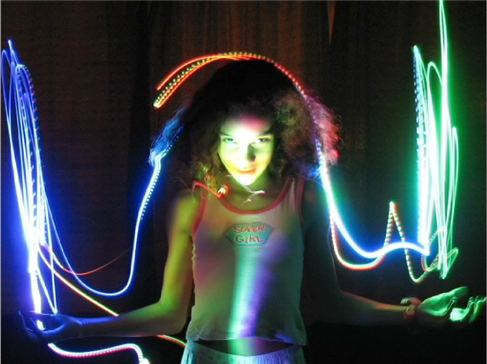
In the same token decreasing shutter speed helps increase the quality of the photo. Another great advantage of decreasing shutter speed is it allows for great motion effects in the final image. A technique known as “light painting” has become increasingly popular. Setting the camera on an very low shutter speed at a very low light, Photographers shoot the photo then use a small LED type light and move the light to create effects in the photo. The low shutter speed allows the film or CCD grid the exposure time to capture the moving light.
See sample of light painting.

http://michael.aivaliotis.com/wp-content/uploads/1.png


SWEET VIDEO of light painting:


Resources:
AIO Lecture Week 2
http://www.diyphotography.net/painting_with_light