4/21/11

Twin Towers By Christiaan Bekker

(TwinTowers Painting by Christiaan Bekker – TwinTowers, 2011)

In the painting title “Twin Towers by Christiaan Bekker” the artist fills the canvas with exquisite detail of the attack on the United States on September 11th 2001 (TwinTowers Painting by Christiaan Bekker – TwinTowers, 2011).  This day marked the birth of America’s “War on Terror”. Bekker displays the horror of the tragedy, the pure evil of the enemy, the destruction and devastation left behind and the hope created by a free nation looking forward of.

In my initial look at Bekkers oil painting my eye was quickly drawn to the statue of liberty crying. Her mouth wide open, eyes clinched shut as she tears her garment and exposes her heart, which is a burning American flag. This imagery alone conveys the oppressing sadness of this event. 

Above lady liberty we see the twin towers backed by darkness or in my opinion smoke, We see the artist has slipped in a few more details here as we see the clouds next to the top of the tower appear to have evil eyes looking at the towers and lower we see two giant hands with claws gripping the tower.  The artist wants us to see the evil intent of those how took the lives of many innocent Americans that day.

In the lower right hand corner we see the devastation of the event. Tangled metal, smoke and rubble. The artist pays tribute to those who fought to save lives with is including of the somber looking firefighters. He also pays respects to those who lost their lives in the event as the firefighters are lowering the flag to half mass.
While 911 was a day of horrible destruction and sadness, many clung to hope. I believe this is displayed in the top right corner where we see the sun and the firefighter pointing on to the US flag, which appears to be held by many. I think this shows our hope in our country and its freedom. 

Other more subtle items Bekker added to this piece are the tail of the American Airlines airplane. This reminds us of those hostages and the terror that was experienced before they collided with the towers. We also see a small section of the pentagon below the towers, to remind “At 9:43 a.m., a third passenger plane crashed into the Pentagon” ( September 11th, 2011). Finally, we see the bald eagle in the center. I believe this is symbolic to show that even when we are attacked we are a strong nation that comes together.

Works Cited:
"September 11th." Digital History. Web. 14 Apr. 2011. .

"TwinTowers Painting by Christiaan Bekker - TwinTowers Fine Art Prints and Posters for Sale." Fine Art - Art Prints - Fine 

 Art Prints - Greeting Cards - Posters - Originals - Buy Art Online - Sell Art Online. Web. 14 Apr. 2011. .

Mulberry Bend VS Monadock Building

QUESTION:
Photographing American Architecture


The rise of industrialism and the accumulation of wealth and labor in major U.S. cities may have led to the development of the skyscraper, a simple and functional type of architecture that was distinctively American. At the same time that the monumental buildings discussed in chapter five of your text , were being constructed to accommodate the commercial needs of large cities, there were also squalid tenement buildings that were the focus of the documentary photography of Jacob Riis. The image available at the following link depicts a neighborhood in the lower east side of New York that housed many of the European immigrants that flocked to the U.S. at the end of the nineteenth century:


Jacob Riis, Mulberry Bend, 1896
Compare the image of tenement buildings with those of the skyscrapers found in your book. What are the different messages being conveyed by these images? How do the photographers compose the images to address the different functions (public v. private) of these structures?


     (Candida Martinelli's Italophile Site, 2011)                                    (Google Images, 2011)


An a initial response in viewing the photo of Mulberry bend and the photograph of the Monadnock Building located in Chicago, IL, could be misconstrued as a different time period. We see crowded streets full of people walking and horse drawn carriages and carts in Jacob Riis’s photo. The streetcars and automobiles in the photograph of the Chicago skyscraper designed by Burnham and Root could be misleading in the comparison of these two photographs.

The major difference I see first hand is that in the Mulberry Bend photo the streets are very crowded and busy with excitement. In viewing the photo of Jacob Riis, we see the area is not glorified in anyway. Riis actually had an office located in Mulberry bend where he worked writing articles. He would daily journey through this cramped dirty area and see the quality of life for the inhabitance of this neighborhood were quite inadequate. In his writings, Jacob Riis was noted for how he “emphasized the humanity of the tenement population” (Documenting "The Other Half", 2011). We can see he also uses a similar technique in his photography. These structures located in the poorer areas on the lower East side of New York City are between three and five stories high and have rickety fire escapes and the littered street also is a visual indicator this area is not well taken care of. 

In the photo of the Monadnock Building we see a different story.  There is hardly any activity in the street below. Given that this structure is a first class office complex, we could guess the photo is taken on a weekend when workers are not around. A streetcar and a few automobiles give us the idea that transportation is needed to bring individuals to this structure from the suburbs. The design is simple with it clean lines and sublet curve showing more modern or contemporary feel on the exterior. We don’t see shutters around the windows as we did in the Mulberry Bend neighborhood. The feel created by the intimidating structure is power. This structure gives a greater sense of security and success. The slightly flared base of the structure helps us verify the building materials. “The brick walls still serve as supportive elements for the sixteen stories and are 17 feet thick at the base” (Pohl , 2001).  The size, clean lines, and height grant a confident appearance to the Monadnock Building

Works Cited:
"Candida Martinelli's Italophile Site(Immigrants NY 1890)." Candida Martinelli's Italophile Site (Italian Culture,links,free Ebooks). Web. 19 Apr. 2011. .

"Documenting "The Other Half": The Social Reform Photography of Jacob Riis and Lewis Hine." American Studies @ The University of Virginia. Web. 19 Apr. 2011. .


"Google Images." Google. Web. 19 Apr. 2011. .
Pohl, Frances K. Framing America: a Social History of American Art. New York, NY: Thames & Hudson, 2002. 290. Print.

Mary Cassatt VS Kenyon Cox

QUESTION:
The painter Mary Cassatt is often discussed as an American artist who, at the end of the nineteenth century, became intimately involved with the European Impressionists and strongly recommended them to American collectors. Her work often focuses on the depiction of informal domestic life. Compare the domestic scene featured in her Mother and Child of 1905 with the idyllic scene depicted in Kenyon Cox’s Eclogue, from 1890. What are the differences in the themes of these paintings? How does the choice of styles — Impressionism by Cassatt and Realism by Cox — fit with the content of each painting? How do you think the gender of the painters informs their choice of themes and treatments?
 
Mary Cassatt chooses a more serious subject matter in her painting “Mother and Child”. Cassatt was known for showing this type of instructional task oriented nurturing of women as it was considered their role. This is also reinforced as both subjects in the portrait are not smiling, but rather have more of a somber gaze. She also is committed to displaying the social expectation of women in society, but painting scenes of standard female behavior. Her commitment to her impressionistic style creates an interesting contrast to her conservative social view. The color pallet creates a rather flat background and allows the artist to bring the subject forward with the lighter tones. The use of the mirrors and created reflections also aid in creating greater dimension in the piece. Kenyon Cox is a great contrast to Mary Cassatt. One of the biggest issues is subject matter. Cox and the exposure to “the Aesthetic Movement of the 1870’s and 1880’s in Europe” had drawn his attention to study and paint female nudes. Americans at this time did not paint nude subjects (Pohl, 2002). He also was encouraged not just to paint what he saw, but create am emotional reaction to his still life. It is interesting that Cox paints in a realistic style when he is working more toward an emotional response. 

In Coxes, “Eclogue” a cluster of nude female figures has been gathered on the right portion of the canvas, which was considered an inappropriate sexual overtone at this time. Cox has attempted to create more youthful and innocent look to the figures to remove the erotic feel created by the revealed flesh of the figures. A male figure is seen entering the scene from the left walking toward the women “confirming the purpose of this display of female flesh” (Pohl, 2002). 

Cassatt and Cox are similar in the fact that they both choose to paint women as their subject matter. However, Cassatt places “ her women are often engaged in a particular domestic activity, caring for children” while Cox paints a scene of erotic emotional responses. (Pohl, 2002). They both choose to paint in styles that in my opinion seen to contrast their intention of their piece. In this case both paintings do reveal nudity, but Cassatt defiantly has her subject in context of innocence.

Mother and Child
(Art 6 Lecture 18, 2001)
Title: Mother and Child
Date: 1905
Artist:Mary Cassatt

Medium: oil on canvas
Size: 36 1/4 x 29 in.


(Kenyon Cox, 2011)
Title: An Eclogue
Date: 1890
Artist: Kenyon Cox

Medium: oil on canvas
Size: 48 1/4 x 60 1/2 in.


Work Cited
"Art 6 Lecture 18." Welcome to the Slide Projector an Instructional Website for Denise Johnson's Art History Students. Web. 19 Apr. 2011. .

"Kenyon Cox, Eclogue, 1890." Beautiful Century. Web. 19 Apr. 2011. .
Pohl, Frances K. Framing America: a Social History of American Art. New York, NY: Thames & Hudson, 2002. 270-271, 299. Print.

The Bradbury Building Contrast Interior and Exterior

The Bradbury Building:

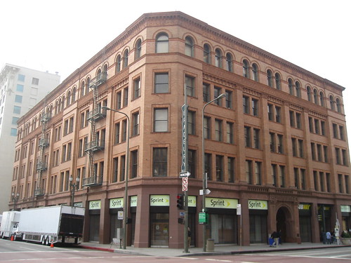
The Bradbury Building was built between 1889 and 1893. It is a commercial office building located in Los Angeles, California. The urban structure has a unique blend of style. “Depending on the architect, historian, or other expert you ask, the Bradbury Building's exterior façade might be described as Italian Renaissance Revival, Romanesque, or (no kidding) Eclectic Victorian Pre-Modern” (Jay, 2011). The relatively simple exterior design raises 5 stories and features a mix of sandstone, terra cotta panels and dressed brick masonry. Decorative elements on the exterior of the structure consist of stringcourse, design of grouping rectangles and a strong sense of line, decoration under the eves, double hung windows on the first 4 stories and on the fifth floor the windows are arcuated or have a structural arch. These subtle details provide a very uniform symmetrical curb appeal that does not make this building cry out great significance from its neighboring buildings.
A harsh contrast is apparent when moving to the interior design of the building. The interior features magnificent attention to details like, “ornamental cast iron, rare marble, glazed brick, polished wood, and imported tile rising majestically to a towering skylight” (Jay, 2011). The skylight is one of the main features in the court as it floods the open 5-story cathedral with vibrant natural light. As the day progresses the lighting in the court changes, causing unique shifting shadows and shapes. “The ornate wrought iron railings”, projecting stairs and hydraulic elevators are other elements that reveal a very unique look creating an “illusion of Babylon's hanging gardens” (Jay, 2011). The elevators are showcased as they are an open cage style revealing intricate detail for the functioning pulleys and weights as well as the open structure which is all completely exposed by the large main skylight. The tile floors brought in from Mexico and marble staircase from Belgium complete the design of this extremely unique and detailed interior.

Exterior View:

https://blogger.googleusercontent.com/img/b/R29vZ2xl/AVvXsEiWOTrleRkjy46kvVHLiqBkp8LkudC43yeUgxDzjqEaDteiljSgKbMwXhvu2meZh7DT9ifJpygpjBOwh7PMHKD59ZibZXefYd760cf4cKM91v2ydc_PggBBGYF_8S3YcIveO7M-rgjceHQ/s1600/Bradbury+Building%252C+Los+Angeles+-+en.wikipedia.jpg

 (Downtown with Kids: Bradbury Building & Grand Central Market, 2011)

Interior Views:

http://www.greatbuildings.com/cgi-bin/gbi.cgi/Bradbury_Building.html/cid_1160284173_Bradbury_Building_04.html
(Bradbury Building - George H. Wyman - Great Buildings Online, 2011)

http://www.greatbuildings.com/cgi-bin/gbi.cgi/Bradbury_Building.html/cid_3118228.html
 (Bradbury Building - George H. Wyman - Great Buildings Online, 2011)
 Bradbury Building - 'Blade Runner' movie location :: Downtown Los Angeles
http://www.you-are-here.com/broadway/bradbury_building.html
(Bradbury Building - Blade Runner Movie Location - Broadway Los Angeles, 2011)
Very Unique interactive interior view:
http://www.360cities.net/image/the-bradbury-building#925.94,13.15,70.0

Works Cited:
"Bradbury Building - Blade Runner Movie Location - Broadway Los Angeles." Los Angeles Modern Architecture Building History. Web. 21 Apr. 2011. .
 
"Bradbury Building - George H. Wyman - Great Buildings Online." Architecture Design Architectural Images History Models and More - ArchitectureWeek Great Buildings. Web. 20 Apr. 2011. .

"Downtown with Kids: Bradbury Building & Grand Central Market." Experiencing Los Angeles. Web. 21 Apr. 2011. .


Jay, Erik. "Bunker Hill Magazine » The Beat » The Bradbury Building." Bunker Hill Magazine - The Magazine For Downtown Los Angeles. Web. 20 Apr. 2011. .

4/13/11

Download FREE HD 1080 videos!

Get way to get HD videos downloaded from youtube!

1. Go to youtube.com and find type any topic in the search bar and add "HD"
2. Select a video that has the HD logo. 
 3. The page will load and you go to the URL

4. Type In "keep-" after "www." and before "youtube.com/...."

5. Welcome to KeepTube.


 6. Select what you would like to download. EVEN 1080!


ENJOY! 


3/24/11

Know Your Software - Efficient Design

Understanding how to use software: In today's technical society software is an essential tool of our trade. Understanding the capabilities of software and the advantages of one over the other and the  techniques used in the professional world, will maximize the power of software tools. Have an expert understanding of how essential software will enable you to faster and more efficiently execute concepts.

Media Variety - Graphic Communication

Working with a variety of media: Experienced graphic designers utilize an array of vehicles communicate concepts. A variety of vehicles and formats, AKA, corporate identity, web design, publication design, advertising, collateral materials, presentation materials, and much offers unique advantages over a single media source. Knowledge and experience in a variety of formats is essential in effective communication.

Conceptualizing: Graphic Communication

Conceptualizing:  Graphic design is a solution to business-communication problems. Designers are often given the responsibility of creating or building a company’s vision into a tangible, visual, written form.  The end result must clearly and appropriately communicate to a targeted audience.  Key to success is a grounded understanding the company, their competition, and their audience.