5/22/11

SWF File Format


Using an “Adobe Flash Player and Adobe Air Software” SWF files carry text, videos, vector graphics, and sound to millions viewers over the world wide web (SWF Technology Center, 2011).  It was designed specifically to “deliver graphics and animation over the Internet” (A Concise Guide to the SWF File Format, 2011). With a high compatibility rate of  “ over 98%” with web enable desktop computers, and over “800 million” personal handheld devices, the SWF file format has proved to be a very efficient an effective way to exchange this binary data (SWF Technology Center, 2011).

While the format is extremely useful for displaying the binary information, SWF does not offer editing capabilities, which forces creators and editors to keep the original document in a different format. At the same time, the inability to edit SWF files, serves somewhat as security for the files that have been created.

The format was created with a handful of key goals in mind. The creators knew the importance of having a file created primarily for on-screen display. The on-screen display would then need to offer “fast rendering to a bitmap of any color format, animation and interactive buttons” (A Concise Guide to the SWF File Format, 2011). It also needed to be expandable so it could easily evolve with technology and demand, as well as, maintain compatibility. There was careful consideration placed in the ability to have files compressed for quick loading regardless of the speed, and bandwidth, as well as, then ensure high quality of the viewed information. Having files that were no longer dependent on other external source files was also very important. This removed the concern for linking external files like fonts, source graphics, videos or even sound. Everything would be contained with in the SWF file. Finally the other area development considered is how the file would interact with different sized displays. With continually changing resolutions, screen sizes and shapes it was important to make the file format scalable.


Works Cited.

"A Concise Guide to the SWF File Format." The Labs: Homepage. Web. 22 May 2011. .

"SWF Technology Center | Adobe Developer Connection." Adobe. Web. 22 May 2011. .

5/6/11

Lewis W. Hine - Men Working on Skyscrapers

Objective: Select an image that you consider to be representative of today's documentary photography and that resonates with the documentary examples:

Workers on Empire State building
(NYPL Digital Gallery, 2011)
Title: Rivetting on the dome, a quarter mile up
Artist: Lewis W. Hine
Date: 1931
Location: Rochester, NY
Medium: Photography
“Lewis W. Hine. Rivetting on the dome, a quarter mile up during construction on the Empire state Building in New York City 1931 Photograph George Eastman House, Rochester; New York” (Pohl, 2002).
  

(Working on Skyscrapers | Aashish Puniany, 2011)
Title: Working on Skyscrapers
Artist: Unknown/Aashish Puniany
Date: Unknown
Location: Indonesia
Medium: Photography

In studying the images in the book I was very drawn to the work of Lewis W. Hine.  In his “Hine. Rivetting on the dome, a quarter mile up” I was quite amazed at the angle of the shot. The photographer is actually higher than the workers. The viewer normally would see the large towering buildings above them, not as small distant shapes below. The dark images of the men and structure contrasting the lighter city really show the viewer how far below the city is. This concept is very impressive totally captures how dangerous the condition is for the men working.  His title fills in some questions a view might have. First of what is, how high are these men, and the second is what are they doing.

It was difficult to find a modern version of this today with so much “red tape” and liability issues. Most photographs I found were stock images that were save and shot from the bottom of the structure with a large lens. In my mind that is a completely different photo. I finally found some photos that are quite similar to what Hine is doing in his. On Aashish Puniany’s blog, he features a small series of photos very similar to Lewis W. Hine of men working very high up on a building over looking the city below. Aashish Puniany also uses black and white photos like Hine, which creates a dynamic contrast, as he too shows his foreground darker and distant city below lighter.  His angle of his subject is not quite as drastic as Hine, but the photographs are still taken slightly above the subject to reveal they breath-taking height. A few of his photos defiantly highlight the lack of safety and danger of what these workers are doing. 

Works Cited:

"NYPL Digital Gallery | Detail." NYPL Digital Gallery | Home. Web. 05 May 2011. .

Pohl, Frances K. Framing America: a Social History of American Art. New York, NY: Thames & Hudson, 2002. Print.

" Working on Skyscrapers | Aashish Puniany." Images, Videos, Websites and Many More. Web. 05 May 2011. .

5/3/11

Wasteland - Vik Muniz - Murals Out of Waste

The other night I saw something I found to be most interesting though as a new technique for murals. It was a documentary on PBS about the artist Vik Muniz and how he is creating huge murals out of trash. I think the film is called "Wasteland". Check out this piece below from www.wastelandmovie.com

Allie Mae Burroughs, Wife of a Cotton Sharecropper- Cirtique

QUESTION: Although documentary photography attempts to be impartial about the situation it records, there are aesthetic approaches taken by photographers that elicit a strong reaction from the viewer. Allie Mae Burroughs, Wife of a Cotton Sharecropper, Hale County Alabama, taken by Walker Evans that was made as part of a project that addressed the plight of migrant workers during the Great Depression. Consider his choice of setting, lighting, compositional arrangement, and title, among other strategies, to describe aspects of the Evans photograph that you think have been manipulated by the artist to produce an empathetic response from the viewer.

PM_fotografi2
(Uppsala Universitet, 2011)

Walker Evans has set up his photograph “Allie Mae Burroughs, Wife of a Cotton Sharecropper, Hale County Alabama,” beautifully. I would speculate that every technique used in this photo was used with the intention to reveal a simplistic way of life that has been very wearing. 

In first looking at the 3 main textures captured in the photo the viewer sees the rough wood grain of the backdrop, the detailed pattern material on Allie Mae’s blouse and the smooth texture of her skin. These three main textures create a great contrast. This contrast reveals a rough abrasive environment that this soft individual is surrounded by. The building is her environment, and it is rough and surrounds her every moment. Her blouse is her labor and tasks. She is very busy not having even a moment for herself. She has so much too do and barely enough time to do it. Her environment requires her labor. The third main texture is her skin. It is soft and smooth and is the only constant in the piece. We see how the skin is revealing wrinkles showing time and abuse from the environment and labor, but the skin is resilient against its opposition. 

The flat lighting creating little dimension, may lead the viewer to further speculate that the life of this migrant worker is very simple and monotonous. She works hard long hours day after day sticking to her routine. Her stark expression cues the viewer to know she is turning into a machine. She has been hardened, by life, extreme conditions and hard work. The wrinkles on her forehead help the viewer know she is less than happy about her current situation, but the gaze in her eyes show that she knows this is all she has. 

Work Cited:

"Uppsala Universitet - PM_fotografi2 - Mynewsdesk." News Releases Mynewsdesk - Search, Monitor, Publish and Share Press Releases. Web. 03 May 2011. .

Jackson Pollock Early VS Later Work - Is there a connection?

QUESTION: Jackson Pollock is known for his abstract work. Much of his career focused on the production of work that was meant to avoid illusionism. His early training, however, was based on a realistic approach to the representation of the artwork. Naked Man with Knife is an early piece by Pollock. Compare it to his Autumn Rhythm No. 30. Discuss similarities between the two works. In your opinion, has his early training influenced his later work? Justify your response.
    
(Pollock, 2011)   
  (Jackson Pollock, 2011)

At first glance Jackson Pollock’s Naked Man with Knife and Autumn Rhythm No. 30 do not appear to have many similarities at all. Overall the pieces are very different. In Naked Man with a Knife, His earlier work, he reveals the figure in more of a cubistic style, but non-the-less a figure is discernable as well as the knife. In Pollock’s later work, in this case Autumn Rhythm No. 30, there are no discernable figures in this piece.

Looking deeper into each of Pollock’s paintings the viewer begins to uncover subtle similarities. Each piece reveals great a sense of chaos, yet shows great balance and unity. Each piece also reveals an enormous feeling of energy and creates a unique affect to almost release internal aggression. One of the most obvious similarities between Pollock’s pieces is the circular swirling motion continually leading and guiding the viewer around each piece.  Both pieces also appear to use a more limited color pallet. While Nakade Man with Knife introduces reds, blues and yellows, the overall tone is more muted creating a more monochromatic effect. Autumn Rhythm No. 30 uses black, white and a tan color which also creates a very muted earth tone.

Both pieces have a very full visual plane, but Naked Man with Knife, does lead the viewer to focus on the knife. I believe among the chaos created in the piece the knife is revealed to be the focal point. The many faces and exaggerated figure leads me to believe Pollock is shows a battle within in this piece. In Autumn Rhythm No. 30 Pollock may also reveal a battle within, but does not have the piece establish any form of visual hierarchy. “There's no central point of focus, no hierarchy of elements in this allover composition in which every bit of the surface is equally significant” (Jackson Pollock, 2011).

In my opinion his early work did defiantly influence his later style. The swirling and circular motion is very apparent in both. I think in the beginning Pollock revealed more of what was behind his paintings. As time progressed Pollock was able to use a more expressive abstract style, but hold his core meaning on a more private personal level. I think he also grew to move away from a focal point, wanting his work to be viewed as an entire expression instead of focusing on just one area of the piece. His early work was needed, and necessary for him to be able to evolved to his later works.

Works Cited:
Pollock, Jackson (1912-1956) - 1938-40 Naked Man with Knife (Tate Gallery, London) | Flickr - Photo Sharing!" Welcome to Flickr - Photo Sharing. Web. 03 May 2011. .

"Jackson Pollock: Autumn Rhythm (Number 30) (57.92) | Heilbrunn Timeline of Art History | The Metropolitan Museum of Art." The Metropolitan Museum of Art, New York: Metmuseum.org. Web. 03 May 2011. .

4/27/11

Rufino Tamayo - America Mural (influenced by) Picasso - Guernia

OBJECTIVE: Select from the Internet an image of an American wall mural that you consider to be significant. Write an analysis contextualizing the content and style of the mural. Discuss how the site contributes to the meaning of the mural.

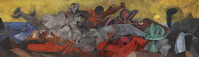
https://blogger.googleusercontent.com/img/b/R29vZ2xl/AVvXsEj1PDMutBD16PxsqLUpGjp05ssmxQAKa2kV9ey-g0gl4PuPsdnwC4Umrr1nKO7-rTMwXIUFCtpo8Eb0Pb5VlJYAbhOuJ-EB0Qlb_xLGsv38S18jqeVMRNSrkdW074unDjIQR6bpvHnrUAM/s1600/Rufino_Tamayo_America_lg2.jpg Title: America
Artist: Rufino Tamayo
Date: 1955
Intended Location: The Bank of the Southwest – Houston, TX 1955-1990
Current Location: Dallas Museum of Art – 1993 - current
Size: 13’2” x 45’10 3/8”
Medium: Vinylite
(Rufino Tamayo America Mural, 2011)


The very large “America” mural, painted by Rufino Tamayo in 1955, is known for being one of his most magnificent and impressive murals. Working alone in Mexico City for 5 months 7 days a week Tamayo was able to truly focus his efforts into his 13 by 45 foot colorful creation. When he had completed it he rolled it up and sent it to Houston, Texas to be displayed at the Bank of the Southwest.

What initially drew me to this mural was the use of the cubism style. According to my research, Tamayo has established a reputation in working in combination of cubism and futuristic styles, which are both apparent in this piece. This allegorical piece reveals the history and richness of America.

The main white figure in the center of the piece resembles a nude female in a reclining position. Surrounding the figure Tamayo has placed iconic natural resources to signal the abundance of the land. The viewer is reminded by “the fish, symbol of wealth of the sea; by a plant, symbol of the richness of the land; by an oil geyser and spring of water, symbols of our underground resources” (Rufino Tamayo America Mural, 2011). Tamayo also shows the unity and cultural influences in the different races with the white and red figures embracing in the top of the painting.

He chooses a vibrant pallet of reds, blues, yellows and greens, as well as, shades of gray. It is these decisions and understanding of color that have given Rufino Tamayo a reputation for color. “Today Tamayo is indeed regarded as one of the great colorists of the twentieth century” (Sotheby’s, 2011).

Tamayo reveals his discipline in study and understanding of his trade as he reveals the influences from Picasso’s Guernica, as well as, the emotion of the Mexican School. The piece “successfully asserts the timeless values of civilization” with his “Abstract Expressionist’s embrace of the primitive and the mythic” (Sotheby’s, 2011).

Title: Guernia
Artist: Pablo Picasso
Date: 1937
Size: 11’ x 25.6’
Medium: Oil Paint
(Guernica, 2011).


Works Cited:
"Guernica (painting): Facts, Discussion Forum, and Encyclopedia Article." AbsoluteAstronomy.com. Web. 27 Apr. 2011. .

"Rufino Tamayo America Mural." MID-CENTURIA : Art, Design and Decor from the Mid-Century and beyond. Web. 27 Apr. 2011. .

"Sotheby’s New York to Offer Important Mural by Rufino Tamayo, Entitled America." TheArtWolf.com - Art and the Art World. Web. 27 Apr. 2011. .

4/25/11

Architecture - Arts and Crafts

The Arts and Crafts movement evolved in opposition to the industrial revolution and specifically against the Victorian period. The Arts and Crafts style “ refers to the early 19th –century British and American movement to revive handicrafts” (Gray, 2011).  Those dedicated to the style wanted to see society move back to being more of a handmade society once again. The desire for a worker to have pride in his skill and craftsmanship fuelled the movement, as well as, the brutal “working conditions found in the factories” The industrial revolution opened the gates of mass production, but had not established a high level of quality control. “Manufactured goods were often poor in design and quality” (The Arts and Crafts Movement, 2011).
The Arts and Crafts style of architecture include both bungalow and craftsman homes. They were known for being easy to build and maintain, as well as, being affordable.  They were typically built with natural materials like wood, stone and brick. The furniture and light fixtures were custom and built in, which created great unity with the interior elements and structure. It also provides efficient uses of space. Arts and crafts used an open floor plan and typically featured a dominant fireplace in the main living space. The “fireplace was the symbol of family in the Arts and Crafts movement” and open floor plan revealed a rejection of the many small rooms commonly used in Victorian architecture (Gray, 2011).  The interior also many times had exposed beams.

The exterior of a typical arts and crafts style home would be identified with a porch with either square or round columns or a low-pitched roof. In most cases they also featured wide eaves. The underlying goal was to attempt to make the “structures become part of their settings by seamlessly integrating them with nature” (AIO, 2011).
See example below.
 
(D. L. James House, 2011)

Architect: Greene and Greene
Location:
Carmel Highlands, California
Date:
1918
Building Type:
house 
Materials:
native stone
Style:
Arts and Crafts


Works Cited:
AIO .American Art History | ART3010 UA.  Week 4 Arts and Crafts Movement, Web.
2
5 April 2011.


"D. L. James House - Greene and Greene - Great Buildings Online." Architecture Design Architectural Images History Models and More - ArchitectureWeek Great Buildings. Web. 25 Apr. 2011. .

Gray, Liz. "Arts and Crafts Architecture : HGTV FrontDoor Real Estate." HGTV FrontDoor Real Estate - Homes For Sale, Real Estate Listings Search. Web. 25 Apr. 2011. .

"The Arts and Crafts Movement." Art, Design, and Visual Thinking. Web. 25 Apr. 2011. .

Photography VS Painting - Edward Steichen, Grant Wood


 http://www.masters-of-photography.com/images/full/steichen/steichen_flatiron.jpg  http://www.artexpertswebsite.com/pages/artists/artists_l-z/wood/Wood_FallPlowing.jpg
 (Masters of Photography, 2011)              (Grant Wood, 2011) Today at first glance, we might question the efforts of Edward Steichen in his piece, The Flatiron, 1905. With the advances of Photography in the 21st century it is hard for us to imagine how difficult the equipment was to work with in this medium. Steichen shows his viewers that he not only knew how to use the equipment, but manipulate it and creates a powerful effect as he studied architecture and nature at twilight. Seeing the reflection of the landscape on the ground and the dreary sky leads me to think Steichen was attempting to create a great effect of a mist in is image. Using contrasting tones he creates dark silhouettes of branches, but then is able to create distance with a lighter shade on the architecture. His foreground is not exactly very visible as we are just able to see basic shape. His middle ground and background might bring about some controversy, as those like my self would call the background the brightest sections where nothing is visible and the middle ground is slightly out of focus, revealing the large structures. 

When contrasting piece Steichen’s photograph to is the Grant Wood painting, Fall Harvest great contrasts are revealed. In the painting the setting is completely different. Wood chooses to work on the rural landscape of a farm. In his piece the viewer gets a slight sense of depth as he has used perspective and created rolling hills that overlap the visual plane.  The most interesting difference is that the painting has much more clarity and information for the viewer in the represented distant areas than the photograph. The painting gives the viewer an illusion that they can actually see for miles. The photograph is completely different, as in the darker setting it would be impossible to see such a distance. Steichen does give the viewer a short sense of distance, but it appears to be very short. The color pallet Wood selected is also slightly different. While, both pieces have a warm tonal feel, Wood has added green hues giving his piece greater vibrancy. In my opinion Wood had done brought his viewers attention to the middle ground as Steichen has. The background is less in focus and lighter and does not have the contrasting value creating greater detail. The foreground is in focus, but is darker almost creating a base or foundation for the viewer to start with and be lead into the middle ground with the dark angled lines.


There are also similarities in these pieces. We see how both artists chose to work with a darker foreground and lighter background, which helps draw the viewer into the piece, in this case creates a sense of depth. Both also contrast nature with man-made structures. Both artists used nature to separate the viewer from the architecture as they have both placed the viewer in nature looking to structures. 

Knowing that both pieces are establishing the viewer in nature looking toward the architecture, I believe both paintings are for those not living in the cities. In both cases elements of nature have created a barrier and separated the viewer from the established structures. I find that as a way that each artist has addressed those that are not city dwellers as outsiders. Or beasts that lurk in the shadows.

Works Cited:
"Grant Wood. Authentication, Certificates of Authenticity and Expert Appraisals." Art 

Experts, Inc.: Authentication, Certificates of Authenticity and Expert Appraisals. Web. 25 Apr. 2011. .
Masters of Photography. Web. 25 Apr. 2011. .

Resources:
"Edward Steichen: The Flatiron (33.43.39) | Heilbrunn Timeline of Art History | The Metropolitan Museum of Art." The Metropolitan Museum of Art, New York: Metmuseum.org. Web. 25 Apr. 2011. .