6/30/10

Free Web Video Player and Play List

I have been looking for months for a FREE video play list and play that quickly can be placed into web sites. I have to say this is actually a bit more difficult to find than I would have though.

However, I have found a great site that makes this very easy.

http://embedr.com


I was looking for a site that would take the embed codes from like a vimeo or youtube and allow you to create a playlist and then post a player and play list on your site. This site does exactly that. and even give a pretty clean look.


Click on this image to see the actual player.

6/28/10

Digital Illustration - Production

OBJECTIVE:
Prepare imagery for proofing and/or final out putting at a service bureau or other supplier.


While I worked as Art Director at bookmasters, Inc., it was my job to make sure all artwork was ready for print. In some cases it was digital and in others it was offset. Either way many of the books we produced were for Pearson. They contained many graphs and charts that I created in illustrator.


I also was contracted to make some corrections to some package designs.

Proofs and Adjustments for Print.
Description: Take existing design make changes to text. Create new heart icon. Adjust die cut mask. Apply to 8 designs.

I also have done some basic posters that have been printed

Poster Promotion Piece for ClickaCoupon.com
Description: Create a poster to promote the video department at clickacoupon.com. Poster needs to have the same look and feel as the existing posters. Poster needs to be created for offset printing.

A lot of the freelance work done for Jimmy D Robinson was printed through Disc Makers and using their templates in illustrator to meet their specs with bleed and folds

Illustrator Set for Production
Description: Set up files for DiskMakers Production. Photography is provided. Apply photography to disc layout template and use layer styles to add color to enhance image. Apply text.

Digital Illustration - Applied

OBJECTIVE:
Apply digital illustrations to design formats and page layouts.

I have used Illustrator exclusively for page design.

Illustration Poster
Description: Created for cyclestrippers.com. Uses many photo references. Applied live trace techniques, pen tool drawing, Layer styles. Gradient mesh. Text.

Illustraitor Magazine Page Design
Description: Created a fully vector layout with vector graphics.

Illustrator Design with Raster Graphics


Program with bleed & asymmetrical fold.
Description: Program created in Illustrator using placed photography. Gradient panels are created and use layer styles to enhance photography and create interesting graphic effects. Text is applied.

Magazine Ad
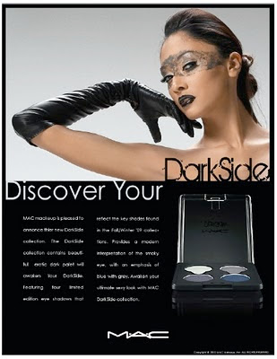
Description: Created placing 3 .jpg graphics into illustrator and applying appropriate designed type. Background color is set to show consistency throughout entire design.

Magazine Layout
Description. Created using a grid and applying 3 .jpg images. Pink panel applied to gun with layer style in illustrator. To create unity of feminine look throughout layout.

I even have a current client that sends me photos to enhance in illustrator with gradient panels and shapes and type for his dance music artwork.

Original Photo Left  ---  Enhanced Image Right

Enhanced by Illustrator.
Description: Client provided photography, which he requested, would be enhanced with shape, line text and gradient panels. Apply layer styles to create psychogenic and colorful graphics.

Digital Illustration - Conceptual Thinking

OBJECTIVE:
Develop conceptual thinking and translate ideas into digital illustrative form.

With Illustrator it is very easy to take creative thinking and translate it into expressive artwork and designs.

Description: Created a concept for “ The Art of Illusioneering” album for the band Beauty Strikes Back. Concept features lead singer holding a crystal ball, which illuminates his face and hand. The image is high contrast as the shadows fight the light from the crystal ball.

Description: Created a SWAG concept and created a mockup of product for promotional give away item. Created a visual mock up of SWAG item- tire pressure gauge from promotional item photograph. Created a Promotional item container – motorcycle tire – to contain the SWAG. Used photograph reference to created tire container.

Description: Create a SWAG item pin for the band Beauty Strikes Back. Pin should contain image of angry Cinderella type character stomping on the pumpkin to reflect the name of the band or “beauty striking back”.

Digital Illustration - Rendering

OBJECTIVE:
Explore and display the simplification of rendering techniques using vector-based applications.

Creating a sharp stylized looks is one of the greatest effects of illustrator. The simplified render can be very expressive and in some case subtle.
 Expressive Illustration

Description: The Gun Show: Created an expressive image for a single color illustration of muscles for silk screen tee shirt.


Description: CyberAnchor.net Created an expressive logo for hosting company cyber anchor using gradients and stylized illustration.

Subtle Effects Illustration

Description: Beauty Strikes Back: Created logo for band Beauty Strikes back creating a subtle effect of smoke, which gives an illusion of a
beautiful girl.

Description: Jellyfish: Created an illustration of jellyfish using layer styles and different.

Digital Illustration - Techniques

OBJECTIVE:
Display various drawing and rendering techniques using vector-based applications.

I have many different illustrations I have created from Illustrator. Many years ago I started with trying to make my illustrations as realistic as possible. Trying to find every shape and change in color in order to create the more realistic illustration possible.


Description: Find a photograph to use to create a digital illustration using only the pen tool.

Description: Using illustrator create a realistic illustration using the pen tool.


In recent years I have pulled away from the realism and worked more toward a stylized look.

Description: Using the pen tool create a stylized illustration from a photo reference.

Description: I found a dog reference and created it using the rectangle tool, circle tool and the star tool to make triangles. I then figured I would place the dog in an outdoor setting. I found a grass reference and created a blade of grass using the pen tool and then created a grass brush, which then I created a grass pattern from. I then found a cloud reference and made a cloud art brush and placed some clouds in the sky. I finally thought I should contain the wild dog with a fence so I created the fence using rectangle tool and star tool to make triangles. Then I created a splinter brush for the fence. Of course the splinter effect spilled over into the sky and grass. So I duplicated the fence merged the paths in pathfinder and created a clipping mask for the splinter effect.

Description: Using the pen tool create a limited color illustration capturing the gesture in the photo reference. Limit your shading to reveal base tone, highlight and shadow for a stylized effect.


I have also used techniques that take advantage of the “auto trace” features for the background of the image and then go in with the pen tool and create my own stylized illustration of the focused subject.

Illustration using auto trace feature for the background image and then going in and rendering greater detail in the subject to enhance and sharpen image.

Illustration Live Trace & Pen Tool to enhance highlight and shadow

Illustration using auto trace feature for the background image and then going in and rendering greater detail in the subject to enhance and sharpen image.

I have experience in applying gradients to manually.

Description: Created a simple illustration from reference material using gradient fills. Image was duplicated three times, flipped, and rotated to complete the composition.

Description: Created logo for Illusionist Adam Gerhart for his company “Real Magic” Wanted to incorporate his signature trick of the bending fork. Utilized Gradient fill.

I have also used the gradient mesh tool to enhance realism with highlight and shadow.

Description: Created a bottle with shadows and highlights using the gradient mesh tool.

Digital Illustration - Reasearch & Reference

OBJECTIVE:
Research and select appropriate reference material to be used in digital illustration:

I have had many years of experience in finding reference material. Finding references that are crisp and clear and are legal for use. In many cases it is best to take create your own reference materials so there will be no copyright issues in the future.
RESEARCH
REFERENCE

ILLUSTRATION

Description:
For this assignment I chose a photo I took this summer of my daughter (Berlyn) eating watermelon. I also chose an illustration from W K Kellogg (1916, 1910) J C Leyendecker – 022 as it has great detail and textures in the little girls hair. I felt I could utilize that technique as well as the multiple shades found in the skin. I have always thought and been told this image shows essence of summer. I don’t know if I was quite able to capture that in the black and white illustration.

6/18/10

Lable & Multiunit Carrier - Lorikeet

Project Overview:
Your project is to design labeling for a group of clear containers. Your labeling will be based on the product category you have already researched for your Product Profile. Then, for your next project you will design and construct the multiunit carrier that will house these containers, so planning is very important at this stage.

Concept:

The product is a pre mixed martini. It will have a front and back label with a cap wrapper. The front label is 6.75” x3” the back label is 6.72” x1.5” and the seal wrapper is 1”x4.5”. This product will come in a pack of 4 with an assortment of flavors. The product will be branded “Lorikeet”. A lorikeet is known for its bright vibrant colors, with this in mind I plan on having the beverage color reflect the name using bright colors for the different flavors.
The first thing the viewer will be drawn to is the Lorikeet perched on the rim of a martini glass. The glass is actually a die cut and reveals the clear bottle with the vibrant color of the drink. The color is reinforced by the flavor. The logo uses the eye of the Lorikeet for the ”o” showing unity with the logo and imagery.
The text included on the front label will be the logo, Flavor, Martini, Ready to serve, 375 ML (12.7 FL OZ) 20 Proof 10% ALC By VOL. The back label will include directions of how to serve. Nutritional information. Ingredients, Government Warning, Please Recycle, made with vodka, Barcode and Contact information. I also wanted to include a seal wrapper for the cap. It would have ready to serve and the warning again.


Thumbs:

Rough:

Tight Rough:

Rough Digital:
 Final Label:


Carrier Design:

Final

6/9/10

Paperboard Grades for Package Design

Paperboard Grades:

(SBS) -Solid Bleached Sulfate

This bleached paperboard or solid bleached sulfate (SBS) is a premium paperboard grade that is produced from a furnish containing at least 80 percent virgin bleached wood pulp. Most bleached paperboard is coated with a thin layer of kaolin clay to improve its printing surface, and it may be coated with polyethylene (PE) resin for wet strength food packaging. SBS is most popular in the United States.

Major market segments that use SBS:

* Medical packaging
* Milk and juice gable top cartons
* Aseptic drink boxes
* Cosmetic and perfume packaging
* Frozen food packaging
* Candy boxes

Coated Unbleached Kraft Paperboard (CUK)

Clay natural kraft (CNK®) or solid unbleached sulfate (SUS®) is a superior strength paperboard grade that is produced from a furnish containing at least 80 percent virgin unbleached, natural wood pulp. Most unbleached or natural kraft paperboard is coated with a thin layer of kaolin clay to improve its printing surface and may be also coated with polyethylene (PE) resin for wet strength food packaging.

Major market segments that use CUK:

* Frozen food packaging
* Milk cartons
* Pharmaceutical packaging

Recycled Paperboard

1. Uncoated Paperboard

Uncoated recycled paperboard, a multiply material, is produced from 100 percent recovered paper, collected from paper manufacturing and converting plants and post-consumer sources. It represents the single largest market for recovered paper in the United States. Some uncoated paperboard is produced with a top ply of white recovered fiber or is vat dyed for color.

Major market segments that use uncoated recycled paperboard:

* Shoeboxes
* Composite cans and fiber drums

2. Coated Paperboard

Coated recycled paperboard, a multiply material, is produced from 100 percent recovered paperboard just as uncoated paperboard is; however, it is typically coated with a thin layer of kaolin clay over a top ply of white recovered fiber to improve its printing surface.

Major market segments that use coated recycled paperboard:

* Soap and laundry detergent packaging
* Cookie and cracker packaging
* Paper goods packaging (facial tissue and napkins)
* Cake mix packaging
* Cereal boxes
* Other dry food packaging


SOURCE:
The Art Institute of Pittsburgh - Online Division
Packaging Graphics G332 XB Week 5 

6/7/10

Photoshop CS4 Clipping Mask

Making a Clipping Mask is pretty easy with Photoshop CS4.

First make a selection of the area you would like to mask. Using your selection tool of choice for this post I will be using the Quick Selection tool.

Using this tool I quickly select the image of the bird.


I then open the Paths tab and click on the corner menu and select “Make Working Path”


I then choose 2.0 tolerance ( you may choose differently) and click ok

The on the paths menu you choose
Save Path – Name the path whatever or use the default – Click ok


Then on the menu you choose
Clipping path – Make sure you are clipping the correct path in the dialogue and click ok

You now have a clipping path!