A great technique to identify contrast issue as mentioned in this weeks lecture is switching the image to gray-scale and checking the overall range of gray-scale value. Then after identifying areas that need adjustment using the history pallet or undo command, or if the image did not have previous edits before the color change using a “Revert” command would also restore the file to its original state.
I then suggest using the adjustment layers. When I first started using Photoshop we never had these. I would always keep a copy of the original image in a separate layer in case I needed to go back. With adjustment layers this step is not needed. The first tool I always use to adjust contrast is “Levels”. In my experience taking a quick look at the curve will explain most contrast issues. I then simply correct it by adjusting the arrows on the curve.
Another tool I use quite often in adjusting contrast is the curves tool. I also use this tool with an adjustment layer as well. The curves tool has quite a bit more control than the levels adjustment and allows for a more involved correction. One of the main times I go to the curves tool is when I am adjusting an image and removing a colorcast. I great starting point for this adjustment is to click on the mid-tone eyedropper and find a middle gray tone in your image and select it. This may correct the cast, or at least give a great starting point to make further adjustments too.
Resources:
AIO Lecture
Showing posts with label Color Management. Show all posts
Showing posts with label Color Management. Show all posts
11/5/10
10/18/10
Emotional Impact of Color
QUESTION: "The impact of color on the emotional feel of a piece can add significantly to the message of the illustration." Explain by giving examples.
Color is a key component in an illustration in aiding the viewer in establishing the correct emotion. A very simple example is the use of complementary colors like red and green. This combination in most situations in the American culture makes people think of Christmas. While looking at the color green alone the viewer may assume growth, fresh, go or safe, it does also have some negative associations like greed and jealousy. It is amazing how adding the complementary color of green to red has created this holiday brand color.

By itself color red has other emotional effects on people like the association of heat, fire, power, it has also been associated with a signal to stop. The color red is even used to represent love and passion.

Pink is another color that has been a way to establish femininity. Most children wearing pink clothing are assumed to be female. Also consider how the popular retailer Victoria Secret has taken the color pink and branded their store with this color. Even the Breast Cancer Awareness has adopted this color for their movement.


Some color combinations even can effect how the piece is visually viewed. For example Warm color combinations have a tendency to appear to move in the direction of the observers and seem to be in a closer proximity. To push away from the viewer one could chose to use a cool color combination, which would will aid in the scene pulling back from the viewer. In other words, warm colors will appear to be larger than cool colors.


One key thing to keep in mind about color is a viewer may respond differently to color depending on their culture and background. While it may seem that response to color could be a natural response, it is really based on conditioned influence or association of a specific culture. An example of this is how in the Chinese culture the color red may be associated with luck, or celebration, but in South Africa it is the color of death or mourning.
Resources:
AIO Lecture
http://www.color-wheel-pro.com/color-meaning.html
http://www.writedesignonline.com/resources/design/rules/color.html
http://webdesign.about.com/od/color/a/bl_colorculture.htm
Color is a key component in an illustration in aiding the viewer in establishing the correct emotion. A very simple example is the use of complementary colors like red and green. This combination in most situations in the American culture makes people think of Christmas. While looking at the color green alone the viewer may assume growth, fresh, go or safe, it does also have some negative associations like greed and jealousy. It is amazing how adding the complementary color of green to red has created this holiday brand color.

By itself color red has other emotional effects on people like the association of heat, fire, power, it has also been associated with a signal to stop. The color red is even used to represent love and passion.

Pink is another color that has been a way to establish femininity. Most children wearing pink clothing are assumed to be female. Also consider how the popular retailer Victoria Secret has taken the color pink and branded their store with this color. Even the Breast Cancer Awareness has adopted this color for their movement.


Some color combinations even can effect how the piece is visually viewed. For example Warm color combinations have a tendency to appear to move in the direction of the observers and seem to be in a closer proximity. To push away from the viewer one could chose to use a cool color combination, which would will aid in the scene pulling back from the viewer. In other words, warm colors will appear to be larger than cool colors.

One key thing to keep in mind about color is a viewer may respond differently to color depending on their culture and background. While it may seem that response to color could be a natural response, it is really based on conditioned influence or association of a specific culture. An example of this is how in the Chinese culture the color red may be associated with luck, or celebration, but in South Africa it is the color of death or mourning.
Resources:
AIO Lecture
http://www.color-wheel-pro.com/color-meaning.html
http://www.writedesignonline.com/resources/design/rules/color.html
http://webdesign.about.com/od/color/a/bl_colorculture.htm

5/23/10
Digial Printing - Going Gray Illustraitor CS 4
Ok Ok, I know better but I figured since I was just printing at Office Max on their digital printer I would set up my Adobe Illustrator CS4 file as RGB. But when they guy went to print it came out as gray scale? We were both stumped. I said well it is RGB, and he and i agreed it shouldn't really effect it since it was digital and it switches it on the fly. But once the fly was switched to CMYK the color came out in the print.
Another interesting thing that I found with this little experiment. It seemed like when I tried to create a PDF from the printer when the file was in RGB it would export in grayscale? I had never heard of this before.
Another interesting thing that I found with this little experiment. It seemed like when I tried to create a PDF from the printer when the file was in RGB it would export in grayscale? I had never heard of this before.
4/27/10
Trapping - Chokes & Spreads
Trapping is simply adjusting the lighter colors to spread into the darker colors to ensure there will not be any gaps or misprints due to human error or poorly registered paper. By overlapping the colors shared boundaries, it ensures proper printing in the event of misregistration. Seeing as most printing is done on white stock, if an object is not properly trapped the print could result in revealing the stock paper there the objects are not perfectly aligned.
Using chokes and spreads proper printing can be accomplished. A choke is applied if an item is adjusted to reduce the shared border. For example, if there is a 5mm knockout for a gray circle to fit in a larger black square, the knockout is reduced to 4mm adjusting the black square to choke the gray circle. A spread would be the opposite effect as it would be an adjustment where one of the objects is enlarged into the shared border of another. It would be making the gray circle larger to a 6mm diameter to accomplish the trap.
Resources:
Frank J, Romano. Pocket Guide to Digital Prepress. Clifton Park, NY: Delmar, Cengage Learning, 1996.
4/25/10
What is line ruling?
What is line ruling?
Line ruling refers to resolution or lpi (lines per inch). It relates to the amount of halftone dots printed based on the specified measurement. The example in the lecture states, “100 lpi means 100 lines of dots per linear inch and 10,000 halftone dots per square inch. Similarly, a 150 lpi screen ruling will have 22,500 halftone dots per square inch.” (Foundations of Electronic Production G322 UG, 2).
The different resolutions are necessary for printing for a few different reasons. A newspaper for example has a rather low resolution ranging from 85lpi to 150lpi. Printing a newspaper at this lower resolution compared to a magazine, which ranges from 135lpi to 175lpi, the print will be a lower quality. With larger dots used the print will not be as accurate in the reproduction as it would be at a higher lpi. Using a lower resolution will also increase the processing speed in production by reducing the size of the file, but keep in mind a lower resolution will limit the number of grays available.
The resolution on a monitor is different as the standard resolution is at 72 pixels per inch (ppi). In print the resolution needs to be higher to not appear fuzzy or pixilated.
Work cited:
Foundations of Electronic Production G322 UG . Week Two Online Lecture :Resolution 4 2010
Resources
AIO Lecture Week 2
Pocket Guide to Digital Prepress
Line ruling refers to resolution or lpi (lines per inch). It relates to the amount of halftone dots printed based on the specified measurement. The example in the lecture states, “100 lpi means 100 lines of dots per linear inch and 10,000 halftone dots per square inch. Similarly, a 150 lpi screen ruling will have 22,500 halftone dots per square inch.” (Foundations of Electronic Production G322 UG, 2).
The different resolutions are necessary for printing for a few different reasons. A newspaper for example has a rather low resolution ranging from 85lpi to 150lpi. Printing a newspaper at this lower resolution compared to a magazine, which ranges from 135lpi to 175lpi, the print will be a lower quality. With larger dots used the print will not be as accurate in the reproduction as it would be at a higher lpi. Using a lower resolution will also increase the processing speed in production by reducing the size of the file, but keep in mind a lower resolution will limit the number of grays available.
The resolution on a monitor is different as the standard resolution is at 72 pixels per inch (ppi). In print the resolution needs to be higher to not appear fuzzy or pixilated.
Work cited:
Foundations of Electronic Production G322 UG . Week Two Online Lecture :Resolution 4 2010
Resources
AIO Lecture Week 2
Pocket Guide to Digital Prepress
Halftone Printing
When we view an image on a monitor or on a television screen, we see the image in pixels. However, we use digital halftone to print the same image on a printing press. Explain why we need two different approaches for reproducing the same digital image.
There are two different approaches to produce the same digital when you consider viewing an electronic sample on a monitor or television screen verses a printed sample on a printing press. With the monitor, removing or adding light changes value. The major issue with printing lies with the limitations of the ink. Consider painting for a minute. Painting is similar to ink as it uses pigments for a subtractive color system. If you needed a lighter shade of black you would add white paint to black to change the shade. In printing there is not ink “white ink” to add to black or any color for that matter to change the value. To print a photograph for example you need shades of gray. With printing, the ink is on or off. This creates a big issue when trying to reproduce gradients, and any other value other than solid black or the absence of ink “white”. To achieve this type of effect printers use a halftone system where an image is converted into a “pattern of very small dots of varying sizes with equals spacing between the dot centers” (Romano, 212). The dots vary in size and therefore create an optical illusion of different values to create the needed shades.
Work Cited:
Frank J, Romano. Pocket Guide to Digital Prepress. Clifton Park, NY: Delmar, Cengage Learning, 1996.
Resources
AIO Lecture Week 2
Pocket Guide to Digital Prepress.
There are two different approaches to produce the same digital when you consider viewing an electronic sample on a monitor or television screen verses a printed sample on a printing press. With the monitor, removing or adding light changes value. The major issue with printing lies with the limitations of the ink. Consider painting for a minute. Painting is similar to ink as it uses pigments for a subtractive color system. If you needed a lighter shade of black you would add white paint to black to change the shade. In printing there is not ink “white ink” to add to black or any color for that matter to change the value. To print a photograph for example you need shades of gray. With printing, the ink is on or off. This creates a big issue when trying to reproduce gradients, and any other value other than solid black or the absence of ink “white”. To achieve this type of effect printers use a halftone system where an image is converted into a “pattern of very small dots of varying sizes with equals spacing between the dot centers” (Romano, 212). The dots vary in size and therefore create an optical illusion of different values to create the needed shades.
Work Cited:
Frank J, Romano. Pocket Guide to Digital Prepress. Clifton Park, NY: Delmar, Cengage Learning, 1996.
Resources
AIO Lecture Week 2
Pocket Guide to Digital Prepress.
Neutral or Gray Balance
Explain the purposes of gray balance and indicate why the black ink is not used for gray balance.
Black ink cannot be used in reproducing neutral or gray areas because they need to be neutral to look like the original which is a created by combining equal amounts of red, green and blue. When using process color for reproduction on white paper it is very apparent when there is any imbalance. The printer uses a balanced combination to cyan, magenta, and yellow to create an accurate neutral in the reproduction. Using black in this reproduction would not create an accurate neutral. Keeping in mind that the impurities in ink, and the fact that they do not reflect equal amounts, the amount of each ink is shifted to create neutral results.
With a combination of equal amounts of red, green and blue light a neutral or gray can also be produced. The light will be diffused through or reflected off the object in equal amounts of red, green and blue and it will look neutral.
Resources:
AIO Lecture
Black ink cannot be used in reproducing neutral or gray areas because they need to be neutral to look like the original which is a created by combining equal amounts of red, green and blue. When using process color for reproduction on white paper it is very apparent when there is any imbalance. The printer uses a balanced combination to cyan, magenta, and yellow to create an accurate neutral in the reproduction. Using black in this reproduction would not create an accurate neutral. Keeping in mind that the impurities in ink, and the fact that they do not reflect equal amounts, the amount of each ink is shifted to create neutral results.
With a combination of equal amounts of red, green and blue light a neutral or gray can also be produced. The light will be diffused through or reflected off the object in equal amounts of red, green and blue and it will look neutral.
Resources:
AIO Lecture
Color Correction - Photoshop
There are quite a number of tools for color correction in Photoshop. Each of these tools have different effects on the image. Name at least three of these tools, along with an explanation of how these tools affect the image.
Layer Styles:
I prefer to use a color layer and layer style to change the color of an image. It works pretty well as you are not actually directly working on the image, but on a separate layer. I typically create a new layer add the color apply a mask and then change the layer style. Different layer styles do different things to the image when they are applied. When trying to change the color I would typically use the color layer style.
Adjusting the Hue:
Another easy way to adjust the color is using an adjustment layer and changing the hue. Once again I would create a mask and then go to the adjustments pallet and click on hue/saturation. Sliding the hue slider back and forth will give a rainbow of color options. At the sometime you may not be able to match a color you had in mind. For example, I have found I can’t create a Deep Dark Blue from an object that is currently red.
LAB & Levels or Curves:
Switching to LAB makes changing color through levels pretty simple. The color is only on the AB channels. Go to Image>Mode>Lab Color. Create a mask around the area you wish to adjust, then go to the adjustments pallet and choose levels or curves. Select either channel A or B to make adjustments from, jumping back and for the between the two to find the desired adjustment. Adjusting the lightness layer will make adjustments to the contrast in the image and remove the highlights and shadows.
All of these examples are great ways to make slight or major color adjustments to the image without directly changing the original. They all also will not change the contrast. The key in each example is having a good mask that will contain the adjustments to a specified area on the image.
Grayscale:
Another simple change of color is to completely remove it. Changing to Grayscale. Go to Image>Mode>Grayscale. This will completely remove the color information from the image. The image will no longer be a RGB or CMYK image.
Resources:
http://www.photoshoplab.com/change-your-car-color.html
http://www.accessmylibrary.com/coms2/summary_0286-698280_ITM
AIO Lecture Week 3
Layer Styles:
I prefer to use a color layer and layer style to change the color of an image. It works pretty well as you are not actually directly working on the image, but on a separate layer. I typically create a new layer add the color apply a mask and then change the layer style. Different layer styles do different things to the image when they are applied. When trying to change the color I would typically use the color layer style.
Adjusting the Hue:
Another easy way to adjust the color is using an adjustment layer and changing the hue. Once again I would create a mask and then go to the adjustments pallet and click on hue/saturation. Sliding the hue slider back and forth will give a rainbow of color options. At the sometime you may not be able to match a color you had in mind. For example, I have found I can’t create a Deep Dark Blue from an object that is currently red.
LAB & Levels or Curves:
Switching to LAB makes changing color through levels pretty simple. The color is only on the AB channels. Go to Image>Mode>Lab Color. Create a mask around the area you wish to adjust, then go to the adjustments pallet and choose levels or curves. Select either channel A or B to make adjustments from, jumping back and for the between the two to find the desired adjustment. Adjusting the lightness layer will make adjustments to the contrast in the image and remove the highlights and shadows.
All of these examples are great ways to make slight or major color adjustments to the image without directly changing the original. They all also will not change the contrast. The key in each example is having a good mask that will contain the adjustments to a specified area on the image.
Grayscale:
Another simple change of color is to completely remove it. Changing to Grayscale. Go to Image>Mode>Grayscale. This will completely remove the color information from the image. The image will no longer be a RGB or CMYK image.
Resources:
http://www.photoshoplab.com/change-your-car-color.html
http://www.accessmylibrary.com/coms2/summary_0286-698280_ITM
AIO Lecture Week 3
Contrast?
There are two distinctly different types of contrast that can be adjusted in an image for optimal reproduction. Differentiate between these two types of contrast and explain how and where these adjustments affect the image. What would be the proper Photoshop controls to use for tonal adjustment? Explain how they work.
Overall contrast relates to the image as a whole in analyzing the brightest whites composed of the smallest halftone dots and the darkest blacks composed of the largest halftone dots. The key is working toward accurate highlight and shadow density and the correct halftone dots dimension.
Contrast adjustment may very from image to image. It focuses on the mid tones keeping the highlight with the smallest dots and shadow with the largest. Adjustments are made by shifting the tone of the 50% dots.
A great tool in Photoshop for quick tonal adjustment is the brightness/contrast tool. It allows you to easily make quick adjustments to the contrast which can quickly sharpen the image as well as adjustments to the brightness which directly controls the over all level of the image. For greater control over adjustments directly to the shadows, highlights, or midtone the Shadows/Highlights, levels, or curves tools are ideal.
Resources:
AIO Lecture
Overall contrast relates to the image as a whole in analyzing the brightest whites composed of the smallest halftone dots and the darkest blacks composed of the largest halftone dots. The key is working toward accurate highlight and shadow density and the correct halftone dots dimension.
Contrast adjustment may very from image to image. It focuses on the mid tones keeping the highlight with the smallest dots and shadow with the largest. Adjustments are made by shifting the tone of the 50% dots.
A great tool in Photoshop for quick tonal adjustment is the brightness/contrast tool. It allows you to easily make quick adjustments to the contrast which can quickly sharpen the image as well as adjustments to the brightness which directly controls the over all level of the image. For greater control over adjustments directly to the shadows, highlights, or midtone the Shadows/Highlights, levels, or curves tools are ideal.
Resources:
AIO Lecture
4/11/10
RGB & CMY -Additive and Subtractive Color
RGB (Red, Green and Blue) are additive primary colors and CMY (Cyan, Magenta and Yellow) are subtractive primaries. Both are needed to reproduce and view color. Which part of the process is additive and which part is subtractive? Explain the reason why they are called additive and subtractive colors. Indicate why we need a black to print photographs.
RGB or Red Green Blue is additive color because by adding in different amounts of red, green, or blue light any color can be created. At the same time if no light is added the result will be black and by using each color equally at full intensity which is achieved.
When working with subtractive color the model is the opposite as pigments, dyes, or inks are used to absorb or filter certain wavelengths of colors out of the reflecting light. Cyan, Magenta, and yellow are the primary pigments used in this model. Unlike RGB the absence of pigment is white and mixing all three pigments together would remove the spectrum of wavelengths and would result in “black”. CMY adds K or black to the pallet as CMY can create a beautiful spectrum of color, but a true black is difficult to create from the CMY pigments. Mixing CMY does not ensure a consistent true black as the pigments always have impurities, which interferes in producing a true black. Adding black to the pallet gives a greater contrast and generates a true rich black.
Resources:
AIO LECTURE week 1
2/20/10
Image Correction
CHOPSTICK IMAGE:
1. I opened the file in Photoshop CS4
2. Adjusted Levels and Gamma:
Image>Adjustments>Levels and adjusted the input levels to 10 | 1.17 | 112
3. Adjusted the Curves:
Image> Adjustments> Curves and selected the “lighter” Preset.
4. Changed the image size:
Image>Image Size> Adjusted size 640x423 at 72 dpi.
5. Save as ai_g223_w2_chopsticks2.psd
6. Then saved again as .jpg quality 8
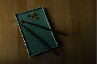
Before
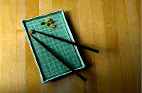
After
FACE IMAGE:
1. I opened the file Photoshop CS4
2. Adjusted Levels and Gamma:
Image>Adjustments>Levels and adjusted the input levels to 4 | 1.77 | 251
3. Adjusted the Curves to remove warm colorcast:
Image> Adjustments> Curves, select the gray eyedropper and select image in a gray area to remove the colorcast.
4. Changed the image size:
Image>Image Size> Adjusted size 397x640 at 72 dpi.
5. Save as ai_g223_w2_face2.psd
6. Then saved again as .jpg quality 8
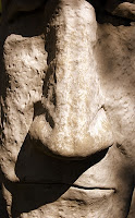
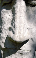
Before--------------------------> After
TEA IMAGE:
1. I opened the file in Photoshop CS4
2. Adjusted Levels and Gamma:
Image>Adjustments>Levels and adjusted the input levels to 110 | 1.00 | 206
3. Adjusted the Curves to remove warm colorcast:
Image> Adjustments> Curves, and moved the top point slightly changing the output to 242.
4. Changed the image size:
Image>Image Size> Adjusted size 640x421 at 72 dpi.
5. Save as ai_g223_w2_teacups2.psd
6. Then saved again as .jpg quality 8
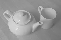
BEFORE
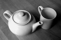
AFTER
1. I opened the file in Photoshop CS4
2. Adjusted Levels and Gamma:
Image>Adjustments>Levels and adjusted the input levels to 10 | 1.17 | 112
3. Adjusted the Curves:
Image> Adjustments> Curves and selected the “lighter” Preset.
4. Changed the image size:
Image>Image Size> Adjusted size 640x423 at 72 dpi.
5. Save as ai_g223_w2_chopsticks2.psd
6. Then saved again as .jpg quality 8

Before

After
FACE IMAGE:
1. I opened the file Photoshop CS4
2. Adjusted Levels and Gamma:
Image>Adjustments>Levels and adjusted the input levels to 4 | 1.77 | 251
3. Adjusted the Curves to remove warm colorcast:
Image> Adjustments> Curves, select the gray eyedropper and select image in a gray area to remove the colorcast.
4. Changed the image size:
Image>Image Size> Adjusted size 397x640 at 72 dpi.
5. Save as ai_g223_w2_face2.psd
6. Then saved again as .jpg quality 8


Before--------------------------> After
TEA IMAGE:
1. I opened the file in Photoshop CS4
2. Adjusted Levels and Gamma:
Image>Adjustments>Levels and adjusted the input levels to 110 | 1.00 | 206
3. Adjusted the Curves to remove warm colorcast:
Image> Adjustments> Curves, and moved the top point slightly changing the output to 242.
4. Changed the image size:
Image>Image Size> Adjusted size 640x421 at 72 dpi.
5. Save as ai_g223_w2_teacups2.psd
6. Then saved again as .jpg quality 8

BEFORE

AFTER
Designing CMYK in an RGB Environment
Managing color in a brochure, which displays different samples of wallpaper, can be challenging. This is because the monitor display (RGB) is quite different than what most printed color (CMYK). The major difference is that RGB color which appears on a monitor is additive color where the Red, Green, Blue colors are combine to create different colors or add all together to create white. Subtractive color is where cyan, magenta, yellow and back colors are absorbed or removed to leave other colors reflecting their various wavelengths back to a viewer.
The key in this example is to maintain the color in the brochure sample with the actual colors in the wallpaper. First the digital sample might need adjusted. Using levels and curves in Photoshop is one way to manage color. Levels are adjusted to ensure there is an adequate range of tones in the photo. The gamma can then be remapped to darken or lighten the image. If an image has a color cast that need removed it can quickly be adjusted in the curves pallet. Manual color correction can be difficult especially as it greatly depends on personal preference of color. Another way is to use profiles. Profiles are a great resource for managing color as it embeds the information in the data to guarantee it prints properly. The only thing about using color profiles is the printer must have the software that supports profiles.
To ensure the color in the brochure is accurate to the actual color I would use pantone colors and match up the CMYK to match. Pantone colors are published in swatch books and are used as a standard to match the correct color. There is a CMYK mixture for every pantone color. These mixes create standards for designer struggling to merge the worlds of CMYK and RGB and have brochure colors match the actual product.
Resources:
AIO Lecture Week 2
http://www.rgbworld.com/color.php#subtract
The key in this example is to maintain the color in the brochure sample with the actual colors in the wallpaper. First the digital sample might need adjusted. Using levels and curves in Photoshop is one way to manage color. Levels are adjusted to ensure there is an adequate range of tones in the photo. The gamma can then be remapped to darken or lighten the image. If an image has a color cast that need removed it can quickly be adjusted in the curves pallet. Manual color correction can be difficult especially as it greatly depends on personal preference of color. Another way is to use profiles. Profiles are a great resource for managing color as it embeds the information in the data to guarantee it prints properly. The only thing about using color profiles is the printer must have the software that supports profiles.
To ensure the color in the brochure is accurate to the actual color I would use pantone colors and match up the CMYK to match. Pantone colors are published in swatch books and are used as a standard to match the correct color. There is a CMYK mixture for every pantone color. These mixes create standards for designer struggling to merge the worlds of CMYK and RGB and have brochure colors match the actual product.
Resources:
AIO Lecture Week 2
http://www.rgbworld.com/color.php#subtract
2/17/10
RGB vs CMYK
Colors can vary from screen to print. How would you choose which color mode is best for a project? Describe gamut and why some colors that we see on our monitor can’t be reproduced in print?
When choosing what mode to work in for a project I always think in terms of “How is the piece going to be produced” If the project is for web, or screen view I would work in RGB Colors. However, if the final piece is going to be printed, I would work in CMYK. Although working in CMYK will eliminate certain colors, as well as, Photoshop filters available, it is best to set up an offset printing file properly in CMYK. Unless I know for sure the final piece is going to print, I tend to use RGB. I do this because, there are more colors available and the art is more vibrant on screen. There are also more options for filters working in RGB and I can always convert the file in the end if I need CMYK.
One major issue with printing is the colors on your screen regardless of what mode you are working in do not show up the same when printed.
See a great example of CMYK Subtractive Color:
See a great example of RGB Additive Color:


The reason for this is a screen emits light and, ink on paper absorbs light. When you consider how its two completely different methods additive color and subtractive color it does make sense why colors would not reproduce exactly the same. It is very important to understand this as a designer. Unfortunately, as many times as you explain it to clients some they will never grasp this concept. When working on printed project, having printed proofs is very important.
Resources:
Discussion Question 1
1. AiO Online Lecture Week 5
2. http://dx.sheridan.com/advisor/cmyk_color.html
Subscribe to:
Posts (Atom)