Showing posts with label Illustration. Show all posts

8/29/12

Choosing 3D Rendering Software?

Choosing 3D Rendering Software?

Source:
your3dsource.com
Software Level OS Price Notes Details
Maya Pro. PC $3,495.00 Full Blown Production Film Quality Alias's Maya 3D is extremely powerful.  Its node-based
architecture enables complex animation and rendering linkages to be created
and it offers a nonlinear modeling history, plus Mental Ray rendering.
Strata 3D Mid. MAC/PC $700.00 Have experience building tradeshow Displays In this,
Use it at work. Similar to Photoshop
Strata's Strata 3D has a long history and is available for
Mac and PC.  It's a sturdy if slightly archaic 3D program, but it has
found favor with many digital illustrators.  It has some good rendering
features, including radiosity, which are rare at the price. www.strata3d.com
Bryce 3D Mid. MAC/PC $99.95 For Landscapes and Environment Corel's
Bryce 3D is an interesting 3D program.  It's primarily a landscape
rendering application, designed to produce skies, seas, and terrains in a
very efficient way.  It can be pressed into service as a more general
purpose 3D tool, but lacks any serious modeling tools. 
Pixels Mid. MAC $49.00 Great for animation and video games Pixels is a Mac-only 3D program
that offers advanced rendering and animation and robust modeling for a modest
cost.  It also features a renderer based on the REYES algorithm-the same
one used in Pixar's RenderMan software.
Blender Mid. MAC/PC FREE Considered one of the best with full 3D production
packages.
One of
the best free 3D applications available is Blender. This program is a full
featured 3D production package featuring the kinds of tools you'd expect to
see in a mid to high end application. 
Lightwave 3D Pro. MAC/PC $895.00 Great tools Newtek's Lightwave 3D is a dual application featuring separate modeler/texturing and
animation/lighting/rendering apps. Its quirky interface is deceptively
powerful, and it offers one of the best quality renderers out there.
Cinema 4D Pro. MAC/PC $2,771.00 Full Blown Production Film Quality The full suite of plug-ins for Cinema
4D
takes it into the high end.  With advanced
radiosity rendering, sophisticated character tools, and a GUI based
expression system, it's also one of the easiest high-end 3D apps to get to
grips with.
Poser Pro Beg. MAC/PC $499.99 Character Development It's a 3D character renderer and animator that lets
you pose and animate ready-made, high quality 3D figures.  It's very
powerful, but it's not an all rounder- it does one thing only-but does it
very well.


3D Rendering Software


  1. Which applications animators use to render 3D images?

    Maya, Strata 3D, Bryce 3D, Pixels Pro, Blender, Lightwave 3D, Cinema 4D, Poser Pro, Houdini, Softimage XSI.

  2. How do 3D applications apply to still graphics as well as animation? 

    3D applications use still graphics at sources to composite and develop complex 3D imagery.

  3. Uses of 3D animations—do they enhance Web sites? Inform an audience? Sell a product? Entertain?

    3D animations are used in a wide variety of forms. Many think that 3D animation only is really used in the entertainment industry in video games and movies. The truth is that 3D animations are use everywhere in our society. From simple small apps and functions on a cell phone, to complex technical animations for demonstrations and instructional purposes 3D animation has become a part of everyday life.
     
  4. Why animators choose to render 3D animations rather than 2D animations?

    3D animation creates and the ability to reveal more dimension and detail in an image. Moving an image from a flat surface to revealing more volume allows the viewer to see and understand more data and detail than compared to what a 2D image introduces. For example in a 3D environment the viewer has a better sense of scale, proximity, and in many instances can view the impossible like in wire frame or cutaways.

  5. Which individuals and industries are using 3D graphics—either still images or animations? What are the characteristics of those 3D graphics currently in use by these individuals/industries?

    The entertainment industry is all about using advanced technology to push the industry further into reality. With 3D graphics and animation both the film industry and gaming industry have exploded with realistic detail. Video games are no longer just for the kids, but remain a high point in the day for many adults. I have even heard of elderly people in their 80’s getting in on the action. One couple I heard about uses a Wii system to play golf every night after dinner. They are too old to go out to the course, but love the game. They tee off every night at 7pm are able to play on courses around the world.

    Beyond entertainment, the medical field is able to explain and show so much more to students and patients about what is happening in the body with both 3d graphics and animation.

    Actually, as technology has greatly advanced and software is more available we see it popping up all over. From cell phones to flight simulators 3D graphics and animation are becoming away of life.

Sources:

"Google Images." Google. Web. 15 June 2011. .

Mac 3D : PiXELS3D for OSX. Web. 14 June 2011. .

"MAXON SHOP - Home Page - North and South America." Www.maxonshop.com. Web. 14 June 2011. .

"Maya - 3D Animation, Visual Effects & Compositing Software - Autodesk." Autodesk - 3D Design & Engineering Software for Architecture, Manufacturing, and Entertainment. Web. 14 June 2011. .

"Which 3D Animation Software Should I Use?" Animated Gifs | Build A Website | Animation Schools | Animation Software. Web. 14 June 2011. .

12/29/11

Raising Standards & Expectations with the Caldecott Awa


The Caldecott Award Pushes Picture Books Further

Picture books are very enjoyable for readers of all ages. While they may be the first favorite books of young toddlers, they still can be found on the coffee table of even the most educated and refined individual. The stunning creativity and expressive strokes that tell such an elaborate story with such little use of words is most impressive. The Caldecott Award has been a huge part of children’s literature since 1938. It originated in honor of “Randolph Caldecott, a nineteenth century English illustrator who was known for his picture book illustrations,” (Kennedy, 2011). Today it is awarded annually to children’s book illustrators for the original, and very distinguished work in children’s literature. One key element of the award is the aspect of “advancing the story visually” (Miller, 2011).  This award has established an expectation and standard to ensure the quality, detail and expressive creativity in the development of children’s literature.  
source: http://mwhittrandr.blogspot.com/2011/05/jumanji.html
Looking back to the 1982 Caldecott winner, Jumanji, by Chris Van Allsburg rich detail is revealed in elaborately detailed scenes.  The many unique perspectives and incredible use of value make this book truly a magnificently illustrated piece. Also consider how the artist was able to create such realistic and dramatic images with a limited color palette. The details of the setting and the characters are so subtle but tell the story of wonder, surprise, and curiosity that the story holds.   
Source: http://www.childlit.com/battledore/shop/index.php?productID=160
Van Allsburg again produces another magnificent piece that was awarded in 1986, The Polar Express. Like Jumanji, The Polar Express also shows realistic detail creating a very dramatic visual story. A difference in the two pieces is that in The Polar Express we see rich color, but both pieces hold a realistic detail that is very similar. “Van Allsburg's beautiful illustrations become as important to the story as the words themselves” (Caldecott Medal Picture  Books, 2011).
 Source: http://coxsoft.blogspot.com/2007_12_01_archive.html
Beyond just visually appealing artwork, Van Allsburg has visually told the story. “These life-like pictures encourage children of ALL ages to explore their own imaginations and to become active participants in the young boy's journey” (Caldecott Medal Picture Books, 2011).
Source: http://picturebookjunkie.wordpress.com/2011/06/08/hello-world/
            The Caldecott is not only for detailed realistic illustrations, but also is awarded for other visual aesthetics that enhance the story. Smoky Night by Eve Bunting is a sharp contrast to the awarded pieces of Van Allsburg. The acrylic painted illustrations on top of the photographed collage of story related items creates a dynamic rich texture that drives the story forward. The texture in turn relates directly to the story like, “when in the story the boy views people stealing cereal from the market, the background is a photograph of actual cereal” (Caldecott Medal Picture Books, 2011). Bunting shows us that creativity and innovative thinking are also key elements admired by the Caldecott Metal. Her book was awarded in 1995.

 Source: http://www.betterworldbooks.com/golem-id-0395726182.aspx
            Even techniques like hand cut paper have been recognized as they have proved to be a great medium for illustration. Golem, by David Wisniewski, was a medal recipient in 1997. “It's beautiful, with cut-paper illustrations that seem to spring off the page” (Caldecott Medal Picture Books, 2011).  At the same time, the choice of color equally added to the dynamic, which adds to the grim tone and development of the story. With this in mind, this book would be considered for a more mature audience as it addresses the Jewish persecution in 1580. The tone and content would not be appropriate for young children. 
 Source: http://alotlikebreathing.blogspot.com/2010/09/house-in-night.html
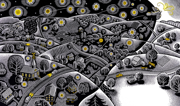
            Another masterpiece that won the Caldecott Award in 2009 is The House in the Night by Susan Marie Swanson, and illustrations by Beth Krommes. This book is truly a visual experience. The artwork is done in a limited palette just using the page color and black ink with splashes of yellow color. Still another illustration technique is used in this piece as well. The etching style of illustration is a completely different style than the previous 4 awarded books. The artist uses hatching techniques to create rather involved landscapes with a rather long visual field considering the technique. A very small sentence or phrase on the page guides the reader as they gaze at the elaborate monochromatic texture before them. Consider the complex illustration below where the text simply reads, “the house in the night” (Swanson, 2008).
Source: http://blaine.org/sevenimpossiblethings/?p=2206
With imagery as such a key element in picture book literature, we can appreciate the standards that the Caldecott Medal recognizes and ensures in children's literature. The award proves that the expectation and standard remain paramount in quality pieces for children’s literature. At the same time we also see that the Caldecott is not in any way committing to one style of illustration over another, but rather celebrating creative and progressive works that directly correlate with the story line and push the message of the text forward. The Caldecott Award proves that the creativity and expression created should not go unnoticed as it recognizes the efforts of dedicated authors and illustrators in this industry.

Works Cited:
Bunting, Eve, and David Diaz. Smoky Night. San Diego: Harcourt Brace,
      1994. Print.
Caldecott Medal Picture Books. Web. 03 Dec. 2011.       
      medal-picture-books.blogspot.com/>.
Kennedy, Elizabeth. Caldecott Medal for Illustration of Children's Books - 
     Randolph Caldecott Award Winners. About. Web. 21 Nov. 2011. 
Miller, Linda. Personal interview. 21 Nov. 2011.
Swanson, Susan M., and Beth Krommes. The House in the Night. Houghton
      Mifflin Company, 2008.
Wisniewski, David, and Lee Salsbery. Golem. New York: Clarion, 1996.
      Print.
Van Allsburg, Chris. Jumanji. Boston: Houghton Mifflin, 1981. Print.
Van Allsburg, Chris. The Polar Express. Boston: Houghton Mifflin, 1985.
     Print.

11/6/10

Fashion Illustration VS. Technical Illustration

Fashion Illustration VS. Technical Illustration

While fundamental drawing and rendering skills are required in the professional illustration industry, the various fields require greater discipline of certain techniques than others. In taking a closer look at fashion illustration and technical illustration one will quickly realize these two areas of illustration require a drastically different approach to accomplish their objectives.

Fashion illustration has greatly evolved over the years. With the advances in photography, fashion illustrators are no longer burdened with the responsibility of rendering out fashion advertisements, catalogues and displays. Today these items are mostly done with photography. Photographers, however have not replaced the job of fashion illustrators, but rather opened the opportunity to work specifically in the initial creation and design of clothing, accessories and garments. Fashion illustrators work out the design of the items, before they are created with fabric or materials. Their designs do not have strict standards as far as needing to be realistic or proportionally atomically. Rather, they can be loose, expressive and stylized, which may help display and even sell the overall look of the proposed style. The drawings rely on the use of line and the simplified human form to express the concept, look and style the designer has in mind.

The fashion illustration below, for example, uses the same girl over and over in different clothing and accessories combinations. It is not at all realistic as the drawing of the figure is quite distorted and the model is identical in each rendering. At the same time, it gives the viewer a strong sense of the look the designer is going for with their clothing.

Image Source:http://www.lushlee.com/images/art/09/9/fashion-illustration-by-bu.jpg

Technical illustration is known for its detail, accuracy, dimension and proportions, which is quite a different direction from fashion illustration. A technical illustrator needs to have a great understanding of perspective, drafting, mechanical drawing, and even knowledge of software like CAD, CorelDraw and in some instances 3D software. While some technical drawings maybe simplified line drawings, others may be a detailed perspective rendering. The overall effect should show the viewer what something does, or give a greater understanding in a technical nature or direction. Regardless of how detailed the technical illustration maybe, it will reveal the important details needed to communicate a sometimes very complex idea. A major advantage of a technical illustration over a photograph would be the ability to simplify the drawing for an easier understanding of a complex idea. A great example of this would be a technical illustration showing how a four cylinder engine functions. The illustrator, James Provost, has actually cut away a section of the engine case to reveal what is going on inside. The drawing below is detailed; proportionate and accurate to show give the viewer an understanding of the complex process happing inside the engine.

Image Source: http://jamesprovost.com/files/2009/11/power-split-device-cutaway.jpg

Technical illustrations many times use colors and added symbols for clarity and even sometimes my show a extra enlarged view to accommodate certain details and complexities.

Fashion and technical illustration are quite different when considering how detailed and precise technical is compared to the free stylistic renderings done for fashion. These two drastically different approaches do have a few things in common. Both fashion illustration and technical illustration are sometimes used in initial studies before fabrication. A technical illustration of a new product would be proposed to a board, like a fashion illustrator may have created a rendering of a collection in proposal for a designer looking for a contract. Fashion obviously deals with fabricating garments, and technical drawing may show a design for a new product, part, or piece of machinery. While these two divisions of illustration have a demand for different disciplines of illustration, both require a fundamental understanding of illustration, form and rendering techniques.

Works Cited:


"How to Become a Fashion Illustrator, Fashion Sketcher." StyleCareer.com, How to Work in Fashion, How to Break Into Fashion and Image Careers. Web. 05 Nov. 2010. .

Intermediate Illustration | G320 UA. Week Five Online Lecture: Specialized Fields in Illustration, 11 2010.

Lushlee, Angie. "Bu Lago Millan." Lushlee.com. 09 Sept. 2009. Web. 06 Nov. 2010.
.

Provost, James. "Power Split Device • James Provost • Technical Illustration, Editorial Illustration, Motion Illustration & Infographics." James Provost • Technical Illustration, Editorial Illustration, Motion Illustration & Infographics. Web. 06 Nov. 2010.
.


11/5/10

Norman Rockwell - Essay ad campaigns


Norman Rockwell is well known for his illustrations on covers of numerous magazines and especially The Saturday Evening Post. He had the ability to look at the culture around him and create visual stories that expressed the wants and needs the people. His illustrations had ordinary people doing everyday activities with exceptional details creating a utopian scene. In the words of Norman Rockwell, “I paint life as I would like it to be” (American Masters, 2006). More plainly stated by Steven Spielberg, “ Rockwell painted the American dream – better than anyone” (American Masters, 2006).

Rockwell’s career as an illustrator spanned many years in which he created many wonderful pieces, and icons that are still recognized today. One thing many people do not remember about this talented artist is his great talent in advertising. It estimated that Rockwell actually did twice as many ads than covers. His incredible talent gave him the opportunity to promote and sell a wide variety of products.

In the 1920’s illustrators had more of a celebrity status and were revered for their familiarity of culture and especially public preference. On many occasions Rockwell’s clients would give him complete control of ad campaigns and strategies of how to promote and sell their products or service. Rockwell knew how to make his pieces interact emotionally with the viewer, which made his advertisements extremely successful. The techniques used in his advertisements are similar to how the photography is set up today to tell the story of the product.

Rockwell began doing advertisements in 1914 and continued illustrating commercial campaigns for 60 years. By 1920 he had already done advertisements for a diverse amount of products. Heinz, oil heaters, tires textiles, Post cereals, US Marines and even motors were the products he began promoting.

He shows that he has great understanding of visual communication in the Norman Rockwell’s advertisement for Parker 61 pen’s in 1959. The viewer sees this master put so many little bits and pieces into this ad. He uses great balance of color in his blocking of the product to bring the viewer back and forth from the color combination. The viewer’s attention is brought to the center of the illustration with the brilliant yellow and he places the product clearly on this background, which really showcases the product. Next consider the all American look he has given this girl and her friends. They are all pretty, conservative, and happy for each other. This wholesome group is every father’s dream of a successful, happy daughter ready to go off to college and be even more successful with this great gift from her father. He then reassures these assumptions when he places the text, “Daddy is trying to spoil me!” This makes the suggestions placed in the illustration more concrete and reassures the viewer that a Parker 61 is a real treat. His eye for detail makes his message incredibly successful. In today’s advertisements many times stock photography is uses. The stock photographs do not contain the elements that tell the story like Rockwell did.


Norman Rockwell’s creativity and understanding of the human figure, as well as, the American culture has made his work very successful for over sixty years. As an accomplished Illustrator he has collections of techniques to establish visual hierarchy and strike an emotional card with the viewer. Not only is his work an inspiration for today’s designers, but also it is a wealth of techniques that need to be observed, understood and used to create incredible pieces with solid design techniques. Today as designers we can appreciate his attention to detail and telling the visual story with his elements first. The initial glance can tell the story, but the more you look there is much more to the story than meets the eye.

Works Cited


"1959 Rockwell Illustration for Parker 61 | Monochromatic Outlook." Monochromatic Outlook | There She Goes, My Beautiful World. 27 Mar. 2008. Web. 02 Nov. 2010. .

American Masters. "Norman Rockwell - About Norman Rockwell | American Masters." PBS: Public Broadcasting Service. 07 Feb. 2006. Web. 02 Nov. 2010.
.

"Norman Rockwell Advertising Art 1914 to 1976." Where Norman Rockwell Art Collectors Begin. Web. 02 Nov. 2010.
.

"Norman Rockwell." American Art Archives, Illustration, Illustrator, Art. Web. 02 Nov. 2010.
.

"Norman Rockwell Art." Norman Rockwell Prints. Web. 02 Nov. 2010.
.


10/23/10

Figure Drawing - Gouache Paint, Color Pencil

Objective: Figure drawing of Olympic Event & render appropriate color in two different traditional mediums.

This illustration was rendered in gouache paint.


This illustration was rendered in Prisma color pencils. 

Color Choices - Complementary - Warm & Cool Colors.

OBJECTIVE: Give your impressions of how the artist might have approached the choice of colors.

I chose an illustration from Mark Bender. He is was one of my instructors at the Art Institute of Pittsburgh when I attended back in 2002. I always enjoyed his style and great use of color. In this piece you see that he has a warm and cool color contrast. His rich blue and green works very nicely with the vibrant orange and yellow. The color pallet choice is actually complementary which gives greatest contrast and great harmony. I also find it interesting how he chose to place the man working in realistic colored clothes. The man is dressed in blue coveralls and a white shirt. His arms are rich golden collection of orange and yellow. In addition to creating a great contrast and harmony, the colors selected are quite realistic and what you would expect to see.

By Mark Bender

Source:http://www.pittsburghillustrators.org/portfolios/bender/bender2.jpg

10/20/10

Product Mockup - Prospective & Color Rendering

OBJECTIVE: Create a line drawing of a product that would be good in an Olympic ad. Then do a color rendering of that drawing.

I first chose the product of "painreliever" This specific product is a actually produced by the Publix brand.
After I had the drawing completed I used Prisma Color Pencils to render the drawing in a monochromatic blue color. 

Effective Use Of Color - Triadic Color - Illustration


kitchen
Image Source: http://www.unstage.com/2009/10/great-use-of-color-in-digital-art/
 
In this illustration titled “kitchen” by Zain you see an example of an artist using a triadic color scheme. This means that the color pallet consists of three main colors that are equally spaced around the color wheel. It is a solid scheme to use as it provides strong contrast but maintains balance or harmony of color.
The artist establishes a cool feel with the use of blues in the top of the illustration. This was a great technique as the cool tones allow the viewer to be drawn in to the illustration, which creates a greater illusion of depth. In addition to the perspective and shading the use of blue makes this kitchen space appear very deep especially with the contrast of the pink warm tone, which is the one of the other colors used in the triad.

The pink tone adds a splash of warmth, but is secondary to the coolness of the more dominant blue. While the piece is quite sad and mellow looking do to the dominate cool color, the use of the warm pink tones on the bottom, are a great way to lead the front of the piece toward the viewer. This contrast of warm and cool is a great technique for this piece as it creates an illusion of an extended visual field a great use of color in this exaggerated perspective drawing.

Finally the artist uses a touch of yellow, which completes this triadic pallet. This aids in the established light source and gives the viewer a feeling of sunlight. This also pushes the blue primary color to appear darker and possibly sadder and helps the viewer realize the intended tone of the piece where the girl is stuck inside working, on a beautiful sunny day.

Resources:
AIO Lecture
http://www.color-wheel-pro.com/color-schemes.html
http://colorschemedesigner.com/

10/18/10

Drawing Line & Shade Concepts

Line and Shade Drawing Concepts from Instructor:
by: Victoria Vebell - AIO Intermediate Illustration.

1. Drawing is creating the illusion of 3D space on a 2d surface.

2. There are no lines in the 3D world only edges seen by the contrast by what's behind it.

3. A line is an abstraction of an edge.

4. Lines create shape, shading creates form.

5. Light creates unity of form by all the objects having the same direction of the light source.

6. Shading is made up of different tones of value. All value is judge how light or dark it is by comparison to another tone.

7. The human eye can see about 40 different values.

8. A trompe l'oeile (fool the eye) artist can render maybe 15 -20 different values in a drawing.

9. A very good artist can render 10 different values.

10. Every good drawing must have a pure white and a pure black.

11. The more different values you can render the more realistic your drawing will be.

12. This is the basis for eye movement, the more contrast you create in an area the more your eye notices it and appears to come forward. The converse is true, the less contrast you have (the closer your values are together) the more that area recedes and your eye slides over it.

Think of it this way, on a sunny day everything looks clear and sharp.... more contrast of values. On a foggy day, the values are all muted and close together and everything seems soft and fuzzy.

13. Realistic rendering takes time and patience. Building up the tones to black will make your drawings more realistic and stronger.

14. Using vine charcoal is a bad choice for small work. Pencil or charcoal pencils both with a paper stump is the best choice.


Tip: to keep your shading from smearing, put a clean white piece of paper under your hand:)! Also if an area gets too dark, use a kneader eraser and dab it slightly. You also can re-establish your white areas by making a point with your eraser and draw the lights back in.

SOURCE:
Instructor: Victoria Vebell - Intermediate Illustration - AIO

10/11/10

Perspective line drawing

Objective: Complete a perspective line drawing will be man-made objects of your choice (buildings, machinery, furniture, etc.)

Generating Good Ideas!

Question: There is no formula or procedure for coming up with great ideas. Discuss some methods that will help in generating good ideas for illustration.

When working on any project I normally have a few ideas that come to mind right away. However I have a 4 main avenues I tend to work through in coming up with good ideas.

Conceptual Notes:
Most would call them some type of thumbnail but I prefer to call them “conceptual notes”. They really won’t mean much to anyone but me. These notes will consist of symbols, graphs, text and even a rough sketch, very rough sketches. I use anything to get the idea out and move on. This is a process I use if I am just slammed with ideas. After I get the ideas out, I may try to brainstorm and workout a few concepts so that I don’t black ball myself into a corner.

Research:
Sometimes I have no idea where to start. I am working on a project where I have no experience with the topic. In this case I will start with some research. I will surf the web, for information, images, logos, websites, and maybe contact someone with more knowledge to gain a better idea of where I should even start.

Think Tank:
My all time favorite way to come up with great ideas is working in a “creative think tank”. Surrounding myself with other creative, or people that maybe quite concrete with an objective to keep me on track, or even people that don’t have a clue of what to do and are afraid of the challenge; I enjoy the group interaction. I find that sometimes the best idea comes from the worst suggestion.

Consult My Muse:
If all else fails and I cannot get a jump on a concept I talk to my wife. I tell here what I am trying to accomplish and maybe some rough thoughts I have, and she can normally help me clarify the direction I should head. My wife is not an artist, but she is very creative. Consulting another person and bouncing ideas of them can really help one figure out what will work and what won't, which helps eliminate many bad ideas.

Illustration Shading

Question: Although lines are extremely useful, line-only drawings are not as effective as drawing can be. To really bring drawings to life, shading needs to be used." Discuss the importance of shading in illustration.

Shading gives dimension to an illustration. It allows the viewer to observe a sense of volume and allows the artist to take the viewer more realistic understanding with object appearing three-dimensional. It also allows the artist to reveal the light source and can even give the viewer an idea of the setting of the piece. Many different techniques can be used to accomplish shading such as hatching, crosshatching, pointillism, blending, veiling, stumping, circular technique, and even scribble technique. In some cases an artist may even choose to work backwards by choosing a dark stock to represent the darkest point, and add a light colored medium to build to the highlight.


Samples:
Hatching

http://www.roymech.co.uk/images/hatch_ex.gif
Crosshatching:

http://th06.deviantart.net/fs36/300W/i/2008/243/e/b/Cross_Hatching_Sketch__Fist_by_esninism.jpg

Pointillism
 http://www.robert-redmond.com/photos/NudeStudies/Pointillism.jpg

 Blending
 http://www.lifelikedrawing.com/5valuegrid.jpg
Veiling
 http://www.explore-drawing-and-painting.com/images/shading-techniques-veiling.jpg
Stumping

http://www.explore-drawing-and-painting.com/images/shading-techniques-stumping.jpg

Circular

 http://library.thinkquest.org/C005470F/images/fundamentals/shading1.jpg
Scribble 

http://library.thinkquest.org/C005470F/images/fundamentals/shading2.jpg

Resources:
http://library.thinkquest.org/C005470F/technique/shading.html
http://www.explore-drawing-and-painting.com/shading-techniques.html

9/14/10

Editorial Illustraition - Salmon Baby Food: How to get kids to eat fish

Overview:
Headline from Time.com
Salmon Baby Food: How to Get Kids to Eat Fish
By Jeffrey Kluger Wednesday, Aug. 25, 2010
Read more: http://www.time.com/time/health/article/0,8599,2013098,00.html#ixzz0xqDAv6wG


This first concept goes with the idea that kids really like salmon, to the point that they will beat up a bear in a stream for it. The image show a bear that just caught a fish and a little girl in her diaper and bib coming up to club the bear and take the fish. The bib the little girl is wearing says “I Love Salmon”. This concept is taken to an extreme obviously, but the idea is to get kids to really want fish.
Concept Rough :
It was suggested in review that the club was a little much. Possibly a tug of war would be more appropriate. This piece was rendered digitally in Illustrator.
Concept Final:

This one features a big guy wearing a “I Love Beef!” t-shirt while he is eating a big burger and drinking a giant soda. The idea is to compare the current problem with the new solution, of getting kids to like fish early in like so they are healthy as adults. This little girl has a MMM “Fish symbol” Yum! Tank top on.. She is eating sardines. It is an interesting contrast, but really calls out the current American diet.
Concept Rough:
This concept stayed pretty much the same as it moved to the final rendering. I adjusted a few things and rendered it in a digital format using Illustrator.
Concept Final:


This concept shows a little girl in her diaper fishing with a net. The image is showing the salmon swimming up stream. The idea is this girl I similar to a young bear cub fishing was the salmon swim upstream. It is very important to her so this young toddler is quite focused, as she really wants the fish.
Concept Rough:

 It was suggested upon review this child playing with the net should be younger with a pole. The final was rendered in Adobe Illustrator.
Concepts Final:

Difficult Mediums - Marker, Ink, Chalk, Charcoal, Watercolor

 Question: What medium(s) do you find difficult?
 

I have also worked with inks and markers. Inks I found to be most difficult especially with the ink. I would drip it everywhere. I did like the effect though and I have a few decent pieces done in ink. Learning a marker technique was also very difficult. Thanks to Instructor David Giuliani, also known as, the “Marker Nazi”, I was able to develop a smooth technique for marker rendering.  Markers were tricky especially when trying to do techniques with the “toothbrush” to make a concrete effect. I found especially in the class I took, no matter how hard you tried to keep your paper clean I would end up smearing the wet marker ink or smudging something somewhere.
Below is a Marker Rendering I completed in Giuliani's class and a ink drawing.
zero designs illustration click to view larger
As I mentioned above using chalk or charcoal I find frustrating as they can so easily be smeared or modified. Have a finished piece could be beautiful in a studio, but most difficult to get anywhere else or even store. I actually have many charcoal and chalk pastel pieces but it is so hard to keep them from messing each other up.

I also mentioned above the watercolor can be challenging. At first I never realized it was made to be a transparent medium. I would try too hard to make it dark and not subtle. It is most difficult as many times one tries to over work the watercolor instead of letting it dry. This causes the medium to become muddy and loose the brightness of color. I also think working “wet on wet” is so difficult to control, but has great effects.


I don’t have many pieces to show my experience available. They are mostly in storage in a different city. At some point I need to go through them and get some in a digital format for portfolio and sample purposes.

Favorite Traditional Medium - Gouache Paint, Color Pencil,

QUESTION: What is your favorite medium to work in...
 
Over the years I have had to opportunity to work with many different materials and mediums. I know in my younger years I was always drawn to acrylic or tempera paint. I was not really a fan of watercolor as it is a more difficult medium and takes time and experience to know how to manipulate it properly.  I really have never had the experience of working with oil paint, but have always wanted to try it. It seems like Bob Ross makes it look so easy. I like the idea that it does not dry quickly and it can be worked and worked, but I may not like that if I actually did it.  At first using gouache paint I also 

found to be most frustrating. In time I foun
d that I preferred gouache paint to all the paints.
Below is a piece i completed using black gouache paint and a piece using ink and gouache:
click to view larger

I also was never a fan of pastels, oil or chalk. Although they did have vibrant color, it was messy and I don’t like how hard it is to keep the final pieces from getting messed up. Chalk and charcoal is also a medium where I enjoyed the flexibility and smooth finish, but could not really enjoy using the material due to the mess factor. It also was so difficult to keep from getting smudges or rubbing off on something else.


Finally when it boils down, I would conclude I prefer working in graphite pencils and color pencils. Even though these are the most simple of mediums I feel they offer flexibility and the opportunity to introduce other mediums to enhance the final if needed.
Below are samples done in color pencil:
 click to view larger
click to view larger

9/1/10

Editorial Illustraition - Teen Sleep Issues

OBJECTIVE:
Find an article in The Washington Post and create and create 10  conceptual thumbnails for the article.

The article I found in the Washington post is called. “Digital diversions leave teens, parents sleep-deprived”
By Donna St. George
Washington Post Staff Writer
Tuesday, August 24, 2010
Link to source:
http://www.washingtonpost.com/wp-dyn/content/article/2010/08/23/AR2010082305482.html


Overview of article.

This article reflects on how getting teens to go to bed is difficult in the first place, but then adding technology to the mix makes it very difficult. From, video games, computer, TV, music and texting on cell phones today’s teen has many more distractions keeping them up late at night. The major issue is these students are required to be up early in the morning for school. Parents are finding that they need to enforce new rules like “no cell phones or laptops in bed”.

Thumbnail Concept 1:
It is more like a child hiding from the “Monsters” at night. Except the monsters in this case are the electronic devices. You see a very tired teen trying to find cover from the glowing devices in the shadows. I-pod, cell phone, video games, tv, computer. The devices crowd around the bed to keep the teen awake.

Thumbnail Concept 2:
The teen is actually asleep, possibly some drool out of the corner of his/her mouth. You see a clock in the shadows in the background. But beside the pillow is the phone in the teens “awake hand” texting as the teen sleeps.

Thumbnail Concept 3:
A very simple approach as a teen is awake in their bed using some type of electronic device. You see the moon and clock for visual cues that this is the wrong time for what the teen is doing.
 Thumbnail Concept 4:
We have all done it. Hide under the blanket and pretend that we are asleep while we play video games on a personal device, or text messages. The screen would laminate the teens face and the parents are in the shadows with their arms crossed. Not the clock and time.

Thumbnail Concept 5:
Parents in bed looking at each other rather cross as their room is filled with electronic devices that they have had to take from their child’s room. Now the devices are keeping them awake.

Thumbnail Concept 6:
The idea of needing to turn in Personal Electronic Devices at night with larger families. The caption would say something about Mrs. Smith found her 4 teens to most unhappy that she installed an electronics arsenal due to the lack of sleep in their home.

Thumbnail Concept 7:
Showing a cell phone with a text message on it, revealing a teen is up late texting when their parents think they are sleeping. Make the text contain text terms, and references to school.

Thumbnail Concept 8:
More like a “Far Side” cartoon. This would should a neighborhood home with a giant metal dome over the top call “Cel-Guard” The caption would explain this is dome was installed to block evening electronic activity.

Thumbnail Concept 9:
The traditional shot of loving parents looking in on their sleeping child. Quote from mom “sleeping like a baby”. Quote from Dad, “Cause I took the phone”. You see the phone in dads back pocket buzzing. And vibrating with messages.


Thumbnail Concept 10:
Shows mom and dad in bed and through the hallway their child is up with their electronic device. The mother, bothered by the noise says. “Aren’t you going to do something? They will be up all night!!!. Dad says, “No I have the charger”.

Thumbnail Concept 11:
Shows a father purchasing a new phone product called “Cinderella Phone”. The sales man is explaining that it will not work after midnight.

Thumbnail Concept 12:
The Cell Club is a device that locks up ones phone. It would show some type of lock up device on a teens cell phone.


ROUGH SKETCHES:


 RENDERED FINAL:

INK:


PENCIL:

Gouache Paint: