Showing posts with label Color. Show all posts

4/27/11

Rufino Tamayo - America Mural (influenced by) Picasso - Guernia

OBJECTIVE: Select from the Internet an image of an American wall mural that you consider to be significant. Write an analysis contextualizing the content and style of the mural. Discuss how the site contributes to the meaning of the mural.
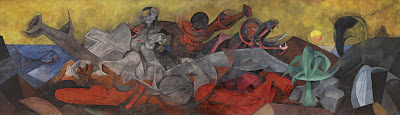
https://blogger.googleusercontent.com/img/b/R29vZ2xl/AVvXsEj1PDMutBD16PxsqLUpGjp05ssmxQAKa2kV9ey-g0gl4PuPsdnwC4Umrr1nKO7-rTMwXIUFCtpo8Eb0Pb5VlJYAbhOuJ-EB0Qlb_xLGsv38S18jqeVMRNSrkdW074unDjIQR6bpvHnrUAM/s1600/Rufino_Tamayo_America_lg2.jpg Title: America
Artist: Rufino Tamayo
Date: 1955
Intended Location: The Bank of the Southwest – Houston, TX 1955-1990
Current Location: Dallas Museum of Art – 1993 - current
Size: 13’2” x 45’10 3/8”
Medium: Vinylite
(Rufino Tamayo America Mural, 2011)


The very large “America” mural, painted by Rufino Tamayo in 1955, is known for being one of his most magnificent and impressive murals. Working alone in Mexico City for 5 months 7 days a week Tamayo was able to truly focus his efforts into his 13 by 45 foot colorful creation. When he had completed it he rolled it up and sent it to Houston, Texas to be displayed at the Bank of the Southwest.

What initially drew me to this mural was the use of the cubism style. According to my research, Tamayo has established a reputation in working in combination of cubism and futuristic styles, which are both apparent in this piece. This allegorical piece reveals the history and richness of America.

The main white figure in the center of the piece resembles a nude female in a reclining position. Surrounding the figure Tamayo has placed iconic natural resources to signal the abundance of the land. The viewer is reminded by “the fish, symbol of wealth of the sea; by a plant, symbol of the richness of the land; by an oil geyser and spring of water, symbols of our underground resources” (Rufino Tamayo America Mural, 2011). Tamayo also shows the unity and cultural influences in the different races with the white and red figures embracing in the top of the painting.

He chooses a vibrant pallet of reds, blues, yellows and greens, as well as, shades of gray. It is these decisions and understanding of color that have given Rufino Tamayo a reputation for color. “Today Tamayo is indeed regarded as one of the great colorists of the twentieth century” (Sotheby’s, 2011).

Tamayo reveals his discipline in study and understanding of his trade as he reveals the influences from Picasso’s Guernica, as well as, the emotion of the Mexican School. The piece “successfully asserts the timeless values of civilization” with his “Abstract Expressionist’s embrace of the primitive and the mythic” (Sotheby’s, 2011).

Title: Guernia
Artist: Pablo Picasso
Date: 1937
Size: 11’ x 25.6’
Medium: Oil Paint
(Guernica, 2011).


Works Cited:
"Guernica (painting): Facts, Discussion Forum, and Encyclopedia Article." AbsoluteAstronomy.com. Web. 27 Apr. 2011. .

"Rufino Tamayo America Mural." MID-CENTURIA : Art, Design and Decor from the Mid-Century and beyond. Web. 27 Apr. 2011. .

"Sotheby’s New York to Offer Important Mural by Rufino Tamayo, Entitled America." TheArtWolf.com - Art and the Art World. Web. 27 Apr. 2011. .

4/21/11

Twilight in Wilderness - Frederic Edwin Churches

QUESTION: Although at first sight landscapes often appear as innocent and neutral, close inspection provides clues to the ideological perspective espoused by the artist. Browse through your textbook and identify a landscape painting that you feel is explicit about its role in offering a nationalist vision. What would you say the message of the painting is? What does the artist want to convey about America? What role, if any, do people play within the landscape?


(Church: Twilight in the Wilderness, 2011)
In Frederic Edwin Churches, “Twilight in the Wilderness” an optimist may suggest that he is expresses a feeling of anticipating with his vast open space. The 40 by 64 inch oil painted canvas, displayed in “The Cleveland Museum of Art” located in Cleveland, Ohio, creates great dimension giving the viewer a sense that the painting never ends. This visual cue touches on the idea of open opportunity offered in the United States and the potential opportunities and limitless possibilities in the west.  
  At the same time, others may argue that the contrasting dark surroundings the thin strip of the setting sun reveal a sense of great uncertainty, anxiety or even fear of difficulties ahead. With the knowledge of the context that the painting was done in 1860, most are confident that the painting was not an optimistic outlook. With the Civil War a year after the creation of the painting, most viewers of that time a less than optimistic response to Churches efforts.

Beyond the initial reaction to the great space created with vibrant color and an advanced knowledge of field of depth; or the dark contrasts pushing toward oppression; another obvious observation in this vast landscape is the lack of people. “Church has banished all evidence of human habitation” (Pohl, 2002). The viewers are giving the scene of an undisturbed wilderness, leading to the idea of uncertainty. Additional the settlers on the east coast at this time were less concerned with the preservation of the west and more concerned with expansion and the issues of slavery. In Painting an undisturbed westward facing landscape, Church brings up a social issue that was in the forefront of the minds of most of the society of the time.

Today most don’t see the painting today as the early Americans did. With the political issues left to the history books and the discussion produced by the piece  today is the speculation that Church has included an eagle in on the left side as “a symbol of American power” (Church: Twilight in the Wilderness, 2011). Others claim the painting holds religious connections to Christianity. They look at the areas “where the branches cross,” and consider it a connection to a crucifix” (Church: Twilight in the Wilderness, 2011).

Maybe these subtle details were indeed what Church was trying to focus on. It is possible that the painting was an attempt at optimism, pride and religious deliverance. Regardless of Churches intentions, the political issues were in the crosshairs of the public minds. Either the issues of that time gave the viewer’s distortion or clarity of Churches intentions.

Works  Cited:

"Church: Twilight in the Wilderness." Mark Harden's Artchive. Web. 12 Apr. 2011. .

Pohl, Frances K. Framing America: a Social History of American Art. New York, NY: Thames & Hudson, 2002. 150-51. Print.

11/5/10

Contrast - Identify, Correct,

A great technique to identify contrast issue as mentioned in this weeks lecture is switching the image to gray-scale and checking the overall range of gray-scale value. Then after identifying areas that need adjustment using the history pallet or undo command, or if the image did not have previous edits before the color change using a “Revert” command would also restore the file to its original state.

I then suggest using the adjustment layers. When I first started using Photoshop we never had these. I would always keep a copy of the original image in a separate layer in case I needed to go back. With adjustment layers this step is not needed. The first tool I always use to adjust contrast is “Levels”. In my experience taking a quick look at the curve will explain most contrast issues. I then simply correct it by adjusting the arrows on the curve.

Another tool I use quite often in adjusting contrast is the curves tool. I also use this tool with an adjustment layer as well. The curves tool has quite a bit more control than the levels adjustment and allows for a more involved correction. One of the main times I go to the curves tool is when I am adjusting an image and removing a colorcast. I great starting point for this adjustment is to click on the mid-tone eyedropper and find a middle gray tone in your image and select it. This may correct the cast, or at least give a great starting point to make further adjustments too.

Resources:
AIO Lecture

10/23/10

Figure Drawing - Gouache Paint, Color Pencil

Objective: Figure drawing of Olympic Event & render appropriate color in two different traditional mediums.

This illustration was rendered in gouache paint.


This illustration was rendered in Prisma color pencils. 

Color Choices - Complementary - Warm & Cool Colors.

OBJECTIVE: Give your impressions of how the artist might have approached the choice of colors.

I chose an illustration from Mark Bender. He is was one of my instructors at the Art Institute of Pittsburgh when I attended back in 2002. I always enjoyed his style and great use of color. In this piece you see that he has a warm and cool color contrast. His rich blue and green works very nicely with the vibrant orange and yellow. The color pallet choice is actually complementary which gives greatest contrast and great harmony. I also find it interesting how he chose to place the man working in realistic colored clothes. The man is dressed in blue coveralls and a white shirt. His arms are rich golden collection of orange and yellow. In addition to creating a great contrast and harmony, the colors selected are quite realistic and what you would expect to see.

By Mark Bender

Source:http://www.pittsburghillustrators.org/portfolios/bender/bender2.jpg

10/20/10

Product Mockup - Prospective & Color Rendering

OBJECTIVE: Create a line drawing of a product that would be good in an Olympic ad. Then do a color rendering of that drawing.

I first chose the product of "painreliever" This specific product is a actually produced by the Publix brand.
After I had the drawing completed I used Prisma Color Pencils to render the drawing in a monochromatic blue color. 

Great Color Design Application!

Here is a great site with a free color application that could be a great color tool.
Check it out the Color Scheme Designer

http://colorschemedesigner.com/

Effective Use Of Color - Triadic Color - Illustration


kitchen
Image Source: http://www.unstage.com/2009/10/great-use-of-color-in-digital-art/
 
In this illustration titled “kitchen” by Zain you see an example of an artist using a triadic color scheme. This means that the color pallet consists of three main colors that are equally spaced around the color wheel. It is a solid scheme to use as it provides strong contrast but maintains balance or harmony of color.
The artist establishes a cool feel with the use of blues in the top of the illustration. This was a great technique as the cool tones allow the viewer to be drawn in to the illustration, which creates a greater illusion of depth. In addition to the perspective and shading the use of blue makes this kitchen space appear very deep especially with the contrast of the pink warm tone, which is the one of the other colors used in the triad.

The pink tone adds a splash of warmth, but is secondary to the coolness of the more dominant blue. While the piece is quite sad and mellow looking do to the dominate cool color, the use of the warm pink tones on the bottom, are a great way to lead the front of the piece toward the viewer. This contrast of warm and cool is a great technique for this piece as it creates an illusion of an extended visual field a great use of color in this exaggerated perspective drawing.

Finally the artist uses a touch of yellow, which completes this triadic pallet. This aids in the established light source and gives the viewer a feeling of sunlight. This also pushes the blue primary color to appear darker and possibly sadder and helps the viewer realize the intended tone of the piece where the girl is stuck inside working, on a beautiful sunny day.

Resources:
AIO Lecture
http://www.color-wheel-pro.com/color-schemes.html
http://colorschemedesigner.com/

10/18/10

Emotional Impact of Color

QUESTION:  "The impact of color on the emotional feel of a piece can add significantly to the message of the illustration." Explain by giving examples.

Color is a key component in an illustration in aiding the viewer in establishing the correct emotion. A very simple example is the use of complementary colors like red and green. This combination in most situations in the American culture makes people think of Christmas. While looking at the color green alone the viewer may assume growth, fresh, go or safe, it does also have some negative associations like greed and jealousy. It is amazing how adding the complementary color of green to red has created this holiday brand color. 

By itself color red has other emotional effects on people like the association of heat, fire, power, it has also been associated with a signal to stop. The color red is even used to represent love and passion. 

 
Pink is another color that has been a way to establish femininity. Most children wearing pink clothing are assumed to be female. Also consider how the popular retailer Victoria Secret has taken the color pink and branded their store with this color. Even the Breast Cancer Awareness has adopted this color for their movement.
           
Some color combinations even can effect how the piece is visually viewed. For example Warm color combinations have a tendency to appear to move in the direction of the observers and seem to be in a closer proximity. To push away from the viewer one could chose to use a cool color combination, which would will aid in the scene pulling back from the viewer. In other words, warm colors will appear to be larger than cool colors.


One key thing to keep in mind about color is a viewer may respond differently to color depending on their culture and background. While it may seem that response to color could be a natural response, it is really based on conditioned influence or association of a specific culture. An example of this is how in the Chinese culture the color red may be associated with luck,  or celebration, but in South Africa it is the color of death or mourning.


Resources:
AIO Lecture
http://www.color-wheel-pro.com/color-meaning.html
http://www.writedesignonline.com/resources/design/rules/color.html

http://webdesign.about.com/od/color/a/bl_colorculture.htm