Showing posts with label Graphic Symbolism. Show all posts

2/17/10

Objective & Subjective/Social & Cultural Factors of Symbol Impact

With a market that is growing more and more international everyday it is critical to consider how graphic logos and branding will be perceived in the different cultures, religions and groups. While graphic symbols are the best way to communicate through a language barrier, depending on the type of symbols used there is always a possibility that the final design could be perceived as offensive to certain cultures or groups; therefore, it vital to create the logo or branding to be as objective as possible. The use of subjective elements that lead to personal or subculture bias and beliefs must be avoided to accomplish successful international branding for the future. While trying not to offend a particular group is important with creating a corporate symbol, the market research begins to play a more vital role in finding the target group. When planning to promote a product or company into a new culture or society that is completely different and in some instances opposite of the familiar culture, it is imperative to have data to lead the creative design process.

A great example of how a simple fun image can create great issues with different cultures is when t-shirts created by Utah students for the game offended the American Indians. Although the students were using the T-shirts to mock the teams mascots (an Indian roasting a frog), American Indians found the image very offensive.


While the incident at Utah was just some students with a tee shirt, there are many sports teams with mascots that could be considered offensive to certain groups. Would you believe even Chief WaHoo for the Cleveland Indians has been questioned as a racist symbol? Today even some schools are rethinking their logos and mascots.

Taking an international look, many times as other cultures try to make their look more universal they fall into a dilemma of possibly miss representing their company. Here is an example of a logo that does exactly that.


In the end, designer must consider what is the best way to visually entice the target group to desire a product or company. Carefully implemented market research will aid in approaching the target group. As it was stated in the beginning of the Logo Design Workbook, “A logo is not a magic lantern. It can’t make a bad product successful or save a poorly managed corporation.” (morioka, 2004) This takes some of the pressure of the designer, but at the same time, the final branding needs to appeal different groups, and cultures and transcend language to be effective.


References:
Adams Morioka; Logo Design Handbook, 2004
AiO Online Lecture Week 5
AiO Online Lecture Week 6
http://www.dailyutahchronicle.com/news/american-indians-offended-by-game-shirts-1.899743
http://paneech.com/2009/03/is-the-cleveland-indians-logo-chief-wahoo-a-racist-symbol/
http://network.nationalpost.com/np/blogs/toronto/archive/2008/10/28/is-school-s-warriors-logo-offensive.aspx
http://www.trendhunter.com/photos/25902/2
http://blogs.citypages.com/sports/images/cleveland_indians.gif
http://www.trendhunter.com/trends/mistakes-in-advertising-questionable-logos

A Global Market - Going Beyond the Language Barrior

The future of graphic symbolism marches on toward a global market place. At this time there is not a language that allows communication to international markets. By harnessing the power of graphic symbolism these markets can be reached by going beyond the language barrier. With logos and brands packed full of communicative devices that break through this barrier, graphic symbols will be paramount in effectively communicating information and striking an emotional response in future global markets.

You can see how some international companies has already broken through and made the adjustments needed to fit the culture and targeted group. The first Wal-mart in China was opened in 1996, and not Wal-mart has 77 Supercenters in China.
See Walmart China: http://www.wal-martchina.com/english/index.htm

At the same time Wal-mart discovered they would need a different strategy to be successful in Europe. It appears that their “Always Low Prices, Always” slogan is not so true in the UK. TESCO –British supermarket chain is a major competitor, and has shown better selection of merchandise and lower prices. Wal-mart will need to address some of their current strategies to effectively reach international markets. A perfect example is in Germany customers were put off at the though of paying a greeter. They have also found issues with loyalty cards. While Wal-Mart stands for value in the USA, and affordable goods in the USA, the corporation may need to make some adjustments to be successful in international markets.

References:
AiO Online Lecture Week 6
http://www.wal-martchina.com/english/index.htm
http://www.planetizen.com/node/20731
http://arunkottolli.blogspot.com/2006/10/wal-mart-is-in-trouble-in-uk-too.html
http://www.businessweek.com/1999/99_26/b3635129.htm

A Comprehensive & Concise Logo - Target


A perfect example of a comprehensive and concise symbol used in corporate branding is the Target logo. Target is very well known for their simple bull’s-eye symbol used to create the straightforward, but well recognized Target logo. On May 1, 1962, Target branded their company with a perfect identifying symbol that defiantly represents their name. Today the symbol has been seen as interchangeable with their name, “Target”. For example, some signage displays the bull’s-eye symbol or target instead of the name “Target”. This symbol is seen reproduced consistently throughout their store. From advertising, credit cards, signage, bags and even their shopping carts, the red bull’s-eye is widely recognized. Target has even placed their branding on a dog with the target symbol over his eye. The Target symbol is defiantly recognized with its consistency. The bull’s-eye symbol is consistently red in most application or white when placed on a red background.

References:
AiO Online Lecture Week 5
Logo Design Workbook – Implementing Logos
http://www.target.com/
http://branding20.wordpress.com/2007/05/07/brand-of-the-week-target/
http://findarticles.com/p/articles/mi_m3092/is_n18_v29/ai_8970766/

Communicating Effectively With A Target Audience

Graphic symbols are critical to drawing in an audience and confirming their values. This is why it is so important to recognize the target market the graphic symbol is to appeal to.

A great example of two different companies selling the same service two that are using two drastically different symbols are Allstate and Geico.

Safe, Secure, a calming blue circle with out stretched helping hands. Doesn’t that just make you feel warm and fuzzy? Allstate insurance company appears to be concerned about one thing, your safety and being there when you need them. While Allstate does not discriminate, I would venture to say based on their logo, website, and graphics they are a company with a target market of older, more experienced drivers. While Allstate insures some younger drivers, I would venture to say this company targets an older generation. Just a quick glance at their website shows images of retired couples, families, and responsible students studying. This company seeks out the responsible, and assures them with their logo and their motto, - “your in good hands”.

Geico, on the other hand, has found great success in using the gecko as a company symbol. In “2000 - The beloved Gecko makes his debut in a wildly popular GEICO ad campaign.” (Geico, 2009) The company erupted with success of this campaign and the company still used the gecko today. Geico has apparently taken a much different approach in their company’s identity. This company has gone completely different direction in using the humor of this cute talking lizard in juxtaposition regarding Geico vs. Gecko to attract their younger market. In this approach they make insurance not such a “serious” issue but more fun and entertaining. You can forget their key motto “15 minutes could save you 15% or more on your car insurance.” is a total appeal to young spirits looking to make ends meet; opposed to an older well-established individual. They have also used other forms of humor in advertising like the caveman. Gecko is targeting a younger market. Even today with their new remix for “Somebody’s Watching Me”, Geico is looking to attract a younger demographic.


Resources:
Geico, 2009 http://www.geico.com/about/corporate/history/

Market Research & Symbols

Market research is critical before creating any visual device that will represent a company or organization that wants to impact their target market. If a company decides on a symbol that does not attract or impact their target market to remember them they symbol has not done its job. A symbol creates a visual maker to set one company or organization apart from another. In the worse instance the symbol that is chosen to represent an organization could be perceived as offensive to the target group and actually repel them.

A Symbol That Sparks Emotional Change

This symbol latterly ruins my day. I am driving along, listening to some music, talking to my family, or just cruising alone in complete silence minding my own business enjoying my day and it comes out of no where. MY CHECK ENGINE LIGHT! A flood of emotions stir my once calm spirit. I start with total surprise, “What, the check engine light is on?” This is then followed then by denial, “Maybe it will turn off. Everything seems fine. Its probably nothing…” I then quickly turn to worry. My mind begins to race with thoughts of, “What’s wrong? Where will I get it fixed? How much will it cost to get fixed? ” After the varied display of emotions this symbol has evoked over these short few minutes, it finally leaves me in COMPLETE ANGER and hate.

Symbol that is culturally bias - Swastika

Post or link to an example of a culturally biased symbol and write a brief paragraph explaining why that symbol is biased. Identify any subjective elements that may make that symbol biased.

The swastika symbol at one time was used by many different cultures as a symbol of life, strength and good luck. The symbol was even used in World War I on the American 45th Division and the Finnish air force. The swastika grew popular in Germany in the mid-nineteenth century as it had ancient Aryan/Indian origins and therefore was a great representation of Germanic/Aryan history. It was even used as the official emblem for the German Gymnast’s League by the end of the nineteenth century. At the beginning of the twentieth century the swastika began to be used to represent German nationalism. Later Hitler decided to use the symbol as the official emblem for the Nazi Party. This resulted in the swastika becoming a symbol of discrimination, violence, hate, and death. Today the there is a bit of a dispute on the meaning of this symbol. For thousands of years the symbol stood for life, and good luck. But, due to Hitler’s effective promotion of this insignia, the symbol has adopted the new meaning of hate and death. The swastika is a commonly used religious symbol for Buddhist and Hindus. Sadly, the swastika’s reputation has been tarnished by the Nazis and remains offensive to many people. A perfect example of how this can be found in an article written by Madhava Smullen. Smullen writes, “In November 1998 Devinder Paul Kaushal, a devout Hindu from New Delhi, found his employment of over twelve years at Chicago’s Hyatt Regency hotel terminated after he used window cleaner to spray a swastika on a mirror he was cleaning. The image was immediately wiped away, but Kaushal's co-workers were taken aback, and complained. Kaushal made efforts to explain to his seniors that in his religion the swastika is a prevalent image associated with auspiciousness. But they were not convinced. He was asked to resign, and when he didn’t, was fired days later.” (Smullen, 2009) Smullen summarizes this entire issue best in a a quote near the conclusion of his article.
“Just because Hitler misused the symbol, abused it and used it to propagate a reign of terror and racism and discrimination, it does not mean that its peaceful use should be banned. That would be equivalent to banning the cross simply because the Klu Klux Klan has used burning crosses.”(Smullen, 2009)

Sources:
Madhava Smullen, : “The Swastika: A Great symbol of Goodness or Hate?”, ISKCON News Weekly, January 10, 2009:


Other References:
http://history1900s.about.com/cs/swastika/a/swastikahistory.htm

Symbols Meaning Changed - Pentagram

1. Identify a symbol whose meaning has changed throughout history. Write a few paragraphs delineating the earliest intended meaning of the symbol and the historical event(s) or cultural changes that precipitating a change in the interpretation of that symbol.


The origin of the pentagram symbol is somewhat sketchy. While one source claims it was discovered about 6,000 years ago, another claims pentagram symbol was originally found in caves of ancient Babylonia. There, we are led to believe that it is copied from the planet Venus. The Greeks thought the symbol had magical properties. The name pentagram actually comes from a Greek word meaning "five-lined" or "five lines". The Pentagram was even used as the official seal for the city of Jerusalem around 300-150 B.C. Medieval Jewish religion referred to the symbol as seal of Soloman or Solomans’s Shield. Even the medieval Christians used the symbol to represent the five wounds of Christ. In those times it was also used to symbolize the proportions of the human body. Later in the Middle Ages and Renaissance the pentagram symbol was used as a charm to ward off witches and demons. In Renaissance times this symbol was considered for its’ geometric proportions. Finally in the twentieth century the five-pointed star became associated with witchcraft and occult practices. This is also where the pentagram was transposed, to symbolize earthly gratification, or triumph of the individual. The pentagram is also used by wiccan to symbolize the five elements. The pentagram is also sometimes recognized with a circle containing the five pointed start. The circle symbolizes eternity and infinity or the cycles of life.


Sources:
http://www.angelfire.com/id/robpurvis/pentagram.html
http://symboldictionary.net/?p=378
http://www.symbols.com/encyclopedia/27/2721.html

Symbols Mean Differnet Things To Different People

Symbols have many different meanings to many different people.

Envelope:

  1. Elderly Person - Envelope
  2. Computer user - Email
  3. Mail Man - Mail
  4. Cell Phone User – Voice Mail or Text Message
  5. Web Developer – Message
  6. Person from the 1800’s – Telegram
  7. Party Supplier – Invitations
  8. The Romantic – Love Letter
  9. UPS Driver – Package
  10. Unemployed American – A Bill

Music Note:

  1. Drummer – Rhythm
  2. Small Child (toy) – Music ON
  3. Piano Player – Pitch
  4. Student in Varsity Jacket – Musical Talent
  5. Musician – Eighth Note
  6. Music Professor - musical note having the time value of an eighth of a whole note
  7. Rock Star – Life
  8. Average Person – Music
  9. Singer – Choir or Vocal sound
  10. Tuba Player – Marching Band
  11. People that enjoy the Symphony – Orchestra
  12. Video Editor - Add Music
  13. Cell Phone User – Ringer

Wheat:

  1. Pilgrim – Harvest
  2. Biblical Scholar – Children
  3. Baker - Whole Grain
  4. Persian – Prosperity
  5. Brewing Company – Wheat Beer
  6. Bio- Chemist – Bio-Fuel
  7. Children - Cereal
  8. Greek Mythology- purity, covenant and blessing
  9. Grade School Teacher - Harvest Party/Thanksgiving
  10. Farmer – Feed

Personal Training Symbol:

1. Personal Trainer - Personal Training

2. Young Mother - Aerobics

3. Strong Young Man - Bodybuilding

4. Overweight - Weight Loss

5. Aerobics Instructor - Cardio

6. Coach - Fitness Training

7. Football Player - Weight Lifting

8. Exercise – General Public

9. Drill Sgt.- Calisthenics

10. Billy Blanks – Tae Bo

11. Body Builder - Body Building

12. Couch Potato – Painful Suffering

Golden Arches Symbol:

  1. Morning Commuter – Coffee
  2. High School Student – Summer Job
  3. Hungry Man – Big Mac or Value meal
  4. Fitness Instructor – Unhealthy Eating
  5. Doctor – Clogged Arteries
  6. Child – Happy Meal
  7. General Public – Fast Food
  8. McDonalds Employee – Work
  9. Pregnant Traveler – Restroom
  10. Poor College Student – Dollar Value Menu
  11. Burger King and Wendy’s CEO – Competition
  12. Beef Cattle Farmer – An income opportunity
  13. The late Soccer Mom – A Drive thru


Sun:

  1. Religious Person - Everlasting life
  2. Someone living in the desert- Heat
  3. A new day
  4. Powerful
  5. Astronomer – Center
  6. Farmer - Light
  7. Skin Cancer Patient – Pain or Disease
  8. Student - Vacation Summer
  9. Energy
  10. Authority
  11. Happiness
  12. Life

Wheat:

  1. Pilgrim – Harvest
  2. Biblical Scholar – Children
  3. Baker - Whole Grain
  4. Persian – Prosperity
  5. Brewing Company – Wheat Beer
  6. Bio- Chemist – Biofuel
  7. Children - Cereal
  8. Greek Mythology- purity, covenant and blessing
  9. Grade School Teacher - Harvest Party/Thanksgiving
  10. Farmer – Feed

Skull & Crossbones Transends the Ages...


A symbol that has transcended the ages is the skull and crossed bones symbol. The symbol has been traced back to the 1700s where the gates to Spanish cemeteries had human skulls and bones marking the entrance. Later in the 1800’s the symbol was used to mark poisonous substance containers. Next the scull and crossed bones symbol found it self on the “Jolly Rogers” Submarine flag. Today the symbol is still widely recognized and known for indicating danger or possible harm. It still is greatly associated with death and poison. The interesting thing about this symbol though with such a dark and gruesome reputation, it has found its way into fashion. Twenty years ago a teenager displaying a skull and crossbones on clothing would be considered taboo. Today, it is very common in our culture to find the skull and crossbones everywhere on clothing: shoes, shirts, pants and even belts. Although the skull and crossbones has made its way into the fashion world, it meaning has not changed.

Reference:

http://symboldictionary.net/?page_id=2006

Gender Symbols Create Controversy?


Gender Symbols have been handed down for generations from ancient Roman times. The Mars symbol which represents male, and the Venus symbol with the cross represents the female. The symbol begins to create some controversy or culturally bias in the 1970’s when gay men began to double interlock the male symbols, to symbolize male homosexuality; and lesbians started double interlock the female symbols, a symbol used to represent lesbianism. There is some debate about the double interlocking female symbol representing sisterhood of women as well. Extreme lesbian feminists have taken it a step further and use three interlocking female symbols to show the rejection of male standards pertaining to monogamy.

Sources:

http://www.geocities.com/kencage/gaysymbols.htm

http://www.lambda.org/symbols.htm

http://www.webworqs.com/users/suz/symbols.html

The Christmas Tree Symbol

The Christmas Tree symbol originated with ancient Egyptians, Chinese, Romans, and other cultures. They would use evergreens to mark the celebration of the winter solstice, at the end of the harvest year. The evergreen was a symbol of the spirit of renewal. Druids used holly and mistletoe as symbols of eternal life.

This symbol also appeared in the Middle Ages to mark an Adam and Eve pagan festival.
In the Middle Ages, evergreens were decorated with red apples to mark the pagan festival of Adam and Eve.

Sources:
http://community.seattletimes.nwsource.com/archive/?date=20041218&slug=christmastree18m
http://www.dart-creations.com/article-tree/cakes/christmas_tree.html

Powerful Graphic Symbol

Question: Find and submit a graphic symbol that communicates a more powerful message than the written language.


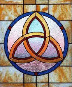
The powerful symbol if chose is The Trinity Knot. It is a symbol that has three interlocking eye shapes that all are intersecting. This symbol is most commonly recognized as the Holy Trinity (Father, Son, Holy Spirit). The complexity of trying to grasp the concept of the Trinity can be quite perplexing. This symbol accomplishes the complex idea that all three are separate, but also all three are one. This simple yet multifaceted symbol shows the unity of three persons in one Godhead.

I do agree, it is not a very universal symbol, but it is “a graphic symbol that communicates a more powerful message than written language”.

This symbol predates Christianity and appears to be a modified simplified version of a Celtic knot. While the Christian Church may view this symbol as Father, Son, Holy Spirit, the symbol is recognized for this trait of three in one. This symbol is also known for representing “mind, body, soul, as well as, in Celtic mythology – earth, sea, sky.” (3, See Source Below)

“Other three in one means for this symbol include:
* Spirit, Mind, Body
* Father, Son, Holy Ghost
* Mother, Father, Child
* Past, Present, Future
* Power, Intellect, Love
* Creator, Destroyer, Sustainer
* Creation, Preservation, Destruction
* Thought, Feeling, Emotion
* Mother, Maiden, Crone
* Other world, Mortal world, Celestial world” (2, See Source Below)

In end, this symbol has been used for many different things. Even today this symbol is being used by the band P.O.D. and “represents One being in Three seperate, but equal parts.” (1, See Source Below)

To me what makes this symbol so powerful is not that the Christian Church uses it for the trinity, or that some claim it a satanic symbol of 666, or even that POD uses the symbol; what makes this symbol powerful to me, is that it is used by for its meaning by all these different, and in some cases controversial sources. One symbol that can be adopted by so many meanings is indeed a powerful symbol.

Sources:

http://www.av1611.org/crock/pod_sym.html
http://www.whats-your-sign.com/celtic-symbol-for-trinity.html

http://symboldictionary.net/?p=159