CD Template Sites:
http://www.ncimedia.com/duplication/everest_design.html
http://www.jakprints.com
http://www.psprint.com
http://www.discmakers.com/templates/download.asp
http://www.discmakers.com/templates/JewelCase.asp#
Showing posts with label Package Design. Show all posts
Showing posts with label Package Design. Show all posts
10/11/10
6/18/10
Lable & Multiunit Carrier - Lorikeet
Project Overview:
Your project is to design labeling for a group of clear containers. Your labeling will be based on the product category you have already researched for your Product Profile. Then, for your next project you will design and construct the multiunit carrier that will house these containers, so planning is very important at this stage.
Concept:
The product is a pre mixed martini. It will have a front and back label with a cap wrapper. The front label is 6.75” x3” the back label is 6.72” x1.5” and the seal wrapper is 1”x4.5”. This product will come in a pack of 4 with an assortment of flavors. The product will be branded “Lorikeet”. A lorikeet is known for its bright vibrant colors, with this in mind I plan on having the beverage color reflect the name using bright colors for the different flavors.
The first thing the viewer will be drawn to is the Lorikeet perched on the rim of a martini glass. The glass is actually a die cut and reveals the clear bottle with the vibrant color of the drink. The color is reinforced by the flavor. The logo uses the eye of the Lorikeet for the ”o” showing unity with the logo and imagery.
The text included on the front label will be the logo, Flavor, Martini, Ready to serve, 375 ML (12.7 FL OZ) 20 Proof 10% ALC By VOL. The back label will include directions of how to serve. Nutritional information. Ingredients, Government Warning, Please Recycle, made with vodka, Barcode and Contact information. I also wanted to include a seal wrapper for the cap. It would have ready to serve and the warning again.
Thumbs:

Rough:

Tight Rough:

Rough Digital:
 Final Label:

Carrier Design:

Final

Your project is to design labeling for a group of clear containers. Your labeling will be based on the product category you have already researched for your Product Profile. Then, for your next project you will design and construct the multiunit carrier that will house these containers, so planning is very important at this stage.
Concept:
The product is a pre mixed martini. It will have a front and back label with a cap wrapper. The front label is 6.75” x3” the back label is 6.72” x1.5” and the seal wrapper is 1”x4.5”. This product will come in a pack of 4 with an assortment of flavors. The product will be branded “Lorikeet”. A lorikeet is known for its bright vibrant colors, with this in mind I plan on having the beverage color reflect the name using bright colors for the different flavors.
The first thing the viewer will be drawn to is the Lorikeet perched on the rim of a martini glass. The glass is actually a die cut and reveals the clear bottle with the vibrant color of the drink. The color is reinforced by the flavor. The logo uses the eye of the Lorikeet for the ”o” showing unity with the logo and imagery.
The text included on the front label will be the logo, Flavor, Martini, Ready to serve, 375 ML (12.7 FL OZ) 20 Proof 10% ALC By VOL. The back label will include directions of how to serve. Nutritional information. Ingredients, Government Warning, Please Recycle, made with vodka, Barcode and Contact information. I also wanted to include a seal wrapper for the cap. It would have ready to serve and the warning again.
Thumbs:

Rough:

Tight Rough:

Rough Digital:


Carrier Design:

Final


6/9/10
Paperboard Grades for Package Design
Paperboard Grades:
(SBS) -Solid Bleached Sulfate
This bleached paperboard or solid bleached sulfate (SBS) is a premium paperboard grade that is produced from a furnish containing at least 80 percent virgin bleached wood pulp. Most bleached paperboard is coated with a thin layer of kaolin clay to improve its printing surface, and it may be coated with polyethylene (PE) resin for wet strength food packaging. SBS is most popular in the United States.
Major market segments that use SBS:
* Medical packaging
* Milk and juice gable top cartons
* Aseptic drink boxes
* Cosmetic and perfume packaging
* Frozen food packaging
* Candy boxes
Coated Unbleached Kraft Paperboard (CUK)
Clay natural kraft (CNK®) or solid unbleached sulfate (SUS®) is a superior strength paperboard grade that is produced from a furnish containing at least 80 percent virgin unbleached, natural wood pulp. Most unbleached or natural kraft paperboard is coated with a thin layer of kaolin clay to improve its printing surface and may be also coated with polyethylene (PE) resin for wet strength food packaging.
Major market segments that use CUK:
* Frozen food packaging
* Milk cartons
* Pharmaceutical packaging
Recycled Paperboard
1. Uncoated Paperboard
Uncoated recycled paperboard, a multiply material, is produced from 100 percent recovered paper, collected from paper manufacturing and converting plants and post-consumer sources. It represents the single largest market for recovered paper in the United States. Some uncoated paperboard is produced with a top ply of white recovered fiber or is vat dyed for color.
Major market segments that use uncoated recycled paperboard:
* Shoeboxes
* Composite cans and fiber drums
2. Coated Paperboard
Coated recycled paperboard, a multiply material, is produced from 100 percent recovered paperboard just as uncoated paperboard is; however, it is typically coated with a thin layer of kaolin clay over a top ply of white recovered fiber to improve its printing surface.
Major market segments that use coated recycled paperboard:
* Soap and laundry detergent packaging
* Cookie and cracker packaging
* Paper goods packaging (facial tissue and napkins)
* Cake mix packaging
* Cereal boxes
* Other dry food packaging
SOURCE:
The Art Institute of Pittsburgh - Online Division
Packaging Graphics G332 XB Week 5
(SBS) -Solid Bleached Sulfate
This bleached paperboard or solid bleached sulfate (SBS) is a premium paperboard grade that is produced from a furnish containing at least 80 percent virgin bleached wood pulp. Most bleached paperboard is coated with a thin layer of kaolin clay to improve its printing surface, and it may be coated with polyethylene (PE) resin for wet strength food packaging. SBS is most popular in the United States.
Major market segments that use SBS:
* Medical packaging
* Milk and juice gable top cartons
* Aseptic drink boxes
* Cosmetic and perfume packaging
* Frozen food packaging
* Candy boxes
Coated Unbleached Kraft Paperboard (CUK)
Clay natural kraft (CNK®) or solid unbleached sulfate (SUS®) is a superior strength paperboard grade that is produced from a furnish containing at least 80 percent virgin unbleached, natural wood pulp. Most unbleached or natural kraft paperboard is coated with a thin layer of kaolin clay to improve its printing surface and may be also coated with polyethylene (PE) resin for wet strength food packaging.
Major market segments that use CUK:
* Frozen food packaging
* Milk cartons
* Pharmaceutical packaging
Recycled Paperboard
1. Uncoated Paperboard
Uncoated recycled paperboard, a multiply material, is produced from 100 percent recovered paper, collected from paper manufacturing and converting plants and post-consumer sources. It represents the single largest market for recovered paper in the United States. Some uncoated paperboard is produced with a top ply of white recovered fiber or is vat dyed for color.
Major market segments that use uncoated recycled paperboard:
* Shoeboxes
* Composite cans and fiber drums
2. Coated Paperboard
Coated recycled paperboard, a multiply material, is produced from 100 percent recovered paperboard just as uncoated paperboard is; however, it is typically coated with a thin layer of kaolin clay over a top ply of white recovered fiber to improve its printing surface.
Major market segments that use coated recycled paperboard:
* Soap and laundry detergent packaging
* Cookie and cracker packaging
* Paper goods packaging (facial tissue and napkins)
* Cake mix packaging
* Cereal boxes
* Other dry food packaging
SOURCE:
The Art Institute of Pittsburgh - Online Division
Packaging Graphics G332 XB Week 5
6/4/10
Typographic Hierarchy - Back Label
How can the use of type styles (bold, regular, italic, caps, etc.), size variation, orientation, and arrangement effect the look and feel of the packaging graphics?
By using different type styles a designer is able to lead the viewer to the key items and organize the information by creating a framework on the label and therefore establishing typographic hierarchy. In this wine bottle sample you see the bold, san serif, all capitol font really pops and draws the eye first on the white label. The word “Chardonnay” is the second thing you see as it is a larger font and quite bold. The smaller thinner fonts are still seen, but it is more of a sublet element. The type styles aid in creating personality and a voice for the product.

Resources:
Packaging Design Successful Product Branding from Concept to Shelf Chapter 5
http://www.thedieline.com/blog/2010/05/back-label-wine.html#more
By using different type styles a designer is able to lead the viewer to the key items and organize the information by creating a framework on the label and therefore establishing typographic hierarchy. In this wine bottle sample you see the bold, san serif, all capitol font really pops and draws the eye first on the white label. The word “Chardonnay” is the second thing you see as it is a larger font and quite bold. The smaller thinner fonts are still seen, but it is more of a sublet element. The type styles aid in creating personality and a voice for the product.
http://www.thedieline.com/.a/6a00d8345250f069e2013481be3a94970c-800wi
Resources:
Packaging Design Successful Product Branding from Concept to Shelf Chapter 5
http://www.thedieline.com/blog/2010/05/back-label-wine.html#more
Experimental Typography - Back Label
How can Packaging Designers utilize interesting and experimental typography within their packaging graphics while still conforming to industry standards?
Package designers must use “out-of-the-box” thinking to increase interest and push experimental typography with packaging design graphics. It is innovative and creative use of typography that makes a package stand out from the competitors visual noise. In analyzing the typography sites, I found this label for a bottle of wine. “Back Label”
I found the label to be completely different and something I had never seen before. It is so simple and inexpensive yet meets the criteria for the product. Using the distortion of the actual bottle and fluid was a very creative way to draw the consumer’s attention and move a basic san serif font to look more dynamic. Even better, they negative space the text created in reverse on the back label adds to the great design. In this design I think the designer could have even taken it a step further and done the same type application to the type of wine “chardonnay”. Overall, the big picture is very simple typography used in a creative way to create a very unique look for this product.
Resources:
http://www.thedieline.com/blog/2010/05/back-label-wine.html#more
Package designers must use “out-of-the-box” thinking to increase interest and push experimental typography with packaging design graphics. It is innovative and creative use of typography that makes a package stand out from the competitors visual noise. In analyzing the typography sites, I found this label for a bottle of wine. “Back Label”
http://www.thedieline.com/.a/6a00d8345250f069e2013481be3a94970c-800wi
I found the label to be completely different and something I had never seen before. It is so simple and inexpensive yet meets the criteria for the product. Using the distortion of the actual bottle and fluid was a very creative way to draw the consumer’s attention and move a basic san serif font to look more dynamic. Even better, they negative space the text created in reverse on the back label adds to the great design. In this design I think the designer could have even taken it a step further and done the same type application to the type of wine “chardonnay”. Overall, the big picture is very simple typography used in a creative way to create a very unique look for this product.
Resources:
http://www.thedieline.com/blog/2010/05/back-label-wine.html#more
6/2/10
Typography, Color & Imagry Develop Branding
How are typography, color and imagery used to develop brand recognition?
Consistent use of typography, color and imagery is key to creating brand awareness. Many people know their product simply by the consistent color used. Our brains actually identify color quicker than they recognize imagery. Color also has many physiological aspects to it as well. Certain colors are not good to use with certain foods while other color choices may brand a product masculine or feminine.
Typography is an interesting ingredient in design that is often overlooked. Letterform has the power and can change the personality of the entire piece, as well as, readability will help the viewer quickly identify the specifics of a product. I always think if type can be manipulated in away to show or reinforce what it says it is always very powerful, but the rule of thumb is the text needs to be readable which means always check spelling an grammar.
Imagery many times is the identifying mark of the brand. A simple symbol or logo placed in a consistent location on the product assures the consumer that he has the correct product. Imagery could be as simple as a symbol or as elaborate as a photographed model. Consider Verizon wireless. They continually use the guy in the black glasses. Verizon has done an amazing job at making the geeky guy in the black glasses with the cell phone, “The Verizon Guy”.
See Verizon guy:
 https://blogger.googleusercontent.com/img/b/R29vZ2xl/AVvXsEi9rf8xv4i7IyYC_mpw2s0n06IJlWPhLr8rjV-cqJxdBo_82SU_U_aJzoEBVNobK8KFJfNo1MI903d5zIoU6i3EsmN44JeBX3vnTOz4SK-xlBUA4uzP0QqNck36eId1uNgcmCB4YuY7QLk/s400/Verizon+guy.jpg
Many companies may try to snag a celebrity and use them as a brand as well. I specifically think of shoe companies and basketball players.

http://blog.themavenreport.com/wp-content/uploads/2008/01/michael-jordan-xx3.jpg
Imagery can also be used to distinguish the type of product. Food is often used to appeal to one appetite. An illustration my give quick visual instructions on how to open a product or even close it. They could even be warnings about harmful uses of the product.
Consistent use of typography, color and imagery is key to creating brand awareness. Many people know their product simply by the consistent color used. Our brains actually identify color quicker than they recognize imagery. Color also has many physiological aspects to it as well. Certain colors are not good to use with certain foods while other color choices may brand a product masculine or feminine.
Typography is an interesting ingredient in design that is often overlooked. Letterform has the power and can change the personality of the entire piece, as well as, readability will help the viewer quickly identify the specifics of a product. I always think if type can be manipulated in away to show or reinforce what it says it is always very powerful, but the rule of thumb is the text needs to be readable which means always check spelling an grammar.
Imagery many times is the identifying mark of the brand. A simple symbol or logo placed in a consistent location on the product assures the consumer that he has the correct product. Imagery could be as simple as a symbol or as elaborate as a photographed model. Consider Verizon wireless. They continually use the guy in the black glasses. Verizon has done an amazing job at making the geeky guy in the black glasses with the cell phone, “The Verizon Guy”.
See Verizon guy:

Many companies may try to snag a celebrity and use them as a brand as well. I specifically think of shoe companies and basketball players.

http://blog.themavenreport.com/wp-content/uploads/2008/01/michael-jordan-xx3.jpg
Imagery can also be used to distinguish the type of product. Food is often used to appeal to one appetite. An illustration my give quick visual instructions on how to open a product or even close it. They could even be warnings about harmful uses of the product.
Product Profile
For what purpose is the Product Profile method used?
The Product Profile is used for researching a product and its particular category closely to aid in early development in the design of packaging graphics. This method involves the study of color, typeface, imagery, hierarchy, unique features, diagrams, package constitution, the retail environment where product will be made available, as well as, other specifics depending on the product.
How can this information benefit the package designer?
Knowledge of what competitors are doing is very important in package design. Considering the strengths and weaknesses of the competing packages in the product category will be critical in developing a successful package design. The package designer needs to know what is out there and what their design is competing against. In the end a designer wants his package to stand out from the visual noise of the others, and communicate the essential information quickly and efficiently.
How can it benefit the marketer?
Since package design is different from ad design, the design is more about creating quick communication where the package can be easily spotted by the consumer. With this in mind a marketer will use consumer research to see what is most effective.
The Product Profile is used for researching a product and its particular category closely to aid in early development in the design of packaging graphics. This method involves the study of color, typeface, imagery, hierarchy, unique features, diagrams, package constitution, the retail environment where product will be made available, as well as, other specifics depending on the product.
How can this information benefit the package designer?
Knowledge of what competitors are doing is very important in package design. Considering the strengths and weaknesses of the competing packages in the product category will be critical in developing a successful package design. The package designer needs to know what is out there and what their design is competing against. In the end a designer wants his package to stand out from the visual noise of the others, and communicate the essential information quickly and efficiently.
How can it benefit the marketer?
Since package design is different from ad design, the design is more about creating quick communication where the package can be easily spotted by the consumer. With this in mind a marketer will use consumer research to see what is most effective.
5/27/10
Package Design - Letterform Only
Objective:
Choose a type of product and develop a brand and package using only letter form.
Project Overview:
I choose to design condom packaging. I will design the actual condom package and the cardboard product container. I plan to use the name “urge” for the name of the company that produces this line of condom, which is called “Xtreme”. The letter “X” will be the dominating design factor. I experiment with cropping the “X” out of the design space as well as using small “X’s” to create a design pattern.
Some of the theory behind the package design: In my research I found that most packaging for condoms is pretty simple. The majority of brands sold in drug stores utilize the type for design. Internet distributors offered greater variety of product and brand.
I also found that many people are too embarrassed to purchase condoms and some feel ashamed while browsing the selection offered. I even found in my research there is quite a debate about who is responsible to go out and buy the product. My plan with this design is to make the product stand out from the rest by using high contrast color, large typeface, and excellent use of text in the design.
I appreciate any insight on the direction of the design. I like most of them, but with this class being advanced typography I would probably lean toward the two in the middle, the 3-D looking one, and the one directly above with the red and white “X’s” at the angle.


Digital Roughs:


Final:
Resources:
http://misaccess.psi.org/bcc_catalog/web/files/JEITO%20EMBALAGEM%20FINAL%2010%281%29.jpg
http://www.condomdepot.com/
http://revfm.net/revshows/XtremeTalk-ShowLogo.jpg
http://www.abundantmoments.com/TeamXtreme_logo.jpg
http://www.itwgema.us/gemagramsept08/XTremeLogo.jpg
http://www.brandsoftheworld.com/brands/0014/5697/brand.gif
http://www.lifestyles.com/
http://www.durex.com/en-US/Pages/default.aspx
http://www.trojancondoms.com/
http://talkback.stomp.com.sg/forums/showthread.php?t=5326
http://www.howtodothings.com/family-relationships/how-to-buy-condoms
http://sti.bmj.com/cgi/content/abstract/82/6/467
http://health.howstuffworks.com/condom10.htm
Choose a type of product and develop a brand and package using only letter form.
Project Overview:
I choose to design condom packaging. I will design the actual condom package and the cardboard product container. I plan to use the name “urge” for the name of the company that produces this line of condom, which is called “Xtreme”. The letter “X” will be the dominating design factor. I experiment with cropping the “X” out of the design space as well as using small “X’s” to create a design pattern.
Some of the theory behind the package design: In my research I found that most packaging for condoms is pretty simple. The majority of brands sold in drug stores utilize the type for design. Internet distributors offered greater variety of product and brand.
I also found that many people are too embarrassed to purchase condoms and some feel ashamed while browsing the selection offered. I even found in my research there is quite a debate about who is responsible to go out and buy the product. My plan with this design is to make the product stand out from the rest by using high contrast color, large typeface, and excellent use of text in the design.
I appreciate any insight on the direction of the design. I like most of them, but with this class being advanced typography I would probably lean toward the two in the middle, the 3-D looking one, and the one directly above with the red and white “X’s” at the angle.

Thumbnails:

Digital Roughs:


Final:
Resources:
http://misaccess.psi.org/bcc_catalog/web/files/JEITO%20EMBALAGEM%20FINAL%2010%281%29.jpg
http://www.condomdepot.com/
http://revfm.net/revshows/XtremeTalk-ShowLogo.jpg
http://www.abundantmoments.com/TeamXtreme_logo.jpg
http://www.itwgema.us/gemagramsept08/XTremeLogo.jpg
http://www.brandsoftheworld.com/brands/0014/5697/brand.gif
http://www.lifestyles.com/
http://www.durex.com/en-US/Pages/default.aspx
http://www.trojancondoms.com/
http://talkback.stomp.com.sg/forums/showthread.php?t=5326
http://www.howtodothings.com/family-relationships/how-to-buy-condoms
http://sti.bmj.com/cgi/content/abstract/82/6/467
http://health.howstuffworks.com/condom10.htm
Package Design - DVD Text only - Seven
Objective:
Find a DVD and redesign the cover using only type. The final should be front, back and spine, as well as, insert front and back and the DVD.
Post: Thumbnail, Digital Rough, Final.
Description:
DVD: Seven -
I used a large #7 to span the entire space with a gritty font called CGF OFF-ROAD. I then used the seven sins, which is the theme of the movie, in the number in a subtle color/shade. I used repetition of these seven sins. I then picked random spots to change the color of the listings to a bright red. This is in keeping with the theme of the movie as well as the murders are at random. I used the font Last Sound Track for the Sins and the Title, which I made large and red. I also exchanged the V in seven for a #7. Finally I applied a quote and the featured actors in a Palatino font. On the original movie they used hash marks, which I thought I would keep in my design which are done in the Megiapaoid font. I plan on adding more color and completing the back spine, inside piece front and back as well as the DVD to complete this project.


Find a DVD and redesign the cover using only type. The final should be front, back and spine, as well as, insert front and back and the DVD.
Post: Thumbnail, Digital Rough, Final.
Description:
DVD: Seven -
I used a large #7 to span the entire space with a gritty font called CGF OFF-ROAD. I then used the seven sins, which is the theme of the movie, in the number in a subtle color/shade. I used repetition of these seven sins. I then picked random spots to change the color of the listings to a bright red. This is in keeping with the theme of the movie as well as the murders are at random. I used the font Last Sound Track for the Sins and the Title, which I made large and red. I also exchanged the V in seven for a #7. Finally I applied a quote and the featured actors in a Palatino font. On the original movie they used hash marks, which I thought I would keep in my design which are done in the Megiapaoid font. I plan on adding more color and completing the back spine, inside piece front and back as well as the DVD to complete this project.

Thumbnail

Digital Rough


Package Design - Continuous Label Cylinder
Objective:
Create a company and product label that will use a cylinder shaped container. It may not contain any die cuts or windows. The label must be continual and not appear to have a front or back.
Show a thumbnail, sketch rough, 3 digital revisions, and final product photo.
Product overview:
The product is spaghetti pasta. The product is currently known for it’s packaging in boxes and bags. The product is produced in long, thin brittle pieces. I would like to packaging to appeal to individuals looking for a spaghetti pasta product for Italian. The packaging will appeal to those looking to use portions of the product; therefore the packaging also serves a purpose of storage. Target group is men and women 18- 40 with a small family or individuals living alone.
The brand name is Segreti. I thought using an Italian family name would work well for this Authentic Italian Pasta Product. I have researched Italian looking fonts and found that they lend more to a script look. At the same time some applications use a think san serif font. The logo is repeated on the container to make it appear there is not a front or back. The size of the label is 7” X 10 5/8” with a ¼” on the top and bottom and a ½” flap.


Digital 1


Create a company and product label that will use a cylinder shaped container. It may not contain any die cuts or windows. The label must be continual and not appear to have a front or back.
Show a thumbnail, sketch rough, 3 digital revisions, and final product photo.
Product overview:
The product is spaghetti pasta. The product is currently known for it’s packaging in boxes and bags. The product is produced in long, thin brittle pieces. I would like to packaging to appeal to individuals looking for a spaghetti pasta product for Italian. The packaging will appeal to those looking to use portions of the product; therefore the packaging also serves a purpose of storage. Target group is men and women 18- 40 with a small family or individuals living alone.
The brand name is Segreti. I thought using an Italian family name would work well for this Authentic Italian Pasta Product. I have researched Italian looking fonts and found that they lend more to a script look. At the same time some applications use a think san serif font. The logo is repeated on the container to make it appear there is not a front or back. The size of the label is 7” X 10 5/8” with a ¼” on the top and bottom and a ½” flap.

Thumbnail

Rough Sketch

Digital 1

Digital 2

Final

Final Prototype
5/22/10
Package Design - Reflecting the product

Response: Crunch graphics work best when balanced with some smooth clean lines.Too much of a crunchy thing can be overbearing, not to mention, unappetizing.
Source From: http://www.rbird.com/movabletype/patterns/archives/package-design-for-crunch.php
Crunch Graphics:
Using the edges and borders to push the “crunch” is a great concept. Not only is the word crunch there, but also it is rocking the environment it is placed in. Pushing the packaging to experience the effect of the product is a great way to express to the costumer how the experience of the product will be. In this case it reminds me more of being creative and mindful with the entire package design. In this case crunch is what is being pushed making the entire package reflect the “crunch” of the product. The same principle would be true if the product was chewy, creamy, bubbly or fizzy..You see this concept applied a lot with bubbles. I think the sub point is important though you can have too much crunch. Balance is always key.


Package Design Use of White

Response: While presentation on white is an effective way to put focus on texture and grain, it also is a common technique among organic, or natural foods. Words like “clean”, “crisp” and “snappy” come to mind for packages using this technique.
http://www.rbird.com/movabletype/patterns/archives/package-design-for-crunch.php
White:
The section about “White” was interesting to me. It seems like this is a newer movement for quality brands in my opinion. It seems like years ago the generic product would use white for packaging with very plain simple text looking very generic I guess at that time it was an affordable design choice. Today it seems like this movement has shifted to quality products and brands as well. These products using a lot of white seems to be a better quality as the brand speaks for itself and the noise of the packaging is not needed for attention. The products seem to be focused more toward the health conscious apposed to those looking for a sweet snack containing red 40.


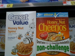


Package Design Windows

Sometimes, gorgeous illustrations or photography can lead to a let down for consumers who demand truth in advertising for the products they purchase. An honest, what you see is what you get, approach could be well worth it for good looking products. Clear windows allow consumers to see the actual product.
Response: Window shapes can be further enhanced with rough edges or irregular shapes to help support the crunchy look.
From: http://www.rbird.com/movabletype/patterns/archives/package-design-for-crunch.php
I think the section about windows is very true. Something to really be mindful of in packaging design is customers want to see the product. This is especially true with bread products. People want to see the bread and texture. You can spot mold, quickly and in this example most like to squeeze and inspect the product for freshness. At the same time, if the product is not so pretty, or not as quality as its competitors, a window could turn off customers. It is important to know what the competitors are doing. If a product has out standing quality compared to its competitors it would be a great way to show the customer the great product. A window may not be quite as effective in products like cereals or fruit snacks. Using a photo or illustration may be a better way to display the product as it is easier to control for consistency and push graphically for excitement. Also controlling the location of the window is key. You wouldn’t want to put a window at the bottom of a chip bag and reveal all the broken chips at the bottom. This type of research is very helpful in any type of packaging design. The candy wrapper applies as well. I am thinking specifically of molded candy where the item has been molded to a specific shape. Valentines Day hearts, Easter bunnies, Christmas trees and the like are great examples of candy bars using a window. Revealing the product can really assure the customer the product is exactly what they are looking for.
Research in Packge Design for Crunch
A great site with information to enchance package design. This site explores the packaging of the following products:
Brands referenced include: Back to Nature, Ben & Jerry, Blue Bunny, Butterfinger Crisp, Cap'n Crunch, Caribou Coffee, Cary's, Cascadian Farm, Cheese Nips, Cheetos, Cocoa Pebbles, Crisp'itz, Crispy Delites, Doritos, Food Should Taste Good, Frito Lay, Garden of Eatin, General Mills, Giga Hold, Goldfish, Good Humor, grape-nuts, Gripz, Healthy Delite, Heart Basics, Hershey, Kashi, Keebler, Kellogg's, Kit Kat, Krackel, Kraft, Krispy Kreme, Lunchables, Madhouse Munchies, Masterfoods, McCormick, Nabisco, Nature's Path, Nestle Crunch, New York Style, Old El Paso, Optimum Zen, Oscar Mayer, Pepperidge Farm, Post, Quaker, Rice Krispies, Salad Toppins, Snickers Cruncher, Stop & Shop, Sun Snacks, Tiny Trapeze, TLC, Wheat Thins, Whole Foods, Wise, YoCrunch.
Comments are made about the following:
Environment
Windows
Background Texture
Product Illustration
White
Energy
Lettering
Color
Brand Characters
Hard Things in Soft Things
Not Quite Crunchy
Crunch Masters
Crunch Graphics
Crispy vs. Crunchy
Check it out:
http://www.rbird.com/movabletype/patterns/archives/package-design-for-crunch.php
Brands referenced include: Back to Nature, Ben & Jerry, Blue Bunny, Butterfinger Crisp, Cap'n Crunch, Caribou Coffee, Cary's, Cascadian Farm, Cheese Nips, Cheetos, Cocoa Pebbles, Crisp'itz, Crispy Delites, Doritos, Food Should Taste Good, Frito Lay, Garden of Eatin, General Mills, Giga Hold, Goldfish, Good Humor, grape-nuts, Gripz, Healthy Delite, Heart Basics, Hershey, Kashi, Keebler, Kellogg's, Kit Kat, Krackel, Kraft, Krispy Kreme, Lunchables, Madhouse Munchies, Masterfoods, McCormick, Nabisco, Nature's Path, Nestle Crunch, New York Style, Old El Paso, Optimum Zen, Oscar Mayer, Pepperidge Farm, Post, Quaker, Rice Krispies, Salad Toppins, Snickers Cruncher, Stop & Shop, Sun Snacks, Tiny Trapeze, TLC, Wheat Thins, Whole Foods, Wise, YoCrunch.
Comments are made about the following:
Environment
Windows
Background Texture
Product Illustration
White
Energy
Lettering
Color
Brand Characters
Hard Things in Soft Things
Not Quite Crunchy
Crunch Masters
Crunch Graphics
Crispy vs. Crunchy
Check it out:
http://www.rbird.com/movabletype/patterns/archives/package-design-for-crunch.php
5/19/10
Milky Way Candy Bar Wraper Project
Overview:
For this assignment I chose to work with Milky Way. At first I only had one concept but then with the thumbnail process I was able to come up with some creative ideas.

Some Thumbnails:


I went with Thumb 7: Milky Way Map:
I made some adjustments from the original thumb. I like this concept cause it is somewhat educational having a map of the Milky Way and that it is very different from the original.
Heal & Seal - Package Design
Project Brief: Heal & Seal
Product: Enter the product name and provide a brief description if necessary | HEAL & SEAL- soap designed for cleaning, healing and preserving tattooed skin. |
Problem: The problem statement briefly presents a situation that needs to be solved. | Many people get tattoos and part of tattoo care is proper cleaning. People need a product that will clean, sooth, and heal their tattoo as well as, retain color and brightness of the ink. |
Objective: The objective presents a solution to the communication problem. | Promote a cleaning, healing, protective soap for people that get and have tattoos, that will aid in quicker healing, relieve discomfort, and enhance the ink for longer lasting clarity and color. Antibacterial, Antimicrobial, Anagelsic. |
Target Market: This section briefly describes specific relevant information about the audience. | Demographics: Men and women ages’ 18-25, living in urban areas, that have, or are getting tattoos. Psychographics: Individuals concerned with long lasting quality detail, and color. Interested in the music and concert scene. Artistic, edgy, dark and provocative. |
Message: This might be a slogan or a one-word description of the “personality” of the communication. It could be as simple as “fun” or “romantic.” The fewer words used to describe the message, the better | “Making Your Marks Last” |
Media Plan: This quickly describes the type of media that you will use. | 1.Internet: Website containing videos, information, discounts, free samples, and purchase options and banner ads, 2. Consumer Magazine: A full-page color advertisement in Prick Magazine, with ad containing product, details, and web address. Run the Ad for 12 months 3. Outdoor: Billboard or transit ad located an urban area near a tattoo shop that carries the product. Billboard would be bold and simplified keeping the branding and look of the magazine ad and internet advertising |
Product Label:

Applied to Container:

Outdoor Advertising:


Subscribe to:
Posts (Atom)