Showing posts with label Other. Show all posts

8/29/12

Choosing 3D Rendering Software?

Choosing 3D Rendering Software?

Source:
your3dsource.com
Software Level OS Price Notes Details
Maya Pro. PC $3,495.00 Full Blown Production Film Quality Alias's Maya 3D is extremely powerful.  Its node-based
architecture enables complex animation and rendering linkages to be created
and it offers a nonlinear modeling history, plus Mental Ray rendering.
Strata 3D Mid. MAC/PC $700.00 Have experience building tradeshow Displays In this,
Use it at work. Similar to Photoshop
Strata's Strata 3D has a long history and is available for
Mac and PC.  It's a sturdy if slightly archaic 3D program, but it has
found favor with many digital illustrators.  It has some good rendering
features, including radiosity, which are rare at the price. www.strata3d.com
Bryce 3D Mid. MAC/PC $99.95 For Landscapes and Environment Corel's
Bryce 3D is an interesting 3D program.  It's primarily a landscape
rendering application, designed to produce skies, seas, and terrains in a
very efficient way.  It can be pressed into service as a more general
purpose 3D tool, but lacks any serious modeling tools. 
Pixels Mid. MAC $49.00 Great for animation and video games Pixels is a Mac-only 3D program
that offers advanced rendering and animation and robust modeling for a modest
cost.  It also features a renderer based on the REYES algorithm-the same
one used in Pixar's RenderMan software.
Blender Mid. MAC/PC FREE Considered one of the best with full 3D production
packages.
One of
the best free 3D applications available is Blender. This program is a full
featured 3D production package featuring the kinds of tools you'd expect to
see in a mid to high end application. 
Lightwave 3D Pro. MAC/PC $895.00 Great tools Newtek's Lightwave 3D is a dual application featuring separate modeler/texturing and
animation/lighting/rendering apps. Its quirky interface is deceptively
powerful, and it offers one of the best quality renderers out there.
Cinema 4D Pro. MAC/PC $2,771.00 Full Blown Production Film Quality The full suite of plug-ins for Cinema
4D
takes it into the high end.  With advanced
radiosity rendering, sophisticated character tools, and a GUI based
expression system, it's also one of the easiest high-end 3D apps to get to
grips with.
Poser Pro Beg. MAC/PC $499.99 Character Development It's a 3D character renderer and animator that lets
you pose and animate ready-made, high quality 3D figures.  It's very
powerful, but it's not an all rounder- it does one thing only-but does it
very well.


3D Rendering Software


  1. Which applications animators use to render 3D images?

    Maya, Strata 3D, Bryce 3D, Pixels Pro, Blender, Lightwave 3D, Cinema 4D, Poser Pro, Houdini, Softimage XSI.

  2. How do 3D applications apply to still graphics as well as animation? 

    3D applications use still graphics at sources to composite and develop complex 3D imagery.

  3. Uses of 3D animations—do they enhance Web sites? Inform an audience? Sell a product? Entertain?

    3D animations are used in a wide variety of forms. Many think that 3D animation only is really used in the entertainment industry in video games and movies. The truth is that 3D animations are use everywhere in our society. From simple small apps and functions on a cell phone, to complex technical animations for demonstrations and instructional purposes 3D animation has become a part of everyday life.
     
  4. Why animators choose to render 3D animations rather than 2D animations?

    3D animation creates and the ability to reveal more dimension and detail in an image. Moving an image from a flat surface to revealing more volume allows the viewer to see and understand more data and detail than compared to what a 2D image introduces. For example in a 3D environment the viewer has a better sense of scale, proximity, and in many instances can view the impossible like in wire frame or cutaways.

  5. Which individuals and industries are using 3D graphics—either still images or animations? What are the characteristics of those 3D graphics currently in use by these individuals/industries?

    The entertainment industry is all about using advanced technology to push the industry further into reality. With 3D graphics and animation both the film industry and gaming industry have exploded with realistic detail. Video games are no longer just for the kids, but remain a high point in the day for many adults. I have even heard of elderly people in their 80’s getting in on the action. One couple I heard about uses a Wii system to play golf every night after dinner. They are too old to go out to the course, but love the game. They tee off every night at 7pm are able to play on courses around the world.

    Beyond entertainment, the medical field is able to explain and show so much more to students and patients about what is happening in the body with both 3d graphics and animation.

    Actually, as technology has greatly advanced and software is more available we see it popping up all over. From cell phones to flight simulators 3D graphics and animation are becoming away of life.

Sources:

"Google Images." Google. Web. 15 June 2011. .

Mac 3D : PiXELS3D for OSX. Web. 14 June 2011. .

"MAXON SHOP - Home Page - North and South America." Www.maxonshop.com. Web. 14 June 2011. .

"Maya - 3D Animation, Visual Effects & Compositing Software - Autodesk." Autodesk - 3D Design & Engineering Software for Architecture, Manufacturing, and Entertainment. Web. 14 June 2011. .

"Which 3D Animation Software Should I Use?" Animated Gifs | Build A Website | Animation Schools | Animation Software. Web. 14 June 2011. .

12/29/11

Effective Direct Mailer Concepts


DISCUSS TOPIC:
Will your direct mail campaign be viewed as just another piece of junk mail? Discuss some of the strategies learned from your reading as well as ideas you've developed that could save a direct mail campaign from being automatically tossed in the trash.

Overview:
The stats are against direct mail especially if an organization is not able to afford the volume to get the low rate of return to show the needed numbers. This means some creative ideas are in order to generate a better return and get the public to delay disposal of the direct mail piece.


1. Using the Famous:
The first idea is to locate some sharp looking celebrities with great teeth, probably some one on the red carpet looking very glamorous. The concept is that “You don’t have to be a celebrity to have a nice smile…” Images could be located on http://www.shutterstock.com and as long as the printed number was less then 250,000 the price for the photography would be rather affordable. To make this concept successful the celebrity would need to be a more popular one. Kids might connect with Justin Bieber, while generation-X might be drawn more to Megan Fox, or Ryan Reynolds. My wife claims women of all ages like George Clooney. The bottom line to this concept is that people would see the celebrity and think of this glorified individual. We would play on their emotions as we are saying the dental care will make them one step closer to this ‘godlike’ individual. Think of how teens have posters of these individuals plastered across their bedrooms. Using a popular celebrity face would defiantly slow the trip to the trash.

2. Special Offer:
My gut reaction is a special offer will always get someone in the door or at least delay throwing away the promotional. But as dental offices are giving away free whitening, cleanings, and x-rays like it is going out of style, one would think that there would never be anyone missing dental care or not establishing a dental home.

This offers have almost given ruined the public for direct mail as there is always a catch. My wife for example went for her free exam and the dentist claimed to find 6 cavities and wanted $2500. Funny she had never had a cavity before in her life.

The offer would need to be clear and not have hidden addenda.  For me I would like to know that I could get in the door and out with the service without getting hammered with a bill. “A free first visit” might be in order. The service and experience would key to retain the client and make them want to return. Also booking the follow up in 6 months would need to happen to help establish the relationship and dental home.

3. Stuff For Kids:
Kids love to get stuff in the mail. If the mailer was directed at children it might prove to stay in the home out of the trash for the longest amount of time. I would consider some type of folded piece that has stickers and was a chart that children could place by their toothbrush, or even hold the toothbrush. They could track their brushing, and flossing and it would help count down to the next dental appointment. This would help remind the child of their next dental visit and they would be excited as the completed chart could offer some “great prize” for healthy brushing habits.

Conclusion:
I think a combination of all of these concepts would be the best solution. Marketing should be directed at the children. The piece should be some type of thing that helps them remember to brush and practice good dental habits. If the piece showed a good track record the child would get a prize and free dental cleaning this would be Incentive for the child and parents both. Taking this one step further finding a relatively inexpensive character to help endorse the promotion would be the best touch, but could be costly. Most cartoon characters are branded with copyright. It might almost be easier to develop a new character, but that removes the “I know them” concept from the piece. For example, if my daughter got a piece in the mail with Dora, or Elmo on it saying to brush her teeth, she would be more drawn to the piece than if a everyday cartoon dog was on the piece. This being the case still combining the concepts would aid in creating a solid piece that would offer great motivation to both child and parent.

5/3/11

Wasteland - Vik Muniz - Murals Out of Waste

The other night I saw something I found to be most interesting though as a new technique for murals. It was a documentary on PBS about the artist Vik Muniz and how he is creating huge murals out of trash. I think the film is called "Wasteland". Check out this piece below from www.wastelandmovie.com

4/27/11

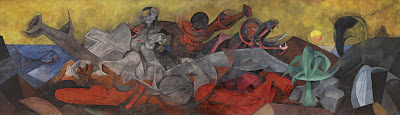
Rufino Tamayo - America Mural (influenced by) Picasso - Guernia

OBJECTIVE: Select from the Internet an image of an American wall mural that you consider to be significant. Write an analysis contextualizing the content and style of the mural. Discuss how the site contributes to the meaning of the mural.

https://blogger.googleusercontent.com/img/b/R29vZ2xl/AVvXsEj1PDMutBD16PxsqLUpGjp05ssmxQAKa2kV9ey-g0gl4PuPsdnwC4Umrr1nKO7-rTMwXIUFCtpo8Eb0Pb5VlJYAbhOuJ-EB0Qlb_xLGsv38S18jqeVMRNSrkdW074unDjIQR6bpvHnrUAM/s1600/Rufino_Tamayo_America_lg2.jpg Title: America
Artist: Rufino Tamayo
Date: 1955
Intended Location: The Bank of the Southwest – Houston, TX 1955-1990
Current Location: Dallas Museum of Art – 1993 - current
Size: 13’2” x 45’10 3/8”
Medium: Vinylite
(Rufino Tamayo America Mural, 2011)


The very large “America” mural, painted by Rufino Tamayo in 1955, is known for being one of his most magnificent and impressive murals. Working alone in Mexico City for 5 months 7 days a week Tamayo was able to truly focus his efforts into his 13 by 45 foot colorful creation. When he had completed it he rolled it up and sent it to Houston, Texas to be displayed at the Bank of the Southwest.

What initially drew me to this mural was the use of the cubism style. According to my research, Tamayo has established a reputation in working in combination of cubism and futuristic styles, which are both apparent in this piece. This allegorical piece reveals the history and richness of America.

The main white figure in the center of the piece resembles a nude female in a reclining position. Surrounding the figure Tamayo has placed iconic natural resources to signal the abundance of the land. The viewer is reminded by “the fish, symbol of wealth of the sea; by a plant, symbol of the richness of the land; by an oil geyser and spring of water, symbols of our underground resources” (Rufino Tamayo America Mural, 2011). Tamayo also shows the unity and cultural influences in the different races with the white and red figures embracing in the top of the painting.

He chooses a vibrant pallet of reds, blues, yellows and greens, as well as, shades of gray. It is these decisions and understanding of color that have given Rufino Tamayo a reputation for color. “Today Tamayo is indeed regarded as one of the great colorists of the twentieth century” (Sotheby’s, 2011).

Tamayo reveals his discipline in study and understanding of his trade as he reveals the influences from Picasso’s Guernica, as well as, the emotion of the Mexican School. The piece “successfully asserts the timeless values of civilization” with his “Abstract Expressionist’s embrace of the primitive and the mythic” (Sotheby’s, 2011).

Title: Guernia
Artist: Pablo Picasso
Date: 1937
Size: 11’ x 25.6’
Medium: Oil Paint
(Guernica, 2011).


Works Cited:
"Guernica (painting): Facts, Discussion Forum, and Encyclopedia Article." AbsoluteAstronomy.com. Web. 27 Apr. 2011. .

"Rufino Tamayo America Mural." MID-CENTURIA : Art, Design and Decor from the Mid-Century and beyond. Web. 27 Apr. 2011. .

"Sotheby’s New York to Offer Important Mural by Rufino Tamayo, Entitled America." TheArtWolf.com - Art and the Art World. Web. 27 Apr. 2011. .

4/21/11

Chuck Close VS Gusstavus Hesslius


Chuck Close is known for painting in a photorealism style. This style pushes detail to the extreme, as it closely resembles a photograph. The artist is able to capture and recreate an image by paying close attention to intricate detail and produce a piece in realistic quality. He created his “Big Self Portrait” with acrylic paint and airbrush on canvas using a grid technique with enlarged photographs to dissect the image and recreate in a larger scale with incredible accuracy and attention to
detail.
Many differences are very apparent between the self-portrait of Chuck Close and works of Gusstavus Hesselius. Maybe the most obvious of differences is the “Big Self Portrait” of Close is painted in black and white while Hesselius’s pieces are both in color. Also the other major difference is the style of Chuck Close’s photorealism shows greater detail of the figure and gives the viewer much more information. Closes understanding of the human figure is spot on and attention to shadows and light move is image to greater realism.
Hesselius seems to want to show is portraits in their glory. The chief with his blue garment and accessories hanging from his neck bordered by an oval show casing the image and the self portrait showing himself in an honored position of authority give both of these characters more of a feeling of awe and power. Chuck Close uses more of a raw gritty approach and does not glorify his portrait but rather appears to degrade it. We see that he even has a smoldering cigarette in his mouth. His hair is everywhere and we are not even sure he is clothed. Unshaven and unkempt it almost appears that Close wants his viewers to think he had just rolled out of bed. His haphazard appearance in the photo adds to the photorealistic quality created in his technique.
In trying to find similarities between the pieces a viewer can identify that all the figures are male, none of the figures are smiling, and the chief and Close’s self portrait are both created with the same view of the face. These two images are also more closely related as they do not have the figure with any furniture around them.
Looking at similarities and differences it can quickly be realized that Hesselius’s paintings really do not have much connection to the Chuck Close “Big Self Portrait”. While they are all paintings, Close’s photorealistic style really takes his piece in a different direction when comparing it to the works of Hesselius. From the perspective, realistic human form, color, and even over all appearance displayed in the portrait Chuck Close shows stark contrast to Hesselius in his self-portrait.


Chuck Close
Big Self Portrait
1967-1986
Acrylic on canvas.
107 1/2 x 83 1/2" (273 x 212 cm).
Walker Art Center, Minneapolis
(
ArtsNet Minnesota, 2011)

  Tishcohan  self-portrait
(Common-place, 2011)
Works Cited:
"ArtsNet Minnesota: Identity: Chuck Close." ArtsConnectEd. Web. 06 Apr. 2011. .
Common-place. Web. 07 Apr. 2011. .
"MoMA.org | Interactives | Exhibitions | 1998 | Chuck Close." MoMA | The Museum of Modern Art. Web. 06 Apr. 2011..

Gustavus Hesselius

QUESTION: A portrait is an image of an identifiable individual and often attempts to convey as much of that individual’s identity as possible to the viewer. A portrait is an artist’s interpretation of what the artist feels are important traits to convey about the subject. In theory, self-portraits are a bit different in that they portray the artists’ own view of themselves.


Visit the following links to view portraits by the Swedish artist Gustavus Hesselius, who was active in New England during the first half of the eighteenth century:


* Gustavus Hesselius, Tishcohan, 1735
* Gustavus Hesselius, self-portrait, c. 1740


The first is an image of the Delaware Chief Tishcohan. The second is a self-portrait by Hesselius.


Because we don’t know much about either men, these images serve as important documentation of who they were. How would you describe these two men? How would you interpret the specific details, such as background, garments, lighting, and facial characteristics, found in each image? Are there substantial differences that distinguish the self-portrait from the portrait? Discuss the differences with reference to the two images. In your opinion, to what extent do cultural differences dictate the way in which artists represent themselves and other members of their community versus how they represent those who are considered outsiders?


Tishcohan  self-portrait
(Overcoming Nausea, 2011)

With no background and research about these images one must go off of visual cues left by the creator. In this case the Swedish artist Gustavus Hesselius left a handful of visual marks to help the viewer draw conclusions about each image. 
 These images show great contrast in the individuals. The first of Delaware Chief Tishcohan indicates he is an Indian by his skin tone, hair, clothing and accessories. The face also shows weathering and deep wrinkles’ indicating this individual spends a great amount of time outdoors in the sun. Also looking closer at the blue garment is not a typical stitched garment, but more of a wrap, which would be more common of that culture of people. This image also does not have anything in the background. It could be a visual cue to lead the viewer to connect the idea that this man does not have many possessions, and is more of a nomad. His social status is lower class and most defiantly poor. The shape of the body indicates that the figure is strong, but defiantly not wealthy as the figure is thin. The chief is also show to have a light source from straight on which makes him appear more flat, and simple, which is another great visual cue to indicate a commoner. 

The self-portrait of Gustavus Hesselius shows a great a contrast in social status, culture and class when compared to the image of the chief. His pale skin and a white wig were a traditional style of sophisticated gentlemen of this time period. His clothing, a white blouse with a dark over coat show that he has money and is at a higher status than a common laborer. He is also seated in a large chair at a desk, which could lead the viewer to believe he is educated and established in his career and not a common laborer. The lighting is displayed from the right. This gives more dimensions to the figure as the right side of the face is in highlight with the hand below and the left side is in shadow. With greater dimension a viewer may be lead to consider a more complex elite role this individual plays. 

The one common thread that both of these images has is that each one show a man that is not smiling. Both have a very serious facial expression, as the mouth in each piece is pulled tight across creating more of a frown. The chief, however, has a softer less arrogant look, as his eyebrows are both in a relaxed position. The self-portrait shows the right eyebrow raised. This could lead the viewer to assume the image portrays a sense of power, arrogance or superiority.  With these many visual cues the viewer can quickly gather information and make assumptions about each image, their status, and culture.

Works Cited:

AIO .American Art History | ART3010 UA.  Week One Assignment 2 – DQ2, Web.
0
5 April 2011.

"Overcoming Nausea." Common-place. Web. 05 Apr. 2011.

Maps VS Landscapes

Question:
Research two types of images that focus on the depiction of land:
* Landscape images that give you an idea of a particular place and its terrain
* Maps meant to help navigate through the land
Discuss what features, such as depictions of flora, fauna, geographic details, help to distinguish images depicting land as landscape or map. In other words, what makes a landscape different from a map? Provide examples from your research to support your answer. Are there images that do not easily fit into either of the categories described? Why? Cite at least one example of such an image.


(A Little History on the Prairies, 2011)

In researching images of maps and landscape I found that the landscape images give the viewer a greater sense of detail. They spark instant emotions as well. In the watercolor and ink piece by Ron Woodall the viewer quickly see a stark baron area. We notice the flat land and the color pallet that leads us to believe the areas is a very dry desolate place. We see no living thing in the image just dead grass and dark skies. The structure in the painting even gives us visual cues to believe it is abandon. The windows and doors are open and parts of the structure are falling down. There is no smoke in the chimney and the path to the structure looks abandon. The viewer feels the emotion of solitude, failure, death or abandonment.

(Waiting, 2011)
The next landscape painting I studied was a more modern landscape. It is less detailed than the previous but still gives us many visual clues to what the artist is trying to communicate. In the painting “Waiting” by William Wray we see an urban setting.  In our culture it is easy to identify the structure of the golden arches. We instantly know it is a McDonalds restaurant. We see figures waiting on the corner and images that resemble cars, billboards, streetlights and signs. We see the harsh contrast of green grass and vibrant landscaping against the gray of the concrete sidewalk and street. The other visual que I believe the artist is attempting to show us is that this landscape is in a morning or evening setting. The light source is coming from the right and showing the viewer either beginning or ending of the day.  The viewer might have a emotional strike of hunger in seeing the arches, fatigue, accomplishment, or ambition with the positioning of the sun.
 
(Aviation Weather Services – Observed Text Products, 2011)

The map diagram I found and studied of the Weather Depiction Chart Example is very different from the landscape images. The map is more analytical details and facts to the viewer. This map is not colored and is very information specific. To truly find this map useful one would need to have the understanding of interpreting the symbols and markings for effective communication.


(April 2009, 2011)
In the study of Jasper Johns “The Map” we see a completely different type of map. The map is very abstract and does not give the viewer much information but may get more of an emotional reaction as it uses many vibrant colors and abstract shapes. The visual cues are very subtle and if the viewer were not familiar with United States this map would not be very helpful at all. While this map is more expressive and iconic, it may give general ideas about the shape and locations of some of the states, but would not help most looking for more detailed accounts.
From my research I find the main difference between maps and landscapes are that maps are more analytical providing data. Even in the abstract map the facts are there as far as the shape and locations of states. In looking at the landscape image I find the viewer is more inclined to abandon fact and move to more emotional responses. The viewer could draw visual conclusions based on visual cues, which could be correct, but are more or less hypothesis.
Autumn Falls Painting


(Autumn Falls Painting by Jaison Cianelli, 2011)

Finally I also found a landscape that was totally uninformative. My first look at “Autumn Falls” by Jaison Cianelli left me with so many questions of what I was seeing. Is it an explosion? A bright light? It was not until I saw the title “Autumn Falls” That I was able to understand this landscape as a waterfall. Even with that name the viewer has great difficulty gathering information from the image.
In conclusion, I find that the more information an image has the quicker the viewer is able to assimilate what the creator is communicating. Greater details also aid in communicating more information but more details do not mean the image is more interesting. I find the weather map very boring and uninteresting even though it has the most factual analytical data for the viewer. Taking this thought a step further I would venture to say that in creating visual cues and mystery without telling the whole story, the image keeps the viewer interested and looking for more to gain greater understanding.
Works Cited:
"Aviation Weather Services – Observed Text Products." Touring Machine Company. 22 June 2008. Web. 5 Apr. 2011. .
"April 2009." Music & More. Web. 05 Apr. 2011. .
"Autumn Falls Painting by Jaison Cianelli - Autumn Falls Fine Art Prints and Posters for Sale." Jaison Cianelli - Fine Art. Web. 05 Apr. 2011. .

"January 13 – March 4, 2011 - University of Lethbridge Art Gallery." University of Lethbridge. Web. 05 Apr. 2011. .

"A Little History on the Prairies." ALICE SALTIEL-MARSHALL. Web. 05 Apr. 2011. .
""Waiting"" MoCo Loco - Modern Contemporary Design & Architecture. Web. 05 Apr. 2011. .

Neoclassical Architecture


QUESTION: Architecture was one area where the European influences in America appeared during the Neocclassical era. These architectural examples remind us of an important period in our history as a country as well as document interesting developments in architectural style in both public and domestic buildings. Discuss European Neoclassical influences on public and domestic architecture from the Neoclassical era in America.  Focus on how it was adapted and evolved in America as well as its importance in forming a nation identity.
 
Neoclassical architecture is best described as structures that are designed based on the classic architecture of ancient Rome and Greece. Neoclassical architecture, also called new classical, can be identified by a handful of distinguishing features. It is best known for its symmetrical shape and tall columns that run from the bottom to the top of the structure. They also are known for having a “low-pitched triangular gable on the front of some buildings” (Craven, 2011). This was very popular “in the Grecian or Greek Revival style of architecture”, and is called a pediment (Craven, 2011). Another notable feature found in neoclassical architecture is a domed roof.

It was the neoclassical influence that gave birth to the Greek Revival and Federalist style architecture, which were popular in the United States in the early 1800 and 1900’s. The home below, located in Saratoga, New York, is a great example of Greek Revival architecture. Its distinguishing features include a “pediment gable, symmetrical shape, heavy cornice, wide plain frieze, bold simple moldings, entry porch with columns, decorative pilasters” and “narrow windows around the front door” (Greek Revival House Style, 2011).

While the Greek Revival style of architecture made its debut in the public building in Philadelphia, the influence and made its way south and many of the large plantation houses
were designed with its distinguishing features. Even in the 20th century the style continued to show its influence in with many American homes that utilize the designed with the
front-gable.
Stately, pillared Greek Revival homes reflect a passion for antiquity.
(Greek Revival House Style, 2011).

The Federalist Style became popular “in the United States from about 1780 until the 1830s” (Federal and Adam House Styles, 2011). The many distinguishing features in this style became quite popular in the early American Colonies. Features like, “Low-pitched roof, or flat roof with a balustrade, windows arranged symmetrically around a center doorway, semicircular fanlight over the front door, narrow side windows flanking the front door, decorative crown or roof over front door, tooth-like dentil moldings in the cornice, palladian window, circular or elliptical windows, shutters, decorative swags and garlands” and “oval rooms and arches” are how many identify this style (Federal and Adam House Styles, 2011). Even with his great popularity with early American structures the influence can still be seen in many modern American buildings.   Graceful details distinguish Federal style homes.
(Federal and Adam House Styles, 2011).
Works Cited:
Craven, Jackie. "Pediment - Definition of a Pediment - Architecture Glossary." Architecture and House Styles - Architecture and House Styles and Home Design. Web. 12 Apr. 2011. .
"Federal and Adam House Styles - House Style Pictures - Federal Houses and Adam Houses." Architecture and House Styles - Architecture and House Styles and Home Design. Web. 12 Apr. 2011. .
"Greek Revival House Style - House Style Pictures - Greek Revival Houses." Architecture and House Styles - Architecture and House Styles and Home Design. Web. 12 Apr. 2011. .

Twilight in Wilderness - Frederic Edwin Churches

QUESTION: Although at first sight landscapes often appear as innocent and neutral, close inspection provides clues to the ideological perspective espoused by the artist. Browse through your textbook and identify a landscape painting that you feel is explicit about its role in offering a nationalist vision. What would you say the message of the painting is? What does the artist want to convey about America? What role, if any, do people play within the landscape?


(Church: Twilight in the Wilderness, 2011)
In Frederic Edwin Churches, “Twilight in the Wilderness” an optimist may suggest that he is expresses a feeling of anticipating with his vast open space. The 40 by 64 inch oil painted canvas, displayed in “The Cleveland Museum of Art” located in Cleveland, Ohio, creates great dimension giving the viewer a sense that the painting never ends. This visual cue touches on the idea of open opportunity offered in the United States and the potential opportunities and limitless possibilities in the west.  
  At the same time, others may argue that the contrasting dark surroundings the thin strip of the setting sun reveal a sense of great uncertainty, anxiety or even fear of difficulties ahead. With the knowledge of the context that the painting was done in 1860, most are confident that the painting was not an optimistic outlook. With the Civil War a year after the creation of the painting, most viewers of that time a less than optimistic response to Churches efforts.

Beyond the initial reaction to the great space created with vibrant color and an advanced knowledge of field of depth; or the dark contrasts pushing toward oppression; another obvious observation in this vast landscape is the lack of people. “Church has banished all evidence of human habitation” (Pohl, 2002). The viewers are giving the scene of an undisturbed wilderness, leading to the idea of uncertainty. Additional the settlers on the east coast at this time were less concerned with the preservation of the west and more concerned with expansion and the issues of slavery. In Painting an undisturbed westward facing landscape, Church brings up a social issue that was in the forefront of the minds of most of the society of the time.

Today most don’t see the painting today as the early Americans did. With the political issues left to the history books and the discussion produced by the piece  today is the speculation that Church has included an eagle in on the left side as “a symbol of American power” (Church: Twilight in the Wilderness, 2011). Others claim the painting holds religious connections to Christianity. They look at the areas “where the branches cross,” and consider it a connection to a crucifix” (Church: Twilight in the Wilderness, 2011).

Maybe these subtle details were indeed what Church was trying to focus on. It is possible that the painting was an attempt at optimism, pride and religious deliverance. Regardless of Churches intentions, the political issues were in the crosshairs of the public minds. Either the issues of that time gave the viewer’s distortion or clarity of Churches intentions.

Works  Cited:

"Church: Twilight in the Wilderness." Mark Harden's Artchive. Web. 12 Apr. 2011. .

Pohl, Frances K. Framing America: a Social History of American Art. New York, NY: Thames & Hudson, 2002. 150-51. Print.

Twin Towers By Christiaan Bekker

(TwinTowers Painting by Christiaan Bekker – TwinTowers, 2011)

In the painting title “Twin Towers by Christiaan Bekker” the artist fills the canvas with exquisite detail of the attack on the United States on September 11th 2001 (TwinTowers Painting by Christiaan Bekker – TwinTowers, 2011).  This day marked the birth of America’s “War on Terror”. Bekker displays the horror of the tragedy, the pure evil of the enemy, the destruction and devastation left behind and the hope created by a free nation looking forward of.

In my initial look at Bekkers oil painting my eye was quickly drawn to the statue of liberty crying. Her mouth wide open, eyes clinched shut as she tears her garment and exposes her heart, which is a burning American flag. This imagery alone conveys the oppressing sadness of this event. 

Above lady liberty we see the twin towers backed by darkness or in my opinion smoke, We see the artist has slipped in a few more details here as we see the clouds next to the top of the tower appear to have evil eyes looking at the towers and lower we see two giant hands with claws gripping the tower.  The artist wants us to see the evil intent of those how took the lives of many innocent Americans that day.

In the lower right hand corner we see the devastation of the event. Tangled metal, smoke and rubble. The artist pays tribute to those who fought to save lives with is including of the somber looking firefighters. He also pays respects to those who lost their lives in the event as the firefighters are lowering the flag to half mass.
While 911 was a day of horrible destruction and sadness, many clung to hope. I believe this is displayed in the top right corner where we see the sun and the firefighter pointing on to the US flag, which appears to be held by many. I think this shows our hope in our country and its freedom. 

Other more subtle items Bekker added to this piece are the tail of the American Airlines airplane. This reminds us of those hostages and the terror that was experienced before they collided with the towers. We also see a small section of the pentagon below the towers, to remind “At 9:43 a.m., a third passenger plane crashed into the Pentagon” ( September 11th, 2011). Finally, we see the bald eagle in the center. I believe this is symbolic to show that even when we are attacked we are a strong nation that comes together.

Works Cited:
"September 11th." Digital History. Web. 14 Apr. 2011. .

"TwinTowers Painting by Christiaan Bekker - TwinTowers Fine Art Prints and Posters for Sale." Fine Art - Art Prints - Fine 

 Art Prints - Greeting Cards - Posters - Originals - Buy Art Online - Sell Art Online. Web. 14 Apr. 2011. .

4/13/11

Download FREE HD 1080 videos!

Get way to get HD videos downloaded from youtube!

1. Go to youtube.com and find type any topic in the search bar and add "HD"
2. Select a video that has the HD logo. 
 3. The page will load and you go to the URL

4. Type In "keep-" after "www." and before "youtube.com/...."

5. Welcome to KeepTube.


 6. Select what you would like to download. EVEN 1080!


ENJOY! 


3/24/11

Know Your Software - Efficient Design

Understanding how to use software: In today's technical society software is an essential tool of our trade. Understanding the capabilities of software and the advantages of one over the other and the  techniques used in the professional world, will maximize the power of software tools. Have an expert understanding of how essential software will enable you to faster and more efficiently execute concepts.

11/29/10

Virtual Team Apps - Skype


In my virtual design team experience, one essential tool that makes communication so much easier is to use Skype to host a group conference call. Not only does this application allow you to talk directly to the group, but you can also have a group chat that enables the team to share documents and even share your desktop. It is free and works on both mac and PC. www.skype.com

Dropbox - Great Doc Share App.

A great app for document sharing. This application has been a life saver in my virtual team experiences. It updates the file for everyone in real time. It is just another folder on your and their computer.


See the video and check out the website to get this great app. http://www.dropbox.com/

11/13/10

Team Conflict

QUESTION? Why do conflicts arise in a virtual team?

Conflict occurs in teams for many different reasons. Whether the team struggles with who’s in charge, a lazy teammate, individuals trying to get off task, a change in direction, or even not meeting deadlines, conflict occurs. In the end most conflicts that arise can be boiled down to due to two types of conflict.

Cognitive conflict involves problems with ideas, principles, issues, or even processes. A cognitive conflict is more targeted at the task and how it is accomplished. The other type of conflict is affective, which focuses on people, values and emotions. This type of conflict is directly linked to personal and the different personalities and background.

Most of the time poor communication is a cognitive conflict. When things are unclear as far as, goals, delegation, expectation, deadlines, quality, and even concept, a team will fall into conflict because of the lack of communication. To avoid this it is important for everyone to ask questions, and take time to make sure everyone is on the same page. It may also be wise to over communicate and have critical items in writing more than once. In the virtual environment it is even more difficult as there is not the visual cues to reinforce what is being said. Also technology does sometimes fail, and critical messages may never actually make it to their recipients.

Having unrealistic expectations is of an affective type of conflict. This is especially true when members of the team may not have as much experience or talent as they claim. Emotions run wild when teammates cannot meet expectations. Individuals in the team may become disappointed in coordinator, and try to take control of the team themselves. In contrast a coordinator my not be satisfied with the work of the finisher and create conflict with trying to improve the quality. Another issue almost every team experiences in this area, is when some members may not commit the same amount of time and effort other team members feel should be given. The conflict arises as the over achiever is irritated at the slacker and the slacker is annoyed at the push of the over achiever.

What ever the conflict is it is important to try to repair the breakdown, to make the unit function more effectively and not a repeating incident. Conflicts can either be resolved constructively or destructively. A constructive resolution would show growth and change from the conflict. It actually fixes a problem and the team is stronger because of the conflict. A deconstructive resolution is the worst way to resolve a conflict as no resolution is reached. It then divides and team and breaks down team moral. It drains the team of energy and vision.


Resources:
AIO Lecture Week1
http://www.ohrd.wisc.edu/onlinetraining/resolution/aboutwhatisit.htm
http://www.chumans.com/human-systems-resources/managing-team-conflict.html

Team Mission Statement

QUESTION? What is the importance of a mission statement for a team?

A mission statement helps a team keep on track with the objective and direction of the task. One of the many functions of a mission statement is to identify a direction and goal for the team to work towards. It will help define and prioritize how and what the team does, as well as, how resources are used. It reveals the identity, standards and core function of the team’s aspirations. In the most simple of terms, it organizes the group to be more productive by getting everyone one the same page.

Without a mission statement a team could easily get off task and waste time floundering instead of making steps to accomplish and expedite the goal. A team lacking a mission statement might trying to accomplish the same goal, as a team with a mission statement, but will waste time, energy and resources. Without a sound direction the team also may be come frustrated, conflicted and even hostile toward each other. The end result the team produces will also probably not be as clear and effective as a group with a mission statement.

A mission statement helps turn a team into a well-oiled machine, as it spells out the values and objectives. With the values and goals defined direction is quite clear, therefore, eliminating some opportunities for conflict.

Resources:
AIO Lecture Week 1
http://www.samples-help.org.uk/mission-statements/team-mission-statements.htm
http://www.health.state.mn.us/divs/hpcd/chp/hpkit/text/team_mission.htm
http://www.businessplans.org/mission.html

11/9/10

Extreme Realism

Extreme Realism

Image Source: https://blogger.googleusercontent.com/img/b/R29vZ2xl/AVvXsEhjR50VrB_882jT6V9F5_K5NVsaKdqo8pUY0m4FUchr5H3JkEVwBsV6x-xIajOMKobyHzdktqd8nTsVcqk4LiXqGpuhHYVGlw-2OffTimMs3B4hS79ujDEq8M6HbucVPqfGKQQmfOo8MkcI/s400/Picture+3.png

Isn’t that a photograph? It is hard to believe Don Eddy was able to capture such detail in his paintings of cars. He is obviously an artist that was strongly influenced by the Extreme Realism Movement and actually considered himself to be a photorealist. In this piece Don Eddy is able to give the viewer a very accurate account of a common everyday setting. His work is so detailed with realistic reflections, light, color and value that at first glance the viewer might think they are actually looking at a photograph opposed to a painting. The artist has revealed the setting without distorting it.

Cubism


Cubism

Image Source: http://1.bp.blogspot.com/_H__ZfihjeDc/S7UVYnXvKdI/AAAAAAAAAd4/QdckPLurCNw/s1600/zhatter.png

This illustration of The Mad Hatter, titled "Time for Tea" by Alex Pribnow, reveals a solid influence of the cubism movement. The viewer can see the different parts of the figure have been broken down into simple geometric shapes used in this movement. The viewer can see the cone, cylinder and sphere forms used to create the figure. It is also apparent the artist does not use a traditional perspective with the figures face, but shows multiple viewpoints. The main view of the figure is a profile view, but we are still able to see both eyes and eyebrows on the face.

Surrealism

Surrealism

Image Source: http://behance.vo.llnwd.net/profiles/57681/projects/488962/576811271844962.jpg


This self-portrait, by Francesco Sambo, shows great influence of Surrealism. The artist has placed brought the viewer into an unresolved conflict. He has placed a figure that is morphing into or out of the wall. The figure has a large hole in his chest. Seeing the texture and slight color at the top left is symbolic of the blood splatter that would have happened when the hole was created. I notice that there is not a rich use of color, but more muted. The blood has turned browner in color, which tells the viewer this incident happened a while ago. Finally the gesture and expression of the figure lets the viewer know that the experience is still fresh and unresolved by the figure. Further more the surreal influence is very present in this piece as we are looking into the subconscious of the artist.