The Christmas Tree symbol originated with ancient Egyptians, Chinese, Romans, and other cultures. They would use evergreens to mark the celebration of the winter solstice, at the end of the harvest year. The evergreen was a symbol of the spirit of renewal. Druids used holly and mistletoe as symbols of eternal life.
This symbol also appeared in the Middle Ages to mark an Adam and Eve pagan festival.
In the Middle Ages, evergreens were decorated with red apples to mark the pagan festival of Adam and Eve.
Sources:
http://community.seattletimes.nwsource.com/archive/?date=20041218&slug=christmastree18m
http://www.dart-creations.com/article-tree/cakes/christmas_tree.html
2/17/10
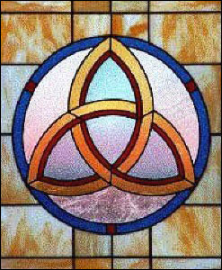
Powerful Graphic Symbol
Question: Find and submit a graphic symbol that communicates a more powerful message than the written language.

The powerful symbol if chose is The Trinity Knot. It is a symbol that has three interlocking eye shapes that all are intersecting. This symbol is most commonly recognized as the Holy Trinity (Father, Son, Holy Spirit). The complexity of trying to grasp the concept of the Trinity can be quite perplexing. This symbol accomplishes the complex idea that all three are separate, but also all three are one. This simple yet multifaceted symbol shows the unity of three persons in one Godhead.
I do agree, it is not a very universal symbol, but it is “a graphic symbol that communicates a more powerful message than written language”.
This symbol predates Christianity and appears to be a modified simplified version of a Celtic knot. While the Christian Church may view this symbol as Father, Son, Holy Spirit, the symbol is recognized for this trait of three in one. This symbol is also known for representing “mind, body, soul, as well as, in Celtic mythology – earth, sea, sky.” (3, See Source Below)
“Other three in one means for this symbol include:
* Spirit, Mind, Body
* Father, Son, Holy Ghost
* Mother, Father, Child
* Past, Present, Future
* Power, Intellect, Love
* Creator, Destroyer, Sustainer
* Creation, Preservation, Destruction
* Thought, Feeling, Emotion
* Mother, Maiden, Crone
* Other world, Mortal world, Celestial world” (2, See Source Below)
In end, this symbol has been used for many different things. Even today this symbol is being used by the band P.O.D. and “represents One being in Three seperate, but equal parts.” (1, See Source Below)
To me what makes this symbol so powerful is not that the Christian Church uses it for the trinity, or that some claim it a satanic symbol of 666, or even that POD uses the symbol; what makes this symbol powerful to me, is that it is used by for its meaning by all these different, and in some cases controversial sources. One symbol that can be adopted by so many meanings is indeed a powerful symbol.
Sources:
http://www.av1611.org/crock/pod_sym.html
http://www.whats-your-sign.com/celtic-symbol-for-trinity.html
http://symboldictionary.net/?p=159
Red Bull Logo Reliant on Color Recognition...
QUESTION?
Think of a brand, product or company whose logo or branded image is reliant on color recognition. Evaluate this use of color. What is the message this color conveys? Why does it convey this message? Give examples in your response.
The Red Bull energy drink uses “red” as is main color with a touch of “yellow”. The color, red, is an ideal choice for this brand, as it not only to reinforce the name “Red” Bull, but the color, red, also is known for raising blood pressure, or causing excitement. Red Bull has used phrases like “Red Bull vitalizes body and mind” and “Red Bull gives you wiiings!” (Peterson, 2009) in it’s marketing campaigns. With the color, red, being associated with drive, action, energy, and strength, it is an ideal match for the branding.
The splash of yellow also used in the logo is a nice touch as yellow is associated with, sunshine, warmth, and happiness. The relationship of the two colors is an Analogous Relationship, where colors are located close to each other on the color wheel. Both colors would be in the warm family.

Cited:
Peterson, Erik. “Logo Critiques.”
1 June 2009. Web. 11 Jan. 2009.
<http://www.logocritiques.com/resources/color_psychology_in_logo_design/>
Resources:
AIO Lecture Week 1 – Design Audience
http://www.logotree.com/html/color_psychology_logo_graphic_design.htm
http://www.logocritiques.com/resources/color_psychology_in_logo_design/
http://www.color-wheel-pro.com/color-meaning.html\
http://www.worqx.com/color/combinations.htm
Think of a brand, product or company whose logo or branded image is reliant on color recognition. Evaluate this use of color. What is the message this color conveys? Why does it convey this message? Give examples in your response.
The Red Bull energy drink uses “red” as is main color with a touch of “yellow”. The color, red, is an ideal choice for this brand, as it not only to reinforce the name “Red” Bull, but the color, red, also is known for raising blood pressure, or causing excitement. Red Bull has used phrases like “Red Bull vitalizes body and mind” and “Red Bull gives you wiiings!” (Peterson, 2009) in it’s marketing campaigns. With the color, red, being associated with drive, action, energy, and strength, it is an ideal match for the branding.
The splash of yellow also used in the logo is a nice touch as yellow is associated with, sunshine, warmth, and happiness. The relationship of the two colors is an Analogous Relationship, where colors are located close to each other on the color wheel. Both colors would be in the warm family.
Cited:
Peterson, Erik. “Logo Critiques.”
1 June 2009. Web. 11 Jan. 2009.
<http://www.logocritiques.com/resources/color_psychology_in_logo_design/>
Resources:
AIO Lecture Week 1 – Design Audience
http://www.logotree.com/html/color_psychology_logo_graphic_design.htm
http://www.logocritiques.com/resources/color_psychology_in_logo_design/
http://www.color-wheel-pro.com/color-meaning.html\
http://www.worqx.com/color/combinations.htm
Design Principles - Unity, Balance, Rhythm, Focal Point, Proportion
Unity:
“Unity is a measure of how the elements of a page seem to fit together - to belong together” (skaalid, 1999).
A few different ways to achieve unity are through proximity, repetition and continuation.
Proximity is the simplest way of creating an appearance of belonging together. See a sample of proximity:

Repetition is a great way to show unity with repeating colors, textures, shapes and objects. See a sample of repetition:

Continuation is a subtle way to create unity in design. Using a continuing line, edge or direction from one part of the piece to another are ways to unify the design. See a sample of continuation:

Balance:
Balance “is an equal distribution of weight” (Linda, 2006) or “objects are of equal weight, they are in balance” (Skaalid,1999). There are a few different types of balance.
Symmetrical balance which is a mirror image balance. It is basically making one side of the page very similar to the other side. See sample of symmetrical balance:

Asymmetrical balance occurs when multiple small items balance a large item, or smaller items are more distant from the center of the screen than larger items. Another method is, using a darker item may be balanced with multiple lighter items. See sample of asymmetrical balance:

Radial balance is when all elements “radiate” out from the center point in circular gesture. It is know for being quite easy to keep a focal point when using radial balance, because all the elements will draw your eye in toward the center. See sample of radial balance:

Rhythm:
“Rhythm is a pattern that is created by repeating or varying elements, with consideration given to the space between them, and by establishing a sense of movement form one element to another” (Linda, 2006). By using rhythm or repetition a designer creates consistency with in the design that makes it easier for the observer to understand. Many different types of rhythm create different feelings for the observer. Using a regular rhythm will reveal breaks between elements, and sometimes the elements are relative in size or length. The use of a flowing rhythm creates a feeling of movement, and more natural. Finally using a progressive rhythm reveals an arrangement of figures with a sequence of steps.
See Regular Rhythm:

See Flow Rhythm:

See Progressive Rhythm:

Focal Point:
Focal point refers to the part of the design that is most emphasize. Many adjustments can be made to accentuate any element in a design such as shape, position, size, color, value, direction, and even texture. (Linda, 2006)
See Focal Point:

Proportion:
Proportion is known as “ the relation of one part to another or to the whole with respect to magnitude, quantity, or degree” (proportion, 2010). Good use of proportion will aid in establishing depth and visual weight.

Works Cited:
Linda, Robin. Graphic Design Solutions. Bostin: Wadsworth, 2006.
Skaalid, Bonnie, “Classic Graphic Design Theory Principles of Design: Balance”,
1999. Web 13 Jan. 2009.
< http://www.usask.ca/education/coursework/skaalid/theory/cgdt/balance.htm>
Skaalid, Bonnie, “Classic Graphic Design Theory Principles of Design: Unity”,
1999. Web 13 Jan. 2009.
<http://www.usask.ca/education/coursework/skaalid/theory/cgdt/unity.htm>
"proportion." Merriam-Webster Online Dictionary. 2010.
Merriam-Webster Online. 13 January 2010
<http://www.merriam-webster.com/dictionary/proportion>
Other Resources:
AIO Lecture
http://www.usask.ca/education/coursework/skaalid/theory/cgdt/balance.htm
http://webdesign.about.com/od/webdesignbasics/p/aarhythm.htm
http://www.digital-web.com/articles/principles_of_design/
“Unity is a measure of how the elements of a page seem to fit together - to belong together” (skaalid, 1999).
A few different ways to achieve unity are through proximity, repetition and continuation.
Proximity is the simplest way of creating an appearance of belonging together. See a sample of proximity:
Repetition is a great way to show unity with repeating colors, textures, shapes and objects. See a sample of repetition:
Continuation is a subtle way to create unity in design. Using a continuing line, edge or direction from one part of the piece to another are ways to unify the design. See a sample of continuation:
Balance:
Balance “is an equal distribution of weight” (Linda, 2006) or “objects are of equal weight, they are in balance” (Skaalid,1999). There are a few different types of balance.
Symmetrical balance which is a mirror image balance. It is basically making one side of the page very similar to the other side. See sample of symmetrical balance:
Asymmetrical balance occurs when multiple small items balance a large item, or smaller items are more distant from the center of the screen than larger items. Another method is, using a darker item may be balanced with multiple lighter items. See sample of asymmetrical balance:
Radial balance is when all elements “radiate” out from the center point in circular gesture. It is know for being quite easy to keep a focal point when using radial balance, because all the elements will draw your eye in toward the center. See sample of radial balance:
Rhythm:
“Rhythm is a pattern that is created by repeating or varying elements, with consideration given to the space between them, and by establishing a sense of movement form one element to another” (Linda, 2006). By using rhythm or repetition a designer creates consistency with in the design that makes it easier for the observer to understand. Many different types of rhythm create different feelings for the observer. Using a regular rhythm will reveal breaks between elements, and sometimes the elements are relative in size or length. The use of a flowing rhythm creates a feeling of movement, and more natural. Finally using a progressive rhythm reveals an arrangement of figures with a sequence of steps.
See Regular Rhythm:
See Flow Rhythm:
See Progressive Rhythm:
Focal Point:
Focal point refers to the part of the design that is most emphasize. Many adjustments can be made to accentuate any element in a design such as shape, position, size, color, value, direction, and even texture. (Linda, 2006)
See Focal Point:
Proportion:
Proportion is known as “ the relation of one part to another or to the whole with respect to magnitude, quantity, or degree” (proportion, 2010). Good use of proportion will aid in establishing depth and visual weight.
Works Cited:
Linda, Robin. Graphic Design Solutions. Bostin: Wadsworth, 2006.
Skaalid, Bonnie, “Classic Graphic Design Theory Principles of Design: Balance”,
1999. Web 13 Jan. 2009.
< http://www.usask.ca/education/coursework/skaalid/theory/cgdt/balance.htm>
Skaalid, Bonnie, “Classic Graphic Design Theory Principles of Design: Unity”,
1999. Web 13 Jan. 2009.
<http://www.usask.ca/education/coursework/skaalid/theory/cgdt/unity.htm>
"proportion." Merriam-Webster Online Dictionary. 2010.
Merriam-Webster Online. 13 January 2010
<http://www.merriam-webster.com/dictionary/proportion>
Other Resources:
AIO Lecture
http://www.usask.ca/education/coursework/skaalid/theory/cgdt/balance.htm
http://webdesign.about.com/od/webdesignbasics/p/aarhythm.htm
http://www.digital-web.com/articles/principles_of_design/
Contrast

Contrast is one of the best ways to draw visual attention. It’s the most basic situation picture a black square with a small white box or circle located on the right or left side. Your eye will be drawn to that white shape because of the great contrast. (See example box below).
At the same time excessive use of contrast across the composition will reduce the focal point. Color is also used in drawing ones eye to a focal point. Bright colors are known for drawing the eye quicker than darker colors. Of course, there is always an exception to the generalization when there is a dark area when everything else is bright.
The image of the bananas is a great example of focal point with contrast. Notice the obvious contrast of the yellow banana’s on the dark colored counter top. There is also a pattern in the counter where the bananas skin does not have a pattern. This image uses color, value, position, shape, and even texture to create a great focal point contrast.
Resources:
AIO Lecture Week 2
Graphic Design Solutions pg. 53, 104-105
http://www.n-sane.net/fundamentals/focal-point/index.php
Positive and Negative Space
In the first design I use an air plain shape in repetition to create a design that moves the viewer from the lower left corner to the upper right corner. Using positive and negative contrast of positive negative not only creates tension, but also isolates the shape and really makes it quite visible in the design. I am able to utilize repetition and reveal the shape to create movement and unity. The positive negative contrast of the large black shape creates great balance of white space at the top and right side as the white shapes are similar in size and shape. A similar balance is also achieve at the left and bottom sides. I also used a “tail cloud” or line element coming from the back of the smaller airplanes to give the viewer more direction of where to begin. The line elements worked well to created interesting composition as they jump from positive to negative to be revealed in overlap of elements.

In the second designs I wanted to use the same shape but with a completely different concept. I wanted to show the chaos but still have a focal point. While there are two planes that move your eyes around the graphic the other elements bring you to the center. With the positive negative working together each shape is isolated to give it clarity even when sections of the shapes have been dropped out there is enough information to communicate.

Other info: I used illustrator to create this design and totally took advantage of the pathfinder tool.
Resources:
AIO Lecture Week 2
Graphic Design Solutions, pg 59-60, 86
http://www.layersmagazine.com/negative-space.html
Graphic Design & The Brain
Question: Why do you think the human brain prefers unified visuals and designs rather than random? Your answer should be two to three paragraphs.
The main objective of a designer is to effectively communicate information through visual elements, color, texture, shape, type, and design. The best way is to quickly and effectively communicate information is to establish unity and consistency within the design. The unity and consistency in the design causes a familiarity and allows for the quicker assimilation of information. If there is a structure to the design and the pieces fit well together and there is actually less information process and retain as the message will be received as a whole or complete thought. Unity can be established in many different ways. The most significant methods to establish unity are using correspondence, alignment and flow.
One of the best ways to ensure unity is to use a grid as a framework to establish structure, margins, columns, and proportion. Grids are key for showing consistency in placement on one or multiple pages and are most helpful in keeping text, graphics and photos aligned. Books and websites have been known to use a grid to achieve a fundamental structure and design consistency.
There is many times when designers may look at a piece and make the statement “There is too much going on in this piece…”. This would indicate the design might lack unity or visual flow. The elements in the piece may not be working together to present factual, emotional, psychological, or persuasive information to the viewer. The information is not organizes efficiently or effectively to for the viewer to quickly assimilate and understand what is being communicated. The elements lack visual connection and do not correspond well with one another, leading the viewer from one element to the next. For effective visual communication a designer must present visual elements in a cohesive format that does not detract from the fundamental message with mixed messages, noise tangents, or even distraction.
Resources:
AIO Lecture
Textbook: Graphic Design Solutions: Pg. 107-108
http://www.online.tusc.k12.al.us/tutorials/grdesign/grdesign.htm
http://plaztikjezuz.com/arts%20102%20ebook/Unity.pdf
Logo with "Spirit" or "Essence" - PUMA
Give an example of a well-known logo which you feel has expression. Describe the “spirit" or “essence” that is communicated in the logo and explain how it is communicated.
The Puma logo was first designed in 1948. It was created for a German company that produced mostly athletic shoes and some sportswear. The logo uses the flat shape of a cougar, mountain lion or panther leaping over the bold san serif text “PUMA”. This powerful creature is known for its activity both during the day and night. It is an accomplished hunter with the aptitude to jump extreme distances in a single leap. Incorporating the imagery of this animal into the branding was a powerful and sure way to insure the spirit product. Their dynamic logo is an excellent metaphor for athletes to adopt in their training and competition.
With the combination of both symbol and text in the logo, viewers have instant recognition. The Puma logo is most often seen in a black or white value, but with the simple flat shape the logo can be easily adjusted to adapt to any color scheme.
See Puma Logo:

Resources:
AIO Lecture
Graphic Design Solutions Chapter 6
http://www.logoblog.org/puma-logo.php
http://www.famouslogos.org/puma-logo
The Puma logo was first designed in 1948. It was created for a German company that produced mostly athletic shoes and some sportswear. The logo uses the flat shape of a cougar, mountain lion or panther leaping over the bold san serif text “PUMA”. This powerful creature is known for its activity both during the day and night. It is an accomplished hunter with the aptitude to jump extreme distances in a single leap. Incorporating the imagery of this animal into the branding was a powerful and sure way to insure the spirit product. Their dynamic logo is an excellent metaphor for athletes to adopt in their training and competition.
With the combination of both symbol and text in the logo, viewers have instant recognition. The Puma logo is most often seen in a black or white value, but with the simple flat shape the logo can be easily adjusted to adapt to any color scheme.
See Puma Logo:
Resources:
AIO Lecture
Graphic Design Solutions Chapter 6
http://www.logoblog.org/puma-logo.php
http://www.famouslogos.org/puma-logo
Subscribe to:
Posts (Atom)