For good designers selecting a fitting font can be the “icing on the cake” or the subtle touch that takes the design to the next level. The designer must consider many different things before an appropriate typeface can be applied. What type of text is in question? Is the amount of text going to eliminate certain typefaces? Does the font choice need to assist in establishing visual hierarchy? Is the text going to be repeating? Is the designer using an assimilation technique? What about legibility and readability? These questions and more are continual design issues that are evaluated when selecting a font for a project.
In some cases a designer can find a typeface that evokes and reaffirms the message a particular design is attempting to communicate or use the text in away to reinforce its message. I think the PBS show “Word World” is a great example of this technique. They use the actual names of the items to create the object. Mostly a very large bold font is used, but it is interesting how it is adjusted slightly to reveal the characteristics of the specific animal or word. Click Here to See the Example: http://wordworld.com/
A few more examples of this technique where the font is more subtle:

Fire -http://tutorialbeach.com/tutorials/images/fire_reflection_8.jpg

Smoke -http://photoshoproadmap.s3.amazonaws.com/texteffects2/20.jpg
While the technique discussed above is very appropriate for a more sublet creative environment, it may not be the best decision when trying to establish a certain visual hierarchy. Using typeface to help establish visual hierarchy is a will help in leading the viewer to see the key elements in the design. Considering the style, point size, position, and of course font of text can reinforce visual hierarchy.
See Examples:

http://lauriejerome.com/portfolio/img/sound_small.jpg

https://blogger.googleusercontent.com/img/b/R29vZ2xl/AVvXsEhAr9haodHvr9QQmtt3IDV3UMn-Scof5S674xfDGb-3SL0ZjDaMi7aO_EntouOqGY-UV73PJpde6qGF7KBmYCyB2oeuNbkYUCtk21Ri76FChEulPr9QL149pD0DULaHyo8RdyzA2rZs9HU/s1600/We3_As2_Fleming_2.jpg
http://www.thedieline.com/.a/6a00d8345250f069e2013481be3a94970c-800wi
Finally one key thing to consider is the tone that the typeface sets. The personality of a piece can be expressed through the choice of font. A designer may choose a specific typeface to show a specific time period or era. Notice how the font selected on this postcard reflect the 1940’s:
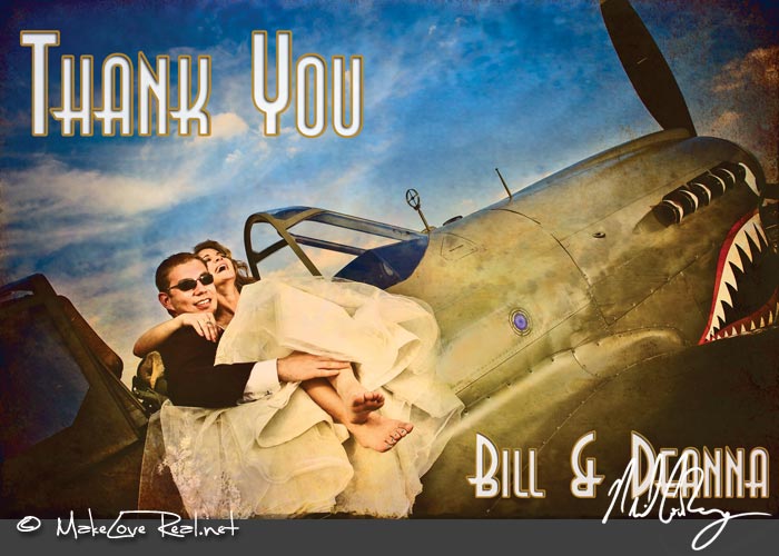
http://farm4.static.flickr.com/3173/2860586590_23a5c80e58_o.jpg
Even using an eroded or destroyed typeface that may be popular today will date the design to this current time period for future viewers. Many times a designer will attempt to use a more timeless looking font to not date the design. This is especially true when working on corporate branding. A doctor’s office would probably choose a clean timeless font over a trendy or playful font for their brochure. That is unless the doctor is a pediatrician and then a handwriting or even crayon looking font may be just the look a designer has in mind. Another basic example is how many times designers choose a script font to evoke romance or love. See Example:
http://www.romancemessages.com/graphics/heart1.gif
There are some many things for designers to consider when choosing a font. In the end it usually boils down to two things to consider, which are readability and legibility. Legibility deals more with being able to interpret individual letters or words. It involves how quickly and easily the viewer recognizes the characters and understands them. Readability deals more with large sections of text and how easy it is to quickly and efficiently gain understanding from them.
Sources:
AIO Lecture Week 1
http://www.minnpost.com/christinacapecchi/2008/01/09/534/typography_psychology_what_does_your_typeface_say_about_you
http://www.blurtit.com/q2884357.html