2/25/10

Shutter Speed - light painting.

What are the advantages/disadvantages of using a particular shutter speed.

Adjusting the shutter speed opens many opportunities in photography. Increasing the shutter speed one can make a crisp sharp capture an object that is moving in some cases at a very high rate of speed. While this is great function it does have draw back. Increasing shutter speed does have some drawbacks. First, a quicker shutter speed will require more light, which makes complete sense as the film or CCD grid will have less time to react to the light, it will require a greater amount of light to react. The other draw back to increasing the shutter speed is the quality decreases. Shooting at high speeds will increase noise in the photo.

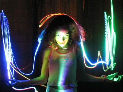
In the same token decreasing shutter speed helps increase the quality of the photo. Another great advantage of decreasing shutter speed is it allows for great motion effects in the final image. A technique known as “light painting” has become increasingly popular. Setting the camera on an very low shutter speed at a very low light, Photographers shoot the photo then use a small LED type light and move the light to create effects in the photo. The low shutter speed allows the film or CCD grid the exposure time to capture the moving light.
See sample of light painting.

http://michael.aivaliotis.com/wp-content/uploads/1.png


SWEET VIDEO of light painting:


Resources:
AIO Lecture Week 2
http://www.diyphotography.net/painting_with_light

2/20/10

Applying Styled Text

I found an image of Kat Von D. I thought I would add here name as a tattoo. I created a text layer with the font “Hurricane”. I rotated the font and got the sizing pretty close to run from her shoulder to her armpit. I then used the “DAMP” method to remove some hairs and clean up the skin. I then converted the text layer to shape and went to Edit>Transform>Warp and adjusted the shape of the text to fit the space. I then changed the layer style to overlay. I then adjusted the color by selecting the color from another tattoo and applied it to the text shape. Then I created a path with the pen tool around the figure and made a selection. Duplicated the main image and dropped saturation in the background and increased the brightness.

1. Found image of Kat Von D.
2. Chose Font Hurricane.
3. Located place for Text “tattoo”
4. Applied the DAMP Method to remove hair.
5. Rotated font
6. Converted layer to shape.
7. EDIT> TRANSFORM>WARP image to fit.
8. Apply layer style Overlay
9. Match color from other tattoos
10. Used the pen tool to create outline of figure and make selection
11. Duplicated main image.
12. Applied mask to background to adjust saturation and brightness.
13. Save

Image Source:
http://i.pinger.pl/pgr162/2ba221cb0004d4284abbb91d/8.jpg

Before


AFTER

Vector VS Rastor Graphics

Vector graphics are mathematically based shapes and lines, objects and fills. They are typically generated with illustration or drawing software like Adobe Illustrator or Freehand. One of the greatest advantages of using vector images is that they are very easy to scale and retain a sharp clear quality. For example if a small logo is created as a vector graphic, it can be resized to be used on a large billboard and retain the same great sharp quality as it the original. I would recommend creating vector graphics for logos, symbols, graphs and charts in books, promotional posters and illustrations. Any occasion where the end result needs to have clean and clear distinct shapes vector is the best choice. Vector graphics also tend to be much smaller than vector graphics since the images are based on mathematical descriptions instead of pixels.

Raster images are composed of pixels or squares of colors. They are created with scanners, digital cameras or raster based software like Adobe Photoshop or Fireworks. Since raster graphics are based on pixels, attempting to increase the size of a vector graphic can cause some issues where the image will loose detail and clarity. However, raster images can be reduced in size and maintain quality. Since raster graphics are pixel based they also have issues with resolution where vector images do not. Web graphics for example have a resolution of 72-96 dpi. Printed images need from 200-300dpi. Raster images are known for being very large if they have a great amount of detail and pixels. Many adjustments and effects can easily be added to raster graphics like drop shadows, blurs, bevels and more. While converting from vector to raster is quite easy, converting from raster to vector is not. Raster files are mostly photographs since it offers a wide range of effects, manipulations, and adjustments. to this type of file. When working on photographs, creating textures and subtle digital effects raster is the way to go.


Resources:
AIO Lecture: Week 4
http://www.logodesignworks.com/blog/vector-graphics-and-raster-graphics-difference
http://designwashere.com/design-battle-vector-vs-raster/

Some examples of vector art from my website see the links below
VECTOR ART:
1. This vector graphic works well as it is crisp and clean at any size. I also like how it is stylized and simplified, but still has a refreshing essence.
2. This is a vector layout for a magazine. The graphic of the motorcycle is a stylized illustration. This is great as the graphic can be reproduced for other media and keep consistency with branding. For example if this graphic was going to be used on a billboard it would retain the sharp crisp quality.
3. This is a page that contains all vector graphic logos. I try to create all logos as vector graphics so they can be easily resized for any application.

RASTER ART:
1. Here are some book covers I created for a client while I worked as an Art Director. These book covers were created in Photoshop software ad used in some cased up to 50 images to create the montage. The covers have many filters and effects and layer styles applied to the photos. To keep the quality of the cover for the final printing these graphics were created as raster art. 
2. The same client I used to do book covers for now has a demand for cd covers. He wants a wild colorful design. I use Photoshop raster art to accomplish what he is looking for. See samples of his covers on this website.
 

Image Correction

CHOPSTICK IMAGE:
1. I opened the file in Photoshop CS4
2. Adjusted Levels and Gamma:
Image>Adjustments>Levels and adjusted the input levels to 10 | 1.17 | 112
3. Adjusted the Curves:
Image> Adjustments> Curves and selected the “lighter” Preset.
4. Changed the image size:
Image>Image Size> Adjusted size 640x423 at 72 dpi.
5. Save as ai_g223_w2_chopsticks2.psd
6. Then saved again as .jpg quality 8

Before

After

FACE IMAGE:
1. I opened the file Photoshop CS4
2. Adjusted Levels and Gamma:
Image>Adjustments>Levels and adjusted the input levels to 4 | 1.77 | 251
3. Adjusted the Curves to remove warm colorcast:
Image> Adjustments> Curves, select the gray eyedropper and select image in a gray area to remove the colorcast.
4. Changed the image size:
Image>Image Size> Adjusted size 397x640 at 72 dpi.
5. Save as ai_g223_w2_face2.psd
6. Then saved again as .jpg quality 8


Before--------------------------> After

TEA IMAGE:
1. I opened the file in Photoshop CS4
2. Adjusted Levels and Gamma:
Image>Adjustments>Levels and adjusted the input levels to 110 | 1.00 | 206
3. Adjusted the Curves to remove warm colorcast:
Image> Adjustments> Curves, and moved the top point slightly changing the output to 242.
4. Changed the image size:
Image>Image Size> Adjusted size 640x421 at 72 dpi.
5. Save as ai_g223_w2_teacups2.psd
6. Then saved again as .jpg quality 8

BEFORE

AFTER

Designing CMYK in an RGB Environment

Managing color in a brochure, which displays different samples of wallpaper, can be challenging. This is because the monitor display (RGB) is quite different than what most printed color (CMYK). The major difference is that RGB color which appears on a monitor is additive color where the Red, Green, Blue colors are combine to create different colors or add all together to create white. Subtractive color is where cyan, magenta, yellow and back colors are absorbed or removed to leave other colors reflecting their various wavelengths back to a viewer.

The key in this example is to maintain the color in the brochure sample with the actual colors in the wallpaper. First the digital sample might need adjusted. Using levels and curves in Photoshop is one way to manage color. Levels are adjusted to ensure there is an adequate range of tones in the photo. The gamma can then be remapped to darken or lighten the image. If an image has a color cast that need removed it can quickly be adjusted in the curves pallet. Manual color correction can be difficult especially as it greatly depends on personal preference of color. Another way is to use profiles. Profiles are a great resource for managing color as it embeds the information in the data to guarantee it prints properly. The only thing about using color profiles is the printer must have the software that supports profiles.

To ensure the color in the brochure is accurate to the actual color I would use pantone colors and match up the CMYK to match. Pantone colors are published in swatch books and are used as a standard to match the correct color. There is a CMYK mixture for every pantone color. These mixes create standards for designer struggling to merge the worlds of CMYK and RGB and have brochure colors match the actual product.


Resources:
AIO Lecture Week 2
http://www.rgbworld.com/color.php#subtract

2/18/10

Multipage Brochure Experiments

Given a chance to design a multiple page brochure, would you like to experiment with different styles and layouts or would you prefer to use the contemporary style? What, in your opinion, might interest general public?

Whenever I have designed a multiple page brochure, the first thing I always consider is the budget. How many pieces will the client want? How will I reproduce them? How much money is the client willing to spend? Most of the time when I design brochures for clients it always comes down to meeting the budget. First I typically look at what the client is trying to achieve in the brochure. Is it Information for training, awareness, promotion or something completely different?

Of course still need more information before I really start thinking about the design. How much and what information do I need to include? Are there any extra items that the brochure needs to accommodate like CD’s, DVD’s, Pens, etc? Does it need multiple folds, tear offs, die cutes, pockets?

Once I have answers to all these questions I begin to thumbnail and think of ways to make the form of the brochure function the best. I look at other layouts and creative brochures and consider those designs verses mine. Then I consider how will the brochure be produced.

So, to answer the question, I like to experiment with new styles. I think seeing something different with great production always attracts attention. Using dynamic typographic and exciting photography to generate interest on a unique looking brochure is more likely to draw attention and say “you got to see this!” compared to a standard design.

A great example of this is when I go to the Dr.’s office and look at all their brochures in the waiting room. Some of the big drug companies have great unique shape brochure about the latest anti-depressant, heart medication, diabetic supplies and so forth. They pop off the display and scream “LOOK AT ME, I AM NEW AND EXCITING!” Verse the simple packet of papers stapled in the top left corner printed on a copy machine that needs cleaned and is out of toner. Pushing brochures to the next level is just part of the graphic design game we designers call work.

Is Thumbnailing That helpful?

How does thumbnailing aid in your creation of a multiple page brochure? Does it actually make the process faster or does it slows down the process?

Thumbnailing is vital to the creative process when working on any project. While it does take time to think and develop multiple concepts for thumbnails, it is much better to sketch out some ideas and see how they will work, opposed to spending hours on a design and realizing it is not good and needs new direction. While having a concrete concept when starting a multi-page brochure does entice some to jump right in, exercising a thumbnail technique will expand the possibilities, and further develop the concept of the design. Creativity flourishes when working on quick, design sketches. Even if the thumbnailing exercise directs a designer toward their original concept, the process has not been in vain. The designer now has other creative elements floating in their head that will take this project to the next level.

Web Campaigns

Give an example of an ineffective Web campaign. How would you revitalize it?

Texas Governor, Rick Perry, planned on streaming a 10-minute online rally called “Talkin’ Texas” unfortunately his site crashed. Over 22,000 visitors users were never able to access the event.

This is an example of a very poorly planned web campaign. In this instance the problem of “hackers” my have been the issue, but what it comes down to is not being prepared to accommodate the web campaign. With more then 22,000 users unable to attend due to what PC World reports as a “ denial-of-service”, Governor Perry, not only missed his target, but also looked foolish and unprepared.

Governor needed experts who could answer the tough questions. Can the server support thousands of users? Is there enough bandwidth, what is our security? Is this the best venue? While Governor Perry is a poor example, Philips Norelco had outstanding results with their web campaign.

In 2006, Philip’s Norelco Bodygroom used a website campaign to presented their product. This product is designed to remove unwanted body hair. But, this is not your average razor. This product is intended for unwanted hair below the neck. This online campaign due to is racy content and imagery of fruit and vegetables for various parts of the anatomy was never released on TV. This campaign was strictly used on the website www.shaveeverywhere.com. The buzz for this site was for the most part word of mouth, except for a plug on a radio show with personality Howard Stern. According to The Wall Street Journal, The “web site drew 259,676 unique visitors between May 1 and May 6” (Stineburgh, 2006). This campaign appears to be quite effective in hitting its target market of males “in their 20s, 30s and early 40s” (Stineburgh, 2006).

If I would change anything, I would possibly use more banner ads to draw more traffic to the site. Word of mouth was a good idea for cutting cost on the project, but in the end many people may never visit the site.

Source:
Stineburgh, Brian; “The Wall Street Journal”.
Marketing The Unmentionable? Talk to the Web.
May 11, 2006, Web November 3, 2009.
Resources:
AIO LECTURE week 5
http://www.pcworld.com/article/172864/texas_governor_blames_web_campaign_flop_on_hackers.html
http://my.eurorscg.com/news/clippings4/wsj-05-11.htm

http://www.clickacoupon.com/clickacouponblog/wordpress/?p=7

Got Legs?

What current marketing and advertising campaigns, other than ones presented in this lesson, have "legs"?

A great campaign that was used back in the 50’s that is still referenced today is for Marlboro cigarettes. The Marlboro Man, marketing campaign that was put together by Leo Burnett Co. created rough and rugged imagery of the cowboy surviving in the range with a cigarette. The campaign was used from 1954 all the way to 1999. Kathleen Schalch details how the target market related to the campaign in her report on National Public Radio. She explains, "In a world that was becoming increasingly complex and frustrating for the ordinary man, the cowboy represented an antithesis -- a man whose environment was simplistic and relatively pressure free. He was his own man in a world he owned" (Schalch, 2002). Although the campaign was very masculine, the strapping, rugged Marlboro Man is still a well-known icon for this product today.


Source:
Schalch, Kathleen, “The Marlboro Man”
October 21, 2002. Web November 3, 2009.
<>


Resouces:
AIO Lecture Week 5
http://en.wikipedia.org/wiki/Marlboro_Man
http://adage.com/century/icon01.html

Legibility Factors

What factors increase the legibility of type? Which factors can decrease legibility?

The issue of legibility has stirred quite a debate. From some arguing that serif fonts are more legible since they help lead the eye form word to word, but others argue that san serif typefaces are easier to read. Often times its comes down to a matter of preference or opinion when determining legibility.

Certain principles have developed, however, when trying to increase the legibility of type. Principles like the use of all capitol letters in sections of copy have been noted for being more difficult to read. This is due to the letters not having ascenders and descenders, as well as, the letters all having similar shape. Fonts with a large x-height would also be less legible. Other factors such as the size of the type, the length of the line, the letting, the kerning, alignment, light, color and even the paper or medium on which the type is displayed has direct control over legibility.

A line, for example, that contains around 60 two 72 characters is going to be easier to read than a line containing more or even less. Using more than 72 characters makes it difficult to jump down to the next line and continue seamless reading. Using less than 60 characters in a line makes the text appear choppy and interferes with the flow of thought.

High contrast is always a good rule of thumb to increase legibility. With road signs reflective paint is used to make the sign for high contrast at night as the darkness decreases legibility. Studies have reveled that a 30 to 50 percent contrast is necessary for legibility for 75 percent of the population.


Resources:
Graphic Design School 3rd edition pages84, 85

http://pubsindex.trb.org/view.aspx?id=58795

http://trex.id.iit.edu/visiblelanguage/Feature_Articles/Roxane/Roxane.html

The human factors of transport signs
By Cándida Castro, Tim Horberry Pages 124, 125
http://books.google.com/books?id=zEZWGz9rOZYC&pg=PA126&lpg=PA126&dq=what+factors+increase+legibility&source=bl&ots=Hde4aauZrh&sig=24RkWYl0VbzUhAv91WT2rBxyazw&hl=en&ei=VcnlSpvtGtTQlAffhcDoCg&sa=X&oi=book_result&ct=result&resnum=5&ved=0CBkQ6AEwBA#v=onepage&q=what%20factors%20increase%20legibility&f=false

Typeface to express the meaning of a word

How can you use typeface to express the meaning of a word?

Manipulating typography to make its form reflect its meaning is a great technique. In this weeks assigned reading the words zoom, jump, spin, blur and even outline were mentioned. The key is to find verbs that indicate action and implying that action in the type design.

Some other great examples I have seen are “topple”,


I have even used this technique myself on a paper sample. I used the phrase “ The perfect paper for an imperfect world” and flipped the “e’s ” around in Imperfect. (See Link)

As the chapter mention “the possibilities are endless.” There is even a childrens show on PBS called word world that does exactly this.

www.wordworld.com.


Resources:
Graphic Design School 3rd edition pages 92, 93
www.papress.com/thinkingwithtype/teachers/Word_Lecture.pdf

Imagery Is Key In Design

The use of complementary images, typefaces, colors, and papers plays an important role in the success of an artwork. Do you agree with this statement? Give reasons to support your answer.

YES, YES, YES, I agree, how could anyone not agree? This week’s lecture reminded us of how important imagery is in our designs. And when talking about images it always said, “an image is worth a thousand words”.

The other details used in the design, typography, color, medium and paper work together to bring the creative idea alive. The elements give the piece personality, mood, tone and most important a message.

Letterform for example is extremely powerful in it’s ability to provide unconscious persuasion. From attracting attention, to setting the tone of a layout, the observer is emotionally and subconsciously impacted and gathers the feeling of the piece without even knowing it. Typography affects people and most of the time they don’t even consciously notice it. A script typeface can create the feel of a particular era or time period as well as, project a mood, elegance and sophistication.

Color is another element that can’t be overlooked. Color has so many conscious and subconscious effects on it’s observers. Color has so many different associations to different cultures due to its history and what the culture has used the it symbolically. Another great example of how powerful color was mentioned in the first week of reading with advancing verses receding color. Color also holds a critical role in visibility.

Finally medium and paper are equally important in a successful design. Does the final piece require the pressed polished look of a high gloss paper? Or is a rough 100 percent recycled cardstock more fitting? The paper and which medium the design is executed in is so critical. Can you imaging opening a brochure in a plastic surgeons office that was created on newsprint and crayon? Possibly in a pediatricians office… These elements to me also fall under another name I call craftsmanship.


Resources:
AIO Electronic Design Lecture Week 3
AIO Advanced Typography Week 4
http://www.sessions.edu/courses/Course-Advanced-Typography.asp
Graphic Design School 3rd Edition pg 26-39

Stock VS Origional Artwork?

Would you prefer to use stock photos/illustrations for your work or would like to create original ones? Why would you do so?

At this point, if the project has the budget for stock photography and I can find images that will work well in the design, I prefer to use that resource. While at the same time I always am concerned about the copyright rules that go along with stock photography. Making sure to read the fine print, or use the photo as an element and create a new piece from the resource seems to always be a haunting issue. I also agree that there are great advantages to staging my own photography or creating an exact piece to meet the needs of a project.

Currently the major factor in going to stock photography is I don’t have the equipment or experience to capture what a professional photographer can. Hopefully this will change over the next few years. At the same time there has been times when I need an exact image that and I would create it myself.

To conclude yes I would prefer to use stock photography for its professional look and convenience, but at the same time for certain projects I prefer to create my own imagery to get the exact image I need or to avoid the conditions of purchased art.

Resources:
AIO Lecture Week 3
www.Corbis.com
www.istockphoto.com

Steps In The Creative Process

How many steps are in the creative and conceptual process?

I always have a hard time agreeing with statements that say, “ this is how it’s done every time”. I do agree that, “sometimes” there are four steps in a creative and conceptual process, but sometimes there are also five or even nine. Sometimes the process is going back and repeating a few steps a few times. I think of how sometimes I think of a great concept right off the bat. Even after a little research and exploring other possibilities I come back to the initial idea, execute it and it is great. I think of other times, however, I really struggle with finding a creative idea. I prepare, I think about it, I may even have and “Aha!” moment, but I find myself going back to the beginning and doing more research. This is especially true when working on logos. A great article on thedesigncubicle.com, talks about the 11 steps taken in a successful logo design process. A few more steps than four…

So I conclude, sometimes there are four steps possibly;
Research, Incubation, Illumination and Implementation. But other times the best creative solution is not achieved so simply, and more steps are necessary to achieve an ideal solution.

Resources:
Graphic Design School 3rd edition pages148,149, Module 4
http://www.creativity-portal.com/bc/four.steps.of.creativity.html
http://www.maxvalue.com/tip027.htm
http://www.bnicolorado.com/cgi-bin/viewnlcontent.cgi?nlarticle_id=213
http://www.nwlink.com/~donclark/creativity/creativity.html
http://www.thedesigncubicle.com/2009/05/11-steps-of-a-successful-logo-design-process/

Thumbnails, Thumbnails, Thumbnails...

In your opinion, what are the reasons and the values behind the process of Thumbnailing ideas in large quantities?

The use of thumbnails is a great way to think through different concepts for an ideal solution to a design problem. Many times the “perfect concept” considered in the beginning can be taken further, trumped, or even redirected altogether by using thumbnails as a tool to evaluate the best direction. Thumbnails are also great time savers. Instead of pouring hours and hours into a design, seeing a few thumbnails may take the project in a different direction. Even showing a client a few thumbnail sketches can help the client see what your thinking and possibly redirect or add to the concept with out loosing large amounts of time invested to the project already.

My favorite way to utilize thumbnails is in a group/team brainstorm setting. It’s amazing what a group of creative people can come up with when they are all focusing and utilizing each other’s strengths and weaknesses.

As far as the quantity of thumbnails, I think it’s great. Most cases I have had seem to require a few more thumbnail sketches than I would personally choose to experiment with. I personally shoot for about 5-7 for personal clients. When doing larger quantity of thumbnails I tend to do more research, as I need more concepts and material. The only downside to being force into more creative concept development is, with more great ideas it is more difficult to decided on a direction.

Resources:
AIO week 2 Lecture
http://desktoppub.about.com/cs/basic/a/thumbnails.htm
http://desktoppub.about.com/b/2003/06/05/design-thumbnail-sketches.htm
http://drawsketch.about.com/library/bl-thumbnail-sketching.htm

PROs & CONs of a Grid

Discuss the advantages and disadvantages of using grids. Should they be used at all?

Of course grids should be used. They create structure and consistency in design. While they do create rules, rules can be broken. Who is the designer anyway? Subdividing or modifying the grid could also be a useful solution if the structure of a grid seems to interfere with the flow of the design. In the end a grid is not much more than are a guide, a direction, a way to establish consistency and in a timely manor. It is a perfect tool to help utilized the design space. They are a great way to create structure and harmony in a design.

In some situations if the grid is blocking a creative concept, of course, throw it out! There have been times that I have been so excited about a concept I dive right in and put the concept down. A great example of this is when I am working on logos and even websites. I know in the end in web development a grid is key, but when trying to design and break out of the uniform expected structure, working through concepts without a grid can be very beneficial.

Another personal example of how a grid can be a disadvantage is I currently work with one client who likes all his designs very loose and unstructured. In fact when I started working with him, I had to make lots of revisions to designs due to the fact that I had most of the layout in a solid grid. Even though the now the finished product is usually unbalanced, chaotic, and lacking structure he is delighted. Is the customer always right?

Resources:
AIO Lecture Week 1
Design School 3rd edition –pgs 17,18,19,140
http://webdesign.about.com/od/layout/qt/why_grids.htm
http://graphicdesign.about.com/od/layout/a/grid_system.htm
http://v3.markboulton.co.uk/articles/detail/why_use_a_grid/

GRID Webpage VS Newspaper

Are certain grid applications better for one type of product or service over another? In your opinion, why is this so?

Webpage VS Newspaper
A great example of one grid application that is ideal in one situation and completely inappropriate in another is a web page grid verses a newspaper grid. In a newspaper there is mostly heavy sections of copy that are displayed in multiple spaced columns. A webpage is completely different where a grid to divide up the page for navigation, content and in some cases advertising.

When I worked for an online adverting agency, at one time we were discussing the grid used in classified papers and applying that to our classified website design. While it sounded good in theory, having the same “look” as classifieds in the paper, applying that design to a website was very difficult. The main issue I remember is the user would be continually scrolling down the page reading the narrow column.

To answer the question "Are certain grid applications better for one type of product or service over another?" Defiantly!

Resources:
AIO Lecture Week 1
Design School 3rd edition –pgs 17,18,19,140
http://960.gs/
http://tutorialblog.org/grid-systems-in-web-design/
http://graphicdesign.spokanefalls.edu/tutorials/tech/column_inches/col_inches.htm

Grids?

What grids appear to work most flexibly, most creatively, most productively? In your opinion, why is this so?

The rule of balance and principal of thirds I think create the most flexible and creative grid for productivity. As the lecture pointed a grid will “narrow the "creative options"” By using one of these two principles for layouts creates many opportunities, as it is a limited amount of structure and control. The possibilities are endless. At the same time, while this limited structure will open creativity and flexibility, it is probably not the best choice for productivity. Using a grid with more structure and control will save time and as the lecture also stated, "things are falling together nicely." With a more structured grid, like a nine column grid, the decisions have been made which will ensure a more consistent design.

Resources:
AIO Lecture Week 1
Design School 3rd edition –pgs 17,18,19,140
http://desktoppub.about.com/od/designprinciples/l/aa_balance4.htm

2/17/10

When Readability Is Not Important! WHAT!!!

Discuss, giving examples, some graphic communications for which "readability" might not be so important.

A. Company>Product>Web Address…
In this ad I found for Sweet Protection. My eye was drawn to the main elements of the contrasting red log, to the silhouette of the skier in an extreme jumping position, then to the bold white text “RAMBLER” above the helmet and finally to the web address in bold white text below. I see there is also text in between the Rambler and web address but it is very light and hard to read. I actually can’t make out a single word. In this case the important informing text are very visible and readable, but the “noise” text is washed into the design.


here is another ad for Sweet Protection I found.


B. Repetition:
Here is a layout that is using repetition of the word “Yes”. My eye visually went to the large “Yes” that is located on the upper right side of the page. At first glance I didn’t read all the other “Yes’s” but I knew they were saying the same thing even though they are in different fonts. Some are cropped off the page leaving only the top of the word or even just the “y”. We still know it stands for “Yes” because of the repetition.


C. Text for Graphic Assimilation.
YOU MUST CHECK THIS ONE OUT!!!!
Applying text with flash media. The text here is used as an element to create the leaves on the tree. Give it a minute; the text is layered making it in some places not readable. When it is done loading, DON”T FORGET TO CLICK ON THE RIGHT “DAY MODE” TAB. Very cool. I love the look of the light green text overlapping. The application is perfect for leaves. So inspiring!!! You have to go there!
https://www.ecotonoha.com/ecotonoha.html


Resources:
AIO Lecture
Typographic Design Form and Communication
http://www.redrabbits.com/blog/wp-content/uploads/2008/10/sweet-ad-rambler2.jpg
http://www.redrabbits.com/blog/wp-content/uploads/2008/10/sweet-ad-rambler-snowboard.jpg
http://www.oi-you.com/wp-content/uploads/2009/07/cg-yes1.jpg
https://www.ecotonoha.com/ecotonoha.html

"Type Reflects Personality"

Justify the statement, 'Type reflects our personality'.

I found a great little article by Dave Murphy called, “Choice of Typeface Reveals Personality Traits”. In the article he list two great examples of how Sir Edward George, the Governor of the bank of England deliberately used Courier typeface due to his opinion that he didn’t need to consider the emotional need of others. The other example listed is the Prince of Wales, who preferred to use modern Helvetica to allude to the idea that he was in touch with the times. Both of these examples are perfect justification of the statement in question.

At the same, time I understand that there are those who would argue, “What about default fonts?” The teenage boy that uses Times New Roman on his book report and the 80 year old that uses the same font to write his granddaughter. Does this font reflect their personality? Of course this great generation gap and use of this font does through a monkey wrench into the mix. But, I would venture to say that in both of these instances the font was left to the default because both of these individuals could have personalities that don’t like change. They are not looking to try something new, or be creative. They are using this default font because it “works for them”… so why would they change it. Even in this instance the statement is still true!

Resources:
AIO Lecture
http://www.dgl.com/itinfo/2001/it010530a.html
http://www.minnpost.com/christinacapecchi/2008/01/09/534/typography_psychology_what_does_your_typeface_say_about_you
http://www.blurtit.com/q2884357.html

Legibility Is It Important?

Discuss that legibility is an important aspect of typographic design by illustrating the works of some leading type designers.

In most cases we are using typography to communicate information. If that information cannot be read or interpreted the intended message is lost or it looses it’s readability. Most of the time legibility will impact not only interpretation, but also the speed of interpretation. These two flavors, legibility and readability, are the key ingredients to the clarity of typography.

Legibility is referring to the ease of discerning one letter from another. Readability is referring more to how the typeface is used and how easily words, phrases or sections of type can be read.

Claude Garamond, worked as an apprentice punch-cutter / printer in 1510. He was a Frenchman developed his Garamond type off the roman font Griffo. At one point he grew so popular with his successful type designs in Europe that King Francois I, demanded that he develop a Greek typeface, which later was knows as “Grecs du Roi”. Today reading Garamond text on a page still requires little effort. Garamond is well known for his use by book designers for over 450 years.

Garamond is also found in many advertisements today. Here are a few:
Abercrombie & Fitch
Motrin
Neutrogena
Apple
http://www.pointlessart.com/education/loyalist/typeTalk/garamond/present.html

Resources:
http://www.typophile.com/node/30388
http://www.fontbureau.com
http://www.fonts.com/aboutfonts/articles/typography/legibility.htm
http://www.pointlessart.com/education/loyalist/typeTalk/garamond/index2.html

Typography Convergence

Explain, giving examples, how convergence of design and technology has immensely increased the scope of typographic design.

When I consider that in the early days of type how each letter was carved or cast and then set up manually in a press, it just seems so ridged, concrete and so much more difficult to be creative. Sure you could adjust letting and kerning, but as far as going back in and changing the size or font on an individual letter, or line, that would mean resetting that line on the plate and repressing. Here I a picture of some on looking over bins of letter and setting up type.


As a designer today with millions of fonts available at my fingertips, I am amazed at what the process used to require. Today it is so easy to make adjustment to large sections of copy with a “command A” and few clicks of a mouse. Even take as website for example, you can adjust countless pages of copy through a single style sheet.

Technology has also enabled designers to use and in some cases abuse typeface like never before. When using a cast letter for printing, that was it. Now with graphic software we can do anything we want to the letter. Sometimes when I don’t like the look of a letter in a certain font, I can go in manually and change that letter myself no disrespect to the original designer, but sometimes it doesn’t look right.. Even great software like Adobe Illustrator has evolved over the past few years. Looking back to version 10 there was never a 3-D tool to quickly manipulate text into a 3d effect. I believe this tool started in CS, Illustrator 11.
The old way http://www.wowwebdesigns.com/power_guides/3d_text/
The new way: http://www.gomediazine.com/tutorials/create-dream-design-3d-typography/


Resources:
1. AIO Lecture
2. History and Foundations of Typography www.infoamerica.org/museo/pdf/evolucion.pdf
3. http://www.jimmydrobinson.com
4. http://www.gomediazine.com/tutorials/create-dream-design-3d-typography/
5. http://www.wowwebdesigns.com/power_guides/3d_text/
6. http://mediadesigner.digitalmedianet.com/articles/viewarticle.jsp?id=22141
7. http://www.wpdfd.com/issues/23/typography/

Good Typography Can Stand Alone

Good use of typography can always stand-alone. Experienced and knowledgeable designers can accomplish this as they understand how to unleash the power of emotion and appeal that typeface possesses. Great examples of this are McDonalds, as their Golden Arches are actually utilizing the letter “M” and their new logo is tagged with their phrase, “Im lovin it.”


Another great example is Google. While google does on occasion use symbol and images to celebrate events and holidays, for the most part Google is a typeface logo with a creative use of color. The text is very well know and can hold its own going solo.

The Power Of Letterform

I think Online School of Design states it best, “Typography, technology, and culture are intertwined. The letterform (in the right hands) has the power to communicate meaning and mood through its quirks and beauty, its history and diversity.” (Online School of Design, 2009)

The reason letterform is so powerful is due to is ability to provide unconscious persuasion. From attracting attention to setting the tone of a layout, the observer is emotionally and subconsciously impacted and gathers the feeling of the piece with out even knowing it. Typography affects people and most of the time they don’t even consciously notice it. Experienced Graphic Designers understand how to harness the power and use it for their advantage to attract attention and reinforce their message. Script typefaces are a great example of letterforms that loaded with all sorts of emotion. As we saw in last week’s assignment, script typeface can create the feel of a particular era or time period as well as, project a mood, elegance and sophistication. While the script typeface does create a nice visual texture, the letterform in most cases is more difficult to read than serif or san serif font. Therefore readers tend to avoid blocks of text containing large amounts of Script text, so it should be handled with care. The BarbieÃ’ logo is great example of how a script typeface has been using in a dynamic elegant way. Even children know the Barbie brand before they can read the playful elegant designed typeface. Their latest version is by design firm Parham Santana.

Cited:

1. Online School of Design, http://www.sessions.edu/courses/Course-Advanced-Typography.asp; 2009.

Text Document To Transcend Time- Dead Sea Scrolls

The Dead Sea Scrolls were discovered in large pottery jars between 1947 and 1956 in eleven different caves about 13 miles east from Jerusalem. Although the discovery mostly consisted of disjointed text and many pieces that were destroyed to the point they could not be restored, the Dead Sea Scrolls have been named one of the greatest manuscript discoveries of modern time. The Scrolls are estimated to have been written between 200 B.C. and 68 C.E./A.D. and contain mostly Hebrew, some Aramaic, and only a few texts in Greek. They mostly are made of animal skin, but there is some use of papyrus and one even made of copper. The text has been analyzed and reported to be a carbon-based ink median and is described to read, right to left, with no use of punctuation, other than an infrequent paragraph indent. Experts have reported that in some instances there are not even spaces between words.

Looking at samples of these Scrolls, I am amazed. They were created so long ago but have so much impact today. They affirm issues in the Jewish and Christian communities. Even looking at the structure of the text written by someone’s hand thousands of years ago, probably by candlelight, it is amazing to notice the consistent letting of each line, as well as, the strong right align with the ragged left edge. I also notice the use of columns and their width is quite consistent.

The fact that these Scrolls were discovered, salvaged, pieced back together and read over 2000 years later leads me to believe the author met his objective. The were not just a personal to-do-list for the author, they were much more important. The fact the author was documenting events, history, and the instructions of God, in this case, it was vital that the author write in a form that could be interpreted. The authors needed their writing to transcend time. They were handling “Gods Word”, His divine instruction to his people. They needed their typography to be as clear as they could get it. They have indeed accomplished this as these writings have been analyzed and interpreted.

See Dead See Scroll Samples:


RESOURCES:
Online lecture
Typographic Design: Form and Communication
http://www.centuryone.com/25dssfacts.html
http://ninjaradio.files.wordpress.com/2009/07/scroll1.jpg
http://www.ibiblio.org/expo/deadsea.scrolls.exhibit/intro.html

Letterform VS. Graphic

Question: In your opinion, what is the graphic impact of letterform and symbol as against the graphic impact of photographic and illustrative image?

In my opinion photographic and illustrative images will always be a stronger communicator and have a greater impact. In referencing the coined phrase “a picture is worth a thousand words” I am affirmed as this phrase explains that ideas and complex thoughts can easily be communicated in a single image, verses the amount of text required to communicate the same thought or idea. There is also the ongoing issue of the language barrier that photographs and illustrations transcend. At the same time, while an graphic image or photograph can be used in a very dynamic way to create great impact, the use of letterform can breath life into a design, or kill it instantly when misused or used poorly. Photographs and illustrations are very effective when they are used as the base and the appropriate use of text can enhance the photograph and illustration and actually take the impact to the next level. In many instances one would have no idea of what the design is trying to communicate without the use of letterform. In conclusion, my opinion is that photographic and illustrations have stronger graphic impact, but combine with letterform to in many cases fill in details, the best graphic impact in communication.


Resources:
Adams Morioka; Logo Design Handbook, 2004
Typographic Design: Form and communication 4e.
AiO Online Lecture Week
Holzschlag, Molly E. "Type fundamentals for nondesigners." New Architect. 01 Jan 2001. 30. eLibrary. ProQuest LLC. ART INSTITUTE OF PITTSBURGH. 27 Aug 2009. .

RGB vs CMYK

Colors can vary from screen to print. How would you choose which color mode is best for a project? Describe gamut and why some colors that we see on our monitor can’t be reproduced in print?

When choosing what mode to work in for a project I always think in terms of “How is the piece going to be produced” If the project is for web, or screen view I would work in RGB Colors. However, if the final piece is going to be printed, I would work in CMYK. Although working in CMYK will eliminate certain colors, as well as, Photoshop filters available, it is best to set up an offset printing file properly in CMYK. Unless I know for sure the final piece is going to print, I tend to use RGB. I do this because, there are more colors available and the art is more vibrant on screen. There are also more options for filters working in RGB and I can always convert the file in the end if I need CMYK.

One major issue with printing is the colors on your screen regardless of what mode you are working in do not show up the same when printed.

See a great example of CMYK Subtractive Color:
See a great example of RGB Additive Color:

The reason for this is a screen emits light and, ink on paper absorbs light. When you consider how its two completely different methods additive color and subtractive color it does make sense why colors would not reproduce exactly the same. It is very important to understand this as a designer. Unfortunately, as many times as you explain it to clients some they will never grasp this concept. When working on printed project, having printed proofs is very important.

Resources:
Discussion Question 1
1. AiO Online Lecture Week 5
2. http://dx.sheridan.com/advisor/cmyk_color.html

Objective & Subjective/Social & Cultural Factors of Symbol Impact

With a market that is growing more and more international everyday it is critical to consider how graphic logos and branding will be perceived in the different cultures, religions and groups. While graphic symbols are the best way to communicate through a language barrier, depending on the type of symbols used there is always a possibility that the final design could be perceived as offensive to certain cultures or groups; therefore, it vital to create the logo or branding to be as objective as possible. The use of subjective elements that lead to personal or subculture bias and beliefs must be avoided to accomplish successful international branding for the future. While trying not to offend a particular group is important with creating a corporate symbol, the market research begins to play a more vital role in finding the target group. When planning to promote a product or company into a new culture or society that is completely different and in some instances opposite of the familiar culture, it is imperative to have data to lead the creative design process.

A great example of how a simple fun image can create great issues with different cultures is when t-shirts created by Utah students for the game offended the American Indians. Although the students were using the T-shirts to mock the teams mascots (an Indian roasting a frog), American Indians found the image very offensive.


While the incident at Utah was just some students with a tee shirt, there are many sports teams with mascots that could be considered offensive to certain groups. Would you believe even Chief WaHoo for the Cleveland Indians has been questioned as a racist symbol? Today even some schools are rethinking their logos and mascots.

Taking an international look, many times as other cultures try to make their look more universal they fall into a dilemma of possibly miss representing their company. Here is an example of a logo that does exactly that.


In the end, designer must consider what is the best way to visually entice the target group to desire a product or company. Carefully implemented market research will aid in approaching the target group. As it was stated in the beginning of the Logo Design Workbook, “A logo is not a magic lantern. It can’t make a bad product successful or save a poorly managed corporation.” (morioka, 2004) This takes some of the pressure of the designer, but at the same time, the final branding needs to appeal different groups, and cultures and transcend language to be effective.


References:
Adams Morioka; Logo Design Handbook, 2004
AiO Online Lecture Week 5
AiO Online Lecture Week 6
http://www.dailyutahchronicle.com/news/american-indians-offended-by-game-shirts-1.899743
http://paneech.com/2009/03/is-the-cleveland-indians-logo-chief-wahoo-a-racist-symbol/
http://network.nationalpost.com/np/blogs/toronto/archive/2008/10/28/is-school-s-warriors-logo-offensive.aspx
http://www.trendhunter.com/photos/25902/2
http://blogs.citypages.com/sports/images/cleveland_indians.gif
http://www.trendhunter.com/trends/mistakes-in-advertising-questionable-logos

A Global Market - Going Beyond the Language Barrior

The future of graphic symbolism marches on toward a global market place. At this time there is not a language that allows communication to international markets. By harnessing the power of graphic symbolism these markets can be reached by going beyond the language barrier. With logos and brands packed full of communicative devices that break through this barrier, graphic symbols will be paramount in effectively communicating information and striking an emotional response in future global markets.

You can see how some international companies has already broken through and made the adjustments needed to fit the culture and targeted group. The first Wal-mart in China was opened in 1996, and not Wal-mart has 77 Supercenters in China.
See Walmart China: http://www.wal-martchina.com/english/index.htm

At the same time Wal-mart discovered they would need a different strategy to be successful in Europe. It appears that their “Always Low Prices, Always” slogan is not so true in the UK. TESCO –British supermarket chain is a major competitor, and has shown better selection of merchandise and lower prices. Wal-mart will need to address some of their current strategies to effectively reach international markets. A perfect example is in Germany customers were put off at the though of paying a greeter. They have also found issues with loyalty cards. While Wal-Mart stands for value in the USA, and affordable goods in the USA, the corporation may need to make some adjustments to be successful in international markets.

References:
AiO Online Lecture Week 6
http://www.wal-martchina.com/english/index.htm
http://www.planetizen.com/node/20731
http://arunkottolli.blogspot.com/2006/10/wal-mart-is-in-trouble-in-uk-too.html
http://www.businessweek.com/1999/99_26/b3635129.htm

A Comprehensive & Concise Logo - Target


A perfect example of a comprehensive and concise symbol used in corporate branding is the Target logo. Target is very well known for their simple bull’s-eye symbol used to create the straightforward, but well recognized Target logo. On May 1, 1962, Target branded their company with a perfect identifying symbol that defiantly represents their name. Today the symbol has been seen as interchangeable with their name, “Target”. For example, some signage displays the bull’s-eye symbol or target instead of the name “Target”. This symbol is seen reproduced consistently throughout their store. From advertising, credit cards, signage, bags and even their shopping carts, the red bull’s-eye is widely recognized. Target has even placed their branding on a dog with the target symbol over his eye. The Target symbol is defiantly recognized with its consistency. The bull’s-eye symbol is consistently red in most application or white when placed on a red background.

References:
AiO Online Lecture Week 5
Logo Design Workbook – Implementing Logos
http://www.target.com/
http://branding20.wordpress.com/2007/05/07/brand-of-the-week-target/
http://findarticles.com/p/articles/mi_m3092/is_n18_v29/ai_8970766/

Communicating Effectively With A Target Audience

Graphic symbols are critical to drawing in an audience and confirming their values. This is why it is so important to recognize the target market the graphic symbol is to appeal to.

A great example of two different companies selling the same service two that are using two drastically different symbols are Allstate and Geico.

Safe, Secure, a calming blue circle with out stretched helping hands. Doesn’t that just make you feel warm and fuzzy? Allstate insurance company appears to be concerned about one thing, your safety and being there when you need them. While Allstate does not discriminate, I would venture to say based on their logo, website, and graphics they are a company with a target market of older, more experienced drivers. While Allstate insures some younger drivers, I would venture to say this company targets an older generation. Just a quick glance at their website shows images of retired couples, families, and responsible students studying. This company seeks out the responsible, and assures them with their logo and their motto, - “your in good hands”.

Geico, on the other hand, has found great success in using the gecko as a company symbol. In “2000 - The beloved Gecko makes his debut in a wildly popular GEICO ad campaign.” (Geico, 2009) The company erupted with success of this campaign and the company still used the gecko today. Geico has apparently taken a much different approach in their company’s identity. This company has gone completely different direction in using the humor of this cute talking lizard in juxtaposition regarding Geico vs. Gecko to attract their younger market. In this approach they make insurance not such a “serious” issue but more fun and entertaining. You can forget their key motto “15 minutes could save you 15% or more on your car insurance.” is a total appeal to young spirits looking to make ends meet; opposed to an older well-established individual. They have also used other forms of humor in advertising like the caveman. Gecko is targeting a younger market. Even today with their new remix for “Somebody’s Watching Me”, Geico is looking to attract a younger demographic.


Resources:
Geico, 2009 http://www.geico.com/about/corporate/history/

Collecting Market Research

There are countless avenues to approach market research. Two great methods that I have discovered for collecting data are surveys and observation.

Surveys are great tools as they can be tailored to gather specific details from individual groups. Something to keep in mind with surveys is the larger the group is that is sampled the more reliable the data will be.

There are many different ways to implement a survey. The In-person survey is doing one-on-one interviews with random individuals in high-traffic areas such as a shopping complex. Here products, packaging or advertising samples are presented and the immediate feedback is collected. While In-person surveys generate great results they can be very expensive when the time and labor is factored in. In some cases individuals surveyed are compensated as well.

Other survey forms are telephone, mail and online surveys. It is not surprising to find that telephone surveys do not produce a great response, as customers are often very resistant to participate in the survey. They are also less expensive than in-person surveys but more costly that mail surveys. Telephone surveys also yield a higher response rate compared to mail or online surveys. Mail surveys are considered a more cost effective route. While a mail survey will have a low response rate, many small business choose to go this direction. Finally, online surveys typically don’t generate accurate data. In most cases launching a survey on the “world wide web” makes collecting data from a target group very difficult. It is difficult to control “who” is participating in the survey. Regardless, an online survey is a simple, economical method to gather subjective data and collect opinions and preferences.

Observation is another great way to gather an individual’s response to a product, advertisement, packaging, etc. One of the greatest advantages to this technique is that the individual is unaware that they are being observed. This allow for individuals to interact naturally in their surroundings, giving a natural and in some cases unconscious response. When individuals are observed, in some cases videotaped, in stores, at home, or at work, observations can be made directly by how a product is bought or used. This is very useful, as it gives a more accurate picture of customer’s usage habits and shopping patters.

Resources:
http://www.asiamarketresearch.com/glossary/observational-research.htm
http://www.allbusiness.com/marketing/market-research/1287-1.html

Market Research & Symbols

Market research is critical before creating any visual device that will represent a company or organization that wants to impact their target market. If a company decides on a symbol that does not attract or impact their target market to remember them they symbol has not done its job. A symbol creates a visual maker to set one company or organization apart from another. In the worse instance the symbol that is chosen to represent an organization could be perceived as offensive to the target group and actually repel them.

A Symbol That Sparks Emotional Change

This symbol latterly ruins my day. I am driving along, listening to some music, talking to my family, or just cruising alone in complete silence minding my own business enjoying my day and it comes out of no where. MY CHECK ENGINE LIGHT! A flood of emotions stir my once calm spirit. I start with total surprise, “What, the check engine light is on?” This is then followed then by denial, “Maybe it will turn off. Everything seems fine. Its probably nothing…” I then quickly turn to worry. My mind begins to race with thoughts of, “What’s wrong? Where will I get it fixed? How much will it cost to get fixed? ” After the varied display of emotions this symbol has evoked over these short few minutes, it finally leaves me in COMPLETE ANGER and hate.

Symbol that is culturally bias - Swastika

Post or link to an example of a culturally biased symbol and write a brief paragraph explaining why that symbol is biased. Identify any subjective elements that may make that symbol biased.

The swastika symbol at one time was used by many different cultures as a symbol of life, strength and good luck. The symbol was even used in World War I on the American 45th Division and the Finnish air force. The swastika grew popular in Germany in the mid-nineteenth century as it had ancient Aryan/Indian origins and therefore was a great representation of Germanic/Aryan history. It was even used as the official emblem for the German Gymnast’s League by the end of the nineteenth century. At the beginning of the twentieth century the swastika began to be used to represent German nationalism. Later Hitler decided to use the symbol as the official emblem for the Nazi Party. This resulted in the swastika becoming a symbol of discrimination, violence, hate, and death. Today the there is a bit of a dispute on the meaning of this symbol. For thousands of years the symbol stood for life, and good luck. But, due to Hitler’s effective promotion of this insignia, the symbol has adopted the new meaning of hate and death. The swastika is a commonly used religious symbol for Buddhist and Hindus. Sadly, the swastika’s reputation has been tarnished by the Nazis and remains offensive to many people. A perfect example of how this can be found in an article written by Madhava Smullen. Smullen writes, “In November 1998 Devinder Paul Kaushal, a devout Hindu from New Delhi, found his employment of over twelve years at Chicago’s Hyatt Regency hotel terminated after he used window cleaner to spray a swastika on a mirror he was cleaning. The image was immediately wiped away, but Kaushal's co-workers were taken aback, and complained. Kaushal made efforts to explain to his seniors that in his religion the swastika is a prevalent image associated with auspiciousness. But they were not convinced. He was asked to resign, and when he didn’t, was fired days later.” (Smullen, 2009) Smullen summarizes this entire issue best in a a quote near the conclusion of his article.
“Just because Hitler misused the symbol, abused it and used it to propagate a reign of terror and racism and discrimination, it does not mean that its peaceful use should be banned. That would be equivalent to banning the cross simply because the Klu Klux Klan has used burning crosses.”(Smullen, 2009)

Sources:
Madhava Smullen, : “The Swastika: A Great symbol of Goodness or Hate?”, ISKCON News Weekly, January 10, 2009:


Other References:
http://history1900s.about.com/cs/swastika/a/swastikahistory.htm

Symbols Meaning Changed - Pentagram

1. Identify a symbol whose meaning has changed throughout history. Write a few paragraphs delineating the earliest intended meaning of the symbol and the historical event(s) or cultural changes that precipitating a change in the interpretation of that symbol.


The origin of the pentagram symbol is somewhat sketchy. While one source claims it was discovered about 6,000 years ago, another claims pentagram symbol was originally found in caves of ancient Babylonia. There, we are led to believe that it is copied from the planet Venus. The Greeks thought the symbol had magical properties. The name pentagram actually comes from a Greek word meaning "five-lined" or "five lines". The Pentagram was even used as the official seal for the city of Jerusalem around 300-150 B.C. Medieval Jewish religion referred to the symbol as seal of Soloman or Solomans’s Shield. Even the medieval Christians used the symbol to represent the five wounds of Christ. In those times it was also used to symbolize the proportions of the human body. Later in the Middle Ages and Renaissance the pentagram symbol was used as a charm to ward off witches and demons. In Renaissance times this symbol was considered for its’ geometric proportions. Finally in the twentieth century the five-pointed star became associated with witchcraft and occult practices. This is also where the pentagram was transposed, to symbolize earthly gratification, or triumph of the individual. The pentagram is also used by wiccan to symbolize the five elements. The pentagram is also sometimes recognized with a circle containing the five pointed start. The circle symbolizes eternity and infinity or the cycles of life.


Sources:
http://www.angelfire.com/id/robpurvis/pentagram.html
http://symboldictionary.net/?p=378
http://www.symbols.com/encyclopedia/27/2721.html

Symbols Mean Differnet Things To Different People

Symbols have many different meanings to many different people.

Envelope:

  1. Elderly Person - Envelope
  2. Computer user - Email
  3. Mail Man - Mail
  4. Cell Phone User – Voice Mail or Text Message
  5. Web Developer – Message
  6. Person from the 1800’s – Telegram
  7. Party Supplier – Invitations
  8. The Romantic – Love Letter
  9. UPS Driver – Package
  10. Unemployed American – A Bill

Music Note:

  1. Drummer – Rhythm
  2. Small Child (toy) – Music ON
  3. Piano Player – Pitch
  4. Student in Varsity Jacket – Musical Talent
  5. Musician – Eighth Note
  6. Music Professor - musical note having the time value of an eighth of a whole note
  7. Rock Star – Life
  8. Average Person – Music
  9. Singer – Choir or Vocal sound
  10. Tuba Player – Marching Band
  11. People that enjoy the Symphony – Orchestra
  12. Video Editor - Add Music
  13. Cell Phone User – Ringer

Wheat:

  1. Pilgrim – Harvest
  2. Biblical Scholar – Children
  3. Baker - Whole Grain
  4. Persian – Prosperity
  5. Brewing Company – Wheat Beer
  6. Bio- Chemist – Bio-Fuel
  7. Children - Cereal
  8. Greek Mythology- purity, covenant and blessing
  9. Grade School Teacher - Harvest Party/Thanksgiving
  10. Farmer – Feed

Personal Training Symbol:

1. Personal Trainer - Personal Training

2. Young Mother - Aerobics

3. Strong Young Man - Bodybuilding

4. Overweight - Weight Loss

5. Aerobics Instructor - Cardio

6. Coach - Fitness Training

7. Football Player - Weight Lifting

8. Exercise – General Public

9. Drill Sgt.- Calisthenics

10. Billy Blanks – Tae Bo

11. Body Builder - Body Building

12. Couch Potato – Painful Suffering

Golden Arches Symbol:

  1. Morning Commuter – Coffee
  2. High School Student – Summer Job
  3. Hungry Man – Big Mac or Value meal
  4. Fitness Instructor – Unhealthy Eating
  5. Doctor – Clogged Arteries
  6. Child – Happy Meal
  7. General Public – Fast Food
  8. McDonalds Employee – Work
  9. Pregnant Traveler – Restroom
  10. Poor College Student – Dollar Value Menu
  11. Burger King and Wendy’s CEO – Competition
  12. Beef Cattle Farmer – An income opportunity
  13. The late Soccer Mom – A Drive thru


Sun:

  1. Religious Person - Everlasting life
  2. Someone living in the desert- Heat
  3. A new day
  4. Powerful
  5. Astronomer – Center
  6. Farmer - Light
  7. Skin Cancer Patient – Pain or Disease
  8. Student - Vacation Summer
  9. Energy
  10. Authority
  11. Happiness
  12. Life

Wheat:

  1. Pilgrim – Harvest
  2. Biblical Scholar – Children
  3. Baker - Whole Grain
  4. Persian – Prosperity
  5. Brewing Company – Wheat Beer
  6. Bio- Chemist – Biofuel
  7. Children - Cereal
  8. Greek Mythology- purity, covenant and blessing
  9. Grade School Teacher - Harvest Party/Thanksgiving
  10. Farmer – Feed

Skull & Crossbones Transends the Ages...


A symbol that has transcended the ages is the skull and crossed bones symbol. The symbol has been traced back to the 1700s where the gates to Spanish cemeteries had human skulls and bones marking the entrance. Later in the 1800’s the symbol was used to mark poisonous substance containers. Next the scull and crossed bones symbol found it self on the “Jolly Rogers” Submarine flag. Today the symbol is still widely recognized and known for indicating danger or possible harm. It still is greatly associated with death and poison. The interesting thing about this symbol though with such a dark and gruesome reputation, it has found its way into fashion. Twenty years ago a teenager displaying a skull and crossbones on clothing would be considered taboo. Today, it is very common in our culture to find the skull and crossbones everywhere on clothing: shoes, shirts, pants and even belts. Although the skull and crossbones has made its way into the fashion world, it meaning has not changed.

Reference:

http://symboldictionary.net/?page_id=2006

Gender Symbols Create Controversy?


Gender Symbols have been handed down for generations from ancient Roman times. The Mars symbol which represents male, and the Venus symbol with the cross represents the female. The symbol begins to create some controversy or culturally bias in the 1970’s when gay men began to double interlock the male symbols, to symbolize male homosexuality; and lesbians started double interlock the female symbols, a symbol used to represent lesbianism. There is some debate about the double interlocking female symbol representing sisterhood of women as well. Extreme lesbian feminists have taken it a step further and use three interlocking female symbols to show the rejection of male standards pertaining to monogamy.

Sources:

http://www.geocities.com/kencage/gaysymbols.htm

http://www.lambda.org/symbols.htm

http://www.webworqs.com/users/suz/symbols.html