Question: Did you find sites that you did not like when you reviewed illustrators portfolios? Again, why was this so?
I was least impressed with the portfolio site for Josh Kenyon. http://www.enyocreative.com/work/illustration. This site has nothing to it. It is just piece after piece you see as you scroll down the page. How boring? There is no information about the piece either. The links don’t tell you anything about the artist they just show more sections of his work like art, print, and apparel. At the same time Josh has done some nice color on his site, but the design is so poor it is hard to appreciate the color pallet.
I thought I would also highlight another site that really bothered me. I found Stan Gormans site to be quite disappointing. http://www.stangorman.com/index.html . While his splash page makes the site look promising, after you get past the second page you see the site is very poorly designed. His links are placed at the bottom of the page. This would not be an issue, but they bounce up and down as you go from page to page. Also the fonts are not consistent for these links. He must have a css issue. The viewer can’t miss the basic header on each page in its bright green all cap’s serif font. It is amazing Stan’s illustrations are so good, but his site does not showcase his great work.
9/17/10
Appealing Web Portfolio - Tony Diterlizzi
Question: Which site was most appealing to you? Why was this so? For example, did you enjoy layout, fonts, message, animation or the "over all gestalt" of the work?
I would say the most appealing site I found form the illustrators I researched was Tony Diterlizzi’s site http://www.diterlizzi.com. I thought it was quite unique especially has he had a little video for each page. You get a real feel for his personality and humor from his comments. I also thought his navigation was very simple. He has nice sized thumbnails in his portfolio section and then the larger images have a nice viewer as well. Finally there is so much in the site. It seems he has many hidden links that interact as the viewer browses. On top of his very sharp site his illustration is quite good too. I actually found that he was the illustrator for one of my daughters books “Ted”. If you have not seen the work of Tony Diterlizzi, I suggest you check out his site http://www.diterlizzi.com.
I would say the most appealing site I found form the illustrators I researched was Tony Diterlizzi’s site http://www.diterlizzi.com. I thought it was quite unique especially has he had a little video for each page. You get a real feel for his personality and humor from his comments. I also thought his navigation was very simple. He has nice sized thumbnails in his portfolio section and then the larger images have a nice viewer as well. Finally there is so much in the site. It seems he has many hidden links that interact as the viewer browses. On top of his very sharp site his illustration is quite good too. I actually found that he was the illustrator for one of my daughters books “Ted”. If you have not seen the work of Tony Diterlizzi, I suggest you check out his site http://www.diterlizzi.com.
9/14/10
Editorial Illustraition - Salmon Baby Food: How to get kids to eat fish
Overview:
Headline from Time.com
Salmon Baby Food: How to Get Kids to Eat Fish
By Jeffrey Kluger Wednesday, Aug. 25, 2010
Read more: http://www.time.com/time/health/article/0,8599,2013098,00.html#ixzz0xqDAv6wG
This first concept goes with the idea that kids really like salmon, to the point that they will beat up a bear in a stream for it. The image show a bear that just caught a fish and a little girl in her diaper and bib coming up to club the bear and take the fish. The bib the little girl is wearing says “I Love Salmon”. This concept is taken to an extreme obviously, but the idea is to get kids to really want fish.
 It was suggested in review that the club was a little much. Possibly a tug of war would be more appropriate. This piece was rendered digitally in Illustrator.

This one features a big guy wearing a “I Love Beef!” t-shirt while he is eating a big burger and drinking a giant soda. The idea is to compare the current problem with the new solution, of getting kids to like fish early in like so they are healthy as adults. This little girl has a MMM “Fish symbol” Yum! Tank top on.. She is eating sardines. It is an interesting contrast, but really calls out the current American diet.
 This concept stayed pretty much the same as it moved to the final rendering. I adjusted a few things and rendered it in a digital format using Illustrator.

This concept shows a little girl in her diaper fishing with a net. The image is showing the salmon swimming up stream. The idea is this girl I similar to a young bear cub fishing was the salmon swim upstream. It is very important to her so this young toddler is quite focused, as she really wants the fish.

It was suggested upon review this child playing with the net should be younger with a pole. The final was rendered in Adobe Illustrator.

Headline from Time.com
Salmon Baby Food: How to Get Kids to Eat Fish
By Jeffrey Kluger Wednesday, Aug. 25, 2010
Read more: http://www.time.com/time/health/article/0,8599,2013098,00.html#ixzz0xqDAv6wG
This first concept goes with the idea that kids really like salmon, to the point that they will beat up a bear in a stream for it. The image show a bear that just caught a fish and a little girl in her diaper and bib coming up to club the bear and take the fish. The bib the little girl is wearing says “I Love Salmon”. This concept is taken to an extreme obviously, but the idea is to get kids to really want fish.
Concept Rough :

Concept Final:

This one features a big guy wearing a “I Love Beef!” t-shirt while he is eating a big burger and drinking a giant soda. The idea is to compare the current problem with the new solution, of getting kids to like fish early in like so they are healthy as adults. This little girl has a MMM “Fish symbol” Yum! Tank top on.. She is eating sardines. It is an interesting contrast, but really calls out the current American diet.
Concept Rough:

Concept Final:

This concept shows a little girl in her diaper fishing with a net. The image is showing the salmon swimming up stream. The idea is this girl I similar to a young bear cub fishing was the salmon swim upstream. It is very important to her so this young toddler is quite focused, as she really wants the fish.
Concept Rough:

It was suggested upon review this child playing with the net should be younger with a pole. The final was rendered in Adobe Illustrator.
Concepts Final:

Creative Juices - How to get them flowing?
Question: What do you do generate ideas? Do you have a set procedure or formula?
Old Way:
I wish I had a really profound answer for this question. When I first attended the Art Institute of Pittsburgh I remember that I would always brainstorm first and sketch out ideas. I would also normally go with my first great concept. I would then take it to one of my graphic design friends and continue or start over. I think this was not the best approach. It really did not open my mind to new ideas and what other designers were doing.
Current Way:
After about 6 years in the field and having a handful of different jobs, my process has changed a little. The main difference between school and the field is in school the student typically picks the topic and direction. The student typically chooses something they are fairly knowledgeable about and have a good idea of where to start on the project. In the field it is different, in that clients many times propose projects and designs in a area where the designer may not be so savvy. I have learned through the years to go directly to the Internet or other resources to find out what is out there. I mainly do all kinds of web searches. I find graphics, photos, logos, and websites that relate to the topic. I may save images or sites for reference if I like a specific design or look. I then may do specific searches to discover more specific elements in the design.
After I have found many different resources and have a good idea of what has been done and what has not been done, I begin thumbnailing or concept sketching. I don’t really consider myself much of a “thumbnailer”. I do very quick concept sketches that really don’t mean much to anyone but me. It a quick way to get concepts out and not spend much time on detail.
After I have generated a handful of good ideas, I typically run them by some other people. My wife in particular is my personal muse and often helps steer me in the best direction. I also may take my ideas to other designers in my network and ask for their thoughts.
So I guess my procedure or formula is
Google + Concept Sketches = Initial concept / critique & feedback = Solid Ideas
I think this process works well for me. I mentioned how I used to do it, and really just isolate my ideas to my own thoughts. I really went nowhere for inspiration. I think using a resource like the web is a great starting place to familiarize ones self with what is currently done or a specific topic. I think then using concept sketches is a great step to start generating ones own ideas, or responding to what was seen on the topic. I think then going to get feedback from reliable sources that will be totally honest and not just say they like everything is key. Getting an honest and sometimes brutal feedback about a concept can really steer a designer in a better direction.
Preferred Way:
On a side note, my absolute favorite way to generate ideas is in a creative brainstorming group. I think a group of creative people sitting down at a table or coffee shop pounding out ideas for a concept can be so productive! In a short time many ideas and perspectives can be addressed.
The main reason I do not use this type of strategy is because I don’t really have a local group that I can really meet with regularly to make this creative bubble. Also for this to be successful the group really needs the right chemistry of people.
Difficult Mediums - Marker, Ink, Chalk, Charcoal, Watercolor
Question: What medium(s) do you find difficult?
I have also worked with inks and markers. Inks I found to be most difficult especially with the ink. I would drip it everywhere. I did like the effect though and I have a few decent pieces done in ink. Learning a marker technique was also very difficult. Thanks to Instructor David Giuliani, also known as, the “Marker Nazi”, I was able to develop a smooth technique for marker rendering. Markers were tricky especially when trying to do techniques with the “toothbrush” to make a concrete effect. I found especially in the class I took, no matter how hard you tried to keep your paper clean I would end up smearing the wet marker ink or smudging something somewhere.
Below is a Marker Rendering I completed in Giuliani's class and a ink drawing.


As I mentioned above using chalk or charcoal I find frustrating as they can so easily be smeared or modified. Have a finished piece could be beautiful in a studio, but most difficult to get anywhere else or even store. I actually have many charcoal and chalk pastel pieces but it is so hard to keep them from messing each other up.
I also mentioned above the watercolor can be challenging. At first I never realized it was made to be a transparent medium. I would try too hard to make it dark and not subtle. It is most difficult as many times one tries to over work the watercolor instead of letting it dry. This causes the medium to become muddy and loose the brightness of color. I also think working “wet on wet” is so difficult to control, but has great effects.
I don’t have many pieces to show my experience available. They are mostly in storage in a different city. At some point I need to go through them and get some in a digital format for portfolio and sample purposes.
I have also worked with inks and markers. Inks I found to be most difficult especially with the ink. I would drip it everywhere. I did like the effect though and I have a few decent pieces done in ink. Learning a marker technique was also very difficult. Thanks to Instructor David Giuliani, also known as, the “Marker Nazi”, I was able to develop a smooth technique for marker rendering. Markers were tricky especially when trying to do techniques with the “toothbrush” to make a concrete effect. I found especially in the class I took, no matter how hard you tried to keep your paper clean I would end up smearing the wet marker ink or smudging something somewhere.
Below is a Marker Rendering I completed in Giuliani's class and a ink drawing.
As I mentioned above using chalk or charcoal I find frustrating as they can so easily be smeared or modified. Have a finished piece could be beautiful in a studio, but most difficult to get anywhere else or even store. I actually have many charcoal and chalk pastel pieces but it is so hard to keep them from messing each other up.
I also mentioned above the watercolor can be challenging. At first I never realized it was made to be a transparent medium. I would try too hard to make it dark and not subtle. It is most difficult as many times one tries to over work the watercolor instead of letting it dry. This causes the medium to become muddy and loose the brightness of color. I also think working “wet on wet” is so difficult to control, but has great effects.
I don’t have many pieces to show my experience available. They are mostly in storage in a different city. At some point I need to go through them and get some in a digital format for portfolio and sample purposes.
Favorite Traditional Medium - Gouache Paint, Color Pencil,
QUESTION: What is your favorite medium to work in...
Over the years I have had to opportunity to work with many different materials and mediums. I know in my younger years I was always drawn to acrylic or tempera paint. I was not really a fan of watercolor as it is a more difficult medium and takes time and experience to know how to manipulate it properly. I really have never had the experience of working with oil paint, but have always wanted to try it. It seems like Bob Ross makes it look so easy. I like the idea that it does not dry quickly and it can be worked and worked, but I may not like that if I actually did it. At first using gouache paint I also
found to be most frustrating. In time I foun
d that I preferred gouache paint to all the paints.
Below is a piece i completed using black gouache paint and a piece using ink and gouache:


I also was never a fan of pastels, oil or chalk. Although they did have vibrant color, it was messy and I don’t like how hard it is to keep the final pieces from getting messed up. Chalk and charcoal is also a medium where I enjoyed the flexibility and smooth finish, but could not really enjoy using the material due to the mess factor. It also was so difficult to keep from getting smudges or rubbing off on something else.
Finally when it boils down, I would conclude I prefer working in graphite pencils and color pencils. Even though these are the most simple of mediums I feel they offer flexibility and the opportunity to introduce other mediums to enhance the final if needed.
Below are samples done in color pencil:


Over the years I have had to opportunity to work with many different materials and mediums. I know in my younger years I was always drawn to acrylic or tempera paint. I was not really a fan of watercolor as it is a more difficult medium and takes time and experience to know how to manipulate it properly. I really have never had the experience of working with oil paint, but have always wanted to try it. It seems like Bob Ross makes it look so easy. I like the idea that it does not dry quickly and it can be worked and worked, but I may not like that if I actually did it. At first using gouache paint I also
found to be most frustrating. In time I foun
d that I preferred gouache paint to all the paints.
Below is a piece i completed using black gouache paint and a piece using ink and gouache:
I also was never a fan of pastels, oil or chalk. Although they did have vibrant color, it was messy and I don’t like how hard it is to keep the final pieces from getting messed up. Chalk and charcoal is also a medium where I enjoyed the flexibility and smooth finish, but could not really enjoy using the material due to the mess factor. It also was so difficult to keep from getting smudges or rubbing off on something else.
Finally when it boils down, I would conclude I prefer working in graphite pencils and color pencils. Even though these are the most simple of mediums I feel they offer flexibility and the opportunity to introduce other mediums to enhance the final if needed.
Below are samples done in color pencil:
9/1/10
Editorial Illustraition - Teen Sleep Issues
OBJECTIVE:
Find an article in The Washington Post and create and create 10 conceptual thumbnails for the article.
The article I found in the Washington post is called. “Digital diversions leave teens, parents sleep-deprived”
By Donna St. George
Washington Post Staff Writer
Tuesday, August 24, 2010
Link to source:
http://www.washingtonpost.com/wp-dyn/content/article/2010/08/23/AR2010082305482.html
Overview of article.
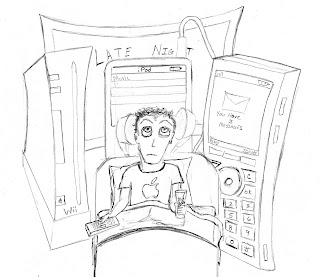
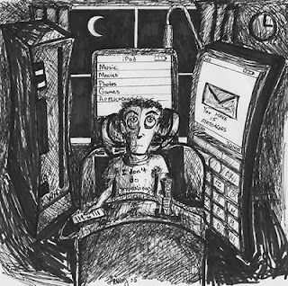
This article reflects on how getting teens to go to bed is difficult in the first place, but then adding technology to the mix makes it very difficult. From, video games, computer, TV, music and texting on cell phones today’s teen has many more distractions keeping them up late at night. The major issue is these students are required to be up early in the morning for school. Parents are finding that they need to enforce new rules like “no cell phones or laptops in bed”.
Thumbnail Concept 1:
It is more like a child hiding from the “Monsters” at night. Except the monsters in this case are the electronic devices. You see a very tired teen trying to find cover from the glowing devices in the shadows. I-pod, cell phone, video games, tv, computer. The devices crowd around the bed to keep the teen awake.

Thumbnail Concept 2:
The teen is actually asleep, possibly some drool out of the corner of his/her mouth. You see a clock in the shadows in the background. But beside the pillow is the phone in the teens “awake hand” texting as the teen sleeps.

Thumbnail Concept 3:
Thumbnail Concept 5:
Parents in bed looking at each other rather cross as their room is filled with electronic devices that they have had to take from their child’s room. Now the devices are keeping them awake.

Thumbnail Concept 6:
The idea of needing to turn in Personal Electronic Devices at night with larger families. The caption would say something about Mrs. Smith found her 4 teens to most unhappy that she installed an electronics arsenal due to the lack of sleep in their home.

Thumbnail Concept 7:
Showing a cell phone with a text message on it, revealing a teen is up late texting when their parents think they are sleeping. Make the text contain text terms, and references to school.

Thumbnail Concept 8:
More like a “Far Side” cartoon. This would should a neighborhood home with a giant metal dome over the top call “Cel-Guard” The caption would explain this is dome was installed to block evening electronic activity.

Thumbnail Concept 9:
The traditional shot of loving parents looking in on their sleeping child. Quote from mom “sleeping like a baby”. Quote from Dad, “Cause I took the phone”. You see the phone in dads back pocket buzzing. And vibrating with messages.

Thumbnail Concept 10:
Shows mom and dad in bed and through the hallway their child is up with their electronic device. The mother, bothered by the noise says. “Aren’t you going to do something? They will be up all night!!!. Dad says, “No I have the charger”.

Thumbnail Concept 11:
Shows a father purchasing a new phone product called “Cinderella Phone”. The sales man is explaining that it will not work after midnight.

Thumbnail Concept 12:
The Cell Club is a device that locks up ones phone. It would show some type of lock up device on a teens cell phone.

 ROUGH SKETCHES:

 RENDERED FINAL:
INK:
PENCIL:

Gouache Paint:

Find an article in The Washington Post and create and create 10 conceptual thumbnails for the article.
The article I found in the Washington post is called. “Digital diversions leave teens, parents sleep-deprived”
By Donna St. George
Washington Post Staff Writer
Tuesday, August 24, 2010
Link to source:
http://www.washingtonpost.com/wp-dyn/content/article/2010/08/23/AR2010082305482.html
Overview of article.
This article reflects on how getting teens to go to bed is difficult in the first place, but then adding technology to the mix makes it very difficult. From, video games, computer, TV, music and texting on cell phones today’s teen has many more distractions keeping them up late at night. The major issue is these students are required to be up early in the morning for school. Parents are finding that they need to enforce new rules like “no cell phones or laptops in bed”.
Thumbnail Concept 1:
It is more like a child hiding from the “Monsters” at night. Except the monsters in this case are the electronic devices. You see a very tired teen trying to find cover from the glowing devices in the shadows. I-pod, cell phone, video games, tv, computer. The devices crowd around the bed to keep the teen awake.

Thumbnail Concept 2:
The teen is actually asleep, possibly some drool out of the corner of his/her mouth. You see a clock in the shadows in the background. But beside the pillow is the phone in the teens “awake hand” texting as the teen sleeps.

Thumbnail Concept 3:
A very simple approach as a teen is awake in their bed using some type of electronic device. You see the moon and clock for visual cues that this is the wrong time for what the teen is doing.
Thumbnail Concept 4: 
We have all done it. Hide under the blanket and pretend that we are asleep while we play video games on a personal device, or text messages. The screen would laminate the teens face and the parents are in the shadows with their arms crossed. Not the clock and time.

Thumbnail Concept 5:
Parents in bed looking at each other rather cross as their room is filled with electronic devices that they have had to take from their child’s room. Now the devices are keeping them awake.

Thumbnail Concept 6:
The idea of needing to turn in Personal Electronic Devices at night with larger families. The caption would say something about Mrs. Smith found her 4 teens to most unhappy that she installed an electronics arsenal due to the lack of sleep in their home.

Thumbnail Concept 7:
Showing a cell phone with a text message on it, revealing a teen is up late texting when their parents think they are sleeping. Make the text contain text terms, and references to school.

Thumbnail Concept 8:
More like a “Far Side” cartoon. This would should a neighborhood home with a giant metal dome over the top call “Cel-Guard” The caption would explain this is dome was installed to block evening electronic activity.

Thumbnail Concept 9:
The traditional shot of loving parents looking in on their sleeping child. Quote from mom “sleeping like a baby”. Quote from Dad, “Cause I took the phone”. You see the phone in dads back pocket buzzing. And vibrating with messages.

Thumbnail Concept 10:
Shows mom and dad in bed and through the hallway their child is up with their electronic device. The mother, bothered by the noise says. “Aren’t you going to do something? They will be up all night!!!. Dad says, “No I have the charger”.

Thumbnail Concept 11:
Shows a father purchasing a new phone product called “Cinderella Phone”. The sales man is explaining that it will not work after midnight.

Thumbnail Concept 12:
The Cell Club is a device that locks up ones phone. It would show some type of lock up device on a teens cell phone.

 ROUGH SKETCHES:

INK:

PENCIL:

Gouache Paint:

History of Editorial Illustration
“Join, or Die” was the caption marking the editorial illustration of a serpent that has been cut into eight
pieces. Each of these pieces was marked to indicate one of the 8 colonies. This piece created by
Benjamin Franklin, on May 9th, 1754, was used with his written column about the disunity of the
colonies. The illustration was an ideal tool to show the early colonies how they needed to be united as
they were in the middle of the French and Indian war. This piece today does not have the same
impact that it did back then as in those days may believed the folklore that had stated, “ a snake that
had been cut into pieces could come back to life if you joined the sections together before sunset”.
(Whitten, 2001) The parallel was ideal, as the colonies were not united at the time. This image is
known for being Americas first political cartoon.

artists would do woodblock illustration. When movable type became more popular illustration became
easier and less costly to produce. The technique involved the artist sketching out their drawing on a
piece of wood, and then they or an engraver would create a relief for print. Ink would then be applied
and the wood relief would be pressed to paper or cloth. It was quite similar to the way we use a
rubber stamp today.
Sir John Tenniel was an illustrator that lived in the Golden Age and is known of for using a woodblock
technique. He would sketch his pieces on a woodblock and then have engravers prepare the block for
printing. He was a political cartoonist, but is better known for the characters he created for Alice in
Wonderland.


As the printing press continued to evolve and production became less expensive, Illustration was in
high demand. It is hard to believe that in the early 20th century illustrators were revered similar to how
our celebrities are today. Norman Rockwell and other illustrators like Edwin Austin Abbey, and
Howard Pyle were paid very well for their talent and ability. In 1905 art schools told students the
illustration profession could earn from $25 to $100 a week, which by today’s standards is between
$600 - $2400. This all started to decline in the 1930’s when photography began to advance. Rockwell
and Abbey, also were able to begin their careers at a very young age.
Howard Pyle is known as being, “an artist who changed the way the world looked at illustration and
the way illustration looked to the world” (Vadeboncoeur, 1997). His pieces are known for their great
action. Previously illustration had a staged look full of props creating a very flat look. He was able to
complete a detailed action scene from a curious perspective.
Source:

Today it is pretty hard to make a living as an editorial illustrator. Many clients prefer to have
photography and the compensation has not like it used to be. Illustrators today must put in many
hours and create vibrant portfolios to get the attention they need for a good stream of clients. Fred
Harper is all too familiar with the hard reality today’s illustrator faces. He has done work for
magazines like Time, Sports Illustrated and The New York Times Magazine. Even thought he has
had some great gigs, he still must work very hard to find more clients and jobs. He knows that there
will always be a need for illustrations, but magazines specifically are not looking to pay a lot of money
for the work.


Work Cited:
""Join or Die"" APStudent.com: U.S. History for AP Students. Web. 23 Aug. 2010.
.
Simkin, John. "John Tenniel." Spartacus Educational. 2003. Web. 23 Aug. 2010.
.
"The Writings of Benjamin Franklin, Volume II: Philadelphia, 1726 - 1757 -- Join or Die." The History Carper -- Primary
Source Documents, Histories, and Stories. 2010. Web. 23 Aug. 2010.
.
Thompson, Wendy. "The Printed Image in the West: Woodcut". In Heilbrunn Timeline of Art History. New York: The
Metropolitan Museum of Art, 2000–. (October 2003) http://www.metmuseum.org/toah/hd/wdct/hd_wdct.htm. 2003.
Vadeboncoeur, Jr., Jim. "Howard Pyle Biography." BPIB - JVJ Publishing. 1997. Web. 23 Aug. 2010.
.
Whittin, Chris. "Don't Tread on Me: Gadsden Flag History." Founding Fathers. 5 July 2001. Web. 23 Aug. 2010.
.
pieces. Each of these pieces was marked to indicate one of the 8 colonies. This piece created by
Benjamin Franklin, on May 9th, 1754, was used with his written column about the disunity of the
colonies. The illustration was an ideal tool to show the early colonies how they needed to be united as
they were in the middle of the French and Indian war. This piece today does not have the same
impact that it did back then as in those days may believed the folklore that had stated, “ a snake that
had been cut into pieces could come back to life if you joined the sections together before sunset”.
(Whitten, 2001) The parallel was ideal, as the colonies were not united at the time. This image is
known for being Americas first political cartoon.
Image Source: http://www.loc.gov/exhibits/us.capitol/one.jpg
Editorial Illustration actually began before the printing press even existed. In Europe in the 1400’sartists would do woodblock illustration. When movable type became more popular illustration became
easier and less costly to produce. The technique involved the artist sketching out their drawing on a
piece of wood, and then they or an engraver would create a relief for print. Ink would then be applied
and the wood relief would be pressed to paper or cloth. It was quite similar to the way we use a
rubber stamp today.
Sir John Tenniel was an illustrator that lived in the Golden Age and is known of for using a woodblock
technique. He would sketch his pieces on a woodblock and then have engravers prepare the block for
printing. He was a political cartoonist, but is better known for the characters he created for Alice in
Wonderland.
Source: http://www.spartacus.schoolnet.co.uk/Jtennielireland.JPG
Source: http://curiouscrow.typepad.com/.a/6a0120a5360147970c0128768fa3e7970c-500wi
As the printing press continued to evolve and production became less expensive, Illustration was in
high demand. It is hard to believe that in the early 20th century illustrators were revered similar to how
our celebrities are today. Norman Rockwell and other illustrators like Edwin Austin Abbey, and
Howard Pyle were paid very well for their talent and ability. In 1905 art schools told students the
illustration profession could earn from $25 to $100 a week, which by today’s standards is between
$600 - $2400. This all started to decline in the 1930’s when photography began to advance. Rockwell
and Abbey, also were able to begin their careers at a very young age.
Howard Pyle is known as being, “an artist who changed the way the world looked at illustration and
the way illustration looked to the world” (Vadeboncoeur, 1997). His pieces are known for their great
action. Previously illustration had a staged look full of props creating a very flat look. He was able to
complete a detailed action scene from a curious perspective.
Source:
Source: http://www.bpib.com/images/pyle-1.jpg
Today it is pretty hard to make a living as an editorial illustrator. Many clients prefer to have
photography and the compensation has not like it used to be. Illustrators today must put in many
hours and create vibrant portfolios to get the attention they need for a good stream of clients. Fred
Harper is all too familiar with the hard reality today’s illustrator faces. He has done work for
magazines like Time, Sports Illustrated and The New York Times Magazine. Even thought he has
had some great gigs, he still must work very hard to find more clients and jobs. He knows that there
will always be a need for illustrations, but magazines specifically are not looking to pay a lot of money
for the work.
Cover for The Week Magazine.
Source: http://www.fredharper.com/BLOG_STUFF/FredHarper_homeBlog/2010/SOSa.jpg
Cover for The Week.
Source: http://www.fredharper.com/BLOG_STUFF/FredHarper_homeBlog/O_chezz_sm.jpg
Work Cited:
""Join or Die"" APStudent.com: U.S. History for AP Students. Web. 23 Aug. 2010.
Simkin, John. "John Tenniel." Spartacus Educational. 2003. Web. 23 Aug. 2010.
"The Writings of Benjamin Franklin, Volume II: Philadelphia, 1726 - 1757 -- Join or Die." The History Carper -- Primary
Source Documents, Histories, and Stories. 2010. Web. 23 Aug. 2010.
Thompson, Wendy. "The Printed Image in the West: Woodcut". In Heilbrunn Timeline of Art History. New York: The
Metropolitan Museum of Art, 2000–. (October 2003) http://www.metmuseum.org/toah/hd/wdct/hd_wdct.htm. 2003.
Vadeboncoeur, Jr., Jim. "Howard Pyle Biography." BPIB - JVJ Publishing. 1997. Web. 23 Aug. 2010.
Whittin, Chris. "Don't Tread on Me: Gadsden Flag History." Founding Fathers. 5 July 2001. Web. 23 Aug. 2010.
Illustraition Style
Q. Who is your favorite illustrator or what is your favorite illustration style?
Nailing down one style or artist to claim as ones favorite seems nearly impossible to me. I like so many different things. I am personally a fan of a digital illustrator named Chris Nielsen. His work is crazy detailed and looks like actual photographs. He is known for doing work with mostly motorcycle engines and is amazing when it comes to polished chrome. I am so drawn to how clear and detailed his work is. It is actually better than a photography.

As far as a traditional illustrator I always think of Mark Bender. I was lucky to have him as an instructor when I attended The Art Institute of Pittsburgh. I always found his style very interesting, and amazing how he would put so many element into each piece, but it all flowed together so well. Visit his website: http://www.benderillustration.com/

Image Source: http://www.pittsburghillustrators.org/portfolios/bender/bender2.jpg
As far as a style goes I am really drawn to the trompe l'oeil technique. For those of you not savvy on the term it is a technique that creates a three dimensional illusion of reality. I of course am not even close to create a good effect, but it is amazing to me that one could study an object long enough and see the detail to recreate a drawing that looks like it could be picked up.
Here are a few cool pieces using this technique.


Nailing down one style or artist to claim as ones favorite seems nearly impossible to me. I like so many different things. I am personally a fan of a digital illustrator named Chris Nielsen. His work is crazy detailed and looks like actual photographs. He is known for doing work with mostly motorcycle engines and is amazing when it comes to polished chrome. I am so drawn to how clear and detailed his work is. It is actually better than a photography.
Image Source: http://www.vectorvault.com/wp-content/uploads/2008/04/chris-nielson-vectorvault-11.jpg
As far as a traditional illustrator I always think of Mark Bender. I was lucky to have him as an instructor when I attended The Art Institute of Pittsburgh. I always found his style very interesting, and amazing how he would put so many element into each piece, but it all flowed together so well. Visit his website: http://www.benderillustration.com/
Image Source: http://www.pittsburghillustrators.org/portfolios/bender/bender2.jpg
As far as a style goes I am really drawn to the trompe l'oeil technique. For those of you not savvy on the term it is a technique that creates a three dimensional illusion of reality. I of course am not even close to create a good effect, but it is amazing to me that one could study an object long enough and see the detail to recreate a drawing that looks like it could be picked up.
Here are a few cool pieces using this technique.
Image Source: http://t1.gstatic.com/images?q=tbn:ANd9GcS6sktsRvyDM66Gl5mnluXALoytDLKBWiOkTpMqGpGWGhkP1Q4&t=1&usg=__M_lvF-jgjUhDTnSZTLEUSIjYxDc=
http://t0.gstatic.com/images?q=tbn:ANd9GcQG68eq_m-l36r71FUfJa95xV2lRs3aY_Zez22ntkBMnl83iIg&t=1&usg=__7Lw-jIkWleWgSghL-8nj3kbS10Q=
Image Source: http://t0.gstatic.com/images?q=tbn:ANd9GcQkNzSaSeVYxo9oWwmer6qnUXx97_Mrjpx4Elz_TY3EGmZc4kY&t=1&usg=__yXIG08HF6vvfvI2wSOY1cB8pxHw=
Image Source: http://www.lectrics.fr/wp-content/uploads/2009/07/Julian-Beever-ladef-01.jpg
http://www.roadsidescholar.com/wp-content/uploads/2007/10/flat-light-web.jpg


Typography Submiting A Font for Review
OBJECTIVE:
SUBMIT FONT FOR REVIEW:
Monotype Imaging, Inc.
500 Unicorn Park Drive
Woburn, MA 01801
Font Submission:
Name: Rapunzel
Design Foundry: Zero Designs
Designer: Fleming, Spyke
Classification: Decorative
Description:
Hair, Feathers, Whimsical, Organic, Growing.
Concept:
Rapunzel, Let Your Hair Down… is exactly what the typeface says. This whimsical ornate movement
created in the font shows the wild beauty of hair in the structure and consistency of a decorative font.
With a creative eye and extreme focus on detail this expressive typeface is have evolved to a very
expressive font.
Application:
This font is quite detailed and would be ideal for large format application or headline and title usage.
Click on images below to view larger
(Rapunzel font designed by Spyke Fleming)
(Rapunzel font designed by Spyke Fleming)


Typography Growth Check
QUESTION:
How have your own concepts regarding contemporary typography grown or somehow changed as a result of your work in this course? Are there any concepts and practices encountered that you will apply to future design projects, either for school or in a professional setting? Explain your thoughts in detail.
This is actually the second class in which I was required to design my own typeface. Since I had done it before I was fairly confident I could do it again. One major thing that helped that I learned in this class that I had not used in the last class was the subcategories. I had a similar process in the last class that I developed on my own, but figuring out the subcategories early in the project helped greatly and creating characters consistently and quickly.
The other aspect that was a huge eye opener is how I was able to really create a huge mess by over designing each character. I learned the valuable lesson of SIMPLIFY, SIMPLIFY, SIMPLIFY! I am also shocked to find some limits with Adobe Illustrator that I had never encountered before.
Another valuable aspect of this class that I was unaware of is the specimen sheet. I have one other font that is finished, and 2 other fonts started. I thought it would be great too finished these out and create 3 more specimen sheets for them. In terms of a portfolio I think that would look pretty solid to have 4 designed typefaces and specimen sheets to showcase the type.
Old font/Contemporary Design
OBJECTIVE:
Explore how an old, conservative, "non-contemporary" typeface might be presented in a contemporary fashion. Choose a short quote to style in a contemporary fashion, but using an older, more traditional typeface.
I used lyrics from one of my favorite bands “mewithoutyou”.
The words read: “She put on happiness like a loose dress over pain I'll never know”.
I used the font LaBrit Regular. It reminded me of the old English type of font. Since the phrase talked about female and a dress I used pink and created a simple dress to hang on the “PP” of happiness. The dress hangs over the “Pain” like the phrase describes.

Subscribe to:
Posts (Atom)