Zuzana Licko is a designer I have found to be most inspiring in her typeface design. She as a handful of more traditional looking fonts, but I am most drawn to her more creative and expressive typefaces. One of her fonts called “Hyponopaedia” is more of a radial pattern or texture. She repeats the character to create a unique pattern. It is very interesting to me to see how she is able to merge and repeat the characters to create these very elaborate looking patterns.
Hypnopaedia
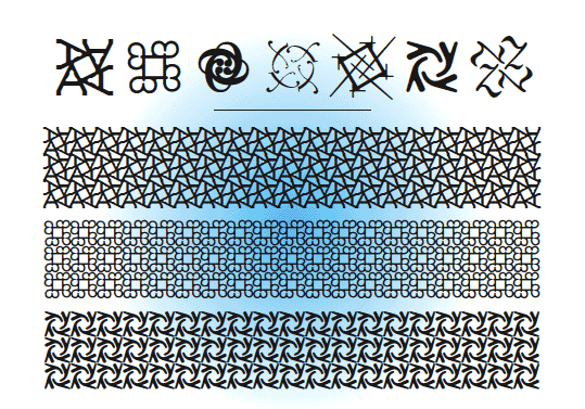
http://www.emigre.com/FontTL/FTHyp.GIF
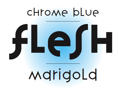
Another thing I am drawn to in this designers typefaces is the creative uses of ascenders and descenders. In the typeface “Variex” you see the movement created in the typeface by this technique. The part I find most inspiring is how well the characters flow with the ascenders and descenders. This is also true with the font “Tall Pack”. I like how the characters break thought the margin lines. It has such a clean conservative look, but when it is popping beyond the margin it seem more like a rebel in a business suite. I love this concept, but I would totally change the name.
Variex
http://www.emigre.com/fontpage.php?PValr.html
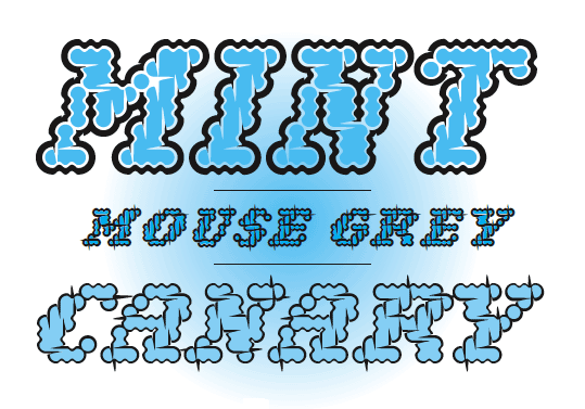
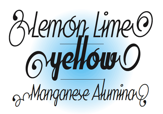
Narly is another great font but I am drawn it if for different reasons. First of all it is very organic. The legibility is somewhat limited, which makes the font more of a headline font than a copy font. I am very drawn to the design and seeing the shapes repeated in each character. Another font in this type of creative category is “Soda Script” I am drawn to how all the letters lead to the next. It seems so smooth and perfect who the combination's or characters are connected with the simple stroke. It is so clean yet decorative. It appears to be a sans serif font, but it is so much more. This perfect unity of script and sans serif, which creates a playful clean professional look.
NarlySoda Script
http://www.emigre.com/EF.php?fid=110
http://www.emigre.com/EF.php?fid=120
TYPE IN DESIGN
I think this piece on Deviant art is what I am drawn to regarding typography design. I love the use of positive and negative space. Adjusting the sized and style and even some times flipping a character to add emphasis when it is needed.

http://postpwned.deviantart.com/art/Typography-Plate-002-64966845
Steve Goodin also has some great inspiring pieces that use very organic type worked into the design to parallel his message beautifully. These are very strong pieces that inspire me to move further into creative design with type.

http://behance.vo.llnwd.net/profiles2/91776/projects/170025/917761232083717.jpg

http://www.behance.net/Gallery/Keep-Reno-Green/170025

http://www.behance.net/gallery/Pink-Party/169953
Sources
http://www.emigre.com/Bios.php?d=10
http://typeinspire.com/
http://www.designshard.com/inspiration/inspiring-grunge-style-big-typography-posters/comment-page-2/#comment-6034
http://cube1987.deviantart.com/
http://www.behance.net/DEMEN1
http://www.behance.net/?field=97