| In web development cascading style sheets can save a designer many headaches and time for formatting the site efficiently. While a website can function without CSS, it is away to add a custom look to a website and remove its default formats. By using cascading style sheets or CSS a developer is able to assign specific formatting to specific areas in the code. With using CSS a designer may choose to assign an ID format specified area or section. An ID is used, “when there is only one occurrence per page” (CSS Tutorial - ID vs Class, 2011). For example, an ID might be used for a call out for a banner section or menu section. With CSS a developer may choose to use a class when there are many instances of a needed format on a page. A class call out would be used on hyperlinks, or create special formatted text for copy sections, headers, and footers. Using a class also allows for creating rollovers for hyperlinks. I personally prefer to use an external style sheet. Even when I am designing only 4 pages I find that I like the ability to control the way each page is formatted with one page of commands. Using an external style sheet does just that. I quickly and efficiently make changes to every page by making a quick edit to my external CSS file. A great example would be if I want my copy text to be larger on each page, and want the color to be gray instead of black. That change can be made to every page that has the link extension in the header and has assigned the proper class to the area that needs to reflect the format. Using an Internal Style Sheet is another way to apply CSS to a web page. Internal style sheet commands are located in the head section and only apply their commands directly to the page they are placed on. Style tags contain the commands for the specific format of that individual page. This technique is not recommended for a website with many pages. Like with external style sheets a class needs to be placed in a tag to apply the style or an ID is applied to a section in the head section. Finally, an inline style is the least flexible for quick changes and adjustment. The inline style is exactly what it sounds like. It is placed right in the tag with a style attribute called directly into the tag. This is a quick and easy way to replace the default formats in a tag with custom formatting. However, this method is more tedious to edit and would not be suggested for websites with many pages. Works Cited: "CSS Tutorial - ID vs Class." Tizag Tutorials. Web. 31 Jan. 2011. "CSS How to." W3Schools Online Web Tutorials. Web. 31 Jan. 2011. | |||
1/31/11
CSS - External, Internal, Inline
1/13/11
Architecture - minimalist
I recently started watching “Lie to Me” and found the building in the show to be quite appealing. I have always been drawn to glass, asymmetrical, buildings especially when they have unique angles, cantilevers and different rooflines. The building used in this show is the DC convention center.
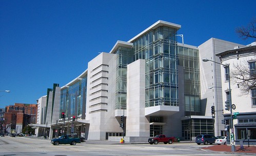

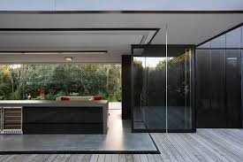
In general I really enjoy modern architecture and specifically minimalist. I like the simplicity and lack of materials. I also love the use of see through materials. I am not one for privacy. It seems like minimalist architecture really takes advantage of light, and does not really have clutter. Here are some samples.
Image Source: http://www.uptodatedesign.com/wp-content/uploads/online-design/2009/04/modern-architecture-of-truro-residence.jpg
Image Source:http://t0.gstatic.com/images?q=tbn:MMF4WzJljYX2eM:http://www.greatfu.com/wp-
Architecture -Federal Style - Coleman-Hollister House
The American culture continued to grow more politically and financially independent. With great prosperity, many grew wealthy and the Federal-style architecture emerged between 1780 and 1820. This more accommodating type of architecture featured a large two-story building with a chimney at each end. The culture shifted and people began to demand large comfortable homes. These structures had a large central hall and four rooms on both floors. This style is less decorated than the Georgian style with lowrelief moldings, palladian windows, and swags. The Federal Style homes reflected the success of those inhabiting them. They typically built in the wealthy commercial areas. Architects like Charles Bulfinch and Samuel McIntire well known for their work in the Federalists style.

While the early settlers held true to their values and spiritual convictions, the prosperity and desire for comfort shifted the ideal of the culture. While the earliest settlers were most concerned with safe secure shelter, the culture evolved to seek comfort, and elaborate beauty.
Works Cited
"Architecture Glossary." American Centuries: History and Art from New England. Web.
12 Jan. 2011.
"Coleman-Hollister House." American Centuries: History and Art from New England.
Web. 12 Jan. 2011.
"Exploring New England Architecture." American Centuries: History and Art from New
England. Web. 12 Jan. 2011.
"New England Architecture." New England Travel. Web. 12 Jan. 2011.
Roth, Leland M. "English Settlements." American Architecture A History. Boulder:
Westview, 2001. 15-56. Print.
Survey of Architecture | ART3020 UB. Week One Online Lecture: Colonial America, 12
Jan 2011.
"Wells Thorn House Ell." American Centuries: History and Art from New England. Web.
12 Jan. 2011.
"Wells Thorn House Main Building." American Centuries: History and Art from New
England. Web. 12 Jan. 2011

(Coleman-Hollister House, 2011)
While the early settlers held true to their values and spiritual convictions, the prosperity and desire for comfort shifted the ideal of the culture. While the earliest settlers were most concerned with safe secure shelter, the culture evolved to seek comfort, and elaborate beauty.
Works Cited
"Architecture Glossary." American Centuries: History and Art from New England. Web.
12 Jan. 2011.
"Coleman-Hollister House." American Centuries: History and Art from New England.
Web. 12 Jan. 2011.
"Exploring New England Architecture." American Centuries: History and Art from New
England. Web. 12 Jan. 2011.
"New England Architecture." New England Travel. Web. 12 Jan. 2011.
Roth, Leland M. "English Settlements." American Architecture A History. Boulder:
Westview, 2001. 15-56. Print.
Survey of Architecture | ART3020 UB. Week One Online Lecture: Colonial America, 12
Jan 2011.
"Wells Thorn House Ell." American Centuries: History and Art from New England. Web.
12 Jan. 2011.
"Wells Thorn House Main Building." American Centuries: History and Art from New
England. Web. 12 Jan. 2011
Architecture - Georgian Style
The Georgian style was named from the kings of England in the early 18th century. “King George I, George II, and George III ruled England from 1714 to 1820” (Architecture Glossary, 2011), when this style rapidly extend to America. The Georgian style reveals how America began to show gradual prosperity. People began to abandon the strict religious convictions that were once paramount to the early colonists. The structures began to offer more comfort, style and beauty with their soaring steeples, bright white exteriors and large windows. The structures built in this style follow ridged symmetry on both the interior and exterior. The rooms and floor plan reflect a symmetrical balanced design as well. The exterior reveals elements influence from Classical Greece and Roman architecture with pilasters, dentils, and pediments.

Works Cited
"Architecture Glossary." American Centuries: History and Art from New England. Web.
12 Jan. 2011.
"Coleman-Hollister House." American Centuries: History and Art from New England.
Web. 12 Jan. 2011.
"Exploring New England Architecture." American Centuries: History and Art from New
England. Web. 12 Jan. 2011.
"New England Architecture." New England Travel. Web. 12 Jan. 2011.
Roth, Leland M. "English Settlements." American Architecture A History. Boulder:
Westview, 2001. 15-56. Print.
Survey of Architecture | ART3020 UB. Week One Online Lecture: Colonial America, 12
Jan 2011.
"Wells Thorn House Ell." American Centuries: History and Art from New England. Web.
12 Jan. 2011.
"Wells Thorn House Main Building." American Centuries: History and Art from New
England. Web. 12 Jan. 2011.

(Wells Thorn House Main Building, 2011)
Works Cited
"Architecture Glossary." American Centuries: History and Art from New England. Web.
12 Jan. 2011.
"Coleman-Hollister House." American Centuries: History and Art from New England.
Web. 12 Jan. 2011.
"Exploring New England Architecture." American Centuries: History and Art from New
England. Web. 12 Jan. 2011.
"New England Architecture." New England Travel. Web. 12 Jan. 2011.
Roth, Leland M. "English Settlements." American Architecture A History. Boulder:
Westview, 2001. 15-56. Print.
Survey of Architecture | ART3020 UB. Week One Online Lecture: Colonial America, 12
Jan 2011.
"Wells Thorn House Ell." American Centuries: History and Art from New England. Web.
12 Jan. 2011.
"Wells Thorn House Main Building." American Centuries: History and Art from New
England. Web. 12 Jan. 2011.
Architecture - Midieval English/ Early Colonial Style
The early settlers adopted many practices of the Native Americans. Their need for shelter led them to build makeshift wigwams in the hillsides similar to the native neighbors. These mud hut type structures were soon replaced with more of a traditional English structure. The still primitive single room structures were created using hand cut beams with thatch roofs. The gaps between the beams filled with mud and sticks. Unfortunately, due to changes in temperature gaps would appear, and the thatch did not weather well either.
Between 1600 and 1740 the post medieval English/early colonial style reflects the early cultures greatest concern of functionality; the early settlers had rather simple humble structures. These early colonists also were also driven by their values and strong religions convictions for living simply. This is very apparent when looking at the style of architecture of this time period. The homes were designed and build to serve the purpose of shelter from the cold. They were used for eating, rest, and duties to keep the home functioning. The structures were very small and boxy with a simple hall and parlor floor
plan. They tend to be one room deep and one and a half stories tall. The small upper loft area, known as a garret, was often used for storage or sleeping. Their steep roofs had a large chimney in the center for heating and indoor cooking. They are designed with few windows and a strong board and batten door that would serve the purpose of keeping those inside safe and secure. The outside of the structure is very plan and have minimal decoration and unpainted exterior walls.

Works Cited
"Architecture Glossary." American Centuries: History and Art from New England. Web.
12 Jan. 2011.
"Coleman-Hollister House." American Centuries: History and Art from New England.
Web. 12 Jan. 2011.
"Exploring New England Architecture." American Centuries: History and Art from New
England. Web. 12 Jan. 2011.
"New England Architecture." New England Travel. Web. 12 Jan. 2011.
Roth, Leland M. "English Settlements." American Architecture A History. Boulder:
Westview, 2001. 15-56. Print.
Survey of Architecture | ART3020 UB. Week One Online Lecture: Colonial America, 12
Jan 2011.
"Wells Thorn House Ell." American Centuries: History and Art from New England. Web.
12 Jan. 2011.
"Wells Thorn House Main Building." American Centuries: History and Art from New
England. Web. 12 Jan. 2011.
Between 1600 and 1740 the post medieval English/early colonial style reflects the early cultures greatest concern of functionality; the early settlers had rather simple humble structures. These early colonists also were also driven by their values and strong religions convictions for living simply. This is very apparent when looking at the style of architecture of this time period. The homes were designed and build to serve the purpose of shelter from the cold. They were used for eating, rest, and duties to keep the home functioning. The structures were very small and boxy with a simple hall and parlor floor
plan. They tend to be one room deep and one and a half stories tall. The small upper loft area, known as a garret, was often used for storage or sleeping. Their steep roofs had a large chimney in the center for heating and indoor cooking. They are designed with few windows and a strong board and batten door that would serve the purpose of keeping those inside safe and secure. The outside of the structure is very plan and have minimal decoration and unpainted exterior walls.

(Wells Thorn House Ell, 2011)
Works Cited
"Architecture Glossary." American Centuries: History and Art from New England. Web.
12 Jan. 2011.
"Coleman-Hollister House." American Centuries: History and Art from New England.
Web. 12 Jan. 2011.
"Exploring New England Architecture." American Centuries: History and Art from New
England. Web. 12 Jan. 2011.
"New England Architecture." New England Travel. Web. 12 Jan. 2011.
Roth, Leland M. "English Settlements." American Architecture A History. Boulder:
Westview, 2001. 15-56. Print.
Survey of Architecture | ART3020 UB. Week One Online Lecture: Colonial America, 12
Jan 2011.
"Wells Thorn House Ell." American Centuries: History and Art from New England. Web.
12 Jan. 2011.
"Wells Thorn House Main Building." American Centuries: History and Art from New
England. Web. 12 Jan. 2011.
Architecture -Federal Style
QUESTION?
Imagine you are a colonist in early America, what architectural features would be important to you in building a house? A place of worship? Community buildings? Discuss your observations and be sure to integrate several historic and architectural examples into your response.
Depending on my social and financial status I would aim for the features included in the Federal style of architecture. I would hope to find myself in the more wealthy part of the culture. I would think extra room, layout and function of the home provides more options for the family and community. It also have great visual appeal in its use of balance and symmetry.
My home would include two chimneys on either end. This would be more efficient in heating the home as well as, be more visually appealing creating balance and symmetry. This feature would also allow for a fireplace in each room, which would be an added luxury.

(Historic Buildings of Connecticut, 2011)
My home would also have the traditional federal home windows. With six by sixdouble hung windows stacked on the first and second floors, my rooms would be full of light. The exterior of the home would be enhanced with the symmetrical decoration of the windows adding character to all exterior walls.

To showcase the exterior of the home I would have grand entry. A beautiful front door surrounded by windows and carpentered moldings. A fanlight window would crown the door in its splendor. The door would be the focal point of the surrounding structure.

The interior of the home would feature a long grand hallway that would run the length of the home. There would be equal rooms on either side of the hallway that would creating areas for private gathering. These rooms could be used for small religious gatherings or other community issues or personal time of reflection, reading or recreation. The interior rooms and hall would also have delicate detail in the moldings, and other influences from roman architecture.


Works Cited:
"Coleman-Hollister House." American Centuries: History and Art from New England.
Web. 12 Jan. 2011.
"Historic Buildings of Connecticut » Blog Archive » The Miles Lewis House (1801)."
Historic Buildings of Connecticut. Web. 12 Jan. 2011.
"Rural Intelligence | Style: House - Two House Tours with a Focus on History." Rural
Intelligence | What's Happening in Our Neck of the Woods: Berkshire, Columbia,
Dutchess & Litchfield Counties. 12 Jan. 2011. Web. 12 Jan. 2011.
"What Is a Fanlight - Architecture Glossary." Architecture and House Styles -
Architecture and House Styles and Home Design. Web. 12 Jan. 2011.
Imagine you are a colonist in early America, what architectural features would be important to you in building a house? A place of worship? Community buildings? Discuss your observations and be sure to integrate several historic and architectural examples into your response.
Depending on my social and financial status I would aim for the features included in the Federal style of architecture. I would hope to find myself in the more wealthy part of the culture. I would think extra room, layout and function of the home provides more options for the family and community. It also have great visual appeal in its use of balance and symmetry.
My home would include two chimneys on either end. This would be more efficient in heating the home as well as, be more visually appealing creating balance and symmetry. This feature would also allow for a fireplace in each room, which would be an added luxury.

(Historic Buildings of Connecticut, 2011)
My home would also have the traditional federal home windows. With six by sixdouble hung windows stacked on the first and second floors, my rooms would be full of light. The exterior of the home would be enhanced with the symmetrical decoration of the windows adding character to all exterior walls.

(Rural Intelligence | Style: House - Two House Tours with a Focus on History, 2010)
To showcase the exterior of the home I would have grand entry. A beautiful front door surrounded by windows and carpentered moldings. A fanlight window would crown the door in its splendor. The door would be the focal point of the surrounding structure.

(What Is a Fanlight - Architecture Glossary, 2011)
The interior of the home would feature a long grand hallway that would run the length of the home. There would be equal rooms on either side of the hallway that would creating areas for private gathering. These rooms could be used for small religious gatherings or other community issues or personal time of reflection, reading or recreation. The interior rooms and hall would also have delicate detail in the moldings, and other influences from roman architecture.


(Coleman-Hollister House, 2011)
(Coleman-Hollister House, 2011)
Works Cited:
"Coleman-Hollister House." American Centuries: History and Art from New England.
Web. 12 Jan. 2011.
"Historic Buildings of Connecticut » Blog Archive » The Miles Lewis House (1801)."
Historic Buildings of Connecticut. Web. 12 Jan. 2011.
"Rural Intelligence | Style: House - Two House Tours with a Focus on History." Rural
Intelligence | What's Happening in Our Neck of the Woods: Berkshire, Columbia,
Dutchess & Litchfield Counties. 12 Jan. 2011. Web. 12 Jan. 2011.
"What Is a Fanlight - Architecture Glossary." Architecture and House Styles -
Architecture and House Styles and Home Design. Web. 12 Jan. 2011.
1/11/11
Poor Webdesign
Website needs some help~
Encountering the landing page for Adam Haynes at, http://www.stickfort.com/, one would think the site would be pretty impressive seeing the detailed illustration. Upon clicking on the illustration to enter the site the user is shocked as the light tan background is drastically changed to a dark blue with gray and yellowish green accents. At first I thought I was linked to the wrong site as it was completely different from the landing page, but the more I studied it I found it was the actual site. In the end the actual site appears to be more of a blog in my opinion. The site is a personal website to display the work of Adam Haynes.
The text is very pixilated so I am guessing that the links and other text in the top box is images. I also don’t understand why the designer would choose a huge header and two equal columns below. The one column holds “Archives” and a few other links. Which was a poor use of space as the other column where the most of his content is located was long and narrow. This creates excessive scrolling for the user. It also creates a huge hold in the design in the shorter right column.
The portfolios are also set up differently and do not have consistency. The illustration portfolio has large thumbnails or small samples of work down the column that the user can click and view a large sample in a popup window. Under the archives though there are missing samples when some links are clicked. The user then questions why it is called “Archive”? The paintings section is completely different as it has small thumbnails in a small block next to the archives. Another small issue I see is that some of the pieces have the frame stroke and others do not. In the end the frame stroke should match the color scheme if it is on.
Then the user clicks on “Available Works” link and looses the other menu links. The page the user goes to also has a coming soon tag. A page with no content is not good, but leaving a user on a page without content without a way to get back is unacceptable.
Finally, the contact link goes directly to the email client on the computer. I am not a big fan of this type of command. If a user is not on their personal computer the email client is not what the user would want. Also there is not any other type of contact information.
Overall this site is very inconsistent and looks like it is still under construction. I also think the design of the site looks like a blog and really does not make this designer very appealing in a competitive market. The other issues of poor imagery, missing pages, and lack of structure and unity are all evidence in my opinion that this designer does not take his work very seriously.
Source:
Stickfort.com
Great web design PG&E
Site with Great Innovation:
The PG&E website found at http://www.wecandothis.com/ is very impressive. PG&E is the Pacific Gas and Electric Company. This site appears to hold content for PG&E customers. The information is entertaining and helpful in educating the customer in energy saving technology, tips and future ideas. The site is mostly flash driven and very interactive and even has games for the user to play. Being a flash site it does have a preloader for the site to load. The preloader is a great distraction as it is a custom preloader with very large number broken into a unique grid. In my opinion the site loaded very quickly, but at the same time I have super fast Internet.
After the page loads, the user is greeted by different sounds that are connected to the different interactive images. Some may say at first glance the design has no visual hierarchy, but I view the display a to be a balanced collaboration of information expressing in a fun interactive way. The eye is drawn up to the top left corner by instinct as well as the bright orange contrasting color. Here is where the user finds the menu. A nice soft blue color is used which is calming and easy on the eyes. Accents of orange are used for contrast and to draw the user to the menu tabs.
The consistency of the site is quite strong. While there are a few links that lead to new windows that do not follow the look and consistency of the flash site, only a few of these links that landed on traditional HTML pages that all looked consistent. In my opinion it looks like it takes the user to the old site or a less entertaining HTML version of the current site. I was surprised to find this as it makes the site seem slightly unfinished.
Considering how much content this site has to offer I appreciate the organization of the information. Most sites that have all this information on the front page with many links I and other user may find over whelming. There is a a lot of clicking going back but it allows the user to have a comfortable experience without too much information at once.
I think it is great that the site offers the content in a few different languages. The only problem I found with that was that once you click on the Spanish link and try to go back to English the page has an error.
A contact phone number is provided, as well as, a form for correspondence. I did not see an email address on the site, and I would venture to guess there is not one. Typically larger companies do not use email addresses but rather forms.
Over all I found the site to be very creative, innovative and user friendly. The interactive roll over images that have animation really draw the user in. The site looked the same in both Safari and Firefox browsers. It however did not load at all in IE 5 but that is not surprising as it is a flash site. Most important I think the site gives the user a one of a kind unique experience with an organized way to find needed information.
Source:
wecandothis.com
Subscribe to:
Posts (Atom)