Had an issue with loosing my bottom scroll bar. I found that when I used a align="right" to align my main table right it did not play nice with the browser.
To fix this problem I used a style="margin-right:0px;margin-left:auto;" instead. Now you see the scroll and it plays nicer...
check out the website.

4/2/10
Photo Repair - Photoshop
So I found a photo online that was damaged.
First I tried to use the “DAMP” method alone. But the damage was too deep. I then went back and used the clone tool to repair some of the major parts of the damage. Then I used the “DAMP method. I then applied adjustment layer with a levels adjustment as well as a brightness contrast adjustment layer and hue saturation adjustment layer.

Photo Resource:

Photo Retouch DAMP Method
Here is what I did to correct this photo:
1. Used the “DAMP” method to clean up the skin imperfections and graininess of the low quality photo.
2. Used an adjustment layer and corrected the levels.
3. Used an adjustment layer and corrected the curves. To remove the yellow color cast
4. Used an adjustment layer and adjusted the vibrance to make the image clearer
5. Used an adjustment layer and adjusted the color balance to reduce the yellow.
6. Used an adjustment layer and adjusted the selective color to enhance the other colors
7. Selected the lips with the quick selection tool.
8. Adjusted the Hue of the lips.
9. Used an adjustment layer and increased the brightness.
10. Save as .psd. (Layered file) then Save as .jpg

Original

Retouched
The DAMP method - Photoshop Retouch
Wow I love the retouching exercise shown in the lecture. At first I didn’t see how it worked, but now I am addicted. This is a great reason to duplicate a layer and work on a separate layer. Another reason to duplicate a layer would be when using layer styles. I make 2 and even 3 copies of layers and add different layer styles to create interesting effects. I also duplicate layers so that have the original to reference quickly without removing masks or turning off a bunch of other layers.
1. I duplicated the layer.
2. I turned off the top layer on the layers pallet.
3. I went to the bottom layer and did a Filter>Noise>Dust and Scratches, Radius 4 and Threshold 6.
4. Turned the top layer back on added a mask to it.
5. Taking the brush tool I selected the bad spots to mask out on the top image
6. I added an adjustment layer for levels and hue saturation.
7. I created a mask separating the boy from the background using the lasso tool and then cleaned it up with the brush tool.
8. I added an adjustment layer for hue and saturation to the boy adding red to his shirt and face.
Photoshop Animation
I have done quite a few Photoshop animations of the years. It is always a little difficult as I also have don’t some in flash, and remembering the limits of Photoshop animations verses flash.
Here is what I did:
- I created a document 640x480
- I started with my name.
- I wanted to highlight the different sections or things in my online portfolio. So I used the same font family and designed text that comes in at different times.
- Then I have my name fade in last. I applied a “difference” layer style to my name and changed the color to cyan.
- Then I added a black panel that will fade in and change my name color due to the layer style.
- Then I added “portfolio”
- I ended up with 33 frames and quite a few tweens.
- Save as .psd
- And Save as gif.
Here are some links to other samples I have created.


See links for more samples:


Web Design Process - Photoshop
Designing a website in Photoshop is a good way to start as it enables you to focus first on the layout for positioning and mockups. Adjusting a design is quite a bit easier in Photoshop or other graphic software compared, to making changes in the code. With layer comps you can easily show different variations of the layout as well as use it to make different pages and rollover links.
When I worked for an online adverting company, ClickaCoupon.com, we built multiple websites we actually did most of the conceptual designs in Photoshop Elements (A stripped down version of Photoshop). We utilized the layers and groups to show different pages or versions for the owner to make decisions. Many times we would go back and move things around and make many adjustments. This would have been more difficult if it were done in code. Sometimes we would even find an existing site, which we would screen capture and utilized the grid and structure as a template. I actually did many sites for this company this way here are just to examples of websites that were laid out in Photoshop before they were coded.
In Photoshop once the site is designed, it can be sliced and exported for too. Many designers do not have extensive web coding knowledge and by using Photoshop these designers are able to produce working websites. Taking things even a step further designer’s can utilized the bridge and export web galleries without even knowing any html code at all. These galleries are a quick and easy way to get samples live on a website. I actually designed a website for a client utilizing the bridge function. The client is a photographer and knows Photoshop and how to create the web galleries. I then utilized some code I knew to enable him to upload and change galleries continually without messing up his site. He also has a function for his clients where they type in their code he assigns and they can view their proof photos he has taken for them. See this site at www.alpinerose.com.
3/25/10
Chris Nielsen - Digital Illustrator
Stumbling into the work of Chris Nielsen, I thought I had found a photographer not an Illustrator. His work is exceptionally realistic. Even as I look very closely at his renderings I find it quite flawless and almost unbelievable that it is not a photo.

Chris Nielsen is a digital illustrator located in Southern California. He is best known for his incredible style he calls “Stylized Realism” (Nielsen). To execute his polished style Nielsen takes around 100 photos of a motorcycle on his digital camera for references, and then places the photos into Adobe Illustrator. Nielsen then relies mainly on the pen tool to increasingly map out the details he sees to create the incredible stylized illustration. He focuses on one section at a time, starting with simple shapes before focusing on great detailed sections. When working on exceptional detail sections, “Nielsen would often zoom to a comfortable 300% or so to work” (Shewer, 2009). Chris then goes back to the shapes he has created and selects the shape, “and use the DIVIDE PATHFINDER to cut the shape down into smaller, more descriptive pieces for coloring later on” (Hodge, 2008). Chris’s illustrator files normally have around 500 layers by the time he is finished.
Chris Nielsen did not acquire this extraordinary style over night. He attended California State University, Fullerton and received his Master of Fine Arts Degree in Illustration with a focus on digital art. He also has over ten years experience as an instructor at the college level.
With Chris’s illustrations so sharp and crisp with rich detail, many assume his photo quality illustrations are packed with visual effects, and filters to achieve such a lustrous effect. Nielsen is quite clear that this assumption is completely false. He claims, “My work is completely made up of flat-colored shapes... lots and lots of them! I DO NOT work with any types of Filters or Special Effects. I like the process of developing a realistic look in my illustrations with totally flat colors and abstract shapes” (Nielsen).

One of the more ironic things about this accomplished illustrator and his subject matter is that he doesn’t have a motorcycle of his own. In fact he has never even sat on one nor does he have a clue of how they work. Many people would wonder then why he would choose this subject matter. Chris explains that his choice of imagery is a refection of what appealing to him visually. He elaborates this in the ‘Statement’ section of his website, “I choose to work on portraits of motorcycles that you and I do not have the privilege of viewing on a daily basis. I do not focus on the whole motorcycle either. I prefer to crop in on those amazing and complicated, little parts and focus on those relationships. Those are the portraits I like to draw... simply because it’s a challenge to me... and they’re fun to look at and talk about” (Nielsen).
I find Chris Nielsen quite inspiring as an illustrator. I appreciate his discipline to mastering the pen tool and his patient consideration of his subject. When I consider the tedious hours that this master illustrator commits to his work I understand his statement, “I draw what I like to look at” (Nielsen). In general I try to search for subject matter that is somewhat visually appealing or interesting to me. Especially when I will be looking at it so much in the creation of a digital vector illustration.
Chris’s discipline to detail to make his work as realistic and in some cases better than the original is something I feel I strive to as a beginning artist. Especially when creating vector art, I work toward his style of “Stylized Realism” (Nielsen). Of course I am not there yet, but he is defiantly an inspiration to keep working to become a master of the pen tool.
Works Cited:
Hodge, Sean. “Chris Nielsen Interview”
14 May. 2008: Web. 23 Oct. 2009
Nielsen, Chris. "Statement"
Web. 23 Oct. 2009.
Stewer, Sharon. “Advanced Techniques – Gallery”
The Adobe Illustrator CS4 WOW! Book
Peachpit Press, 2009.384-385.
Vectorvault.com. “AnchorPoint”
2008: Web. 23 Oct. 2009.
Developing A Personal Style
1. Discuss your own personal experience in attempting to develop a certain style and why you favor that approach.
I remember when back when I was in a mixed media class and I was trying to mimic the style of the 80’s trapper keeper artist Mark Fredrickson. I really liked how he exaggerated his images.
Mark Fredrickson Example:
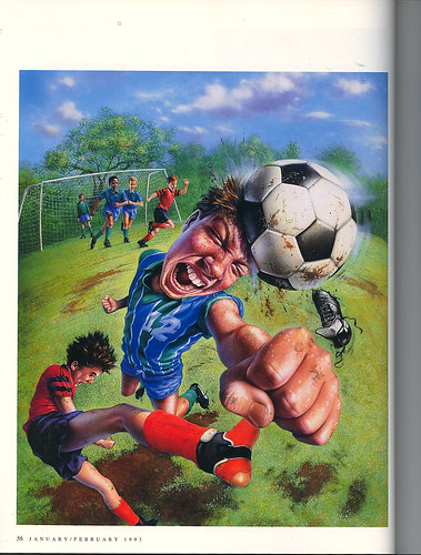
I tried to find as many resources as I could to feed from. In the end I remember finding the photo reference of the person I was going to use and actually scanning the photo into Photoshop and using a fisheye effect to get a good reference for my illustration. The final piece was for an Aesop fable of a boy in an almond jar. See my finished drawing on my website here:

When working in illustrator and producing a digital illustration in the beginning I really wanted my work to look like a photograph. I spent hours creating shapes for every color I could see. I would only use references that were very sharp and clear. I reminded me of how I was really consumed of a technique called trompeloeil, in which you tried to create an image so realistic it appeared that you could just pick it up. See some samples of my early digital illustrations works.


As I quickly learned this style was very time consuming I went to more of an implied style and tried to find highlights, midtones and shadows. See Samples:


And just recently I have started working in the direction of using more silhouette and implied forms I think this is greatly influenced from itunes advertising.


Resource:
Subscribe to:
Posts (Atom)