|  (A Little History on the Prairies, 2011)
In researching images of maps and landscape I found that the landscape images give the viewer a greater sense of detail. They spark instant emotions as well. In the watercolor and ink piece by Ron Woodall the viewer quickly see a stark baron area. We notice the flat land and the color pallet that leads us to believe the areas is a very dry desolate place. We see no living thing in the image just dead grass and dark skies. The structure in the painting even gives us visual cues to believe it is abandon. The windows and doors are open and parts of the structure are falling down. There is no smoke in the chimney and the path to the structure looks abandon. The viewer feels the emotion of solitude, failure, death or abandonment. 
( Waiting, 2011)
The next landscape painting I studied was a more modern landscape. It is less detailed than the previous but still gives us many visual clues to what the artist is trying to communicate. In the painting “Waiting” by William Wray we see an urban setting. In our culture it is easy to identify the structure of the golden arches. We instantly know it is a McDonalds restaurant. We see figures waiting on the corner and images that resemble cars, billboards, streetlights and signs. We see the harsh contrast of green grass and vibrant landscaping against the gray of the concrete sidewalk and street. The other visual que I believe the artist is attempting to show us is that this landscape is in a morning or evening setting. The light source is coming from the right and showing the viewer either beginning or ending of the day. The viewer might have a emotional strike of hunger in seeing the arches, fatigue, accomplishment, or ambition with the positioning of the sun.
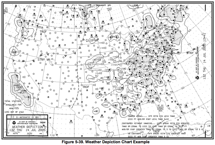
 (Aviation Weather Services – Observed Text Products, 2011)
The map diagram I found and studied of the Weather Depiction Chart Example is very different from the landscape images. The map is more analytical details and facts to the viewer. This map is not colored and is very information specific. To truly find this map useful one would need to have the understanding of interpreting the symbols and markings for effective communication.

( April 2009, 2011)
In the study of Jasper Johns “The Map” we see a completely different type of map. The map is very abstract and does not give the viewer much information but may get more of an emotional reaction as it uses many vibrant colors and abstract shapes. The visual cues are very subtle and if the viewer were not familiar with United States this map would not be very helpful at all. While this map is more expressive and iconic, it may give general ideas about the shape and locations of some of the states, but would not help most looking for more detailed accounts.
From my research I find the main difference between maps and landscapes are that maps are more analytical providing data. Even in the abstract map the facts are there as far as the shape and locations of states. In looking at the landscape image I find the viewer is more inclined to abandon fact and move to more emotional responses. The viewer could draw visual conclusions based on visual cues, which could be correct, but are more or less hypothesis.

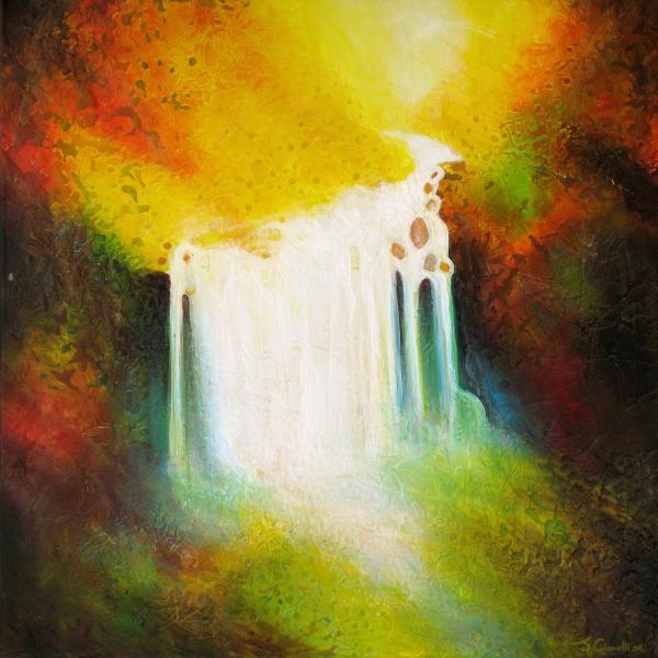
(Autumn Falls Painting by Jaison Cianelli, 2011)
Finally I also found a landscape that was totally uninformative. My first look at “Autumn Falls” by Jaison Cianelli left me with so many questions of what I was seeing. Is it an explosion? A bright light? It was not until I saw the title “Autumn Falls” That I was able to understand this landscape as a waterfall. Even with that name the viewer has great difficulty gathering information from the image.
In conclusion, I find that the more information an image has the quicker the viewer is able to assimilate what the creator is communicating. Greater details also aid in communicating more information but more details do not mean the image is more interesting. I find the weather map very boring and uninteresting even though it has the most factual analytical data for the viewer. Taking this thought a step further I would venture to say that in creating visual cues and mystery without telling the whole story, the image keeps the viewer interested and looking for more to gain greater understanding.
Works Cited:
"Aviation Weather Services – Observed Text Products." Touring Machine Company. 22 June 2008. Web. 5 Apr. 2011. .
"April 2009." Music & More. Web. 05 Apr. 2011. .
"Autumn Falls Painting by Jaison Cianelli - Autumn Falls Fine Art Prints and Posters for Sale." Jaison Cianelli - Fine Art. Web. 05 Apr. 2011. .
"January 13 – March 4, 2011 - University of Lethbridge Art Gallery." University of Lethbridge. Web. 05 Apr. 2011. .
"A Little History on the Prairies." ALICE SALTIEL-MARSHALL. Web. 05 Apr. 2011. .
""Waiting"" MoCo Loco - Modern Contemporary Design & Architecture. Web. 05 Apr. 2011. . |


