Photographing American Architecture
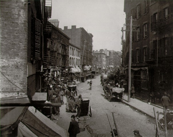
The rise of industrialism and the accumulation of wealth and labor in major U.S. cities may have led to the development of the skyscraper, a simple and functional type of architecture that was distinctively American. At the same time that the monumental buildings discussed in chapter five of your text , were being constructed to accommodate the commercial needs of large cities, there were also squalid tenement buildings that were the focus of the documentary photography of Jacob Riis. The image available at the following link depicts a neighborhood in the lower east side of New York that housed many of the European immigrants that flocked to the U.S. at the end of the nineteenth century:
Jacob Riis, Mulberry Bend, 1896
Compare the image of tenement buildings with those of the skyscrapers found in your book. What are the different messages being conveyed by these images? How do the photographers compose the images to address the different functions (public v. private) of these structures?
  (Candida Martinelli's Italophile Site, 2011) (Google Images, 2011) (Candida Martinelli's Italophile Site, 2011) (Google Images, 2011)An a initial response in viewing the photo of Mulberry bend and the photograph of the Monadnock Building located in Chicago, IL, could be misconstrued as a different time period. We see crowded streets full of people walking and horse drawn carriages and carts in Jacob Riis’s photo. The streetcars and automobiles in the photograph of the Chicago skyscraper designed by Burnham and Root could be misleading in the comparison of these two photographs. The major difference I see first hand is that in the Mulberry Bend photo the streets are very crowded and busy with excitement. In viewing the photo of Jacob Riis, we see the area is not glorified in anyway. Riis actually had an office located in Mulberry bend where he worked writing articles. He would daily journey through this cramped dirty area and see the quality of life for the inhabitance of this neighborhood were quite inadequate. In his writings, Jacob Riis was noted for how he “emphasized the humanity of the tenement population” (Documenting "The Other Half", 2011). We can see he also uses a similar technique in his photography. These structures located in the poorer areas on the lower East side of New York City are between three and five stories high and have rickety fire escapes and the littered street also is a visual indicator this area is not well taken care of. In the photo of the Monadnock Building we see a different story. There is hardly any activity in the street below. Given that this structure is a first class office complex, we could guess the photo is taken on a weekend when workers are not around. A streetcar and a few automobiles give us the idea that transportation is needed to bring individuals to this structure from the suburbs. The design is simple with it clean lines and sublet curve showing more modern or contemporary feel on the exterior. We don’t see shutters around the windows as we did in the Mulberry Bend neighborhood. The feel created by the intimidating structure is power. This structure gives a greater sense of security and success. The slightly flared base of the structure helps us verify the building materials. “The brick walls still serve as supportive elements for the sixteen stories and are 17 feet thick at the base” (Pohl , 2001). The size, clean lines, and height grant a confident appearance to the Monadnock Building Works Cited: "Candida Martinelli's Italophile Site(Immigrants NY 1890)." Candida Martinelli's Italophile Site (Italian Culture,links,free Ebooks). Web. 19 Apr. 2011. "Documenting "The Other Half": The Social Reform Photography of Jacob Riis and Lewis Hine." American Studies @ The University of Virginia. Web. 19 Apr. 2011. "Google Images." Google. Web. 19 Apr. 2011. Pohl, Frances K. Framing America: a Social History of American Art. New York, NY: Thames & Hudson, 2002. 290. Print. | |||