2/17/10

The Power Of Letterform

I think Online School of Design states it best, “Typography, technology, and culture are intertwined. The letterform (in the right hands) has the power to communicate meaning and mood through its quirks and beauty, its history and diversity.” (Online School of Design, 2009)

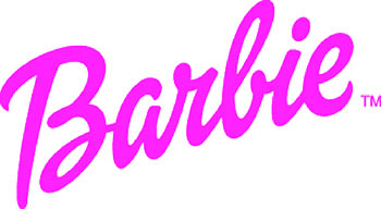
The reason letterform is so powerful is due to is ability to provide unconscious persuasion. From attracting attention to setting the tone of a layout, the observer is emotionally and subconsciously impacted and gathers the feeling of the piece with out even knowing it. Typography affects people and most of the time they don’t even consciously notice it. Experienced Graphic Designers understand how to harness the power and use it for their advantage to attract attention and reinforce their message. Script typefaces are a great example of letterforms that loaded with all sorts of emotion. As we saw in last week’s assignment, script typeface can create the feel of a particular era or time period as well as, project a mood, elegance and sophistication. While the script typeface does create a nice visual texture, the letterform in most cases is more difficult to read than serif or san serif font. Therefore readers tend to avoid blocks of text containing large amounts of Script text, so it should be handled with care. The BarbieÒ logo is great example of how a script typeface has been using in a dynamic elegant way. Even children know the Barbie brand before they can read the playful elegant designed typeface. Their latest version is by design firm Parham Santana.
Cited:

1. Online School of Design, http://www.sessions.edu/courses/Course-Advanced-Typography.asp; 2009.

Text Document To Transcend Time- Dead Sea Scrolls

The Dead Sea Scrolls were discovered in large pottery jars between 1947 and 1956 in eleven different caves about 13 miles east from Jerusalem. Although the discovery mostly consisted of disjointed text and many pieces that were destroyed to the point they could not be restored, the Dead Sea Scrolls have been named one of the greatest manuscript discoveries of modern time. The Scrolls are estimated to have been written between 200 B.C. and 68 C.E./A.D. and contain mostly Hebrew, some Aramaic, and only a few texts in Greek. They mostly are made of animal skin, but there is some use of papyrus and one even made of copper. The text has been analyzed and reported to be a carbon-based ink median and is described to read, right to left, with no use of punctuation, other than an infrequent paragraph indent. Experts have reported that in some instances there are not even spaces between words.

Looking at samples of these Scrolls, I am amazed. They were created so long ago but have so much impact today. They affirm issues in the Jewish and Christian communities. Even looking at the structure of the text written by someone’s hand thousands of years ago, probably by candlelight, it is amazing to notice the consistent letting of each line, as well as, the strong right align with the ragged left edge. I also notice the use of columns and their width is quite consistent.

The fact that these Scrolls were discovered, salvaged, pieced back together and read over 2000 years later leads me to believe the author met his objective. The were not just a personal to-do-list for the author, they were much more important. The fact the author was documenting events, history, and the instructions of God, in this case, it was vital that the author write in a form that could be interpreted. The authors needed their writing to transcend time. They were handling “Gods Word”, His divine instruction to his people. They needed their typography to be as clear as they could get it. They have indeed accomplished this as these writings have been analyzed and interpreted.

See Dead See Scroll Samples:


RESOURCES:
Online lecture
Typographic Design: Form and Communication
http://www.centuryone.com/25dssfacts.html
http://ninjaradio.files.wordpress.com/2009/07/scroll1.jpg
http://www.ibiblio.org/expo/deadsea.scrolls.exhibit/intro.html

Letterform VS. Graphic

Question: In your opinion, what is the graphic impact of letterform and symbol as against the graphic impact of photographic and illustrative image?

In my opinion photographic and illustrative images will always be a stronger communicator and have a greater impact. In referencing the coined phrase “a picture is worth a thousand words” I am affirmed as this phrase explains that ideas and complex thoughts can easily be communicated in a single image, verses the amount of text required to communicate the same thought or idea. There is also the ongoing issue of the language barrier that photographs and illustrations transcend. At the same time, while an graphic image or photograph can be used in a very dynamic way to create great impact, the use of letterform can breath life into a design, or kill it instantly when misused or used poorly. Photographs and illustrations are very effective when they are used as the base and the appropriate use of text can enhance the photograph and illustration and actually take the impact to the next level. In many instances one would have no idea of what the design is trying to communicate without the use of letterform. In conclusion, my opinion is that photographic and illustrations have stronger graphic impact, but combine with letterform to in many cases fill in details, the best graphic impact in communication.


Resources:
Adams Morioka; Logo Design Handbook, 2004
Typographic Design: Form and communication 4e.
AiO Online Lecture Week
Holzschlag, Molly E. "Type fundamentals for nondesigners." New Architect. 01 Jan 2001. 30. eLibrary. ProQuest LLC. ART INSTITUTE OF PITTSBURGH. 27 Aug 2009. .

RGB vs CMYK

Colors can vary from screen to print. How would you choose which color mode is best for a project? Describe gamut and why some colors that we see on our monitor can’t be reproduced in print?

When choosing what mode to work in for a project I always think in terms of “How is the piece going to be produced” If the project is for web, or screen view I would work in RGB Colors. However, if the final piece is going to be printed, I would work in CMYK. Although working in CMYK will eliminate certain colors, as well as, Photoshop filters available, it is best to set up an offset printing file properly in CMYK. Unless I know for sure the final piece is going to print, I tend to use RGB. I do this because, there are more colors available and the art is more vibrant on screen. There are also more options for filters working in RGB and I can always convert the file in the end if I need CMYK.

One major issue with printing is the colors on your screen regardless of what mode you are working in do not show up the same when printed.

See a great example of CMYK Subtractive Color:
See a great example of RGB Additive Color:

The reason for this is a screen emits light and, ink on paper absorbs light. When you consider how its two completely different methods additive color and subtractive color it does make sense why colors would not reproduce exactly the same. It is very important to understand this as a designer. Unfortunately, as many times as you explain it to clients some they will never grasp this concept. When working on printed project, having printed proofs is very important.

Resources:
Discussion Question 1
1. AiO Online Lecture Week 5
2. http://dx.sheridan.com/advisor/cmyk_color.html

Objective & Subjective/Social & Cultural Factors of Symbol Impact

With a market that is growing more and more international everyday it is critical to consider how graphic logos and branding will be perceived in the different cultures, religions and groups. While graphic symbols are the best way to communicate through a language barrier, depending on the type of symbols used there is always a possibility that the final design could be perceived as offensive to certain cultures or groups; therefore, it vital to create the logo or branding to be as objective as possible. The use of subjective elements that lead to personal or subculture bias and beliefs must be avoided to accomplish successful international branding for the future. While trying not to offend a particular group is important with creating a corporate symbol, the market research begins to play a more vital role in finding the target group. When planning to promote a product or company into a new culture or society that is completely different and in some instances opposite of the familiar culture, it is imperative to have data to lead the creative design process.

A great example of how a simple fun image can create great issues with different cultures is when t-shirts created by Utah students for the game offended the American Indians. Although the students were using the T-shirts to mock the teams mascots (an Indian roasting a frog), American Indians found the image very offensive.


While the incident at Utah was just some students with a tee shirt, there are many sports teams with mascots that could be considered offensive to certain groups. Would you believe even Chief WaHoo for the Cleveland Indians has been questioned as a racist symbol? Today even some schools are rethinking their logos and mascots.

Taking an international look, many times as other cultures try to make their look more universal they fall into a dilemma of possibly miss representing their company. Here is an example of a logo that does exactly that.


In the end, designer must consider what is the best way to visually entice the target group to desire a product or company. Carefully implemented market research will aid in approaching the target group. As it was stated in the beginning of the Logo Design Workbook, “A logo is not a magic lantern. It can’t make a bad product successful or save a poorly managed corporation.” (morioka, 2004) This takes some of the pressure of the designer, but at the same time, the final branding needs to appeal different groups, and cultures and transcend language to be effective.


References:
Adams Morioka; Logo Design Handbook, 2004
AiO Online Lecture Week 5
AiO Online Lecture Week 6
http://www.dailyutahchronicle.com/news/american-indians-offended-by-game-shirts-1.899743
http://paneech.com/2009/03/is-the-cleveland-indians-logo-chief-wahoo-a-racist-symbol/
http://network.nationalpost.com/np/blogs/toronto/archive/2008/10/28/is-school-s-warriors-logo-offensive.aspx
http://www.trendhunter.com/photos/25902/2
http://blogs.citypages.com/sports/images/cleveland_indians.gif
http://www.trendhunter.com/trends/mistakes-in-advertising-questionable-logos

A Global Market - Going Beyond the Language Barrior

The future of graphic symbolism marches on toward a global market place. At this time there is not a language that allows communication to international markets. By harnessing the power of graphic symbolism these markets can be reached by going beyond the language barrier. With logos and brands packed full of communicative devices that break through this barrier, graphic symbols will be paramount in effectively communicating information and striking an emotional response in future global markets.

You can see how some international companies has already broken through and made the adjustments needed to fit the culture and targeted group. The first Wal-mart in China was opened in 1996, and not Wal-mart has 77 Supercenters in China.
See Walmart China: http://www.wal-martchina.com/english/index.htm

At the same time Wal-mart discovered they would need a different strategy to be successful in Europe. It appears that their “Always Low Prices, Always” slogan is not so true in the UK. TESCO –British supermarket chain is a major competitor, and has shown better selection of merchandise and lower prices. Wal-mart will need to address some of their current strategies to effectively reach international markets. A perfect example is in Germany customers were put off at the though of paying a greeter. They have also found issues with loyalty cards. While Wal-Mart stands for value in the USA, and affordable goods in the USA, the corporation may need to make some adjustments to be successful in international markets.

References:
AiO Online Lecture Week 6
http://www.wal-martchina.com/english/index.htm
http://www.planetizen.com/node/20731
http://arunkottolli.blogspot.com/2006/10/wal-mart-is-in-trouble-in-uk-too.html
http://www.businessweek.com/1999/99_26/b3635129.htm

A Comprehensive & Concise Logo - Target


A perfect example of a comprehensive and concise symbol used in corporate branding is the Target logo. Target is very well known for their simple bull’s-eye symbol used to create the straightforward, but well recognized Target logo. On May 1, 1962, Target branded their company with a perfect identifying symbol that defiantly represents their name. Today the symbol has been seen as interchangeable with their name, “Target”. For example, some signage displays the bull’s-eye symbol or target instead of the name “Target”. This symbol is seen reproduced consistently throughout their store. From advertising, credit cards, signage, bags and even their shopping carts, the red bull’s-eye is widely recognized. Target has even placed their branding on a dog with the target symbol over his eye. The Target symbol is defiantly recognized with its consistency. The bull’s-eye symbol is consistently red in most application or white when placed on a red background.

References:
AiO Online Lecture Week 5
Logo Design Workbook – Implementing Logos
http://www.target.com/
http://branding20.wordpress.com/2007/05/07/brand-of-the-week-target/
http://findarticles.com/p/articles/mi_m3092/is_n18_v29/ai_8970766/

Communicating Effectively With A Target Audience

Graphic symbols are critical to drawing in an audience and confirming their values. This is why it is so important to recognize the target market the graphic symbol is to appeal to.

A great example of two different companies selling the same service two that are using two drastically different symbols are Allstate and Geico.

Safe, Secure, a calming blue circle with out stretched helping hands. Doesn’t that just make you feel warm and fuzzy? Allstate insurance company appears to be concerned about one thing, your safety and being there when you need them. While Allstate does not discriminate, I would venture to say based on their logo, website, and graphics they are a company with a target market of older, more experienced drivers. While Allstate insures some younger drivers, I would venture to say this company targets an older generation. Just a quick glance at their website shows images of retired couples, families, and responsible students studying. This company seeks out the responsible, and assures them with their logo and their motto, - “your in good hands”.

Geico, on the other hand, has found great success in using the gecko as a company symbol. In “2000 - The beloved Gecko makes his debut in a wildly popular GEICO ad campaign.” (Geico, 2009) The company erupted with success of this campaign and the company still used the gecko today. Geico has apparently taken a much different approach in their company’s identity. This company has gone completely different direction in using the humor of this cute talking lizard in juxtaposition regarding Geico vs. Gecko to attract their younger market. In this approach they make insurance not such a “serious” issue but more fun and entertaining. You can forget their key motto “15 minutes could save you 15% or more on your car insurance.” is a total appeal to young spirits looking to make ends meet; opposed to an older well-established individual. They have also used other forms of humor in advertising like the caveman. Gecko is targeting a younger market. Even today with their new remix for “Somebody’s Watching Me”, Geico is looking to attract a younger demographic.


Resources:
Geico, 2009 http://www.geico.com/about/corporate/history/