I think Online School of Design states it best, “Typography, technology, and culture are intertwined. The letterform (in the right hands) has the power to communicate meaning and mood through its quirks and beauty, its history and diversity.” (Online School of Design, 2009)
The reason letterform is so powerful is due to is ability to provide unconscious persuasion. From attracting attention to setting the tone of a layout, the observer is emotionally and subconsciously impacted and gathers the feeling of the piece with out even knowing it. Typography affects people and most of the time they don’t even consciously notice it. Experienced Graphic Designers understand how to harness the power and use it for their advantage to attract attention and reinforce their message. Script typefaces are a great example of letterforms that loaded with all sorts of emotion. As we saw in last week’s assignment, script typeface can create the feel of a particular era or time period as well as, project a mood, elegance and sophistication. While the script typeface does create a nice visual texture, the letterform in most cases is more difficult to read than serif or san serif font. Therefore readers tend to avoid blocks of text containing large amounts of Script text, so it should be handled with care. The BarbieÒ logo is great example of how a script typeface has been using in a dynamic elegant way. Even children know the Barbie brand before they can read the playful elegant designed typeface. Their latest version is by design firm Parham Santana.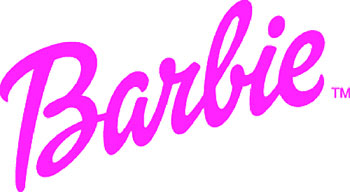
The reason letterform is so powerful is due to is ability to provide unconscious persuasion. From attracting attention to setting the tone of a layout, the observer is emotionally and subconsciously impacted and gathers the feeling of the piece with out even knowing it. Typography affects people and most of the time they don’t even consciously notice it. Experienced Graphic Designers understand how to harness the power and use it for their advantage to attract attention and reinforce their message. Script typefaces are a great example of letterforms that loaded with all sorts of emotion. As we saw in last week’s assignment, script typeface can create the feel of a particular era or time period as well as, project a mood, elegance and sophistication. While the script typeface does create a nice visual texture, the letterform in most cases is more difficult to read than serif or san serif font. Therefore readers tend to avoid blocks of text containing large amounts of Script text, so it should be handled with care. The BarbieÒ logo is great example of how a script typeface has been using in a dynamic elegant way. Even children know the Barbie brand before they can read the playful elegant designed typeface. Their latest version is by design firm Parham Santana.
Cited:
1. Online School of Design, http://www.sessions.edu/courses/Course-Advanced-Typography.asp; 2009.
No comments:
Post a Comment