Line is an important element of design. Lines can be used to create texture, shapes and tone. Go exploring indoors and outdoors with your camera and look for examples of line in its simplest form. Think formally and conceptually about the term “line.” Take many photos of lines while exploring different angles and proximities to your subject. Create a contact sheet showing at least two photos that best express the design element of line.
This assignment I found to be more difficult than you would think. It started yesterday when I went driving around looking for line element photograph subject. While I found many things that would have worked great I found it hard to find a place to stop, park, and get close enough to shoot. One of the best things I found was a barn falling down with all kinds of incredible lines with the exposed roof and beams, but due to the 2 feet of snow this month, I really could not get close enough to it.
I settled on 4 photos. You will see the “beautiful” gray skies of Ohio in each photo. All photos were taken on My Canon Powershot A40, using a cloudy light balance.
1. The transformer power station. From the highway driving by this seemed like an ideal place to find great line subject. Once I was able to find it, I discovered the entire station was fenced off at quite a distance. I decided to use the element of the fence as an a close element but not the focal point of the photo. Even though the transformers are in focus there is so much going on the lines seem to blur together. It is great contrast with the simple diagonals form the fence and with straight free lines form the wires above. I shot this 1/50 F14.
2. Best Buy was one of the first things that came to mind with this assignment. A few weeks ago I remember walking in and noticing the many posts blocking the entrance and how they were not all straight in a row. I remember them being bright yellow a few months ago, so I was slightly disappointed to find them muted down. I think this photo is really interesting as it does have the reflection in the door and interesting grid from the door as well as the perspective created by the posts, which lead to the red horizontal lines going up. I shot this photo at 1/80 F14.
3. This photo was taken at the transformer power station as well. As I was getting into my car somewhat disappointed I looked up and saw the chaos of power lines crossing as they moved away from the station. I thought it was interesting how they created a natural focal point on the dark pole towards the center. I also like the contrast of thick and thin lines. I shot this photo at 1/200 F14.
4. This power line structure I drove past thinking, “I should really stop that is perfect, and there is a great place to pull off the road”. But of course I didn’t stop. The next day I made a trip back out. I took a few different shots of this, looking straight up from inside, looking from a distance, and this photo, which is looking up one of the large corners. I like the complexity of this structure. There are so many angles and different sized lines. I like how the corner takes you up into the structure I shot this photo at 1/1500 F8.
3/1/10
Photography Composition - Line
2/25/10
Shutter Speed - light painting.
What are the advantages/disadvantages of using a particular shutter speed.
Adjusting the shutter speed opens many opportunities in photography. Increasing the shutter speed one can make a crisp sharp capture an object that is moving in some cases at a very high rate of speed. While this is great function it does have draw back. Increasing shutter speed does have some drawbacks. First, a quicker shutter speed will require more light, which makes complete sense as the film or CCD grid will have less time to react to the light, it will require a greater amount of light to react. The other draw back to increasing the shutter speed is the quality decreases. Shooting at high speeds will increase noise in the photo.
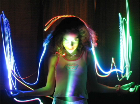
In the same token decreasing shutter speed helps increase the quality of the photo. Another great advantage of decreasing shutter speed is it allows for great motion effects in the final image. A technique known as “light painting” has become increasingly popular. Setting the camera on an very low shutter speed at a very low light, Photographers shoot the photo then use a small LED type light and move the light to create effects in the photo. The low shutter speed allows the film or CCD grid the exposure time to capture the moving light.
See sample of light painting.

http://michael.aivaliotis.com/wp-content/uploads/1.png
SWEET VIDEO of light painting:
Resources:
AIO Lecture Week 2
http://www.diyphotography.net/painting_with_light
Adjusting the shutter speed opens many opportunities in photography. Increasing the shutter speed one can make a crisp sharp capture an object that is moving in some cases at a very high rate of speed. While this is great function it does have draw back. Increasing shutter speed does have some drawbacks. First, a quicker shutter speed will require more light, which makes complete sense as the film or CCD grid will have less time to react to the light, it will require a greater amount of light to react. The other draw back to increasing the shutter speed is the quality decreases. Shooting at high speeds will increase noise in the photo.
In the same token decreasing shutter speed helps increase the quality of the photo. Another great advantage of decreasing shutter speed is it allows for great motion effects in the final image. A technique known as “light painting” has become increasingly popular. Setting the camera on an very low shutter speed at a very low light, Photographers shoot the photo then use a small LED type light and move the light to create effects in the photo. The low shutter speed allows the film or CCD grid the exposure time to capture the moving light.
See sample of light painting.

http://michael.aivaliotis.com/wp-content/uploads/1.png
SWEET VIDEO of light painting:
Resources:
AIO Lecture Week 2
http://www.diyphotography.net/painting_with_light
2/20/10
Applying Styled Text
I found an image of Kat Von D. I thought I would add here name as a tattoo. I created a text layer with the font “Hurricane”. I rotated the font and got the sizing pretty close to run from her shoulder to her armpit. I then used the “DAMP” method to remove some hairs and clean up the skin. I then converted the text layer to shape and went to Edit>Transform>Warp and adjusted the shape of the text to fit the space. I then changed the layer style to overlay. I then adjusted the color by selecting the color from another tattoo and applied it to the text shape. Then I created a path with the pen tool around the figure and made a selection. Duplicated the main image and dropped saturation in the background and increased the brightness.
1. Found image of Kat Von D.
2. Chose Font Hurricane.
3. Located place for Text “tattoo”
4. Applied the DAMP Method to remove hair.
5. Rotated font
6. Converted layer to shape.
7. EDIT> TRANSFORM>WARP image to fit.
8. Apply layer style Overlay
9. Match color from other tattoos
10. Used the pen tool to create outline of figure and make selection
11. Duplicated main image.
12. Applied mask to background to adjust saturation and brightness.
13. Save
Image Source:
http://i.pinger.pl/pgr162/2ba221cb0004d4284abbb91d/8.jpg

Before

AFTER
1. Found image of Kat Von D.
2. Chose Font Hurricane.
3. Located place for Text “tattoo”
4. Applied the DAMP Method to remove hair.
5. Rotated font
6. Converted layer to shape.
7. EDIT> TRANSFORM>WARP image to fit.
8. Apply layer style Overlay
9. Match color from other tattoos
10. Used the pen tool to create outline of figure and make selection
11. Duplicated main image.
12. Applied mask to background to adjust saturation and brightness.
13. Save
Image Source:
http://i.pinger.pl/pgr162/2ba221cb0004d4284abbb91d/8.jpg

Before

AFTER
Vector VS Rastor Graphics
Vector graphics are mathematically based shapes and lines, objects and fills. They are typically generated with illustration or drawing software like Adobe Illustrator or Freehand. One of the greatest advantages of using vector images is that they are very easy to scale and retain a sharp clear quality. For example if a small logo is created as a vector graphic, it can be resized to be used on a large billboard and retain the same great sharp quality as it the original. I would recommend creating vector graphics for logos, symbols, graphs and charts in books, promotional posters and illustrations. Any occasion where the end result needs to have clean and clear distinct shapes vector is the best choice. Vector graphics also tend to be much smaller than vector graphics since the images are based on mathematical descriptions instead of pixels.
Raster images are composed of pixels or squares of colors. They are created with scanners, digital cameras or raster based software like Adobe Photoshop or Fireworks. Since raster graphics are based on pixels, attempting to increase the size of a vector graphic can cause some issues where the image will loose detail and clarity. However, raster images can be reduced in size and maintain quality. Since raster graphics are pixel based they also have issues with resolution where vector images do not. Web graphics for example have a resolution of 72-96 dpi. Printed images need from 200-300dpi. Raster images are known for being very large if they have a great amount of detail and pixels. Many adjustments and effects can easily be added to raster graphics like drop shadows, blurs, bevels and more. While converting from vector to raster is quite easy, converting from raster to vector is not. Raster files are mostly photographs since it offers a wide range of effects, manipulations, and adjustments. to this type of file. When working on photographs, creating textures and subtle digital effects raster is the way to go.
Resources:
AIO Lecture: Week 4
http://www.logodesignworks.com/blog/vector-graphics-and-raster-graphics-difference
http://designwashere.com/design-battle-vector-vs-raster/
AIO Lecture: Week 4
http://www.logodesignworks.com/blog/vector-graphics-and-raster-graphics-difference
http://designwashere.com/design-battle-vector-vs-raster/
Some examples of vector art from my website see the links below
VECTOR ART:
1. This vector graphic works well as it is crisp and clean at any size. I also like how it is stylized and simplified, but still has a refreshing essence.
2. This is a vector layout for a magazine. The graphic of the motorcycle is a stylized illustration. This is great as the graphic can be reproduced for other media and keep consistency with branding. For example if this graphic was going to be used on a billboard it would retain the sharp crisp quality.
3. This is a page that contains all vector graphic logos. I try to create all logos as vector graphics so they can be easily resized for any application.
RASTER ART:
1. Here are some book covers I created for a client while I worked as an Art Director. These book covers were created in Photoshop software ad used in some cased up to 50 images to create the montage. The covers have many filters and effects and layer styles applied to the photos. To keep the quality of the cover for the final printing these graphics were created as raster art.
2. The same client I used to do book covers for now has a demand for cd covers. He wants a wild colorful design. I use Photoshop raster art to accomplish what he is looking for. See samples of his covers on this website.
Image Correction
CHOPSTICK IMAGE:
1. I opened the file in Photoshop CS4
2. Adjusted Levels and Gamma:
Image>Adjustments>Levels and adjusted the input levels to 10 | 1.17 | 112
3. Adjusted the Curves:
Image> Adjustments> Curves and selected the “lighter” Preset.
4. Changed the image size:
Image>Image Size> Adjusted size 640x423 at 72 dpi.
5. Save as ai_g223_w2_chopsticks2.psd
6. Then saved again as .jpg quality 8

Before

After
FACE IMAGE:
1. I opened the file Photoshop CS4
2. Adjusted Levels and Gamma:
Image>Adjustments>Levels and adjusted the input levels to 4 | 1.77 | 251
3. Adjusted the Curves to remove warm colorcast:
Image> Adjustments> Curves, select the gray eyedropper and select image in a gray area to remove the colorcast.
4. Changed the image size:
Image>Image Size> Adjusted size 397x640 at 72 dpi.
5. Save as ai_g223_w2_face2.psd
6. Then saved again as .jpg quality 8


Before--------------------------> After
TEA IMAGE:
1. I opened the file in Photoshop CS4
2. Adjusted Levels and Gamma:
Image>Adjustments>Levels and adjusted the input levels to 110 | 1.00 | 206
3. Adjusted the Curves to remove warm colorcast:
Image> Adjustments> Curves, and moved the top point slightly changing the output to 242.
4. Changed the image size:
Image>Image Size> Adjusted size 640x421 at 72 dpi.
5. Save as ai_g223_w2_teacups2.psd
6. Then saved again as .jpg quality 8

BEFORE

AFTER
1. I opened the file in Photoshop CS4
2. Adjusted Levels and Gamma:
Image>Adjustments>Levels and adjusted the input levels to 10 | 1.17 | 112
3. Adjusted the Curves:
Image> Adjustments> Curves and selected the “lighter” Preset.
4. Changed the image size:
Image>Image Size> Adjusted size 640x423 at 72 dpi.
5. Save as ai_g223_w2_chopsticks2.psd
6. Then saved again as .jpg quality 8

Before

After
FACE IMAGE:
1. I opened the file Photoshop CS4
2. Adjusted Levels and Gamma:
Image>Adjustments>Levels and adjusted the input levels to 4 | 1.77 | 251
3. Adjusted the Curves to remove warm colorcast:
Image> Adjustments> Curves, select the gray eyedropper and select image in a gray area to remove the colorcast.
4. Changed the image size:
Image>Image Size> Adjusted size 397x640 at 72 dpi.
5. Save as ai_g223_w2_face2.psd
6. Then saved again as .jpg quality 8


Before--------------------------> After
TEA IMAGE:
1. I opened the file in Photoshop CS4
2. Adjusted Levels and Gamma:
Image>Adjustments>Levels and adjusted the input levels to 110 | 1.00 | 206
3. Adjusted the Curves to remove warm colorcast:
Image> Adjustments> Curves, and moved the top point slightly changing the output to 242.
4. Changed the image size:
Image>Image Size> Adjusted size 640x421 at 72 dpi.
5. Save as ai_g223_w2_teacups2.psd
6. Then saved again as .jpg quality 8

BEFORE

AFTER
Designing CMYK in an RGB Environment
Managing color in a brochure, which displays different samples of wallpaper, can be challenging. This is because the monitor display (RGB) is quite different than what most printed color (CMYK). The major difference is that RGB color which appears on a monitor is additive color where the Red, Green, Blue colors are combine to create different colors or add all together to create white. Subtractive color is where cyan, magenta, yellow and back colors are absorbed or removed to leave other colors reflecting their various wavelengths back to a viewer.
The key in this example is to maintain the color in the brochure sample with the actual colors in the wallpaper. First the digital sample might need adjusted. Using levels and curves in Photoshop is one way to manage color. Levels are adjusted to ensure there is an adequate range of tones in the photo. The gamma can then be remapped to darken or lighten the image. If an image has a color cast that need removed it can quickly be adjusted in the curves pallet. Manual color correction can be difficult especially as it greatly depends on personal preference of color. Another way is to use profiles. Profiles are a great resource for managing color as it embeds the information in the data to guarantee it prints properly. The only thing about using color profiles is the printer must have the software that supports profiles.
To ensure the color in the brochure is accurate to the actual color I would use pantone colors and match up the CMYK to match. Pantone colors are published in swatch books and are used as a standard to match the correct color. There is a CMYK mixture for every pantone color. These mixes create standards for designer struggling to merge the worlds of CMYK and RGB and have brochure colors match the actual product.
Resources:
AIO Lecture Week 2
http://www.rgbworld.com/color.php#subtract
The key in this example is to maintain the color in the brochure sample with the actual colors in the wallpaper. First the digital sample might need adjusted. Using levels and curves in Photoshop is one way to manage color. Levels are adjusted to ensure there is an adequate range of tones in the photo. The gamma can then be remapped to darken or lighten the image. If an image has a color cast that need removed it can quickly be adjusted in the curves pallet. Manual color correction can be difficult especially as it greatly depends on personal preference of color. Another way is to use profiles. Profiles are a great resource for managing color as it embeds the information in the data to guarantee it prints properly. The only thing about using color profiles is the printer must have the software that supports profiles.
To ensure the color in the brochure is accurate to the actual color I would use pantone colors and match up the CMYK to match. Pantone colors are published in swatch books and are used as a standard to match the correct color. There is a CMYK mixture for every pantone color. These mixes create standards for designer struggling to merge the worlds of CMYK and RGB and have brochure colors match the actual product.
Resources:
AIO Lecture Week 2
http://www.rgbworld.com/color.php#subtract
2/18/10
Multipage Brochure Experiments
Given a chance to design a multiple page brochure, would you like to experiment with different styles and layouts or would you prefer to use the contemporary style? What, in your opinion, might interest general public?
Whenever I have designed a multiple page brochure, the first thing I always consider is the budget. How many pieces will the client want? How will I reproduce them? How much money is the client willing to spend? Most of the time when I design brochures for clients it always comes down to meeting the budget. First I typically look at what the client is trying to achieve in the brochure. Is it Information for training, awareness, promotion or something completely different?
Of course still need more information before I really start thinking about the design. How much and what information do I need to include? Are there any extra items that the brochure needs to accommodate like CD’s, DVD’s, Pens, etc? Does it need multiple folds, tear offs, die cutes, pockets?
Once I have answers to all these questions I begin to thumbnail and think of ways to make the form of the brochure function the best. I look at other layouts and creative brochures and consider those designs verses mine. Then I consider how will the brochure be produced.
So, to answer the question, I like to experiment with new styles. I think seeing something different with great production always attracts attention. Using dynamic typographic and exciting photography to generate interest on a unique looking brochure is more likely to draw attention and say “you got to see this!” compared to a standard design.
A great example of this is when I go to the Dr.’s office and look at all their brochures in the waiting room. Some of the big drug companies have great unique shape brochure about the latest anti-depressant, heart medication, diabetic supplies and so forth. They pop off the display and scream “LOOK AT ME, I AM NEW AND EXCITING!” Verse the simple packet of papers stapled in the top left corner printed on a copy machine that needs cleaned and is out of toner. Pushing brochures to the next level is just part of the graphic design game we designers call work.
Whenever I have designed a multiple page brochure, the first thing I always consider is the budget. How many pieces will the client want? How will I reproduce them? How much money is the client willing to spend? Most of the time when I design brochures for clients it always comes down to meeting the budget. First I typically look at what the client is trying to achieve in the brochure. Is it Information for training, awareness, promotion or something completely different?
Of course still need more information before I really start thinking about the design. How much and what information do I need to include? Are there any extra items that the brochure needs to accommodate like CD’s, DVD’s, Pens, etc? Does it need multiple folds, tear offs, die cutes, pockets?
Once I have answers to all these questions I begin to thumbnail and think of ways to make the form of the brochure function the best. I look at other layouts and creative brochures and consider those designs verses mine. Then I consider how will the brochure be produced.
So, to answer the question, I like to experiment with new styles. I think seeing something different with great production always attracts attention. Using dynamic typographic and exciting photography to generate interest on a unique looking brochure is more likely to draw attention and say “you got to see this!” compared to a standard design.
A great example of this is when I go to the Dr.’s office and look at all their brochures in the waiting room. Some of the big drug companies have great unique shape brochure about the latest anti-depressant, heart medication, diabetic supplies and so forth. They pop off the display and scream “LOOK AT ME, I AM NEW AND EXCITING!” Verse the simple packet of papers stapled in the top left corner printed on a copy machine that needs cleaned and is out of toner. Pushing brochures to the next level is just part of the graphic design game we designers call work.
Is Thumbnailing That helpful?
How does thumbnailing aid in your creation of a multiple page brochure? Does it actually make the process faster or does it slows down the process?
Thumbnailing is vital to the creative process when working on any project. While it does take time to think and develop multiple concepts for thumbnails, it is much better to sketch out some ideas and see how they will work, opposed to spending hours on a design and realizing it is not good and needs new direction. While having a concrete concept when starting a multi-page brochure does entice some to jump right in, exercising a thumbnail technique will expand the possibilities, and further develop the concept of the design. Creativity flourishes when working on quick, design sketches. Even if the thumbnailing exercise directs a designer toward their original concept, the process has not been in vain. The designer now has other creative elements floating in their head that will take this project to the next level.
Subscribe to:
Posts (Atom)