5/27/10

Package Design - DVD Text only - Seven

Objective: 
Find a DVD and redesign the cover using only type. The final should be front, back and spine, as well as, insert front and back and the DVD.


Post: Thumbnail, Digital Rough, Final.

Description:
DVD: Seven -
I used a large #7 to span the entire space with a gritty font called CGF OFF-ROAD. I then used the seven sins, which is the theme of the movie, in the number in a subtle color/shade. I used repetition of these seven sins. I then picked random spots to change the color of the listings to a bright red. This is in keeping with the theme of the movie as well as the murders are at random. I used the font Last Sound Track for the Sins and the Title, which I made large and red. I also exchanged the V in seven for a #7. Finally I applied a quote and the featured actors in a Palatino font. On the original movie they used hash marks, which I thought I would keep in my design which are done in the Megiapaoid font. I plan on adding more color and completing the back spine, inside piece front and back as well as the DVD to complete this project.


Thumbnail

Digital Rough

Re-Forming the Message - 2nd Amendment

Objective: Choose a significant historical document and reformat the design to make a better visual impact.

I mostly used IMPACT as I wanted the font to really be bold. I also used Arial narrow in some area that I didn’t have much space. I also used Wide Latin for the big bold look of the number 2 to resemble the gun. I also used Arial Black across the top and used a 3-d effect to same me some time and simulate the top ridge.


I think it’s a pretty creative use of type for this paticular document
View source document here:
http://www.gpoaccess.gov/constitution/html/amdt2.html


Resources:
Online lecture
Typographic Design: Form and Communication
http://www.dreadgazebo.com/gunporn/wp-content/uploads/2007/12/feg_plated_3.jpg
http://www.gpoaccess.gov/constitution/html/amdt2.html

Package Design - Continuous Label Cylinder

Objective:
Create a company and product label that will use a cylinder shaped container.  It may not contain any die cuts or windows. The label must be continual and not appear to have a front or back. 

Show a thumbnail, sketch rough, 3 digital revisions, and final product photo.

Product overview:

The product is spaghetti pasta. The product is currently known for it’s packaging in boxes and bags. The product is produced in long, thin brittle pieces. I would like to packaging to appeal to individuals looking for a spaghetti pasta product for Italian. The packaging will appeal to those looking to use portions of the product; therefore the packaging also serves a purpose of storage. Target group is men and women 18- 40 with a small family or individuals living alone.

The brand name is Segreti. I thought using an Italian family name would work well for this Authentic Italian Pasta Product. I have researched Italian looking fonts and found that they lend more to a script look. At the same time some applications use a think san serif font. The logo is repeated on the container to make it appear there is not a front or back. The size of the label is 7” X 10 5/8” with a ¼” on the top and bottom and a ½” flap.
Thumbnail

Rough Sketch

Digital 1

Digital 2

Final

Final Prototype

5/23/10

Digial Printing - Going Gray Illustraitor CS 4

Ok Ok, I know better but I figured since I was just printing at Office Max on their digital printer I would set up my Adobe Illustrator CS4 file as RGB. But when they guy went to print it came out as gray scale? We were both stumped. I said well it is RGB, and he and i agreed it shouldn't really effect it since it was digital and it switches it on the fly. But once the fly was switched to CMYK the color came out in the print.

Another interesting thing that I found with this little experiment. It seemed like when I tried to create a PDF from the printer when the file was in RGB it would export in grayscale? I had never heard of this before.

5/22/10

Package Design - Reflecting the product

Cracked edges, rough and distressed borders, woodcuts and the like add hand-hewn looked that is so often associated with crunch. Images of whole grains, if applicable, are also seen woven into background patterns and typography to support naturally crunchy products, like cereals.

Response: Crunch graphics work best when balanced with some smooth clean lines.Too much of a crunchy thing can be overbearing, not to mention, unappetizing.

Source From: http://www.rbird.com/movabletype/patterns/archives/package-design-for-crunch.php


Crunch Graphics:
Using the edges and borders to push the “crunch” is a great concept. Not only is the word crunch there, but also it is rocking the environment it is placed in. Pushing the packaging to experience the effect of the product is a great way to express to the costumer how the experience of the product will be. In this case it reminds me more of being creative and mindful with the entire package design. In this case crunch is what is being pushed making the entire package reflect the “crunch” of the product. The same principle would be true if the product was chewy, creamy, bubbly or fizzy..You see this concept applied a lot with bubbles. I think the sub point is important though you can have too much crunch. Balance is always key.
Adding keeping these elements of texture is very important when designing packaging for anything, and especially candy bars. We see crunch graphics applied to some candy bar packaging.

Package Design Use of White

Several brands use a clean white field to provide contrast and let the product image communicate crunch more effectively. This unadorned presentation keeps the focus on the grain, texture and nuances of the product.

Response: While presentation on white is an effective way to put focus on texture and grain, it also is a common technique among organic, or natural foods. Words like “clean”, “crisp” and “snappy” come to mind for packages using this technique.
http://www.rbird.com/movabletype/patterns/archives/package-design-for-crunch.php


White:
The section about “White” was interesting to me. It seems like this is a newer movement for quality brands in my opinion. It seems like years ago the generic product would use white for packaging with very plain simple text looking very generic I guess at that time it was an affordable design choice. Today it seems like this movement has shifted to quality products and brands as well. These products using a lot of white seems to be a better quality as the brand speaks for itself and the noise of the packaging is not needed for attention. The products seem to be focused more toward the health conscious apposed to those looking for a sweet snack containing red 40.
A great example of this is with Kashi products.
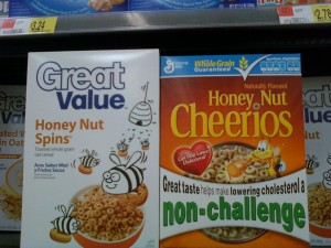
The texture of the product is defiantly highlighted. The logo and branding are also easy to spot. At the same time you also see generics going with this look too. Wal Mart for example has recently switched to this look too.
With candy bars there are a few that may use this strategy. Payday is one that comes to mind.
sing the white background to contrast the crunchy nuts. I have also seen this a little with Hershey’s Cookie ‘n’ Cream
In general most candy bars use white to show white chocolate. But theses are some great ways where it was used to show crunch.

Package Design Windows

Windows:

Sometimes, gorgeous illustrations or photography can lead to a let down for consumers who demand truth in advertising for the products they purchase. An honest, what you see is what you get, approach could be well worth it for good looking products. Clear windows allow consumers to see the actual product.

Response: Window shapes can be further enhanced with rough edges or irregular shapes to help support the crunchy look.

From: http://www.rbird.com/movabletype/patterns/archives/package-design-for-crunch.php

I think the section about windows is very true. Something to really be mindful of in packaging design is customers want to see the product. This is especially true with bread products. People want to see the bread and texture. You can spot mold, quickly and in this example most like to squeeze and inspect the product for freshness. At the same time, if the product is not so pretty, or not as quality as its competitors, a window could turn off customers. It is important to know what the competitors are doing. If a product has out standing quality compared to its competitors it would be a great way to show the customer the great product. A window may not be quite as effective in products like cereals or fruit snacks. Using a photo or illustration may be a better way to display the product as it is easier to control for consistency and push graphically for excitement. Also controlling the location of the window is key. You wouldn’t want to put a window at the bottom of a chip bag and reveal all the broken chips at the bottom. This type of research is very helpful in any type of packaging design. The candy wrapper applies as well. I am thinking specifically of molded candy where the item has been molded to a specific shape. Valentines Day hearts, Easter bunnies, Christmas trees and the like are great examples of candy bars using a window. Revealing the product can really assure the customer the product is exactly what they are looking for.

Research in Packge Design for Crunch

A great site with information to enchance package design. This site explores the packaging of the following products:

Brands referenced include: Back to Nature, Ben & Jerry, Blue Bunny, Butterfinger Crisp, Cap'n Crunch, Caribou Coffee, Cary's, Cascadian Farm, Cheese Nips, Cheetos, Cocoa Pebbles, Crisp'itz, Crispy Delites, Doritos, Food Should Taste Good, Frito Lay, Garden of Eatin, General Mills, Giga Hold, Goldfish, Good Humor, grape-nuts, Gripz, Healthy Delite, Heart Basics, Hershey, Kashi, Keebler, Kellogg's, Kit Kat, Krackel, Kraft, Krispy Kreme, Lunchables, Madhouse Munchies, Masterfoods, McCormick, Nabisco, Nature's Path, Nestle Crunch, New York Style, Old El Paso, Optimum Zen, Oscar Mayer, Pepperidge Farm, Post, Quaker, Rice Krispies, Salad Toppins, Snickers Cruncher, Stop & Shop, Sun Snacks, Tiny Trapeze, TLC, Wheat Thins, Whole Foods, Wise, YoCrunch.

Comments are made about the following:
Environment
Windows
Background Texture
Product Illustration
White
Energy
Lettering
Color
Brand Characters
Hard Things in Soft Things
Not Quite Crunchy
Crunch Masters
Crunch Graphics
Crispy vs. Crunchy

Check it out:
http://www.rbird.com/movabletype/patterns/archives/package-design-for-crunch.php