
Response: While presentation on white is an effective way to put focus on texture and grain, it also is a common technique among organic, or natural foods. Words like “clean”, “crisp” and “snappy” come to mind for packages using this technique.
http://www.rbird.com/movabletype/patterns/archives/package-design-for-crunch.php
White:
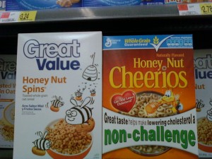
The section about “White” was interesting to me. It seems like this is a newer movement for quality brands in my opinion. It seems like years ago the generic product would use white for packaging with very plain simple text looking very generic I guess at that time it was an affordable design choice. Today it seems like this movement has shifted to quality products and brands as well. These products using a lot of white seems to be a better quality as the brand speaks for itself and the noise of the packaging is not needed for attention. The products seem to be focused more toward the health conscious apposed to those looking for a sweet snack containing red 40.


No comments:
Post a Comment